

7 Practical Colour Principles for Designing App Interfaces
source link: https://uxplanet.org/7-practical-colour-principles-for-designing-app-interfaces-3de3f0667ded
Go to the source link to view the article. You can view the picture content, updated content and better typesetting reading experience. If the link is broken, please click the button below to view the snapshot at that time.
7 Practical Colour Principles for Designing App Interfaces
A simple checklist of time-tested ideas for product designers

“Anyone who has ever felt blue, seen red, blacked out, or turned green knows we’re prone to make emotional associations with different shades.”
— Winifred Gallagher
You’ve covered the basics of Colour Theory and are excited to design your first app. You’re looking at some great colour combinations to use in your app. Great! But in practice, the advice ‘use a complementary colour scheme’ has little practical bearing on whether you would eventually end up with a good-looking design.
So how do you apply colour theory in practice as a UI designer? How do you leverage time-tested principles and not reinvent the wheel every time you’re making a prototype? This is what made me write this.
This post is a small attempt at creating a bridge between theory and practice, to get to a practical rulebook at applying colour principles in app design. I am writing this as a guide to beginners in design, including myself.
The essential question that I am trying to answer here is: How do I pare down colour theory to a few (limited) core design tenets, so as to create a repeatable system or framework for app design?
Of course, as with anything in design, the choice of colour(s) for your app needs to take into consideration the users and
- the mood and perception you want to convey
- the emotions and behaviours you want to elicit
- the brand identity & personality, tone of messaging, and industry
- the cultural associations of different colours in general (and in the target geography in particular).
These preliminary checks are a must for designers before moving on to the finer nuances. But we’re not talking about all that here. We are looking at some generic, context-independent UI ground rules.
To keep it short and sweet, I will not cover any colour theory basics in this post and have deliberately attempted to make the pointers as succinct as possible. If you’re new to colour theory or want a relook at the basics, check out the below article.
Cool? Let’s jump straight in!
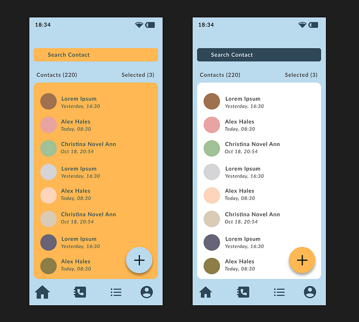
#1. Use no more than 3 colours on your UI
Remember this: Colour selection in UI is less about selecting a bunch of colours and more about creating multiple variations of 1 or 2 base colours.
Simpler is better. Avoid overload. Often it’s more useful to limit the palette to 2 base colours and work with different shades of the same colour (rather than two different colours). In a 3-colour palette, use
- 1 colour as the dominant colour (use it for backgrounds). Dominant colours are typically light and often neutral.
- 1 colour as the complementary colour (use this for text). Ensure it has reasonably good contrast with the dominant colour.
- 1 colour as the accent colour (use it to create emphasis such as on CTA buttons, error messages etc.). Accent colours are typically bright and may be the primary brand colour. If variations are required, try using different shades.
- To generate ‘shadowed’ or ‘darker’ versions of a base colour, lower the value (brightness) and bump up the saturation. Similarly, to get brighter colour variations, increase the value and lower the saturation.

Wanna try some amazing colour palettes? Head over to coolers.co and generate your own palettes — just press ‘Space’ for a new combination!
#2. Colour Pairing & Schemes:
Stick to basic colour schemes like Monochromatic, Analogous or Complementary. Or a combination of monochromatic & neutral colours (e.g. different shades of blue with white as accent colours).
- While using an analogous scheme, use a high-saturation colour from the opposite end of the colour wheel as an accent colour (to create emphasis).
- It’s extremely easy to mess up complementary colour combinations — but when done right, they can make UI elements pop. Be careful about the saturation and value. Choose one of the complementary pairs as the dominant colour and the other for accent. Tone down the saturation of the dominant colour and try different shades to make it easier on the eyes.
- A combination of a neutral monochromatic palette with a bright colour for accent works great (e.g. different shades of gray with blue as accent colour).
- Do NOT use complementary colours for text & background combinations, they vibrate.
#3. Text to Background Colour Contrast
Ensure a minimum colour contrast of 4.5:1 between text and background (the same applies to other elements like icons as well).
- Do NOT set body text in bright colours against white backgrounds. Black and dark gray work the best for body text against a white background.
- Make sure the colour palette passes WCAG compliance checks for accessibility. To integrate this into your design workflow, download the Stark plugin for Figma and check colour contrast on your designs directly in Figma.
- As a general check, avoid using these colours next to each other: Green & Red, Green & Brown, Blue & Purple, Green & Blue, Blue & Gray, Green & Gray.
- Do NOT rely on colour alone to create contrast. Use icons, text, patterns, textures alongside colours to act as additional differentiators.
#4. Always Test Colours Against Each Other
Sometimes colours look great when we see them as isolated swatches on a white background, but that doesn’t mean the same colours will work together within a user interface. It is important to always test colours out against each other, and pick only those combinations that gel well.

#5. Manage Simultaneous Contrast
Simultaneous contrast occurs when complementary or near-complementary colours of the exact same saturation are placed adjacent to one another, causing them to ‘vibrate’ at the interface.
- Avoid simultaneous contrast in text-and-background combos. Tone down the saturation of one of the colours.
- Leverage simultaneous contrast to draw attention to particular elements such as notifications.
- Do not use more than 1 high-saturation colour on your UI.
#6. The 60:30:10 rule
Probably the least useful in this list. Like any thumb-rule, the 60:30:10 rule is just a guiding light, which suggests the best proportion of background, complementary and accent colours on your interface (by area) so as to achieve a balanced and harmonious look. To apply, use
- A neutral or light color on 60% of your design (dominant colour).
- A complementary color on 30% of your design. This may be a secondary brand colour.
- An accent colour on 10% of your UI for interactive elements such as CTAs, icons etc.
#7. Consider Interaction and Functionality of Elements
In design, we study similarity — which illustrates how elements which are similar in appearance are perceived to have a similar functionality. This extends to colour.
- Do NOT use the same colour for interactive and non-interactive elements — this might be very confusing for users.
- Do NOT use the same colour for elements with different functionality. Elements having markedly different functions, e.g. an ‘Add To Cart’ button and an FAQ icon, should use different colours.
- Create dark and light states for the interactive elements (to check the changing appearance during a press or a hover)
The above guidelines are neither written in stone nor exhaustive in scope. But they serve as good starting points to think about colour application on apps. Another caveat to keep in mind is that a great colour combination doesn’t compensate for a bad functionality.
What colour tips do you use on app interfaces? Let us know in the comments below.
Enjoyed this post? If yes, please show some appreciation by clicking on the “clap” button. Fun trivia — you can hit it up to 50 times! It helps the content reach out to more like-minded people.
Please share your thoughts and feedback in the comments below. This will help me improve and also inspire me to create more.
I try to publish regularly on Medium. Follow this account to receive similar content in future, and click here to get each post directly in your email. You can find me on Linkedin and Twitter as well.
Recommend
About Joyk
Aggregate valuable and interesting links.
Joyk means Joy of geeK