
8 insightful ways to design boring Terms of Service page
source link: https://blog.prototypr.io/8-insightful-ways-to-design-boring-terms-of-service-page-a4335885471f
Go to the source link to view the article. You can view the picture content, updated content and better typesetting reading experience. If the link is broken, please click the button below to view the snapshot at that time.

Information breakdown examples from Facebook
8 insightful ways to design boring Terms of Service page
Designing the way humans interpret complex strings of text
Undeniably as we are immersing ourselves in highly knowledgeable tech products, the requirement for pages like privacy, terms of services, data sharing, data collection, and security are becoming important. These pages hold special importance in the way a user’s data is being utilized and shared with other services by the product. Yet, a lot of companies turn a blind eye to these products and never care to make them clearer. One reason for that would be that companies don’t want people to read these pages. They just want them to accept the terms of use and carry on with using the product.
Oftentimes, I have seen companies treating terms of service and privacy pages as an obstacle and something that are a checkbox item that was added by their legal teams. Some social network companies have come under fire and speculations because they chose to sell users’ data to other media companies for money. Hence, I feel today tech companies can do better and simplify their terms of using language and layout structures to make the information more accessible and easily understandable. In this post, I’ll discuss eight different design patterns we can utilize to make long pages full of legal text, short and readable by the wider audience.
#1–4 Visual Information Breaks

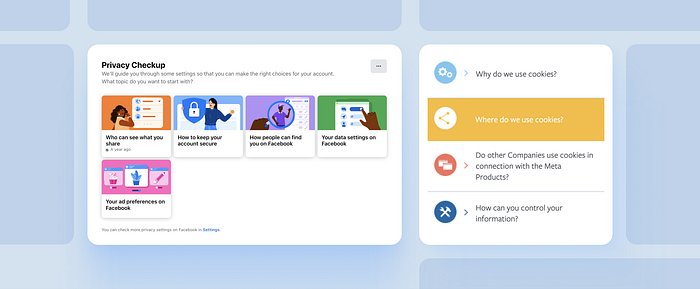
Facebook’s Privacy Centre
Check out Facebook’s Privacy Centre. Privacy Policy is important because it explains how the company collects, uses, shares retains, and transfers information. It is particularly interesting how Facebook aligns its user's interests by making its privacy terms easy to follow.
There are a few tricks here that we all can learn from —
- Examples: Each section of the Policy includes helpful examples and simpler language to make the policies easy to understand.
- Visual Breaks: For each of the sections, there is either a video or a photo that breaks the information flow and refocuses the user’s attention.
- Inline Links: Across the page, there are links added to resources where users can learn more about related privacy topics.
- Lists & Progressive Disclosure: Information and things like Partner information are exposed via a linked list. These lists are linked to popup dialogs and hence, utilize progressive disclosure to keep the structure less cluttered while maintaining the central theme of the page.
#5–7 Colors & Anchored Links

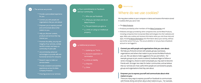
Facebook’s Terms of Service Page
Another example from Facebook is its Terms of Service page and Cookies. Here the company uses a few more important patterns to make the information easily accessible and enjoyable to the eyes.
- Anchor Links: Anchored links are a great way to make your page SEO optimized and break the information into different logical sections that can easily be visited by the users at their own will. Facebook also collapsed the contents of a particularly long list of anchored links to reduce the information density and only show what is necessary on click or focus. Another great example of progressive disclosure.
- Return to Top: While anchor links are great, it is very annoying to scroll to the top to access the previous links. “Return to top” is a valuable hack that allows people to scroll to the top of the page with just one click. To improve usability further, anchored links can be made floating on the left side. This would reduce the need to scroll to the top of the page for accessing page links.
- Colors & Hierarchy: Facebook chunks its anchor links into different buckets and assigns different colors to each of the chunks. These colors are used in the long text essay for header text colors. When going through a large page full of text, colors can make a huge difference in breaking the information flow and allowing users’ eyes to rest and refocus. Beyond colors, it is also advisable to use Bold font-weight to high information words or strings of information. Increasing the font weight improves users' ability to focus on the important information bits.
#8 Information Simplification

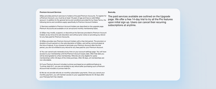
Terms of Service page by 500px
Oversimplification is desperately required for terms of service pages. This is fantastically shown by 500px. 500px’s Terms and Privacy pages are both structured in a two-column layout where on the left side the original long forms of the policy are written and on the right side a simplified human form of the text is displayed. This excellent simple copywriting is something that most companies should invest in to make their terms of service page simplified while also keeping the legal team happy.
Here is a word count of three of the longest sections in 500px’s Terms of Service page —
- Copyright Complaints
Original Text Length: 551 Words
Simplified Length: 17 Words
%age Reduction: 96.91% - User Conduct
Original Text Length: 742 Words
Simplified Length: 32 Words
%age Reduction: 95.68% - Visual Content Submitted or Made Available for Inclusion in the Service and for Licensing
Original Text Length: 1063 Words
Simplified Length: 124 Words
%age Reduction: 88.33%
This is astonishing. The impact on the user’s ability to easily skim through and read every term of service is over 70%. It reduces the long passage of text by over 80% and that alone is nothing short of remarkable. If as a designer or product person, you choose to follow only one trick from this post then it should be this one —
Over simplify your boring text strings and focus towards making your page exceedingly readable for the users.
🙌 That’s all folks!
Thanks for making it to the end. I hope you gained something from it.
Thanks for reading 🥳. Before you go,
👨🏻💻 Join my content verse or slide into my DMs on LinkedIn, Twitter,Figma, Dribbble, and Substack.
💭 Comment your thoughts and feedback, or start a conversation!
Recommend
About Joyk
Aggregate valuable and interesting links.
Joyk means Joy of geeK