

UI/UX Design: What is Visual Design?
source link: https://uxplanet.org/ui-ux-design-what-is-visual-design-865c53ab6b4f
Go to the source link to view the article. You can view the picture content, updated content and better typesetting reading experience. If the link is broken, please click the button below to view the snapshot at that time.

Overview
In the UI/UX industry, the term “visual designer” is thrown around quite a bit, and it can cause some confusion for folks just starting off, or for those who work in conjunction with designers.
What exactly is visual design? How does it relate to UI/UX design, and what does visual design entail?
Today, we’ll be covering what visual design is, how it works within UI/UX design, and how you can incorporate it in your projects more effectively.
What is visual design?
Visual design is essentially the process of crafting the visual and aesthetic qualities of a user interface.
Visual Designers vs Graphic Designers - Who Does What and Why (with Infographic)
On the surface visual design and graphic design sound like the same thing and are sometimes used as interchangeable…
What’s the difference between UI design and visual design?
UI is everything about the user interface, including interactions and functionality. Visual design focuses specifically on the visual presentation and aesthetics of the visible UI.
Visual design incorporates many of the same disciplines as a graphic designer, but instead of designing for standalone graphics, a visual designer is generally concerned with the visual presentation of the entire product or service.
Why should we care about visual design?
The main reason that we should always care about quality visual design is due to the Aesthetic-Usability Effect.
In short, users perceive that a design that looks nice is more usable, and is of a higher overall quality, than designs that don’t take aesthetic presentation into account.
While this may seem obvious, its worth pointing out that visual design is a discipline in and of itself for good reason: because products and services that look better have higher overall user engagement, conversion, and retention.
What does good visual design entail?
Now that we know what visual design is and why we should care about it, what all does it entail?
Information hierarchy
First and foremost is information hierarchy, which is an umbrella term that covers color, typography, spacing, and overall design composition. This has to do with how information is presented on the page overall, from most important to least important.

This improves the scannability of your content, while assisting your users in determining what the most important aspects of your content are.
Color theory & application
One major aspect of visual design that can deeply affect your information hierarchy is color theory and application.

Illustration credit https://www.colorsexplained.com/color-harmony/
There are many different types of color harmonies that we can explore for our designs, the most common being complimentary, analogous, triadic, and monochromatic in visual design.
Color Harmony: What It Is And Color Harmony Examples (2022) * Colors Explained
Wanna learn more about color harmony and harmonious color combinations? Then you're in the right place because we'll…
As we can see in the example below, on the left we have a monochromatic application of color, and on the right we have a non-harmonious mix. Same content, different color application, and a highly different result visually.

Typography
Another huge aspect of visual design is typography which consists of type specifications for the readable elements of your design.

In a nutshell, good typography makes the content much easier to parse visually, whereas bad typography directly inhibits your ability to read content in any meaningful way.
Effects
In addition to your design elements themselves, we have effects that can be applied to those elements which can create specific visuals as desired.

That being said, these should always be used sparingly to accentuate your design rather than overwhelming it.
Layout & visual composition
Lastly, layout and visual composition refers to how all of the elements are laid out and work together to create your entire design as perceived by the user.

Your layout and visual composition will almost always be determined by the type of grid that your project is using (2, 4, 6 column, etc.) and by your spacing tokens (4, 8, 16pt, etc.).
Once you’ve determined your base spacing and base grid styles, where applicable, you can begin creating your design from these various elements and combining them to create a visually appealing layout.
How to incorporate more visual design
So how can we get started with visual design, ensuring that we’re taking the necessary steps to promote good aesthetic practices throughout our compositions?
Regardless of where you’re at, I always recommend starting with the following three.
Adequate spacing between elements
First and foremost, you want to make sure that you have adequate spacing between your elements to give them room to breathe, and the eye room to rest.

It is vastly better to have too much negative space than not enough, so don’t be afraid to start with a design that feels a little loose and then tighten it up as you go.
Good typographical implementation
Next, with good implementation of typography scales and specifications, your design will look much better and your content will be much easier to read.

Typography is a must for information hierarchy, and when applied correctly, it can really take your compositions to the next level.
Good application of color to create depth
Lastly, I always recommend the subtle application of color to create depth in your designs. The main thing here is that less is more and you don’t want to overdo it.

As an example, we have a standard color application on the left and a color application for depth on the right.
Still, it’s worth mentioning that for depth in your designs, you will almost always need more colors than you think you do, so plan for at least 4–6 tints/shades of your main colors so that you have some variety to work with.
When applied correctly, using both atmospheric perspective and individual artistic taste, you can create this depth in your composition using the application of color.
Where you can learn more
Visual design is an interesting field within the UI/UX industry, with the demand for, and prevalence of, visual designers growing year over year.
If you’re interested in learning more about visual design, Pluralsight has an entire course dedicated to visual design for UX.
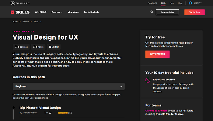
Pluralsight offers an entire course dedicated to visual design for UX.
It’s high-quality, concise, and broken down by skill level so you can start wherever you feel most comfortable. Best of all you can get a free trial using the link below if you just want to check it out to see if it’s
right for you.
Visual Design for UX
Visual design is the use of imagery, color, space, typography, and layouts to enhance usability and improve the user…
Full disclosure: I’m an affiliate of Pluralsight which means I do get a small commission, at no extra cost to you, if you decide to give them a try through this link. This helps me to keep creating quality content for you. Thank you again for all your support!
Bringing it all together
So what does this all mean for you? Visual design is essentially the process of focusing on and designing for the visual presentation and aesthetics of the visible UI.
The main elements of visual design are:
- Information hierarchy
- Color theory and application
- Typography
- Effects, and
- Layout & visual composition
The main things you’ll want to watch out for you improve your visual design are:
- Making sure you have adequate spacing between your elements.
- Double-checking your typography and application of type specs, and
- Applying color using atmospheric perspective and individual artistic taste to create depth in your compositions.
If you found this article valuable, I invite you to lovingly slap that like button, and if you’d like to see more content like this don’t forget to subscribe so you don’t miss any of the awesome stuff I’ve got slated!
Until next time, keep designing, my friends! :D
Recommend
About Joyk
Aggregate valuable and interesting links.
Joyk means Joy of geeK