

Data visualization with Observable JavaScript
source link: https://bigthinkbuzz.com/data-visualization-with-observable-javascript/
Go to the source link to view the article. You can view the picture content, updated content and better typesetting reading experience. If the link is broken, please click the button below to view the snapshot at that time.

Built-in reactivity is one of Observable JavaScript’s biggest value adds. In my two previous articles, I’ve introduced you to using Observable JavaScript with R or Python in Quarto and learning Observable JavaScript with Observable notebooks. In this article, we get to the fun part: creating interactive tables and graphics with Observable JavaScript and the Observable Plot JavaScript library.TABLE OF CONTENTS
Create a basic Observable table
I usually think of a table as an “output”—that is, a helpful way to view and explore data. In Observable, though, a basic table can also be considered an “input.” That’s because Observable tables have rows that are clickable and selectable by default, and those selected values can be used to affect plots and other data on your page. This helps explain why the function Inputs.table(your_dataset) generates a table.
The default table is sortable if you click column headers, and shows several rows along with a scroll bar.
To specify the number of rows you’d like visible in the scrollable window, add the rows argument. The argument shown here displays the first 20 rows in the scrollable window:
1 second of 28 secondsVolume 0%
Inputs.table(mydata, {
rows: 20
})
Note that table options are enclosed in curly braces, even if there’s only one option.
To choose specific columns to appear in a table, add a columns option to Inputs.table() with the syntax:
Inputs.table(mydata, {
 columns: ["column_name_1", "column_name_2", "column_name3"]
 })
Note that columns: is followed by a JavaScript array, which is created by [] brackets similar to Python and not c() as in R. Column names need to be in quotation marks.
To rename columns, use header: with the following syntax:
header: {
   original_name1: "NewName1",
   original_name2: "NewName2"
}
To combine selecting and renaming columns, use both columns: and header::
Inputs.table(mydata, {
  columns: [
    "column_name_1",
    "column_name_2"
  ],
header: {
   original_name1: "NewName1",
   original_name2: "NewName2"
}
})
The resulting default will look something like this, using data for US states and their populations:
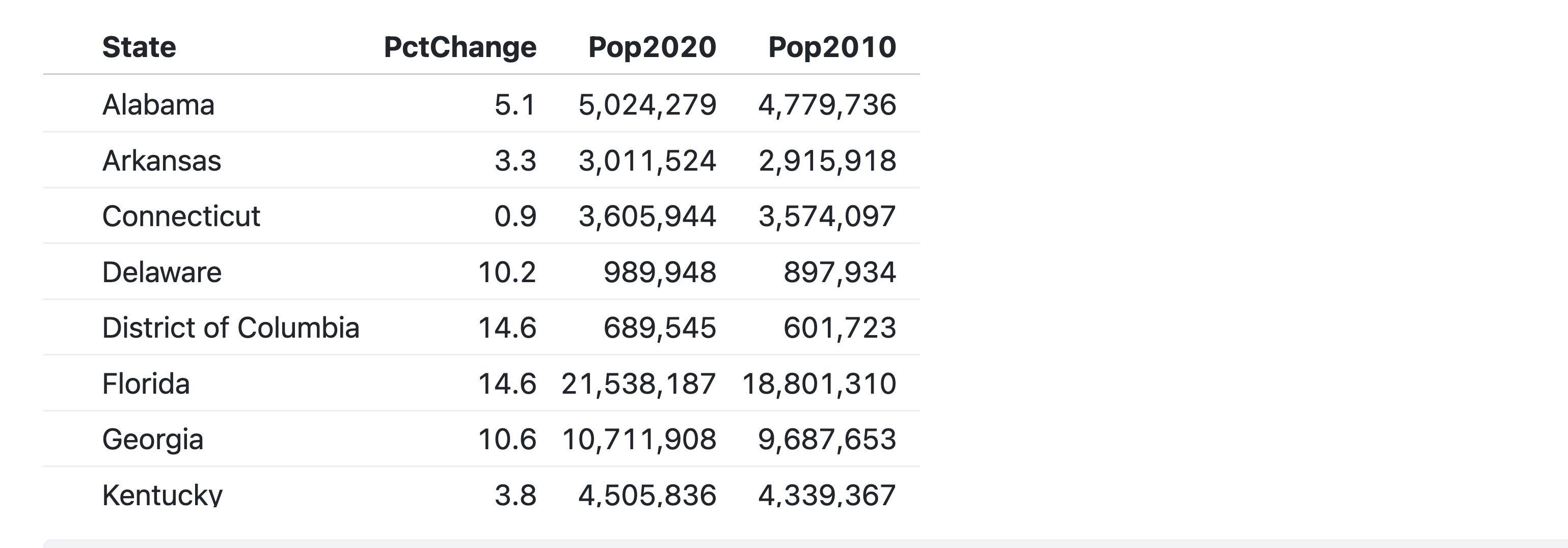 Figure 1. An Observable default table using Inputs.table().
Several other options are available for Inputs.table(), including sorting and reverse-sorting, which you can do with the syntax: sort: "ColumnName", reverse: true.
If you’re coding in a hosted notebook on ObservableHQ.com, you’ll see that there are other built-in table types available for a cell, such as Data Table cells. Some of these types are part of the Observable web platform. They are not standard JavaScript functions and you won’t be able to use them in a Quarto document. How can you tell? If you don’t see a line of code pop up after you create a table, it’s probably not available off-platform unless you code it yourself.
Create interactive filters for data in Observable
One of Observable’s biggest value adds is its built-in reactivity. To create an interactive filter, the syntax is usually along the lines of
viewof new_variable_name = Inputs.the_filter_type()where the_filter_type is one of the built-in Observable filter types.
Filter types include checkbox, radio, range (for a slider), select (for a dropdown menu), search, and text (for free-form single-line text). Arguments for the Inputs filter function depend on the filter type.
viewof makes the filter reactive. In his notebook A brief Introduction to viewof, Mike Bostock, CTO and founder of Observable, Inc., writes: “The way to think about viewof foo is that, in addition to the viewof foo that displays the input element, viewof creates a second hidden cell foo that exposes the current value of this input element to the rest of the notebook.”
Inputs.search()
Inputs.search() creates both a text search box and a reactive data set that is automatically filtered and subsetted based on what a user types into the box. For R Shiny users, it’s as if a single function created both the text field UI and the server-side code for the reactive data set.
The syntax is:
viewof my_filtered_data = Inputs.search(mydata)To use the reactive data set elsewhere in your code, simply refer to my_filtered_data instead of mydata, such as:
Inputs.table(my_filtered_data)The above code generates a table from my_filtered_data. The data set and table will update whenever a user types something into the search box, looking for matches across all the columns.
You can use that filtered data set multiple times on a page in various kinds of plots or in other ways.
Inputs.select()
Inputs.search() is somewhat of a special case because it is designed to filter a data set in a specific way, by looking across all columns for a partial match. That’s simple but may not be what you want, since you may need to search only one column or create a numerical filter.
Most other Observable Inputs require two steps:
- Create the input.
- Write a function to filter data based on the value of that input.
For example, if you want a dropdown list to display possible values from one column in your data and filter the data by that selection, the code to create that dropdown needs to specify what values to display and which column should be used for subsetting. The code below creates a dropdown list based on sorted, unique values from the my_column column in the mydata data set:
viewof my_filtering_value =
  Inputs.select(my_initial_data.map(d => d.my_column), {sort: true, unique: true, label: "Label for dropdown:"})
As you might conclude from the variable name my_filtering_value, this both creates the dropdown list and stores whatever value is chosen, thanks to viewof.
map() applies a function to each item in an array, in this case getting all the values in my_initial_data’s my_column.
The above code uses JavaScript’s newer “arrow” (=>) format for writing functions. You could write the same code with JavaScript’s older function and return syntax, as well:
viewof my_filtering_value2 =
  Inputs.select(mydata.map(function(d) {return d.my_column}), {sort: true, unique: true, label: "Label for dropdown:"})
Once again, don’t forget the viewof before defining Inputs if you want the code to be reactive.
Unlike Inputs.search(), which automatically acts upon an entire data set, Inputs.select() only returns values from the dropdown. So, you still need to write code to subset the data set based on those selected values and create a new, filtered data set. That code is the same as if you were filtering a static data set.
As explained in Quarto’s Observable documentation: “We don’t need any special syntax to refer to the dynamic input values, they ‘just work’, and the filtering code is automatically re-run when the inputs change.” You don’t need viewof before the statement that defines the data set; use it only before the Inputs.
my_filtered_data2 =
  mydata.filter(function(d) {return d.my_column === my_filtering_value2})
If you prefer, you can use JavaScript’s older syntax with function() and return:
my_filtered_data2 =
  mydata.filter(function(d) {return d.my_column === my_filtering_value2})
You can use the filtered data set as you would a static data set, such as:
Inputs.table(my_filtered_data2)Numerical and date filters work similarly to Input.select().
Check out the Hello Inputs and Observable Inputs notebooks for more about Inputs.
Include a variable’s value in a text string
Including the value of a variable in a text string to generate dynamic text can be useful if you want to create a graph headline or summary paragraph that changes with your data. If a variable is defined in an ojs code chunk, you can include that variable’s value within a Quarto ojs code chunk by enclosing the variable name with ${}, such as:
md`You have selected ${my_filtering_value2}.`Here, md indicates that what’s contained within the backticks should be evaluated as Markdown text, not JavaScript code. You can also use html before the backticks if you want to write HTML that includes a variable value, such as:
html <p>The value of x is <strong>${x}</strong>.Note that md and html are only needed in Quarto documents. If you are using a hosted notebook at ObservableHQ.com, you can choose Markdown or HTML for the cell mode so you don’t need to signify md or html.
You should use backticks on ObservableHQ.com to signify that the contents are text and not code if you are storing text in a variable inside a notebook’s JavaScript cell.
Data visualization with Plot
Bostock told me that the Observable Plot JavaScript library was designed to be a “practical tool” to quickly visualize tabular data. However, it’s not the only one you can use with Observable. D3.js and Vega-Lite are also included by default, and you can use the require() function to incorporate other open-source JavaScript libraries.
Plot is a good option for beginners compared with a library like D3.js, which is more suited to designers who want to start with a blank canvas and create heavily customized visualizations.
ggplot2 fans may be happy to learn that Plot was inspired in part by the grammar of graphics, a way of looking at the components that make up a visualization that also underlies ggplot. While a simple ggplot2 bar graph uses code like this:
ggplot(mydata, aes(x = xcol, y = ycol)) +
  geom_bar()
Plot’s syntax looks like this:
Plot.plot({
  marks: [
    Plot.barY(mydata, {x: "xcol", y: "ycol"})
  ]
})
Following grammar-of-graphics principles, a Plot library visualization starts off with a plot object and then layers on additional data visualization details in categories like marks (shapes) and scales (how values map to a plot’s coordinate system).
The Plot.barY mark, you might have guessed, creates a vertical bar chart. There are also Plot.barX, Plot.line, Plot.dot, Plot.areaX, Plot.areaY, and others.
A mark’s fill option can be set to a specific color, such as “steelblue,” or another column value, such as a column name in quotation marks, with syntax like this:
Plot.plot({
  marks: [
    Plot.barY(mydata, {x: "xcol", y: "ycol", fill: "zcol"})
  ]
})
8 basic data visualization tasks in Plot
For the next few examples, I’m going to use a data set of the population by US states from the US Census Bureau. If you’d like to follow along, you can import the data by running the following code in a Quarto document ojs code chunk or ObservableHQ.com notebook (put each line in its own cell if you’re on ObservableHQ.com; they can be in the same chunk in Quarto):
states = d3.csv("https://raw.githubusercontent.com/smach/SampleData/master/east_coast_states.csv")
Inputs.table(states)
That imports the CSV data file hosted on GitHub and also displays a table with the data, which should look something like the table below containing states in the Census Bureau’s South and Northeast regions. If you want all the states, use
https://raw.githubusercontent.com/smach/SampleData/master/states.csvI’m using the smaller file so the graphs aren’t so large.
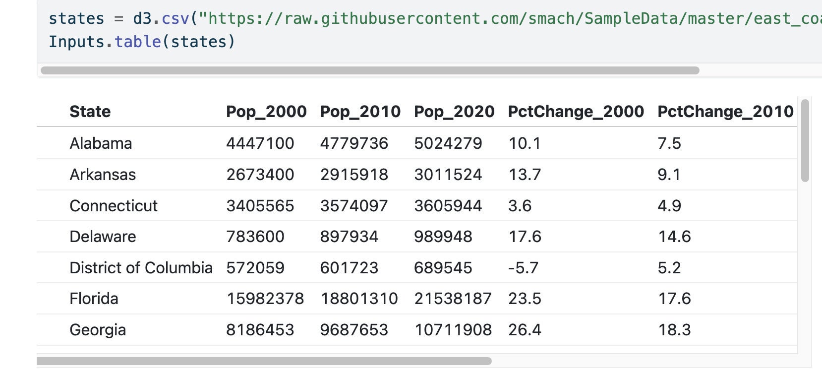
Figure 2. The default table after uploading the east_coast_states.csv file.
1. Create a default graph
In this example, we’ll create a horizontal bar chart:
Plot.plot({
  marks: [
    Plot.barX(states, {x: "PctChange_2020", y: "State"})
  ]
})
Here’s the default graph with a horizontal bar chart:

Figure 3. The default bar chart has black bars and state names clipped off.
2. Add a left margin
Next, we’ll use marginLeft to add a left margin so the state names aren’t cut off:
Plot.plot({
  marginLeft: 110,
  marks: [
    Plot.barX(states, {x: "PctChange_2020", y: "State"})
  ]
})
3. Sort the bars on the y axis by the value of x, in reverse order
For this, we can use sort: {y: "x", reverse: true}:
Plot.plot({
  marginLeft: 110,
    marks: [
        Plot.barX(states, {x: "PctChange_2020", y: "State", sort: {y: "x", reverse: true}})
          ]
          })
4. Color the bars by the Division column
Let’s use the Plot default Tableau10 color scheme for this next step:
Plot.plot({
  marginLeft: 110,
    marks: [
        Plot.barX(states, {x: "PctChange_2020", y: "State", fill: "Division",
                      sort: {y: "x", reverse: true}})
  ]
                      })
Figure 4 shows the graph we’ve produced so far:
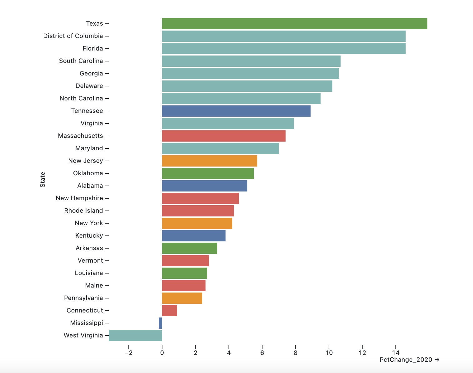
Figure 4. A bar chart with the Observable Plot default Tableau10 color scheme.
You could also choose a specific color for all the bars, such as fill: "steelblue".
5. Color the bars with a different, built-in color scheme
Here, we’ll use dark2 (you can see scheme options at the interactive Plot color cheat sheet):
Plot.plot({
  marginLeft: 110,
  marks: [
      Plot.barX(states, {x: "PctChange_2020", y: "State", fill: "Division",
                    sort: {y: "x", reverse: true}})
                      ],
                        color: {
                            scheme: "dark2",
                            type: "categorical"
                        }
                        })
6. Color the bars with a custom color palette
You can also create your own palette by defining range (the color codes) and type, in this case categorical (other types include linear and diverging), within color:
Plot.plot({
  marginLeft: 110,
    marks: [
        Plot.barX(states, {x: "PctChange_2020", y: "State", fill: "Division",
                      sort: {y: "x", reverse: true}})
                        ],
                        color: { range: ["#5b859e", "#1e395f", "#75884b", "#1e5a46", "#df8d71", "#af4f2f", "#d48f90", "#732f30", "#ab84a5"],
                                 type: "categorical"}
                        })
7. Add a legend
We can use legend:true to add a legend:
Plot.plot({
  marginLeft: 110,
    marks: [
        Plot.barX(states, {x: "PctChange_2020", y: "State", fill: "Division",
                      sort: {y: "x", reverse: true}})
  ],
color: {legend: true}
                       })
Figure 5 shows the plot with a default legend:
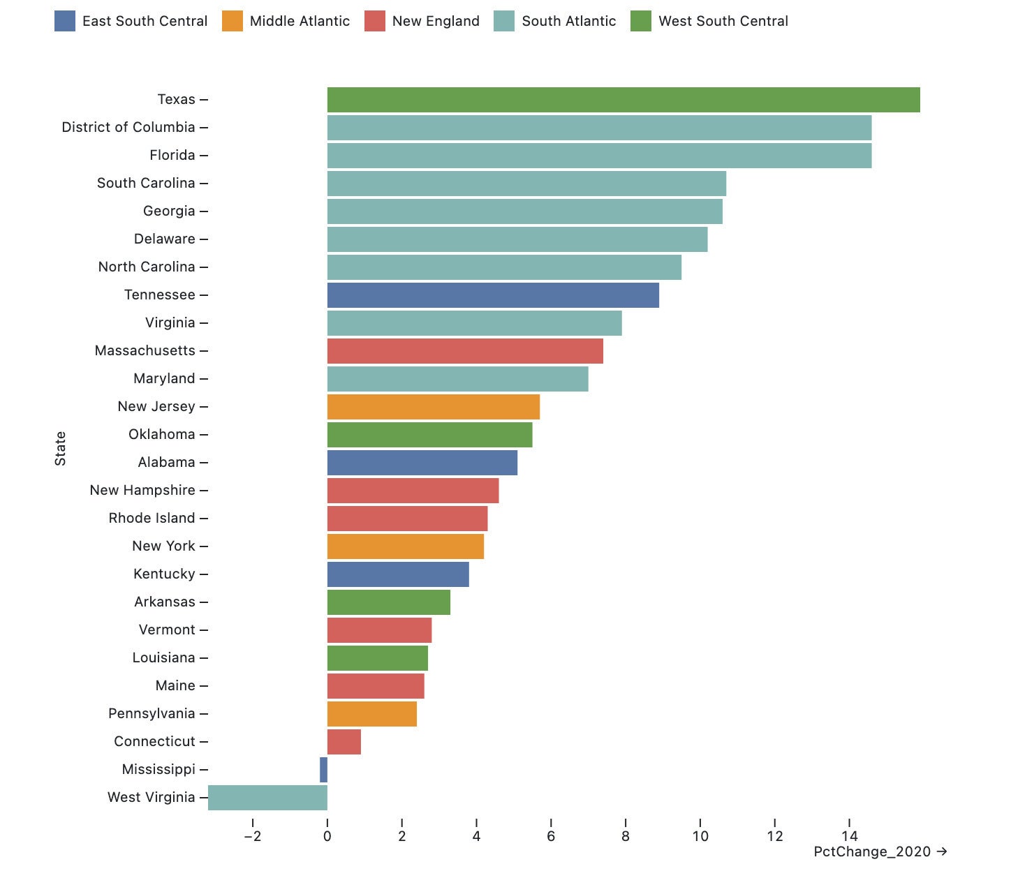
Figure 5. The plot with a default legend.
8. Add interactive filters
Finally, we’ll add filters to view the graph by census region or range of percent change. The code below can be in one Quarto ojs code chunk but should be in multiple cells, one each per defined variable and plot, at ObservableHQ.com:
// Region filter
viewof selected_region =
  Inputs.select(states.map(d => d.Region), {sort: true, unique: true, label: "Select region:"})
// Percent change filter
viewof selected_change = Inputs.range([-12, 19], {label: "Minimum Pct Change", step: 0.5, placeholder: "5"})

// filtered data set based on values from above filters.
// Use === in JavaScript to test for strict equality
filtered_states = states.filter(function(d) {return d.Region === selected_region && d.PctChange_2020 >= selected_change})

Plot.plot({
  marginLeft: 110,
  marks: [
    Plot.barX(filtered_states, {x: "PctChange_2020", y: "State", fill: "Division",
              sort: {y: "x", reverse: true}})
  ],
  color: {legend: true}
})
Figure 6 shows the final result.
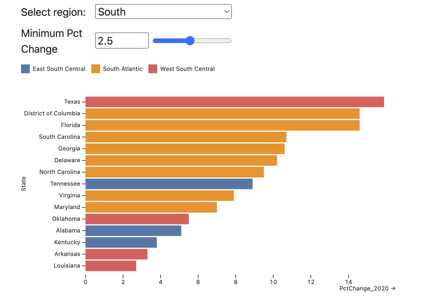
Figure 6. An Observable graph with filters.
More Plot customization options
As with any powerful graphing library, Plot has many more customization options. Plot’s collection of interactive cheat sheets is one of the most helpful starting resources to see how to do other tasks such as customizing axis labels, creating small multiples with faceting, and more.
Observable Plot doesn’t come with tooltips by default, but you can add them via Mike Freeman’s Plot Tooltip notebook.
If you’re interested in a deeper understanding of Observable Plot, ObservableHQ.com hosts a collection of notebooks about the Plot library, where you can find a lot more technical info.
Layout options for your Quarto document
Quarto includes a number of layout options. To add a sidebar panel layout for interactive filters, use //| panel: sidebar as an ojs chunk option and //| panel: fill for the main layout.
//| panel: sidebar

SIDEBAR CODE HERE

//| panel: fill

SIDEBAR CODE HERE
If you want your content to go the full width of the page, include page-layout: full in the document’s YAML header. If you want to create a single HTML file instead of generating separate folders for some of the content, make sure to add self-contained: true to the YAML, as well.
title: "My Headline"
format:
  html:
      page-layout: full
      self-contained: true
You can read more about layouts for interactive Quarto documents at the Quarto documentation’s Component Layout section, including how to add tabs to a document.
Using other JavaScript libraries
Several popular open-source libraries are included with Observable, including D3, Arquero, and Apache Arrow.
You can use other JavaScript libraries as well, as long as you require them first. The syntax is mylib = require("library-name@v") where mylib is your name for the object, library-name is the name of the library, and @v is an optional version number. You can use require() for an included library if you want to specify a specific version number, such as d3 = require("d3@6") to use version 6 of D3.js. require() will also take a URL for a library being served from a CDN.
Learn more about data visualization with Observable JS
I hope this article has given you enough to get started with data visualization using Observable in Quarto! If you’d like to continue learning about Observable Javascript, see the following resources:
- Observable User Manual
- Quarto documentation for Observable JS
- Hello: Examples of open-source libraries on ObservableHQ
- Basic beginning JavaScript for R, Python, SQL, and Excel users
- Plot cheat sheets
- Awesome Plot: An Observable notebook with links to various resources about Plot
- Plot technical overview: A good resource if you want to find out more about how Plot works
- How to use SQL to query data in your JavaScript array: A notebook explaining how to use Observable’s DuckDB client (Mike Freeman and Ian Johnson at ObservableHQ)
- Simulate color vision deficiency to make your Quarto document visualizations more accessible (Ian Lyttle)
- Introducing Arquero: A JavaScript library offering dplyr-like syntax for data wrangling.
- Arquero Cookbook: A collection of “recipes” for analyzing data with Arquero.
- Longbox: Reusable Observable component by David Eads for rendering HTML-styled cards as an interactive, infinite-scroll table. Uses Arquero for interactive filtering.
- Data Visuaulization with the Vega-Lite library (not Observable’s Plot) from the University of Washington Interactive Data Lab (if you’d like to try another visualization library with Observable).
Recommend
About Joyk
Aggregate valuable and interesting links.
Joyk means Joy of geeK