

The colors of game design
source link: https://uxdesign.cc/colors-of-game-design-9413d81e93a
Go to the source link to view the article. You can view the picture content, updated content and better typesetting reading experience. If the link is broken, please click the button below to view the snapshot at that time.

The colors of game design
In the past 10 years working with, teaching and consulting on game design, I’ve seen, time and again, teams struggle with some basic aspect of their games’ working.
Sometimes it’s a cool theme that doesn’t deliver on gameplay, or a fun core mechanic that doesn’t develop as the game progresses. Others it’s a good core loop that doesn’t feel purposeful, or a single interaction that feels out of place. It often seems like game design is too fleeting and volatile to be fully grasped and put to good work. One team’s strength is another’s fault, and there’s an overall sense of “mechanics” being the sole matter of the craft: something isn’t working? We’ve got to put in a new mechanic.
For this article, I’d like to share a framework I’ve been developing and using with these teams, based on, and along with, essential materials such as the MDA, 4 Keys 2 Fun and Gamer Motivation Model frameworks. I hope this can be of use both for aspiring developers and experienced ones that feel like the dots aren’t connecting, as well as indie teams that don’t have a dedicated game designer but sense that they should delve deeper into it.
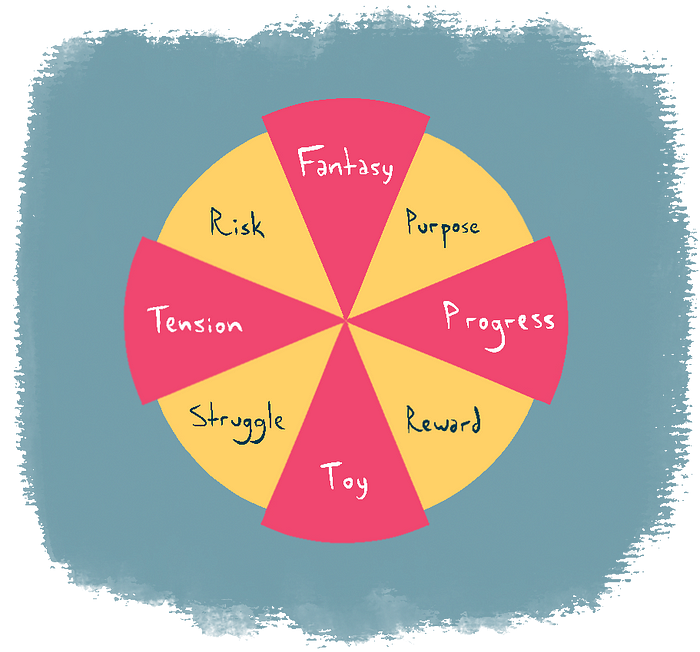
There we go. I call these the primary colors of game design.
Toy, Fantasy, Tension and Progress
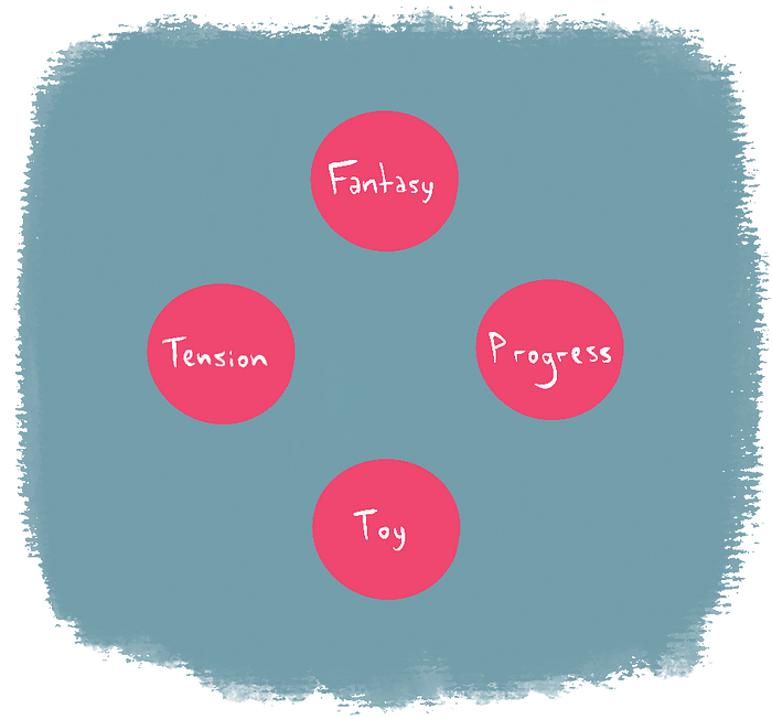
Toy is the things you play with. It’s the tactile aspect of the game: running and jumping, aiming and shooting. In a boardgame, it’s the cool meeples and the foldable, modular board. Toy is also the audiovisual and haptic feedback: the “hop” sound at the start of a jump, the splash of particles after a headshot, the bounciness of a physics-based game, the tremble when your car hits the curb. Toy is your interface for a good time.
Fantasy is the fiction you’re immersed in. The aspirational aspect of the game: saving the world, traveling among the stars, being a farmer, a firefighter, a popstar, a champion. It doesn’t necessarily mean story: Tetris is about controlling chaos and trying to be a top scorer; Chess lets you dream of besting another person’s intellect, and eventually becoming a master. Fantasy is usually what draws you in, with the promise of special, out-of-life meaning once you step into the magic circle.
Tension is what challenges you. Games, like stories, tend to rely on conflict as an anchor for meaning and growth. A ball by itself is a toy, but it earns gravitas once you stack tension on it: you must hit that goal; you can’t use your hands; there’s some dude blocking the goal; there’s a time limit. Tension confers weight and order to an activity, enables flow, and is responsible for the ultimate perception of fun.
Progress is what makes you grow. It provides a horizon to look forward to: beating each scenario, leveling up, unlocking skills and advancing the story, getting stronger and wiser. Progress makes the game expand and vary as the player’s experience evolves. It’s what makes the first hour of a game be different from the 100th — thus giving you a reason to still be there after 100 hours.

In other words: Toy is sensory, fantasy is symbolic. Tension pulls you back, progress pushes you forward.
Every game has these 4 elements present in some way or another. As designers trying to accommodate them, we must guarantee they’re all comfortable, well-fed, and talking to each other.
We can start by mixing these elements to identify functions in common.
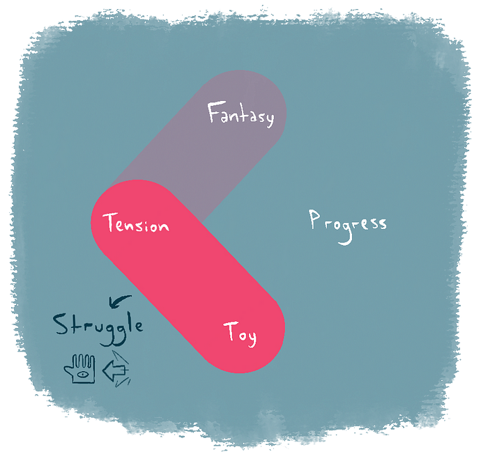
Simulation and Realization

Together, the opposites toy and fantasy produce a Simulation: what you do as a player and what that means. Press a button to swing a sword; click the mouse to shoot a gun. Swing a sword to become a hero. We interpret and remember the moments in games mostly by their fantasy, but we interact and have sensory fun through their many toys. Both work in tandem to create make-believe.

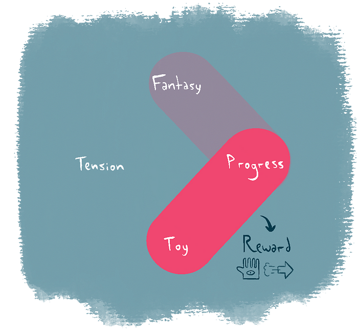
Tension and progress together create Realization: what you face and what you earn from it. Beating enemies and getting stronger; solving a puzzle and gaining access to a new area. We evaluate a challenge’s worth by how we grow from it, and we look forward to walking that path.
Simulation and realization represent the core axes of experience, and identifying them may help summarize the game’s theme and overall dynamics.

Going further, we can find more specific aspects that designers need to keep an eye on. I’m calling these the secondary colors of game design.
Purpose and Struggle, Risk and Reward

The fantasy of tension is Risk. Risk is what the player fears emotionally, what they try to avoid in the fiction of the game. Getting spotted by the monster, losing a fight, losing the tournament, getting lost, getting hungry, not having the resources to build something or express themselves, not feeling valued, not having a key piece of information, not having access to an important place or entering it unprepared, not escaping in time, dying.
Risk is the player’s Sword of Damocles: it keeps them grounded and striving for betterment. It prompts the need for change. But risk can only be acted upon by the player through its neighbor across tension, Struggle.
The toy of tension is Struggle. This is what we might call “core gameplay”. It’s the minute-to-minute problems the player needs to solve to advance. It combines the sensory with the challenge: kick a ball to hit the goal, aim and shoot to kill the monsters, hide to avoid getting spotted, dodge-roll to avoid getting struck, interrogate to get information, swing a pickaxe to dislodge resources, jump to avoid the pit, run to reach the exit in time.
The struggle tends to be the first concrete aspect of game design that aspiring designers need to master in order to produce something fun to play. But struggle on its own can feel empty if you neglect its complementary color, Purpose.

The fantasy of progress is Purpose. This is what the player strives for in the game’s fiction, the symbols of growth. Getting stronger as a warrior, exploring and understanding a new planet, solving a mystery, building a cozy home, dominating the kingdom’s economy, feeling confident to explore the wilderness, keeping the settlers safe from harm.
Purpose elevates the medium: it provides context and drive, and ultimately transforms abstract artifacts into meaningful motivation and personal story arcs. But purpose only gets tangible and actionable through its neighbor across progress, Reward.
The toy of progress is Reward. This is what the player earns by completing the tasks they’re pitted against. While purpose is aspirational, rewards are tangible: a new skill or power-up, an item, a resource, access to an area or information, a collectible, a cosmetic option. They can also be purely audiovisual: a difficult boss exploding in a million pieces after being defeated, a cute dance done by an NPC after you help them, villagers cheering at the hero’s return.
I’ve covered rewards extensively in this article on Elden Ring. The bottom line is: they come in many shapes, and can be powerful payoffs for the player’s effort. But reaping rewards doesn’t amount to much if its opposite, Risk, stops presenting anything new. So an increase in stakes is always welcome to keep the need for better rewards alive, and we keep the cycle going.
So now we have this…
Structure
To finish it off, I’d like to introduce one more element, the roundabout at the center that makes the player flow through the other aspects: structure.

Structure is what John Truby, in Anatomy of Story, would call the designing principle. It’s the particular way we choose to frame a story: the protagonist is trapped in a time loop so they keep repeating the same day; the story happens entirely inside a locked room; we accompany the characters growing from childhood to adulthood; the story is a travelogue; the story is told twice from opposing viewpoints, etc.
In game design, that would describe the organization responsible for exposing the player to risk, instilling a sense of purpose, making them struggle and offering rewards. A series of linear levels, an open-world dotted with quests, a single house to explore at one’s own pace, a repeatable playthrough with random challenges… I can’t stress enough how important it is to find the right structure for the game.
Using the palette
So here’s the full map of the colors of game design (high-res here).

You can use it as a way to visualize and nail down a game’s scope, by jotting down the elements present in each area. Primary aspects (red wedges) are meant as conceptual anchors, while secondary aspects (yellow wedges) are specific applications. In the consultancies, I used the map in so far, it helped us identify outliers or elements that weren’t being supported by the rest of the game.

But the map can also be applied when designing a single feature. Let’s say our survival game has vine-swinging as one of its unlockable skills. What are the toy and the fantasy there? What about tension and progress? What do the player fear when they’re swinging on vines and how do they counter that? What are their aspirations here and what do they earn from engaging with the mechanic, which will keep it interesting in the following hours?
I also see it as a tool for brainstorming. Let’s say the team is developing a new game based on Vampire Survivors. What are other possible fantasies for that? What are possible toys that appear in other games but haven’t been used in this genre yet? What are the alternatives for tension and progress, already crafted to perfection in VS? More: how does tension and progress work within a single level, versus how they work in the game at large? Mapping multiple alternatives before settling on the right path for the game helps avoid scope creep with every new idea getting in, and is extra valuable in a small team scenario with limited iteration time.

As I said at the start, this approach draws from existing game design theory to offer a practical way of looking at the craft. It doesn’t replace any existing design process, but rather offers a tool to use along with these other ideas: it may help you see the dynamics at play to settle down a particular game aesthetic when analyzing MDA, for instance. It’s also not too dissimilar to Lazzaro’s 4 Keys 2 Fun: toy and fantasy relate to easy fun, while tension is an important part of hard fun, etc.
I still recommend these materials to the teams first and foremost, but I hope the Colors of Game Design framework can be of use in the more practical aspects of structuring a design. If you ever use it and come up with feedback on its current format, please let me know!
Recommend
About Joyk
Aggregate valuable and interesting links.
Joyk means Joy of geeK