
7

前端三剑客快速入门(二) - 鹤城
source link: https://www.cnblogs.com/he-cheng/p/16756390.html
Go to the source link to view the article. You can view the picture content, updated content and better typesetting reading experience. If the link is broken, please click the button below to view the snapshot at that time.

前端三剑客快速入门(二)
本文书接上回,继续css的知识,序号就重新开始了。上篇内容:前端三剑客快速入门(一)
-
盒子模型
盒子模型属性:- border外框
- margin外边距
- padding内边距
<!DOCTYPE html>
<html lang="en">
<head>
    <meta charset="UTF-8">
    <meta http-equiv="X-UA-Compatible" content="IE=edge">
    <meta name="viewport" content="width=device-width, initial-scale=1.0">
    <title>Document</title>
    <style>
        /* 元素边距初始化 */
        *{
            margin: 0px;
            padding: 0px;
        }
        .box{
            width: 100px;
            height: 100px;
            /* border-width: 10px;
            border-style: solid;
            border-color: red; */
            border: 1px solid green;
            margin: 0px;
            padding: 10px 20px;
            /* box-sizing: border-box; */
        }
    </style>
</head>
<body>
    <div class="box">
        <a href="">test</a>
    </div>
    <div class="box1">
        <h1>hhhh</h1>
    </div>
</body>
</html>
<!DOCTYPE html>
<html lang="en">
<head>
    <meta charset="UTF-8">
    <meta http-equiv="X-UA-Compatible" content="IE=edge">
    <meta name="viewport" content="width=device-width, initial-scale=1.0">
    <title>Document</title>
    <style>
       *{
        margin: 0px;
        padding: 0px;
       }
       .container{
        width: 500px;
        height: 300px;
        border: 1px solid red;
        margin: 0 auto;
       }
    </style>
</head>
<body>
   <div class="container"></div>
</body>
</html>
盒子模型实例:
<!DOCTYPE html>
<html lang="en">
<head>
<meta charset="UTF-8">
<meta http-equiv="X-UA-Compatible" content="IE=edge">
<meta name="viewport" content="width=device-width, initial-scale=1.0">
<title>Document</title>
<style>
*{
margin: 0px;
padding: 0px;
}
.fruits{
border: 1px solid red;
width: 800px;
margin: 0 auto;
padding-left: 30px;
box-sizing: border-box;
padding-top: 20px;
}
.sports{
border: 1px solid blue;
width: 800px;
margin: 0 auto;
margin-top: 50px;
padding-left: 30px;
box-sizing: border-box;
padding-top: 20px;
}
.fruits ul,.sports ul{
list-style: inside;
}
</style>
</head>
<body>
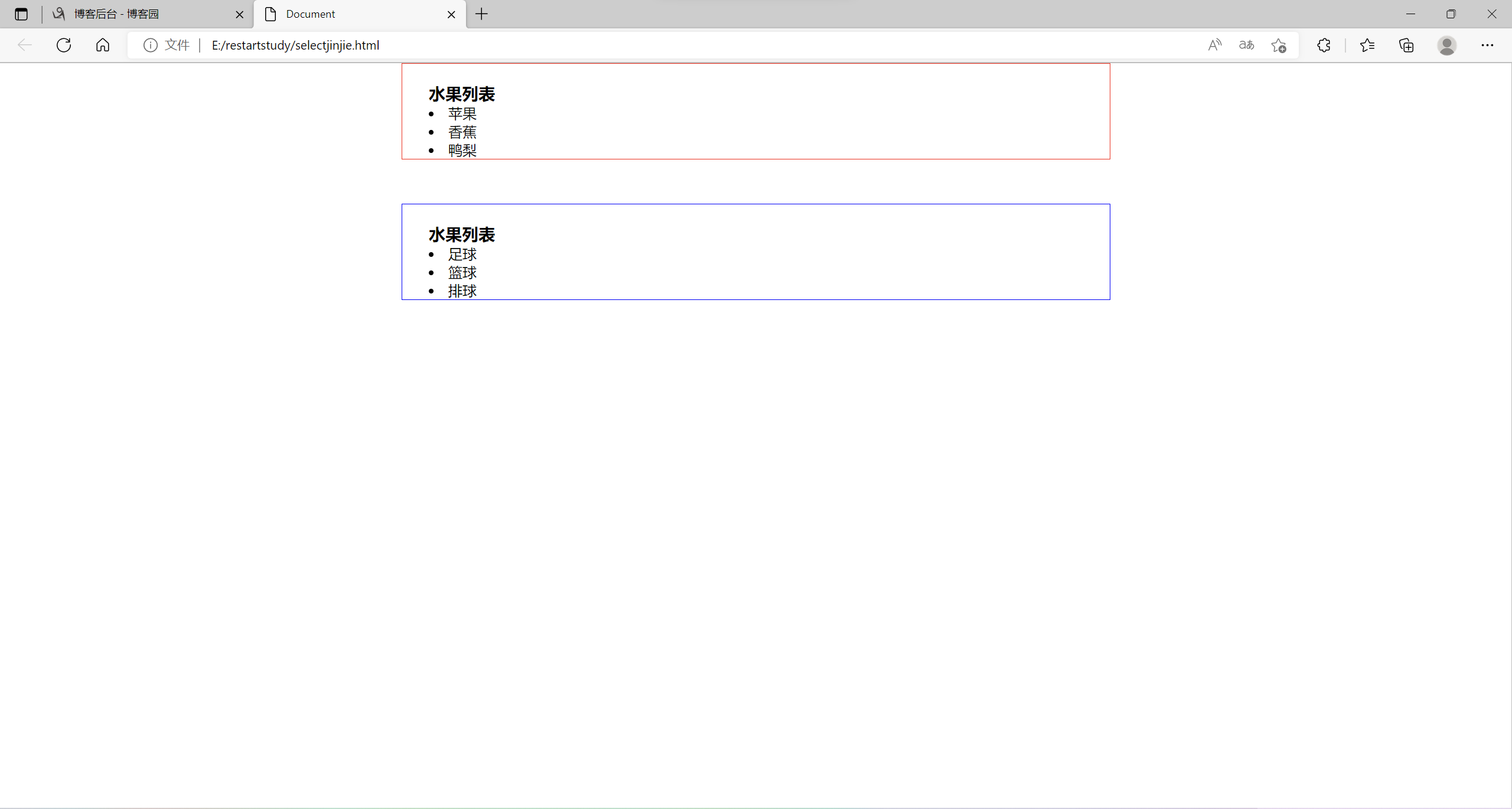
<div class="fruits">
<h3>水果列表</h3>
<ul>
<li>苹果</li>
<li>香蕉</li>
<li>鸭梨</li>
</ul>
</div>
<div class="sports">
<h3>水果列表</h3>
<ul>
<li>足球</li>
<li>篮球</li>
<li>排球</li>
</ul>
</div>
</body>
</html>
实例运行结果:
-
CSS浮动布局
- html元素分类:
- 块元素:可以设置宽度和高度,独立成行。如h1-6、p、div、ul、li
- 行内元素(内联元素、行级元素):不可以设置宽度和高度,不可以独立成行,如a、span
- 行内块元素:可以设置宽度和高度,不独立成行img、input、button
<!DOCTYPE html>
<html lang="en">
<head>
    <meta charset="UTF-8">
    <meta http-equiv="X-UA-Compatible" content="IE=edge">
    <meta name="viewport" content="width=device-width, initial-scale=1.0">
    <title>Document</title>
    <style>
        a{
            width: 300px;
            height: 100px;
            border: 1px solid red;
            /* 将a标签转换为块元素 */
            /* display: block; */
            display: none;
        }
    </style>
</head>
<body>
    <h1>hello world</h1>
    <a href="http://www.baidu.com">百度</a>
    <h2>hello world</h2>
</body>
</html>
设置元素浮动实例
<!DOCTYPE html>
<html lang="en">
<head>
    <meta charset="UTF-8">
    <meta http-equiv="X-UA-Compatible" content="IE=edge">
    <meta name="viewport" content="width=device-width, initial-scale=1.0">
    <title>Document</title>
    <style>
        .content{
            width: 300px;
            height: 100px;
            border: 1px solid red;
            /* 设置元素浮动 */
            float: left;
        }
        .aside{
            width: 200px;
            height: 100px;
            border: 1px solid red;
            float: left;
        }
        /* 浮动元素脱离文档流 */
        .box{
            width: 400px;
            height: 400px;
            background-color: yellow;
        }
        /* 清除浮动 */
        .clear{
            clear: both;
        }
    </style>
</head>
<body>
    <div class="content">内容</div>
    <div class="aside">边栏</div>
    <div class="clear"></div>
    <div class="box"></div>
</body>
</html>
伪元素清除浮动
<!DOCTYPE html>
<html lang="en">
<head>
    <meta charset="UTF-8">
    <meta http-equiv="X-UA-Compatible" content="IE=edge">
    <meta name="viewport" content="width=device-width, initial-scale=1.0">
    <title>Document</title>
    <style>
        .content{
            width: 300px;
            height: 100px;
            border: 1px solid red;
            /* 设置元素浮动 */
            float: left;
        }
        .aside{
            width: 200px;
            height: 100px;
            border: 1px solid red;
            float: left;
        }
        /* 浮动元素脱离文档流 */
        .box{
            width: 400px;
            height: 400px;
            background-color: yellow;
        }
        /* 伪元素清除浮动 */
        .clear::before,.clear::after{
            content: "111";
            display: block;
            clear: both;
            /* content: "";
            display: block;
            clear: both; */
        }
    </style>
</head>
<body>
    <div class="contoner clear">
        <div class="content">内容</div>
        <div class="aside">边栏</div>
    </div>
    <div class="box"></div>
</body>
</html>
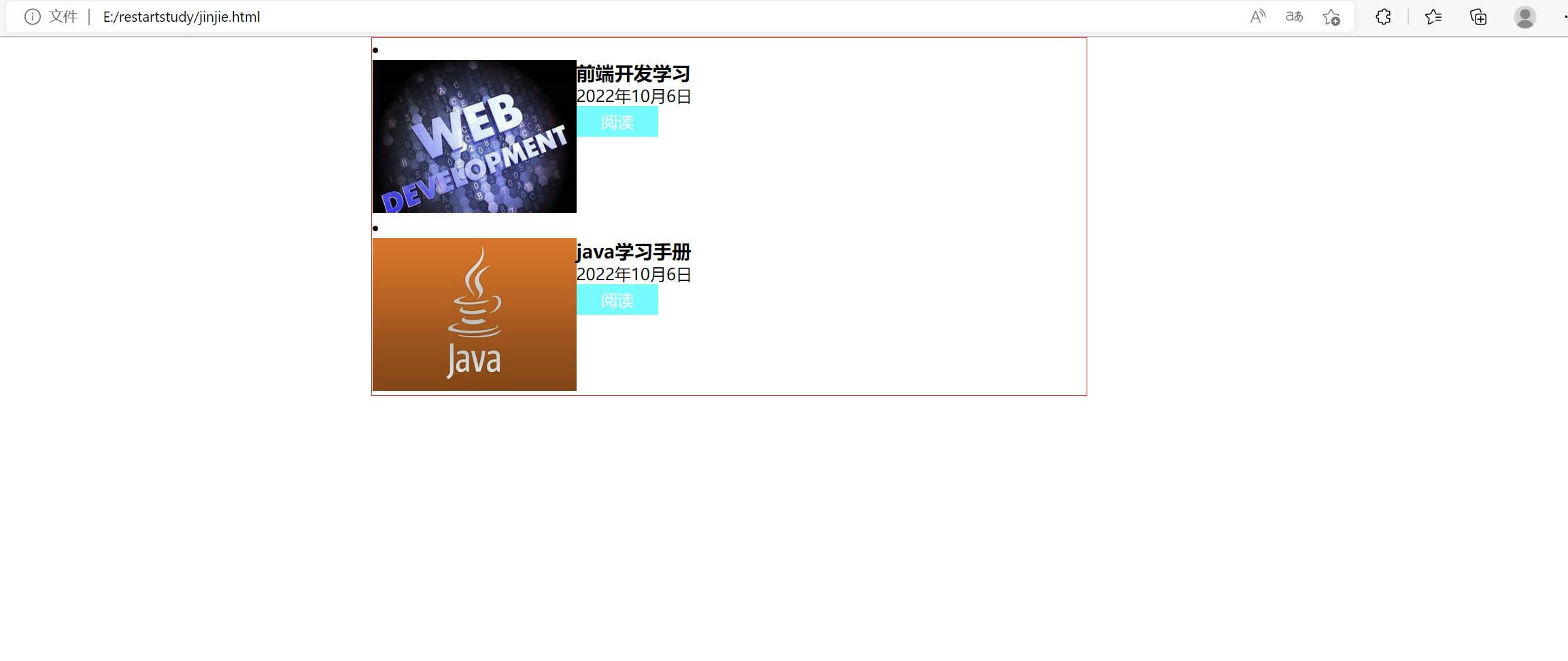
浮动布局练习:
html文件
<!DOCTYPE html>
<html lang="en">
<head>
    <meta charset="UTF-8">
    <meta http-equiv="X-UA-Compatible" content="IE=edge">
    <meta name="viewport" content="width=device-width, initial-scale=1.0">
    <title>Document</title>
    <link rel="stylesheet" href="css/jinjie.css">
</head>
<body>
    <ul class="list">
        <li class="box">
            <div class="pic">
                <img src="pic/th.jpg" alt="图片正在加载ing...">
            </div>
            <div class="content">
                <h3>前端开发学习</h3>
                <p>2022年10月6日</p>
                <a href="">阅读</a>
            </div>
        </li>
        <li class="box">
            <div class="pic">
                <img src="pic/java.jpg" alt="">
            </div>
            <div class="content">
                <h3>java学习手册</h3>
                <p>2022年10月6日</p>
                <a href="">阅读</a>
            </div>
        </li>
    </ul>
</body>
</html>
css文件
*{
    margin: 0px;
    padding: 0px;
}
.list .pic img{
    width: 200px;
    height: 150px;
}
.pic{
    width: 200px;
    float: left;
}
.content{
    width: 300px;
    float: left;
}
.box::before,.box::after{
    content: "";
    display: block;
    clear: both;
}
a{
    display: block;
    width: 80px;
    height: 30px;
    background-color: aqua;
    text-align: center;
    color: aliceblue;
    text-decoration: none;
    line-height: 30px;
}
.list{
    display: block;
    width: 700px;
    margin: auto;
    border: 1px solid red;
}
.list{
    list-style: inside;
}
浮动布局练习结果:
- 树状结构
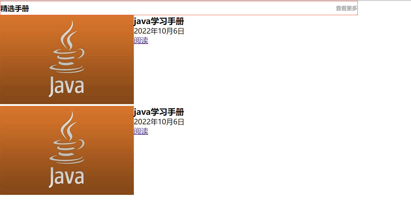
树状结构练习
html代码:
<!DOCTYPE html>
<html lang="en">
<head>
    <meta charset="UTF-8">
    <meta http-equiv="X-UA-Compatible" content="IE=edge">
    <meta name="viewport" content="width=device-width, initial-scale=1.0">
    <title>树状结构</title>
    <link rel="stylesheet" href="css/treeStudy.css">
</head>
<body>
    <div class="title">
        <h2>
            精选手册
            <a href="">查看更多</a>
        </h2>
    </div>
    <div class="list">
        <ul>
            <li class="clear">
                <div class="pic">
                    <img src="pic/java.jpg" alt="图片正在加载ing...">
                </div>
                <div class="discribe">
                    <h3>java学习手册</h3>
                    <p>2022年10月6日</p>
                    <a href="">阅读</a>
                </div>
            </li>
        </ul>
    </div>
</body>
</html>
css代码:
*{
    margin: 0px;
    padding: 0px;
}
.title{
    width: 800px;
    height: 30px;
    border: 1px solid red;
}
.title h2{
    font-size: 16px;
    line-height: 30px;
}
.title h2 a{
    font-size: 12px;
    color: #aaa;
    float: right;
    text-decoration: none;
}
.pic{
    width: 300px;
    float: left;
}
.list img{
    width: 300px;
    height: 200px;
}
.discribe{
    width: 500px;
    float: left;
}
.clear::after,.clear::before{
    content: "";
    display: block;
    clear: both;
}
运行结果图:
后面还有一个css定位,感觉今晚可能写不完了,就先发布吧,剩下的算到(三)里面,明天就能还原设计稿了。今天的浮动布局真是为难了好一阵,最终经验是浮动的是div块,清除浮动的话要在浮动的父元素处做手脚。web这两天一点也没学,要学的好多,好着急。
Recommend
About Joyk
Aggregate valuable and interesting links.
Joyk means Joy of geeK