

Dashboards. Go beyond data visualisation
source link: https://uxplanet.org/dashboards-go-beyond-data-visualisation-41efa712b795
Go to the source link to view the article. You can view the picture content, updated content and better typesetting reading experience. If the link is broken, please click the button below to view the snapshot at that time.

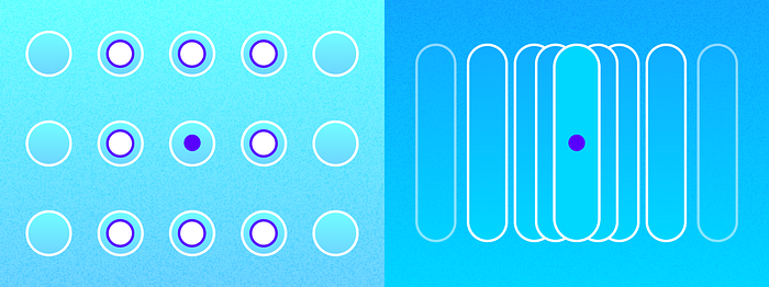
Dashboards. Go beyond data visualisation
“Create a dashboard”, they said. “Add visualisations, metrics, cards, numbers, and trends. We need a dashboard to help users gain insights into actions from raw data.”
If you are designing a product that juggles and conveys heavy stacks of data or aims at making numbers (data) more relatable, you might have — at some point — been tasked to create a dashboard.
So, what the hell is a dashboard? Etymologically, dashboards are applied to a barrier fixed at the front of a horse-drawn carriage to protect the driver from mud or other debris dashed up by the horses. Gradually this panel evolved into a control panel within the central console of vehicles displaying instrumentation and controls for the vehicle’s operation. So these need to be ergonomic and intelligible enough (based on the driver’s expertise) to interact with while driving. Having users divert their attention from their goal of driving safely (hopefully, that is their goal) can be catastrophic. So these dashboards will need to be crafted with immense intentionality and simplicity kept in mind.
I like to view creating software dashboards with the same mentality. Dashboards helped track the spread of COVID-19; the data displayed advised the level of precaution we must take. Small businesses utilise Dashboards surface and analyse metrics that provide insight into their store’s performance and customer behaviours; a well-designed dashboard would highlight pain points that corroborate and prioritise the course of action to increase their bottom line. Mobile device management dashboards help large organisations monitor, control and maintain the security of all their employee’s devices that contain business-sensitive data.
What I’m trying to say is that dashboards play a paramount role in communicating crucial — business critical — metrics. Dashboards need to create a single source of truth — efficiently, coherently and contextually showcasing key metrics. Dashboards that arise from strong (and the right) intentionality embody qualities that help users comprehend the meaning in numbers and data. They will not have to spend hours upon hours trawling through various reporting tools or spreadsheets to find and understand what they need.
So how do you create this mystical screen that aims to show and do everything? (the first step is it should not). The next few paras will be me rambling a bit about the principles I followed at IBM to create dashboards focused on empowering users with information rather than bogging them down. I hope this will help answer some questions you have.
Gain clarity on the purpose

There are different kinds of dashboards out there in the wild. Based on the data and the message it conveys, they can be broadly classified into:
- Operational: These dashboards answer the question, “What is happening now?”. These help users monitor real-time data, changes or updates. Tight integration with daily workflows should be a focal consideration when creating these dashboards.
- Strategic: These are generally viewed less frequently. Decision makers and executives use these to monitor the status of KPIs. Users will want an easy-to-scan information structure to stay on top of KPIs and track changes and anomalies.
- Analytical: These help users make sense of and analyse large volumes of data. These dashboards aim at making data a little less daunting by helping users investigate trends, predict outcomes and discover insights.
Understanding the problem you are trying to solve, gaining expertise in your product context, internalising user behaviours (and needs), anticipating what they will need, and the clearly defining goal(s) you want to achieve will help you decide on a dashboard (or a hybrid) you will require. The more product/domain knowledge you have, the broader and more well-thought-out your perspective will be.
Understand and work your magic on data
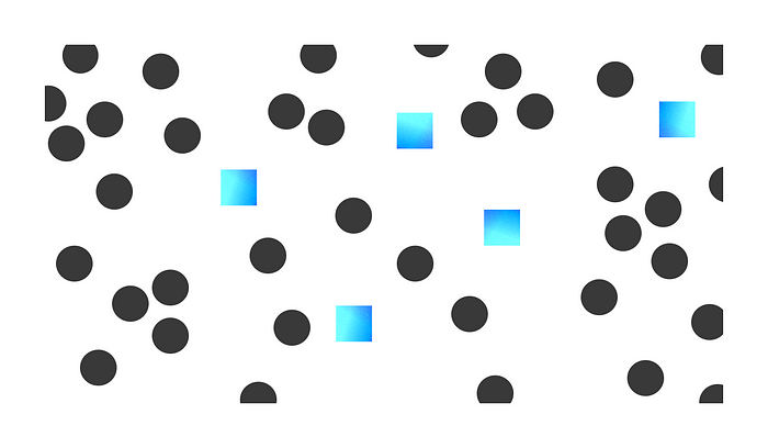
Finalising the type of dashboard defines its principles; it sets the foundation that guides how we build it moving forward. Next comes identifying and isolating data that your dashboard will house. Scour far and wide through your product to gather the relevant data. Validate every selection you make by cross-referencing the nature of the data with your dashboard’s goals and user needs.
Once you have everything in front of you ( and please write them down), It is time for an audit session. Go through each one of the data points to analyse and understand the meaning that lies beneath the numbers. Think about the message they will convey, or you can impart it through them. As a team, with the data at hand, look at how you can use it to create actionable insights.
Identifying and surfacing the relevant data is step one. The second step is helping users easily understand their next steps and the action they will need to take from the data they see; for example, highlighting anomalies with the ability to investigate the root cause.
Do not give users raw data. (However, it is essential; to have a way users can view that), tell them what to make of it. Help them understand and make sense of all the boring numbers.
Illustrate a story
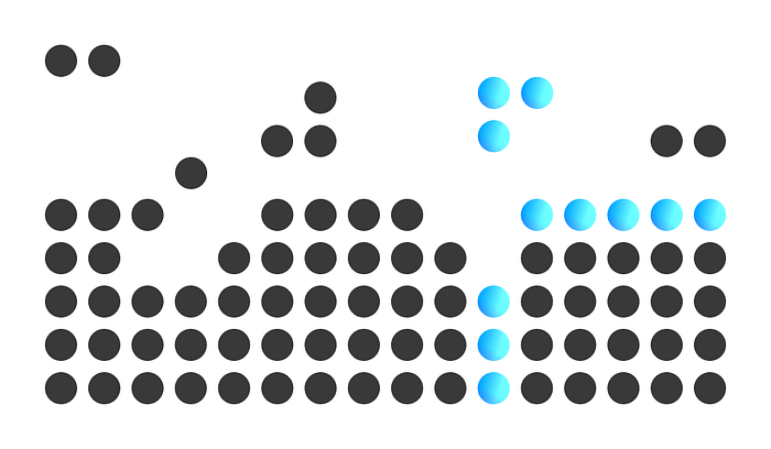
The dashboard sets the context. The connections you make between datasets create the narrative or message you want to convey. Doing so will help highlight the key takeaways from your dashboard.
As you tell your story, you need to use your data as (supporting) pillars for your insights. Help your audience understand by connecting the dots for them. Help your users take the path of least resistance. Distil complex information into informative insights.
For example, just providing an intro sentence with a data-driven graphic is often the quickest way to tell a short data story. Connect two or more data visualisations to showcase the bigger picture. Or even allow users to create their own narrative by having the ability to set and track goals through their dashboard.
There could be (most times there are) multiple messages to convey. During such instances, prioritise and weave a story. Try to keep data connected. One way you could achieve this is by having the highest level of information on the top left and slowly increasing granularity as you go.
Always be intentional in the way you organise data. Avoid throwing data on the dashboard. Please don’t make your users go through that.
Use space efficiently

Screen space is limited; utilise it wisely! You have heard this a ton. However, it helps me view screens with the concept that they afford infinite space. It just boils down to how we guide users through this space. Use this unlimited space/capacity to your advantage, and hide complexity effectively. Ask yourself, “How can we make complex dashboards simple?” Or rather, a more relevant question would be, “Where can I find the balance between simplicity and complexity?”.
On the one hand, we want the dashboard to be easy to use; on the other, we also want it to be able to show and do everything that our users might want it to do. We will need to consciously decide on reducing functionality (in-turn its complexity) without significant penalties on the user experience or value.
One example of when I applied this principle while creating an operational dashboard, we aimed at using the dashboard to provide users with a birds’ eye view of essential statuses. Craft and arrange data such that users can derive their own insights and easily navigate into workflows they prioritise. The dashboard would afford seamless navigation to relevant pages that help users quick start workflows from each data point/insight. The dashboard helped create a map, and we aimed at enabling a shuttle service to different areas highlighted on the map.
We utilised the infinitely available space by improving data channels and connections. Focus on having seamless interaction, you do not need to include or show everything on one page. As long as users can easily find their way through the large field of information, they will be happy.
Just like there’s infinite space, there are innumerable opportunities to organise information. Always focus on the problems you are solving for people and really hold yourself to a high bar for simplicity, design decisions on how to accomplish it will naturally follow.
And please stay aligned with what your users want

As you go along the trail of building out your dashboard, discussions with stakeholders will foster new ideas, opportunities to pursue and challenges. The true complexity of the problem space usually reveals itself during these discussions. This can cause us to hyper-focus on minute details/specifics, slowly losing focus on the bigger picture.
To avoid this, prioritise reflecting as a team regularly. Through these regular reflections share the current status of the project (at every milestone), updates made to the experience, new opportunities worth investigation, challenges (design and technical) identified and share “aha” moments with each other!
If you find yourself drifting out of alignment, slow down! Stop and examine the intent behind the experience you are crafting. As a team, retrace your steps and reach a common understanding of your users, the problem you are solving, and the outcome you are working to achieve together. Take control of the work you are doing and ensure it is aligned with the big-picture mission.
During the project, situations change as your understanding evolves. Don’t move forward blindly. It will be essential to identify these moments and take time to rethink how to move forward.
Decide together on your next move. You can either go back to the drawing board or put a stake in the ground and commit to an idea. Whatever you decide, ensure all of you are clear on what to do next.
With a blink of an eye, dashboards can transform into something quite frustrating and intimidating for your users. Emotions make the experience. How your users feel will define the experience of your dashboard.
All of us have enough complexity in our lives, let’s take that into consideration and create experiences that aim at making someone’s life a little bit easier.
If you’ve made it this far and reading this, your awesome 🎉
And thank you for reading this whole post! Do share your thoughts and take on what goes into making complex yet simple dashboards.
Recommend
About Joyk
Aggregate valuable and interesting links.
Joyk means Joy of geeK