

Footer Design – Best Practices Together with 6 Examples
source link: https://www.uxpin.com/studio/blog/footer-design-basics/
Go to the source link to view the article. You can view the picture content, updated content and better typesetting reading experience. If the link is broken, please click the button below to view the snapshot at that time.

Footer Design – Best Practices Together with 6 Examples
Website footers are essential UI patterns. They guide visitors to important content while providing an excellent opportunity to add business value and connect with new customers.
This article explores website footer design, do’s and dont’s, expert examples, and best practices to inspire your next web project.
Prototype UI designs at higher fidelity and advanced functionality with UXPin. Sign up for a free trial to discover the endless possibilities of code-based design.
What is a Website Footer?
A website footer is a UI pattern at the bottom (or footer) of a website or application. Footers are important website components because they display helpful information, including navigational links, contact details, policies, copyright info, and social media links, so users can learn more about your business.
Link the primary header navigation; a website footer appears on every page so users can always access the links and content. Even though it sits at the bottom of a web page, footers are vital components for users and business goals.
What is the Purpose of a Footer?
How designers use a website footer depends on the business and content. Most websites use the footer for secondary navigation–important links that can’t fit in the website header like about, product docs, resources, etc.
With GDPR, CCPA, and other legal information, websites must include certain policies, like privacy, terms of use, etc. Designers usually have these links in the footer, so users always know where to find them.
Sales Benefits
Many UI/UX designers also use website footers for business purposes like a product CTA or capturing leads via contact page or a newsletter signup form. Footers help users to navigate to feature pages, best-selling product categories or more information about services.
Marketing Benefits
Many marketers also use website footers for SEO (search engine optimization) purposes. There are a couple of SEO benefits of footers:
- Help with boosting pages you want to rank
- Homepage links carry weight, meaning search engines see these internal links as important and prioritize accordingly
- Increases the likelihood of clicks, thus reducing bounce rates which improve domain authority and rankings
What Should a Footer Include?
Again, it depends on the website. An eCommerce website will have different priorities for the footer to a blog. Here is a list of items you might include in a footer:
- Navigation links
- Brand engagement and messaging
- Testimonials
- Copyright
Navigation Links
There are several types of navigation links businesses include in the footer. These include:
- Utility links: contact information, phone number, email address, physical address, customer service contacts, privacy policy, terms of use
- Doormat navigation: A copy of the main navigation for convenience (might be unnecessary for sticky headers)
- Secondary task links: job application, investor information, documentation/specifications, press information, affiliate signups, FAQs
- Sitemap: Links to multiple topic/product categories
Brand Engagement & Messaging
Another common use for a website footer is brand engagement and messaging–links and footer content that encourage people to connect with the company, including:
- Social media icons
- Social feeds with several latest posts (usually Instagram or Twitter)
- Brand logo
- Brand slogan or vision (1-3 sentences)
- Email signup
Testimonials
Some brands use the footer for testimonials and reviews. They might even include a Google Business or TrustPilot widget displaying their star rating. These UI patterns are excellent for social proof and creating interest in your product or service.
Copyright
The copyright symbol and notice at the bottom of a footer tell visitors that you own the website’s content. It’s not a legal obligation, but it is common practice to inform people that you plan to protect your rights to the content.
6 Footer Design Examples
We’ve chosen six footer design examples from different industries to show how designers create layouts that align with business goals and user needs.
The key takeaway from these examples is how different industries prioritize links and content. Each example also uses a clean, minimalist layout to help visitors find information quickly.
1. UXPin – Saas Footer Design
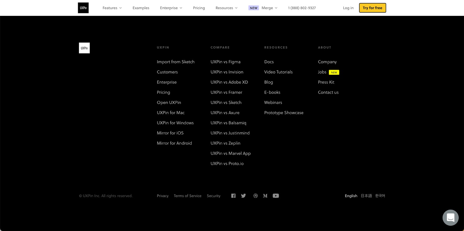
We decided to use our UXPin website as a SaaS footer example. You’ll notice we use a sticky header, so our primary navigation is always visible to desktop users.
UXPin’s footer includes key company, product, and marketing information. Customers often want to know how UXPin, an advanced tool, compares to popular image-based competitors, so we’ve included several product comparison links.
Other essential footer links for SaaS products are documentation, tutorials, educational content, and other helpful resources. UXPin also includes a language selector, social links, and policy information.
2. The BBC – News Footer Design
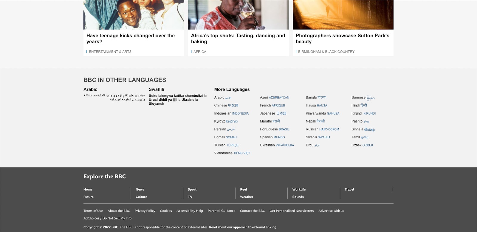
The BBC (British Broadcasting Corporation) is one of the largest news and media organizations worldwide.
The media giant primarily uses its footer to display different 30+ language versions of the website with a separate section for popular news topics. The very bottom of the page features links to legal information, policies, contacts, and advertising with the BBC.
The clean layout is easy to read, allowing users to find content and links fast.
3. Asos – eCommerce Footer Design
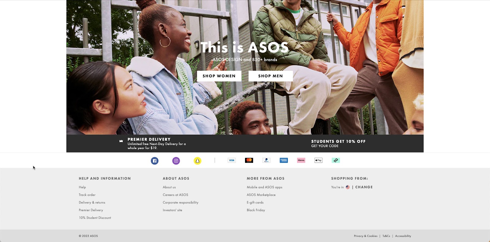
Global eCommerce brand Asos uses a simple footer design with social media buttons, payment methods, and helpful links. Most important for eCommerce are links for delivery/returns policy, order tracking, and special promotions–in Asos’ case, they promote student discounts, gift cards, and Black Friday.
As a listed company (ASOMY), Asos must provide investor information and corporate responsibility.
Lastly, as a global eCommerce brand, Asos shows customers which store they are viewing and a link to change to another region and currency.
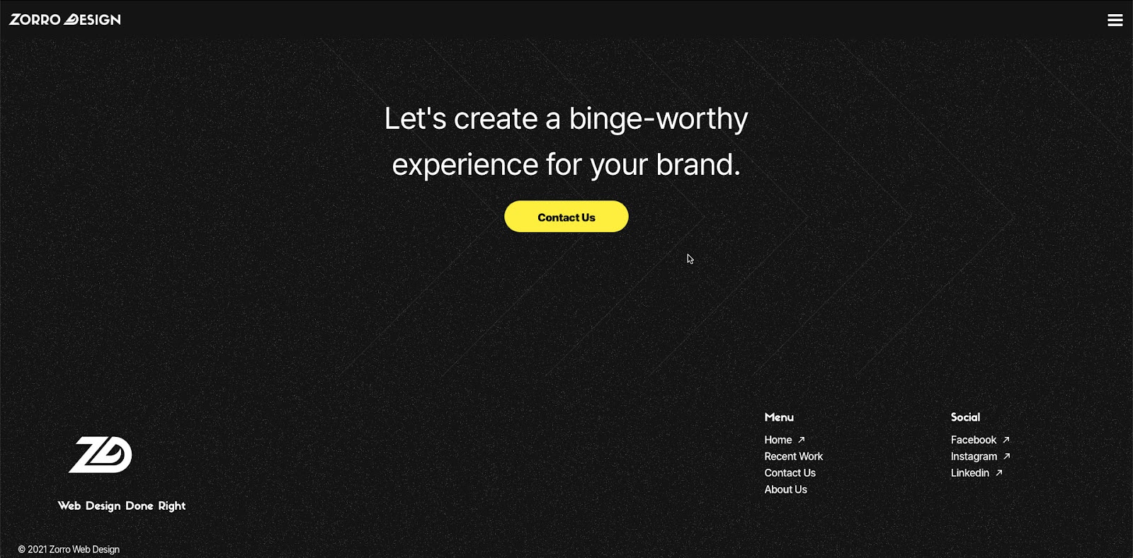
4. Zorro Design – Agency Footer Design
Agencies generally use their websites for two purposes:
- Showcase their work
- Generate new leads
US-based Zorro Design uses a black and white footer design with a bright yellow CTA taking users to a contact form. Zorro’s designers have designed the footer perfectly, so the CTA sits in the center of the screen, with lots of surrounding whitespace screaming “CLICK ME!”
Lastly, Zorro places its logo and slogan to the left with several key links, including recent work, contact, about, and social media buttons.
Zorro’s footer design is clean and uncluttered, allowing users to absorb and find content quickly.
5. Alex Lakas – Freelancer Footer Design
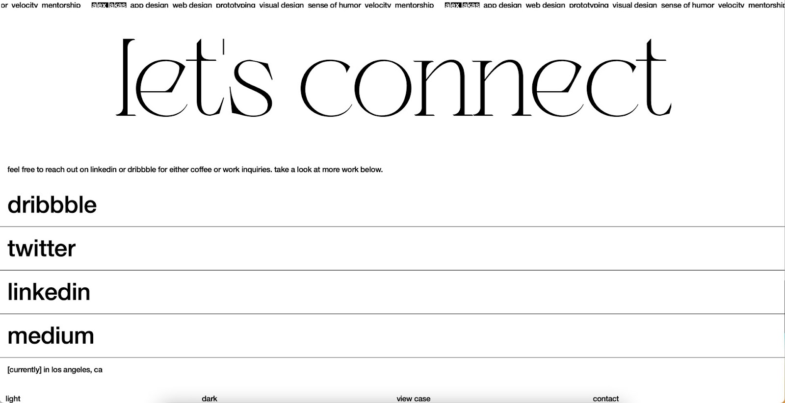
Like agencies, freelancers need a portfolio website to showcase their work and get clients. Product Designer Alex Lakas uses his website footer primarily to connect with potential clients/employers and designers through his social channels.
As a remote worker, Alex also uses flashing text to tell visitors where he’s currently working–in this case, it’s Los Angeles.
Alex’s dark/light mode switcher is a nice touch for a UX design portfolio, showing he’s mindful of web accessibility. He also has links to past work and a contact page.
6. Booking.com – Travel Footer Design
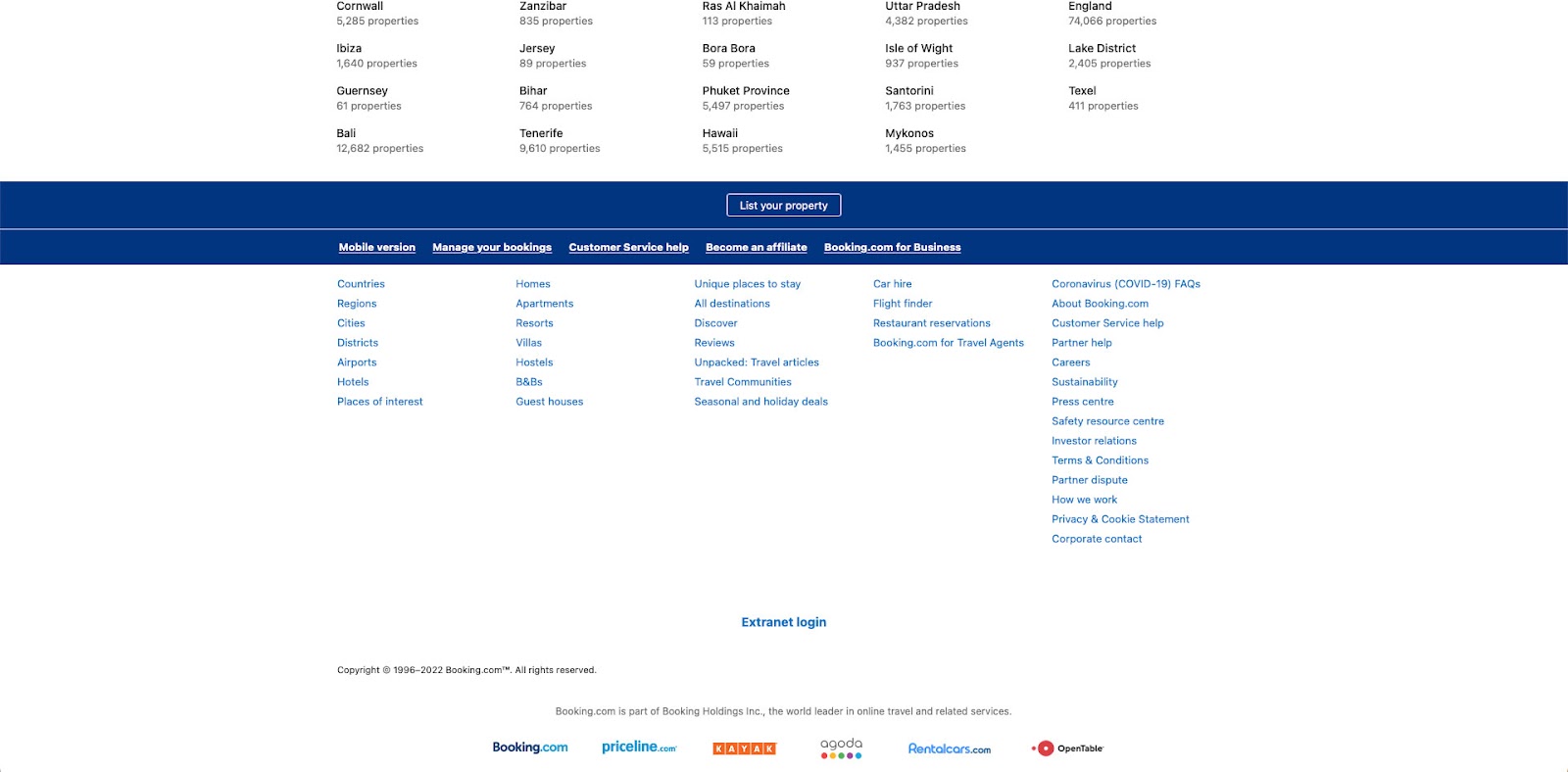
Booking.com is one of the world’s biggest online travel agencies, with over 28 million accommodation listings in more than 70 countries. Booking.com’s goal is to sell accommodation, but they also want to onboard new properties, so their primary footer CTA is to “list a property.”
The website’s footer also features its five most important links using a large bold typography to stand out. Customers also have several search categories, including regions and accommodation options, for customers to find their ideal destination faster.
As a listed company (NASDAQ: BKNG), Booking.com includes links to all necessary investor and corporate information.
At the bottom of the page, Booking.com features several logos of the company’s holding group, Booking Holdings Inc.
How to Design a Footer?
1. Prioritize Links
The first step to designing a great footer is prioritizing your links. Designers must consider user needs and business goals to create something meaningful and helpful to visitors.
2. Less is More
Cluttered UIs always perform poorly. They’re difficult to digest and can confuse users. Reducing UI elements, links, and text can help drive traffic to your most important content–which takes us back to point one, prioritize your links properly!
3. Use a Single CTA
A single CTA helps guide visitors to your most important task or business goal. Footer designs are usually two-tone, often black and white, providing the perfect background for a bright-colored CTA to pop and grab people’s attention.
4. Make Footers Mobile-Friendly
Mobile-first design is crucial for website footers. On a desktop, you may have 3-4 columns, while on a smartphone, you have one. The more columns and links, the more users have to scroll to find content. Place your most important links and content in the first column, so users see this first.
5. Use Hierarchy to Display Importance
The examples from Booking.com, Zorro Design, The BBC, and Alex Lakas used visual hierarchy to show users their most important links. Different sizes, colors, and weights are effective techniques for displaying importance.
6. Stay Compliant
Legal information like policies and disclaimers are crucial for modern web design. Designers must research their company’s obligations regarding where and how to display these links.
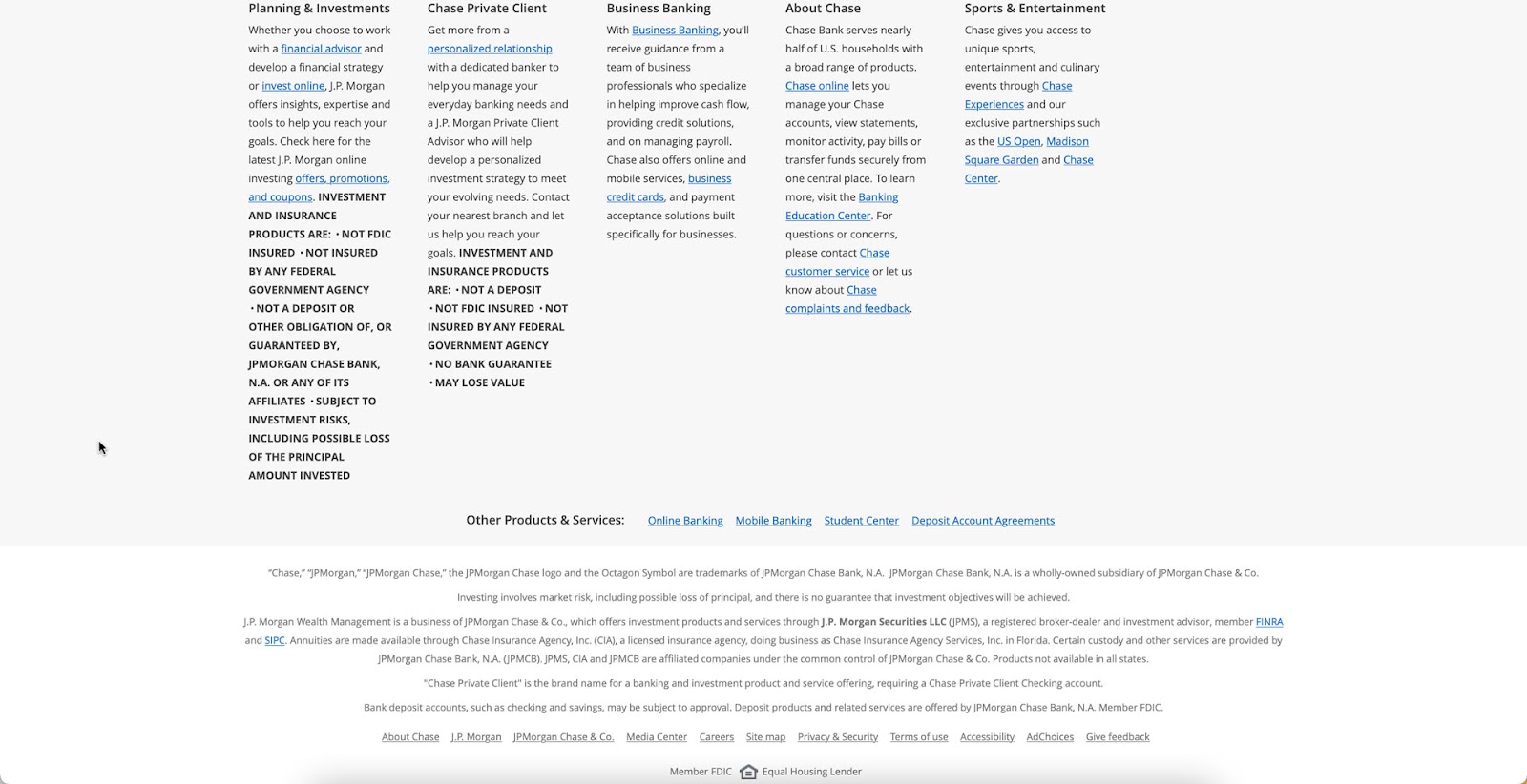
For example, financial and investment products in some countries must display their disclaimer information in the footer, so it’s always visible to customers. See this footer example from Chase Bank.
7. Branding Opportunities
Your website’s footer is a fantastic opportunity to connect users with your brand’s touchpoints, like social media, newsletter signup, and company links.
8. Be Helpful
Users often scroll to a website footer looking for help like documentation, tutorials, blog, and other resources. The UXPin footer design is a perfect example of providing multiple resources to educate customers about our products.
Designing Footers With UXPin
Create beautiful, interactive, responsive website footers in UXPin. With UXPin, designers can build prototypes with code-like functionality to improve user testing and get better feedback from stakeholders.
UXPin also includes built-in accessibility tools, including a contrast checker and color blindness simulator to test designs on the flying without leaving the canvas.
Deliver better products faster with UXPin–the world’s most advanced code-based design tool. Sign up for a free trial and deliver better user experiences to your customers with UXPin.
Recommend
About Joyk
Aggregate valuable and interesting links.
Joyk means Joy of geeK