

watchOS 9: The MacStories Review
source link: https://www.macstories.net/stories/watchos-9-the-macstories-review/
Go to the source link to view the article. You can view the picture content, updated content and better typesetting reading experience. If the link is broken, please click the button below to view the snapshot at that time.

watchOS 9: The MacStories Review
As we enter the ninth iteration of watchOS, I must admit that I sometimes find myself looking back wistfully on the computer watch that the Apple Watch once was. My inner tech nerd misses the wild, blind shots at digital connection and interface design which we were gifted by an Apple that had not yet figured out what the mass market wanted from this device.
In many ways, the early days of the Apple Watch feel like echoes from a bygone era of Apple; an era in which it was more willing to throw things at the wall just to see what stuck. This is, after all, the company which brought us the buttonless iPod shuffle, the hockey puck mouse, brushed metal, the tape-recorder Podcast app, and so much more. We tend to call it Apple’s sense of “whimsy”, and early watchOS had plenty of it.
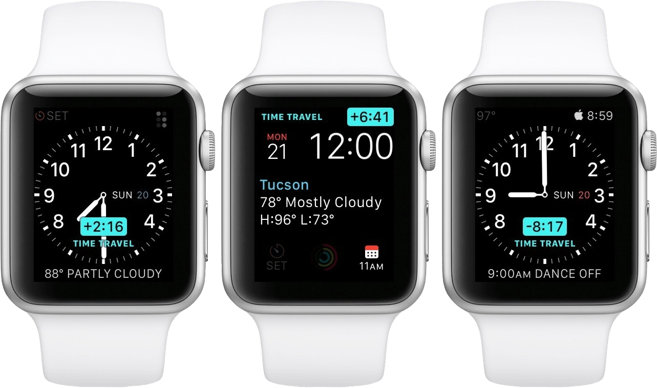
Time Traveling in watchOS 2.
In watchOS 2, Apple shipped a feature called Time Travel where you could spin the Digital Crown to “travel backwards and forwards in time”. Complications would move alongside the watch hands to reflect their past or predicted future values. Time Travel was demoted to a setting in watchOS 3, and quietly removed entirely some time later.
There was also the concept of Glances beginning all the way back in watchOS 1. Glances were single-page app interfaces accessible by swiping up from the watch face, then swiping side-to-side to switch between them. Third-party apps could create these, and the watch supported up to 20 of them. Glances were also canned in watchOS 3. They were replaced by the Dock, which never quite managed to capture the same energy.
For years, Apple seemed particularly interested in the potential of the Apple Watch to be a core hub for personal communication. Until watchOS 3, the hardware side button on the device was dedicated to opening the Friends interface. When interacting with your friends, you could send giant animated emojis — perhaps a very early precursor to the Memoji that we have today. And of course, no one could forget Digital Touch. Who among us did not feel more connected to our loved ones when tapping out pings and drawing shapes on their wrists1?
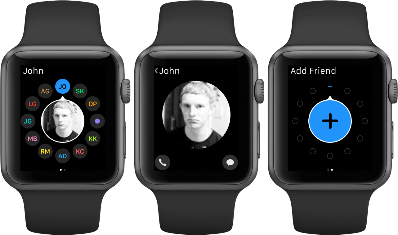
The Friends interface in watchOS 2.
What leaves me feeling so conflicted is that, ultimately, all of the above features were pretty bad. No one used the Friends interface, Time Travel wasn’t particularly useful, third-party Glances were kneecapped by their lack of interactivity, and communicating from an Apple Watch has always just been way more work than pulling out your iPhone. Apple was right to kill all of these features in their time, but I still can’t stop missing the days when my Apple Watch was searching for more variety in purpose than it exists with today.
Supported By
Pillow

Pillow: Sleeping better, made simple.
Today’s Apple Watch is a well-oiled machine of health and fitness. The gains in these areas are extraordinary, and these devices have been quite literally life saving for many people. The Apple Watch is an incredible device, but it does now feel born of the more polished, mass-market Apple of the last decade. The rough, exploratory edges of its early days have been diamond-chamfered into a near-mirror finish.
As I discussed in my watchOS 9 preview story earlier this summer, watchOS updates have settled into a fairly pronounced pattern at this point. Apple knows exactly what it wants from this device and its operating system, and it executes on that year after year. The formula, ordered by Apple’s own emphasis, looks essentially like this:
- Improvements to the Workout app
- New health features
- New watch faces
- One or two brand-new first-party apps
- One or two redesigned first-party apps
- A system-level feature or improvement
This direction has led to years of remarkably tight annual updates. Everything (with the exception of watch faces) in each new version of watchOS is solid. Every improvement is well thought out, helpful, and useable.
I don’t want to look a gift horse in the mouth. Each year, Apple delivers a high quality and effective watchOS update. I just don’t think this operating system is as finished as these updates seem to imply that it is. There was merit in the ideas of early watchOS, even if the execution wasn’t quite there yet.
For now, though, Apple soldiers on; relentlessly improving the areas of watchOS which have propelled the device to huge heights of popularity. It’s hard to argue that they aren’t doing everything right.
Let’s leave the past behind for a bit, and take a look at what Apple’s winning formula has delivered in watchOS 9.
Table of Contents
- I imagine Digital Touch is unfazed by my mockery; likely too busy feeling satisfied that it is the only one of the features described above which has (somehow) endured into modern iterations of watchOS. ↩︎
Recommend
About Joyk
Aggregate valuable and interesting links.
Joyk means Joy of geeK