

Wear OS Tiles Material Library: Build Tiles, Fast.
source link: https://android-developers.googleblog.com/2022/08/wear-os-tiles-material-library-build-tiles-fast.html
Go to the source link to view the article. You can view the picture content, updated content and better typesetting reading experience. If the link is broken, please click the button below to view the snapshot at that time.

Wear OS Tiles Material Library: Build Tiles, Fast.
24 August 2022
Posted by Anna Bernbaum, Product Manager, Ataul Munim, Developer Relations Engineer
We are excited to announce the launch of the Tiles Material library! Now, instead of building buttons, progress arcs and more from scratch, you can use our pre-built Material components and layouts to create tiles that embrace the latest Material design for Wear OS. You can use these together with the Tiles Design Kit to easily follow the Tiles Design Guidelines.
Tiles provide Wear OS users glanceable access to the information and actions they need in order to get things done quickly. They also are one of the most used surfaces on Wear OS. Just one swipe away from the watch face, users can quickly access the most important information or actions from an app, like starting a timer or getting the latest weather forecast.
 |
| Tiles carousel on Wear OS |
We have built the following components for elements commonly used in tiles:

These components also make it faster to build tiles. For example, creating a button for your tile takes just a few lines of code:
val clickable: Clickable = generateClickable() val button: Button = Button.Builder(this, clickable) .setContentDescription("Start workout") .build() |
We have also created some predefined layouts to kickstart your tiles development. These already follow our design guidelines on how your tile layout should be formatted.
For example, we can build this tile using a predefined layout:

val theme = Colors( /*primary=*/ 0xFFD0BCFF.toInt(), /*onPrimary=*/ 0xFF381E72.toInt(), /*surface=*/ 0xFF202124.toInt(), /*onSurface=*/ 0xFFFFFFFF.toInt() val buttonColors = ButtonColors.secondaryButtonColors(theme) val chipColors = ChipColors.primaryChipColors(theme) val timeline = Timeline.fromLayoutElement( .setPrimaryLabelTextContent( Text.Builder(this, "1 run this week") .setTypography(Typography.TYPOGRAPHY_CAPTION1) .setColor(argb(theme.primary)) .build() .setContent( MultiButtonLayout.Builder() .addButtonContent( Button.Builder(this, clickable) .setIconContent("icon_run") .setButtonColors(buttonColors) .setContentDescription("Run") .build() .addButtonContent( Button.Builder(this, clickable) .setIconContent("icon_yoga") .setButtonColors(buttonColors) .setContentDescription("Yoga") .build() ) Button.Builder(this, clickable) .setIconContent("icon_cycle") .setButtonColors(buttonColors) .setContentDescription("Cycle") .build() .build() .setPrimaryChipContent( CompactChip.Builder(this, "More", clickable, deviceParameters) .setChipColors(chipColors) .build() .build() |
What's in the library
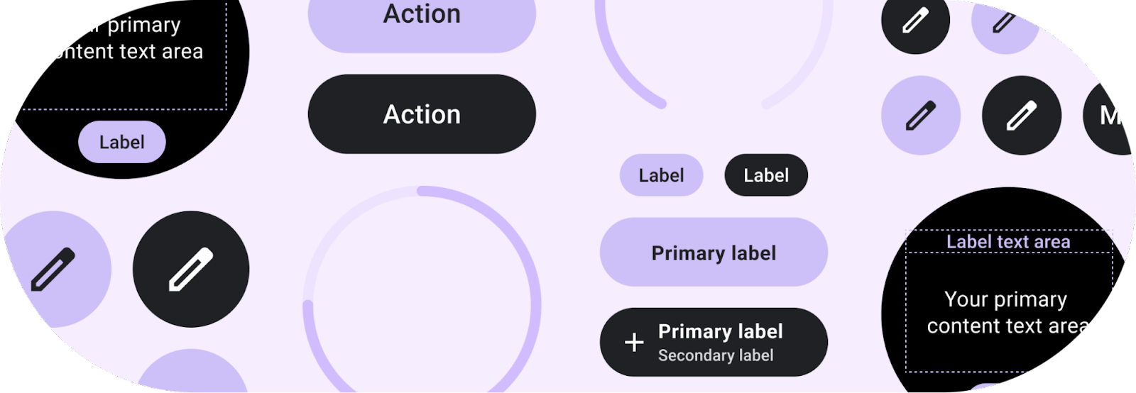
This library contains components and layouts that are in-line with Material guidelines and easy to use. The included components are:- Button - clickable, circular-shaped object, with either icon, text or image with three predefined sizes.
- Chip - clickable, stadium-shaped object that can contain an icon, primary and secondary labels, and has fixed height and customizable width.
- CompactChip & TitleChip - two variations of the standard Chip that have smaller and larger heights, respectively, and can contain one line of text.
- CircularProgressIndicator - colored arc around the edge of the screen with the given start and end angles, which can describe a full or partial circle with the full progress arc behind it.
- Text - styled text which uses the recommended Wear Material typography styles.
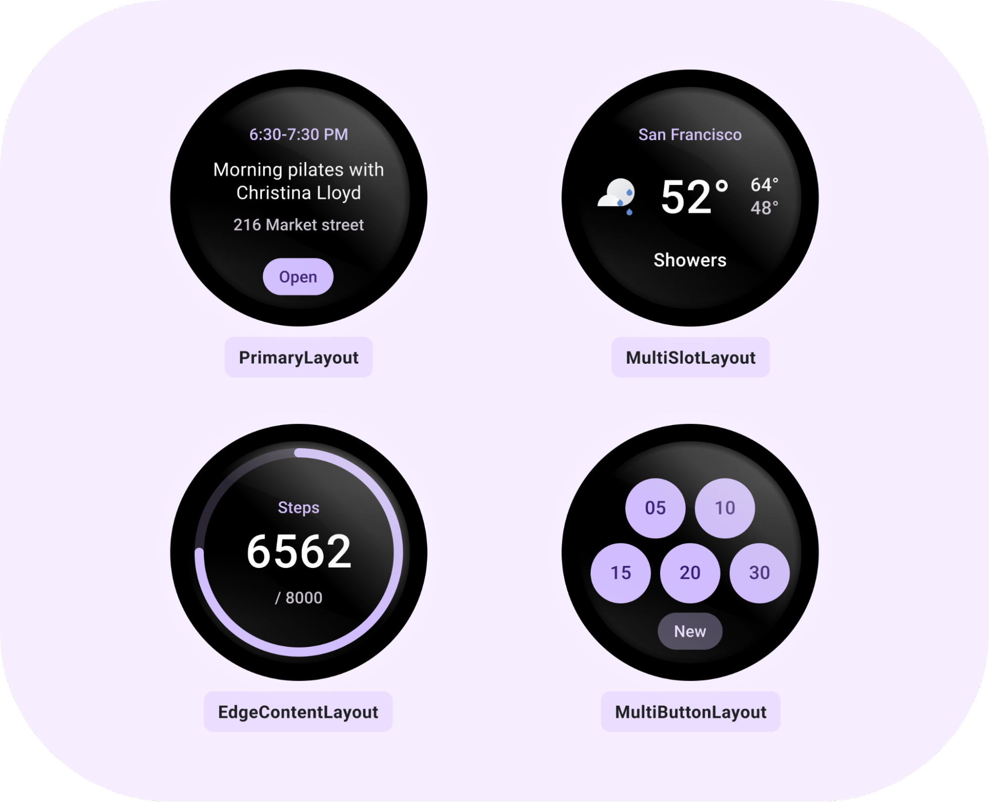
In addition to components, there are recommended tile layouts:
- PrimaryLayout - a layout which can be customized by adding primary or secondary labels, content in the middle, and a primary chip at the bottom. The main content within this layout could be added as a MultiSlotLayout or MultiButtonLayout object.
- EdgeContentLayout - a layout for hosting CircularProgressIndicator around the edge with main content inside and primary or secondary label around it.
- MultiButtonLayout - a layout that can contain between 1 - 7 buttons, arranged in line with the Material guidelines depending on their number.
- MultiSlotLayout - a row-like style layout with horizontally aligned and spaced slots (for icons or other small content).
Tools for tiles
Android Studio Dolphin includes the Direct Surface Launch feature. This lets developers install and launch a tile directly from Android Studio, instead of having to manually add it from the tile selector on the target device. Get started with Direct Surface Launch by creating a new Run Configuration and selecting Wear OS Tile, then choosing the module and TileService class.Horologist Tiles is also recommended to save time during tile development. This library gives you the ability to preview a tile UI straight from Android Studio, making the write-test loop a lot shorter. Horologist Tiles also includes Kotlin friendly abstractions, like CoroutinesTileService so you can use what you're already familiar with.
Get started with Tiles Material
For a quick start, take a look at the new Tiles codelab, the code sample and the docs.Please share your feedback on the issue tracker and let us know what you think of Tiles Material!
Recommend
-
63
pdftilecutlets you sub-divide a PDF page(s) into smaller pages so you can print them on small form printers. This operation is sometimes called posterizing (related to printing large posters on home printers) an...
-
11
Leaflet Tiles in Lambert 93 projection (2154)Leaflet Tiles in Lambert 93 projection (2154) Sun 05 August 2012 What purpose ? Ideally, unless living in Lapland, we should not be bothered that much about maps projections...
-
11
landez : tiles post-processinglandez : tiles post-processing Tue 29 May 2012Some weeks ago, I started to refactor landez (timidly). But smart caching and post-processing of WMS map...
-
8
landez : introducing new features of our tiles toolboxlandez : introducing new features of our tiles toolbox Fri 24 February 2012landez started as a very small toolbox to build MBT...
-
11
Create card visualizations 05/05/2020 2 minutes to read In this article APPLIES TO:
-
9
[worklog] Edition 055otsukare Thoughts after a day of work[worklog] Edition 055 - Tiles on a wall Ven 17 fév...
-
7
Creating Tiles for Wear OSGroupGroupGroupGroupGroupGroupGroupGroupGroupGroupShapeGroupGroupGroupGroupGroupGroupGroupGroupGroupGroupGroupGroupGroupGroupGroupGroupGroupGroupGroupGroupGroupGroupGroupGroupGroupGroupGroupGroupGroupGroupGroupGroupGrou...
-
7
Wear Tiles Create applications for Wear OS by Google smartwatches. Latest Update Current Stable Release Next Release Candidate Beta Release Alpha Release...
-
8
Fast Pair on Wear OS will let you quickly pair your watch with your headphones At I/O last year, Google revealed its plans to
-
4
What you need to knowMaterial You dynamic colors could arrive on Android smartwatches as part of Wear OS 4.Many elements of a smartwatch's interface will presumably change color to match the watc...
About Joyk
Aggregate valuable and interesting links.
Joyk means Joy of geeK