

Former Microsoft Boss Criticizes the Windows 11 Start Menu, And He’s Right
source link: https://news.softpedia.com/news/former-microsoft-boss-criticizes-the-windows-11-start-menu-and-he-s-right-536016.shtml
Go to the source link to view the article. You can view the picture content, updated content and better typesetting reading experience. If the link is broken, please click the button below to view the snapshot at that time.
“I was shocked by the user experience,” he says
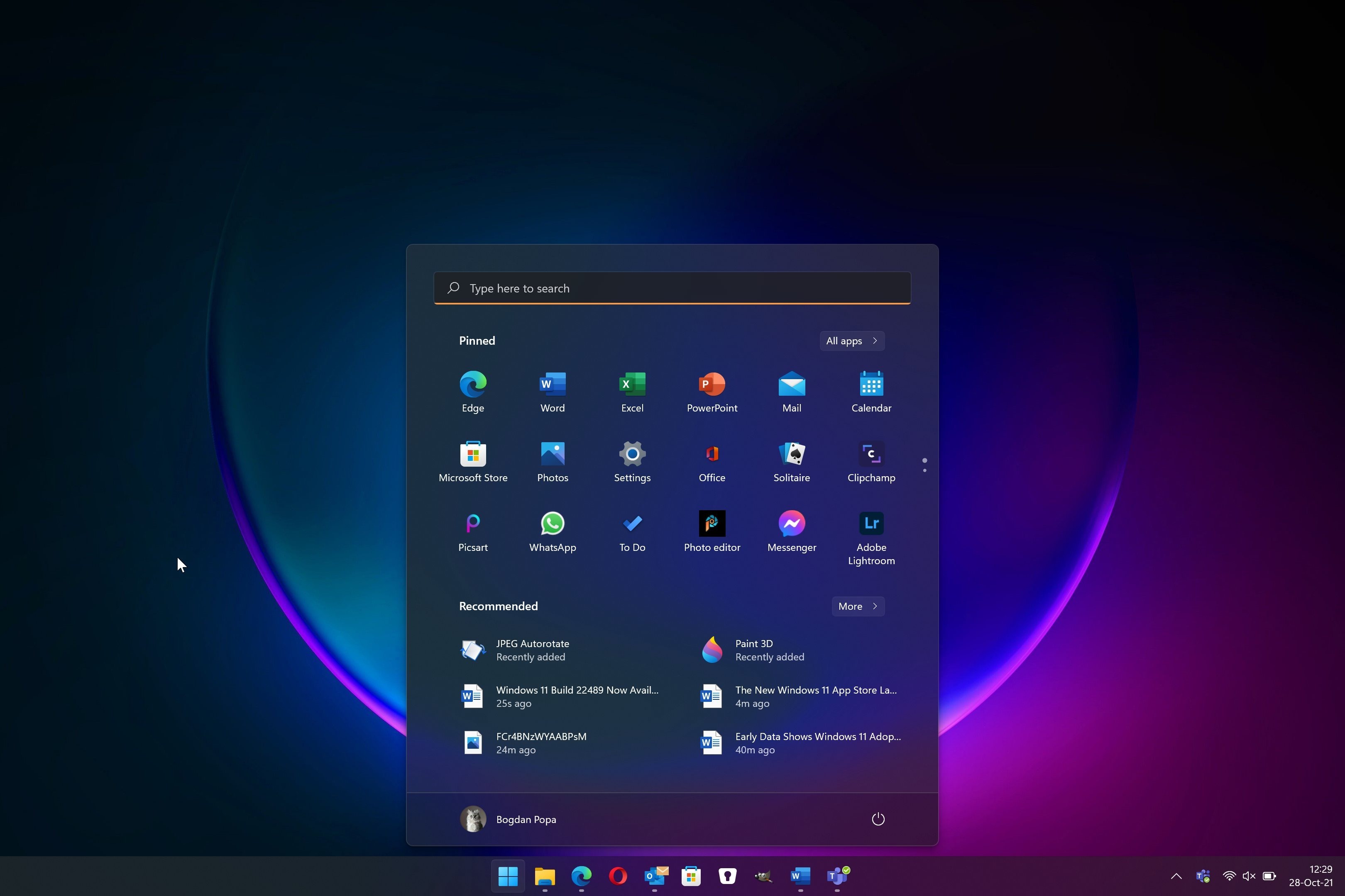
Windows 11 comes with a new Start menu, and Microsoft introduced the revamp with much fanfare, claiming it helps people get things done much easier.
And while the company has further refined the Start menu in Windows 11 since the first version came out more than a year ago, the current design still isn’t everybody’s cup of tea.
Jensen Harris, a former Microsoftie who spent more than a decade in several roles at the company, including as a director of user experiences, highlighted all the bad parts of the Windows 11 Start menu in a series of tweets earlier this week.
As reported by German site WinFuture, Jensen claims he is “shocked by the user experience” with the new Start menu.
“It's just really confusing. The left side looks like it was created by a designer. We could quibble about some of the design choices, but that's not the story here. The right side looks like my Internet Explorer toolbars did in 2008,” he says.
After a thorough analysis of the design mishaps, Harris also signals the Start menu approach that seems to be bothering pretty much everybody out there: the banners.
“The bigger issue here though: why are there banner ads in the Start menu? Is the amount of $ made by this wallpaper app worth cheapening the experience people have in this very high-touch piece of UI? It erodes trust—I wasn't even searching for "wallpaper,” he says.
Harris also believes that putting the Start button in the middle of the taskbar isn’t a good idea.
“I think moving the Start button to the middle of the taskbar wasn't a good move. Corner location not only had decades of muscle memory but also took perfect advantage of Fitts' Law to make it ideally easy to target. Worse for mouse, worse for touch,” he says.
Of course, while many users agree with Harris’ opinions, Microsoft doesn’t seem very keen on embracing a radical overhaul of the Start menu at this point, though smaller refinements, especially in terms of design, are still very likely.
Recommend
About Joyk
Aggregate valuable and interesting links.
Joyk means Joy of geeK