

How Good is Gmail ‘Material You’ Redesign?
source link: https://uxplanet.org/how-good-is-gmail-material-you-redesign-497035d4aeb0
Go to the source link to view the article. You can view the picture content, updated content and better typesetting reading experience. If the link is broken, please click the button below to view the snapshot at that time.
How Good is Gmail ‘Material You’ Redesign?
Gmail has received a redesign that is much more simple.

Google is also rolling out a stylish Material You redesign for Gmail users. The pill-shaped button has been replaced with a rectangle with square corners as the compose button.
Additionally, the compose button, side panel, and read emails all have new colors.
A new user interface that, unless you’ve already disabled them, will display the Chat and Meet sections in the side pane by default.
Earlier this year, Google released this new integrated look through opt-in choices, meaning the Chat and Meet panes had to be manually enabled.
However, the business will require you to opt out if you prefer the traditional Gmail look as the new phase of the rollout begins.
Google Sans Font
Google Sans Text was featured in the Material You redesign screenshots shared at launch, but Google Sans is now available in Gmail.
A size-optimized variation of Product Sans, which is primarily used in Google’s product logos, was described as Google Sans in 2018.
Google Sans Text is “ideal for body text” and “made for smaller point sizes.”
The typeface has started to appear more regularly in Google products, it has been split-tested in mobile search results and there are plans to add it to Chrome OS.
Gmail-only view
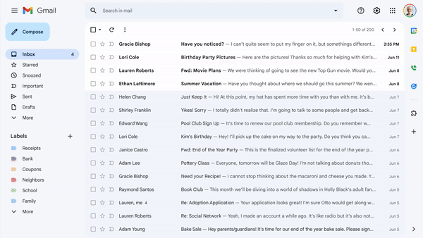
Image Credit: Google
The new “Apps in Gmail” preference allows you to choose whether you wish to view/use Chat (with Spaces) and/or Meet in an integrated view by opening quick settings from the gear symbol in the top bar.
Depending on your choice, those icons will vanish from the left sidebar, and unchecking both will completely eliminate that navigation element and load the Gmail-only setup.
With this, Google is launching a new feature in Meet that will allow you to check each participant’s RSVP status on the meeting screen and contact those who have accepted the invitation but have not yet arrived via the Chat tool.
In case users choose not to use Chat, Google ought to have provided a fast email reminder option as well.
Compose Button & Window

Image Credit: Google
The Compose Floating Action Button gets a new shape. It matches the Android app and takes the place of the pill-shaped button.
The actual compose window, meanwhile, has been very subtly altered with a thin top bar, rounded send button & dark icons.
Search & Filter

Image credit: Google
A filter button with search choices like “is unread,” “has attachment,” and more is included in the new “Material You” look for the inbox.
In the past, users had to enter pertinent terms in the search box and navigate through the results to discover a mail. However, this new upgrade will make it much simpler to find emails in your inbox.
Themes
Image Credit: Google
Last but not least, you may still switch the backdrop theme so that it is not Material.
Your default theme is blue. Go to Quick settings and select Theme.
Similar to earlier, there are a number of solid color options, including Dark, Blue, Soft Gray, Lavender, Rose, Mustard, Wasabi, Spearmint, Seafoam, Dusk, Mahogany, and Eggplant.
There are numerous images, and you may also post your own.
Cons:
Distracting light blue hues include many different tones. It seems like there are more icons and buttons competing for your attention than there is less on-screen clutter.
Recommend
About Joyk
Aggregate valuable and interesting links.
Joyk means Joy of geeK