

Business Intelligence tooling showdown
source link: https://xebia.com/blog/business-intelligence-tooling-showdown/
Go to the source link to view the article. You can view the picture content, updated content and better typesetting reading experience. If the link is broken, please click the button below to view the snapshot at that time.

Business Intelligence tooling showdown
This website stores cookies on your computer. These cookies are used to improve your website and provide more personalized services to you, both on this website and through other media. To find out more about the cookies we use, see our Privacy Policy.
We won't track your information when you decline. But in order to comply with your preferences, we'll have to use just one tiny cookie so that you're not asked to make this choice again.
Recently, I tried out different tools in the Business Intelligence (BI) space in order to find one that suited my needs. I’d like to share this journey, and while it’s not intended to be the most thorough research, it may save you some time. Before getting into the tool specifics, let’s talk a bit more about my intended usage – since the tool that works for me, might not work for you.
At Qxperts, one of the things we help our customers with is assessing their software development process and make suggestions to improve their outcomes. We often need to get and provide insights from different types of data sources – think of issue management systems, but combined with code and its history. While we have several scripts to obtain the data, so far we didn’t have any elaborate way (i.e. a dashboard) to explore this data and visualise it (often, we just settle with checking our assumptions and making charts in Excel).
Having worked as a software engineer on Business Intelligence software for roughly 7 years, I knew the market provides opportunities to both make exploration easier, and to have reusable dashboards with prettier (‘Qxperts-themed’) charts.
My initial hope was to just `docker run` the dashboards together with our other scripts…
Some of my requirements:
- Easy to use, both for non-technical and non-analyst colleagues (truly self-service)
- Capabilities to understand my data (or provide modelling options), e.g. join tables, date formats
- Enough visualisation capabilities (line chart, bar chart, tree map)
- Some form of re-usability
- Keep all (customer) data secure
- Ideally free/open source – to keep the option open to share with the world
- While the scripts can be adjusted to Support a simple local data format, e.g. SQLite or csv.
The major reason to do this tool exploration is that me and most of my colleagues work on a Macbook, which doesn’t run PowerBI as nicely as on Windows (fewer options to prepare data).
I started out with Metabase, which I ran across earlier when evaluating faros – once I had everything running, I liked the suggestions it made, but it was hard to get beyond that point: the visualisation types were limited, and the UI to create custom charts felt very cumbersome. After that, I went to explore Grafana, IBM Cognos Analytics and several other tools, with my impressions listed in the comparison below:
Pros | Cons | |
|
| |
|
| |
|
| |
|
| |
| ||
|
| |
|
|
I loved Tableau the most as it gave me a similar experience as PowerBI, but I could use my Macbook. However, in the end I felt I needed to settle. There is not really a good open source alternative that we could easily distribute as part of our toolset.
A more specific downside to Tableau dashboards (versus Cognos Analytics and PowerBI), is that different charts don’t really seem to interact with each other (brushing). Nevertheless, for now we go with Tableau, but when our tooling matures we might just revisit that decision.
I should stress that I only scratched the surface on different tools, enough to get an impression, and certainly am not an expert in any of them. So please feel free to share your own experiences with us, and perhaps we can learn from each other.
When you are starting out analysing your own software delivery process on a small scale, I would invite in you to do your own experiments. You can not really go wrong with any of these tools – tools are just tools – The goal to keep in mind is to make better informed decisions, which our industry can certainly improve upon – even though you can not measure everything.
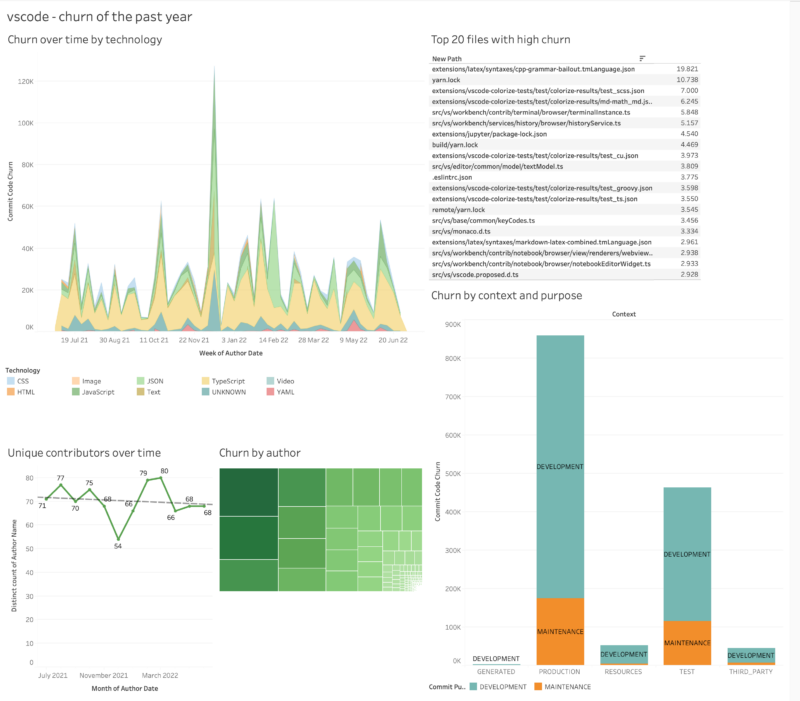
Figure: an early prototype of a dashboard created with Tableau, visualising activity on the vscode repository.
Recommend
About Joyk
Aggregate valuable and interesting links.
Joyk means Joy of geeK