

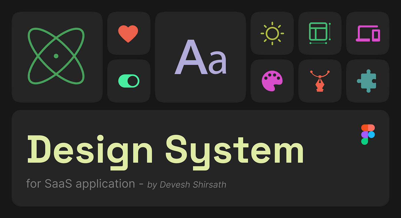
Building a design system for SaaS application
source link: https://uxplanet.org/design-case-study-building-a-design-system-for-saas-application-a8837c606e0
Go to the source link to view the article. You can view the picture content, updated content and better typesetting reading experience. If the link is broken, please click the button below to view the snapshot at that time.

Building a design system for SaaS application
In this design case study, I talk about how we overcame the challenges we were facing when we didn't have a design system. I also talk about the process of building the design system.
“A design system is a set of standards to manage design at scale by reducing redundancy while creating a shared language and visual consistency across different pages and channels.” -NNG
As the team grew, we started to face challenges from an operational standpoint while designing any new feature for Cliff.ai. To be more precise, scaling the design and delivering it end-to-end got unnecessarily complex. We wanted to make sure that we are focused on addressing user needs instead of wasting hours pushing the boxes.
That's when we decided to work on the design system. Now let's understand why we need a design system.

Remember that products that are small, have a short deadline, or have small team size may not require a design system.
Why do we need a Design System? 🧐
We wanted to address some key issues.
These problems identified below came from our experience of working on the product’s core functionalities. These experiences can vary from team to team and use cases.
1. Asynchronicity & lack of consistency
In 2021, as Cliff.ai started growing, numerous features got introduced as per user needs. We noticed that the new components were not in-sync with the old ones since various features were designed and developed by different teams with varied contexts. That led to a lack of consistency.
2. Lack of a design pattern
Not having a pattern leads to a wastage of time and resources and as a result, UX gets suffered. Design patterns cannot be created unless we acknowledge the lack of predictability and consistency. A design language can significantly speed up the design process. It allows designers and the rest of the product team to concentrate more on the flow and logic of a new feature or screen than on visual design. Design Systems create a shared language within and between cross-functional teams, which creates visual consistency across the products and act as a single source of truth.
3. Bad design handoffs
The lack of a shared language between the designers, developers, and product managers affects collaboration. There were moments when the developed product was not even close to what was designed. There was a huge gap between the expectations and reality. But the developers cannot be faulted for this. Designers had to improve the quality of handoff by introducing a design system. Read more about my take on improving handoffs.
4. Bad “design experience”
What designers feel while working on the features is an important aspect. Let’s face it, designing is a hectic job and without a design pattern, it can get even worse. Design systems can improve the design experience. It will allow fellow designers to literally drag and drop components from the library. This will enhance reusability. So that we can streamline the design process by bypassing redundant decisions. Focus more on the logic part than the implementation part.
5. Ensure better onboarding for new team members
The growing requirement for the features led to the growth of the design team. When there were just three people it was easy for us to design the interface, as it was easy to collaborate. But as the team grew, we faced a lot of collaboration issues that motivated us to work on the design system. The design system acts as a single source of truth for all the team members.
What do we have to achieve?🎯
We’re not designing pages, we’re designing systems of components”. — Stephen Hay
Based on our past experiences, we wanted our design system to have the following properties.
1. Reusability
We applied a component-based approach in our design process. We made sure that each and every element is an instance of a component that's a part of our component library to maintain harmony.
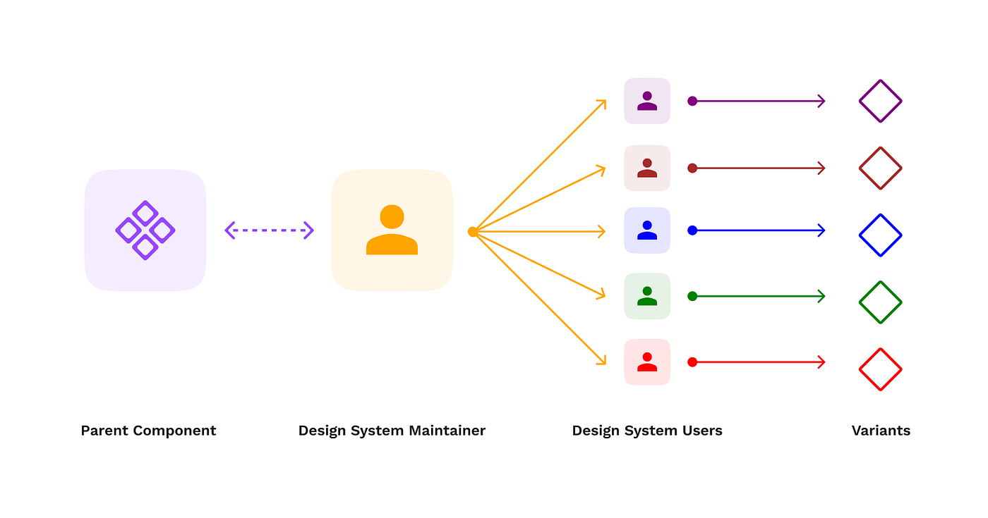
2. Scalability
We leveraged the Component Properties feature of Figma to make sure that any component A is a derivative of component B (at least for common elements). Given they have similar functionality but different use case. Without having to introduce a new component to the library and prevent redundancy
3. Responsiveness
We had to make sure that the components we make are responsive in Figma itself! To do that, we used the Autolayout feature in Figma to avoid nitpicking the elements in terms of dimensions and sizing. We just set the size of the child elements relative to the parents’.
4. Handoff-friendly
We needed to ensure the design was practical enough to be implemented. This required active communication with the developers to understand the scope and feasibility of complex components like tables, etc. All the assets like
- Icons
- Illustrations
- Color hex codes
- Typography, etc.
Were handed off separately to the developers, allowing them to locate and access them easily.
5. Aesthetic
We wanted to incorporate the new modern visual design trends in our app so that it looks fresh and is a delightful experience for the users. Following all the above constraints, we can’t compromise the visual appeal of the product. We took lots and lots of inspiration for this from Dribbble, Behance, etc.

It was essential for us to have a fair balance between the old and the new design language so that the user’s predictability doesn’t go for a toss.
Process of building our Design System.
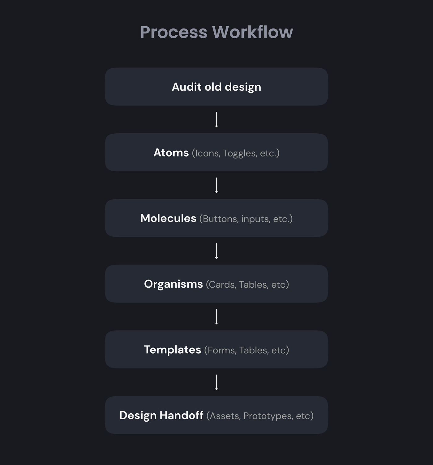
We took inspiration from several organizations that followed Brad Frost’s atomic approach of building a design system because it only makes sense to create a system where even the smallest parts of the component(atoms) are generalized! We mapped that approach to our audited components and tried to categorize them. (Atoms, Molecules, Organisms, Templates).
When you hear “atomic design,” you probably think of Brad Frost. Interestingly, he was not the first person to develop that method of delivering design as components, or even the terminology. Source: http://danieldelaney.net/atomic/
Auditing existing design
Our first step toward building the design system was to audit all the current UI components. And then breaking them down further into molecules and atoms.
We could identify the scope for improvements. But, this ‘rule formation’ was becoming a bottleneck for the design team, it was hindering our creativity. We were not able to experiment well with those constraints that we made for ourselves. We were not able to enhance the aesthetics and visual appeal of Cliff.
So we decided to finish the audit first and then recreate some of the screens independent of the component library and go fully creative. No rules to follow. We took lots of inspiration from Dribbble. We didn't focus on the colors, typeface, functionality, or anything that could create a hindrance to our creativity (at first). We would make whatever would look good on the page, that’s it. After many days of iterating and brainstorming with the team, we finally started to get the foundation right. We knew what colors to pick, what typeface to choose, etc.
So, this experiment led us to beautiful pages and had us figure out our visuals part. This is how we did the foundation.
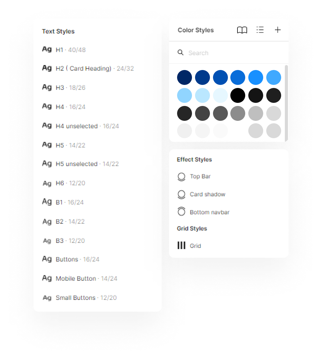
Visuals
We picked up a few of the older designs and tried various colors and typefaces. After agreeing upon the design, we finalized the visuals within 2–3 weeks of experimentation.

Atoms and Molecules
There was a process that we followed while creating any components.


Similarly, we finalized all other atoms and molecules. You can read more about creating components here.
Organisms and Templates
While exploring inspirations, we came across Align Design System. This helped us figure out how to work on the templates since organisms we usually easier to work on as atoms and molecules we almost ready.

We followed the same layout format for all the high-level components. They had a header, body, and footer.
Design Hand-off
This was a huge cross-team effort!
To see how we made this happen, read here.
While handing off, to make sure that developers can access assets easily, we made sure all the components are labeled using the chips headers, and similarly label all other components. And we stayed well in touch with the whole team and had frequent follow-ups.
That’s it! Any feedbacks are welcome!
Recommend
About Joyk
Aggregate valuable and interesting links.
Joyk means Joy of geeK