

Challenge 008–Stats Preview Card Component🚀
source link: https://uxplanet.org/challenge-008-stats-preview-card-component-aaec8046a984
Go to the source link to view the article. You can view the picture content, updated content and better typesetting reading experience. If the link is broken, please click the button below to view the snapshot at that time.

Challenge 008–Stats Preview Card Component🚀
Exercise using flexbox and grid both
Welcome Back !!🤩👋
If you are a first-time visitor Welcome! 🤩 First and foremost, let’s begin this with a small introduction to today’s article.👇
As some of you might know, I pivoted to UI development a few weeks back and started to do challenges using HTML and CSS. Then I have done four challenges using Flexbox ( Challenge 01, Challenge 02, Challenge 03 & Challenge 04). Afterwards, I have done another three challenges using CSS Grid( Challenge 05, Challenge 06 & Challenge 08 ).
As we are reaching our 8th, I have decided to do another small change in Frontend Mentor. As for today’s challenge, we are doing it in two different methods. We do this challenge in both CSS Grid and Flexbox.
You might be wondering how we are going to do it. Let me tell you how👇😎
- First, as always we started with the blueprint of the design (HTML)
- Then we do the common styling.
- And for the ones that need flexbox or grid, First, we do the design using flexbox. Then we do it using the grid. ( Same component in two different ways).
- Last but not least, in the responsive section, we will follow the same procedure as above.
With Thaaaat…..Let’s get into our Today’s Challenge.
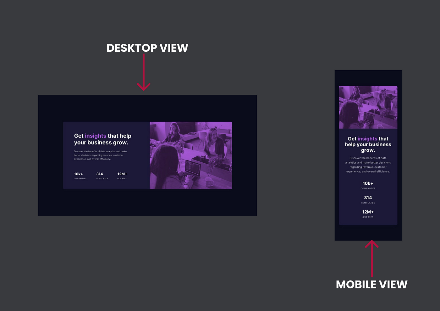
As for today’s challenge, we will be doing an intermediate challenge from Front End Mentor. 👉Challenge 008– Stats Preview Card Component.
As always, let’s begin the challenge with a motivational quote.👇 (This is one of the quotes that helps me to keep moving, I am sharing this with you with the hope that it’ll help you all as well to keep on moving forward)
“There is no magic to achievement. It’s really about hard work, choices, and persistence.”
~Michelle Obama~

Before beginning, let me highlight a small note (as always):-
For some of you, this might be a challenge that you can do with your eyes closed, for some of you this might be a challenge that you learn a new thing and for some of you this might be the beginner step for CSS Grid. So this article is for anyone from pro to beginner who loves to learn and sharpen their skills.🤓 With that…..
ARE YOU READY FOR THE CHALLENGE??💣
🔸 Challenge Name:-
Frontend Mentor | Stats preview card component coding challenge
Your challenge is to build out this card component and get it looking as close to the design as possible. You can use…
🔸 Description:-
Your challenge is to build out this landing page from the designs provided in the starter code. Your users should be able to:
- View the optimal layout for the page depending on their device’s screen size
🔸 Tools:-
HTML, CSS & Figma
STEP 01 — Begin With the blueprint (HTML)🚀
First and Foremost, we will do a sketch/blueprint of the card component using HTML. Afterwards, we’ll make the look and feel of the Stats Preview Card Component according to the Design.
🔴 STEP 1.1 ➡ Basic structure of HTML
<!DOCTYPE html>
<html lang="en">   <!-- Head Section-->
    <head>
      <meta charset="UTF-8">
      <meta http-equiv="X-UA-Compatible" content="IE=edge">
      <meta name="viewport" content="width=device-width, initial-
       scale=1.0">
      <title> Stats Preview Card Component</title>
    </head>    <!-- Body Section-->
    <body>
    </body>
</html>
🔴 STEP 1.2 ➡ Create the main structure for the Stats Preview Card Component
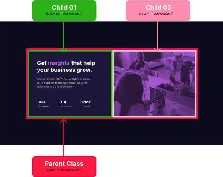
<!--wrapped parent Container-->
<div class="main-container section-container">    <!--Child 01 Container-->
   <div class="common-content des-content">
   </div>   <!--Child 02 Container-->
   <div class="image-content">
   </div></div>
Before moving forward let us briefly discuss the above code👆
- Here you can see there are two classes we have been using in a single tag. You might be wondering why we have used two classes. Let me tell you why
- At the beginning of the article, I mentioned that we will be doing this using CSS grid as well as CSS flexbox is it?
- So as in the highlighted section, we will be using one class for common styling and the other to specify the styling either grid or flexbox.
<div class="main-container section-container"><!--👆👆👆👆👆👆👆-->
<!-- class="main-container" is used for the common styling-->
<!-- class="section-container" is used for specific styling-->
🔴 STEP 1.3 ➡ Create the structure for each section
Now we are done with the basic structure. It’s time for us to dig deep into each container and do the layout for each section for our headstart.
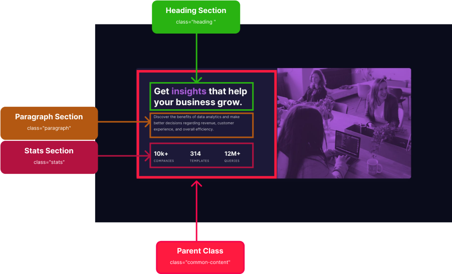
01) Layout the Content Section
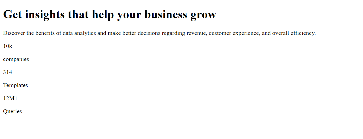
<div class="common-content">     <!--heading section-->
     <div class="heading ">
       <h1 class="full-heading">
          Get <span class="highlighted">insights</span>
          that help your business grow
       </h1>
     </div>    <!--paragraph section-->
    <div class="paragraph">
       <p>
         Discover the benefits of data analytics and make
         better decisions regarding revenue, customer experience,
         and overall efficiency.
      </p>
    </div>    <!--stats section-->
    <div class="stats">
      <div class="companies">
         <p class="largeNo">
          10k
         </p>
         <p class="name">
          companies
         </p>
       </div>       <div class="templates">
         <p class="largeNo">
          314
         </p>
         <p class="name">
           Templates
         </p>
      </div>      <div class="queries">
        <p class="largeNo">
          12M+
        </p>
        <p class="name">
          Queries
        </p>
      </div>
    </div></div>
02) Layout the Image Section
<!--image Parent section-->
<div class="image-content">   <!--image Overlay section-->
   <div class="image"></div></div>
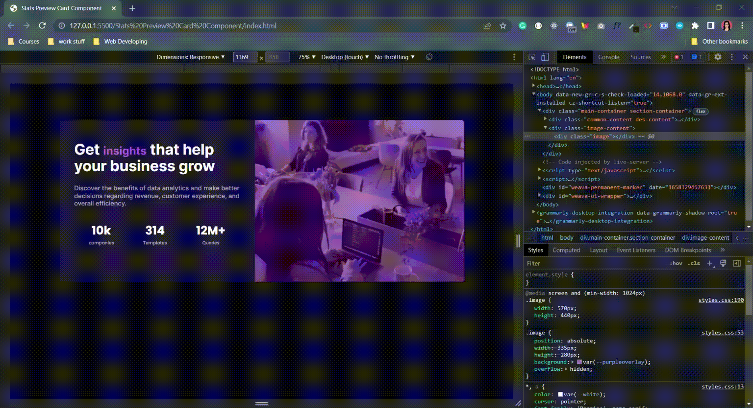
— — And with that, we have done with the blueprint. It’s time for us to check the output of our blueprint.👀👇 — —
— — HMMM, I am not a fan of this. It looks ugly.🤮 But rather than wasting our time on complaining, shall we get into work and make it more appealing — —
STEP 02 — Time to make it more appealing (CSS)🚀
Note Followings before beginning 👇
- Here We start the styling for the mobile view first, and then we’ll adjust the styling for the larger screens using media queries.
- And we will first do the Common Styling.
- Then we move to specify each section using CSS Grid and CSS flexbox.

2.1) Common Styling
Before we divide into flexbox or grid, let us first put the common styling.
🔴 Step 2.1.1 ➡ First and foremost let us start by Linking The External Style Sheet to the HTML file
<head>  <meta charset="UTF-8">
  <meta http-equiv="X-UA-Compatible" content="IE=edge">
  <meta name="viewport" content="width=device-width, initial
  scale=1.0">

<link rel="stylesheet" href="styles.css">

<title> Stats Preview Card Component</title></head>
🔴 Step 2.1.2 ➡ Import fonts to the external style sheet
So as you can see in the Design we have used two font styles. Such as, ‘Inter’ & ‘Poppins’. Therefore what we can first do is, go to google font, search for ‘Inter’ & ‘Poppins’ font, click on the relevant font weights we needed, and then get the import link.
@import url('https://fonts.googleapis.com/css2?family=Poppins:wght@300;400;500;600;700;800;900&display=swap');@import url('https://fonts.googleapis.com/css2?family=Inter:wght@400;500;600;700;800;900&display=swap');🔴Step 2.1.3 ➡ Use root: to declare the colours we are using
:root {   --white: #ffffff;
   --darkblue: #1C1938;
   --purple: #AF62E2;
   --darkgrey: #B0AEC4;
   --purpleoverlay: rgba(83, 0, 138, 0.5);}
For a thorough explanation of :root check out Challenge No 002, where I descriptively walked you through why and what we use :root.
🔴Step 2.1.4 ➡ Include the Styling for the Universal Selector
Now let me begin with a small note🔊:- Since I have descriptively walked you through the universal selector in previous challenges (001, 002, 003, 004, 005,006,007) as well as in the CSS article, I won’t be explaining the universal selector, and why we use it again.
*, a {   color:var(--white);
   cursor: pointer;
   font-family: 'Poppins', sans-serif;
   font-size: 15px;
   font-weight: 600;
   margin: 0px;
   margin-left: auto;
   margin-right: auto;
   text-decoration: none;}
🔴Step 2.1.5 ➡ Add the background colour
As you can see there is a dark blue background colour around the card.
- Therefore, we include the dark blue colour in the main body section to affect the whole page.
body { background-color: var(--blackishblue);}🔴Step 2.1.6 ➡ Add the styling for the parent container
Here we are going to add the common styling for the parent container
.main-container {   width: 335px;
   margin: 30px 18px 30px 18px;
   background-color: var(--darkblue);
   border-radius: 7px;
   min-height: 500px;
   margin-left: auto;
   margin-right: auto;}
Let us discuss the above-highlighted code snippet👆
<!-- When we give min height the height of the container will adjust according to the length of the content-->min-height: 500px;
🔴Step 2.1.7 ➡ Add the styling for the image section
Following styles, we will be doing here
- Add the background image
- Add a background overlay on the top of the image
<!-- Adding Background Image-->
.image-content {  background-image: url("./images/image-header-mobile.png");
  background-position: center;
  background-repeat: no-repeat;
  background-size: cover;
  border-top-left-radius: 7px;
  border-top-right-radius: 7px;
  border-bottom-left-radius: 0px;
  border-bottom-right-radius: 0px;
  width:335px;
  height: 280px;}<!-- Adding Background Overlay-->
.image {  position: absolute;
  width:335px;
  height: 280px;
  background: var(--purpleoverlay);
  overflow: hidden;}
🔴Step 2.1.8 ➡ Add the common styling for the content section
.common-content {    text-align: center;
    padding: 30px 15px 30px 15px;}.full-heading,
.full-heading .highlighted  {   color: var(--white);
   font-size: 30px;
   font-weight: 700;
   font-family: 'Inter', sans-serif;
   line-height: 40px;
   margin-bottom: 20px;}.full-heading .highlighted {   color: var(--purple);}.paragraph p{   color: var(--darkgrey);
   font-size: 17px;
   font-weight: 500;
   font-family: 'Inter', sans-serif;}.largeNo  {   font-size: 32px;
   font-weight: 700;
   color: var(--white);}.name  {   font-size: 12px;
   font-weight: 500;
   color: var(--darkgrey);
   padding-top: -2px;}.companies,
.templates,
.queries {   padding-top: 10px;
   padding-bottom: 10px;
   text-align: center;}
2.2) Distinguish between CSS GRID & CSS Flexbox😬
Here, we need to use the grid or flexbox for
01) Divide the card into two sections for the content and image
02) Divide the stats section into three for three different types of stats
2.2.1) Using Flex Box
<!-- Divide the card into two sections-->
.section-container {   display: flex;
   flex-direction: column-reverse;}<!-- Divide the stats into three sections-->
.stats {   display: flex;
   flex-direction: column;}
2.2.2) Using Grid
<!-- Define the content section should be in second row-->
.des-content {

grid-row: 2;}<!-- Divide the card into two sections-->
.section-container {    display: grid;}<!-- Divide the stats into three sections-->
.stats {    display: grid;
    grid-template-rows: repeat(3, 1fr);}
— — LET’S SEE THE OUTCOME IN MOBILE VIEW💣. TADAAA..🤩 — —

STEP 03 — Time to make responsive for all the screens (Media Query)🚀
Since we have done in a mobile-first approach, we have done our basic styling for the mobile view. Now it’s time to use the media query and make it responsive for the larger size screens.
Once you include the styles for the media query, those styles will override the basic style accordingly for larger screens.
🟡Step 3 ➡ let us Complete adjust the styles for screens which are greater than 1024px
- Here also, we do it in the same way.
- First, we do the common styling.
- Then we will differentiate the styling using CSS grid and flexbox.

3.1) Common Styling
@media screen and (min-width: 1024px) {.image-content {   width:570px;
   height: 440px;
   border-top-left-radius: 0px;
   border-top-right-radius: 7px;
   border-bottom-left-radius: 0px;
   border-bottom-right-radius: 7px;}.common-content {   text-align: left;
   padding: 60px 40px 60px 40px;}.image {   width:570px;
   height: 440px;}.main-container {   width: 1100px;
   min-height: 400px;
   margin-top: 100px;}.full-heading {   margin-bottom: 30px;
   font-size: 40px;}.paragraph {  margin-bottom: 30px;}}
3.2) Distinguish between CSS GRID & CSS Flexbox
3.2.1) Using Flex Box
.des-content {     width: 453px;}.section-container {    display: flex;}.stats {   display: flex;
   flex-direction: row;}
3.2.1) Using Grid
.des-content {    grid-row: 1;
    grid-template-columns: repeat(2, 1fr);}.section-container {    display: grid;
    grid-template-columns: repeat(2, 1fr);}.stats {    display: grid;
    grid-template-rows: auto;
    grid-template-columns: repeat(3, 1fr);}
— — LET’S SEE THE FINAL OUTCOME IN MOBILE & DESKTOP VIEW💣. TADAAA..🤩 — —

Note: — We used both flexbox and grid to distinguish between both, but remember the best practice would be to use one of them throughout the development.
Final Thought
As we have done with the challenge, I’ll end this article with the hope that you have gained and learned something. Thank You for checking this out.
Now your time has arrived to give a try to this challenge. Trust me you would love the process.
If you are interested in gaining more knowledge, sharpening your skillset or need a small reminder, check out the following articles.👇🧠
Vessel of Knowledge in CSS https://medium.com/@nknuranathunga/vessel-of-knowledge-in-grid-1272764725a2
Understanding flexbox to make things easy:- https://levelup.gitconnected.com/understanding-flexbox-to-make-things-easy-adf90891ff25
Understanding Flexbox to make things easy 👏
If you are not willing to learn, no one can help you. If you are determined to learn no one can stop you
Learn the fundamentals of CSS within a few minutes:- https://bootcamp.uxdesign.cc/beginners-guide-to-css-9bc8298985c0
Beginner’s guide to HTML:-https://uxplanet.org/beginners-guide-to-html-and-css-letss-start-off-with-html-3d7ffd035182
If you like this give one or more claps and feel free to leave your thoughts and feedback in the comment section.
Thank you for checking this out and feel free to checkout my other articles by clicking the following link 👇
Nathasha - Medium
Read writing from Nathasha on Medium. UI/UX Engineer 👩💻 Technical Writer ✍️. Every day, Nathasha and thousands of…
🔸Follow me on Twitter👀: @NathashaR97🔸
Recommend
About Joyk
Aggregate valuable and interesting links.
Joyk means Joy of geeK