

十行代码绘制漂亮金融K线图,这个神器你不可错过
source link: https://developer.51cto.com/article/714496.html
Go to the source link to view the article. You can view the picture content, updated content and better typesetting reading experience. If the link is broken, please click the button below to view the snapshot at that time.

十行代码绘制漂亮金融K线图,这个神器你不可错过-51CTO.COM
Mplfinance 是 Matplotlib 组织开源项目的一部分。相对于Matplotlib,Mplfinance这个处于金融行业的垂直领域的模块的关注度确实是少了一些,以至于很多朋友都不知道它的存在,实际上它非常实用且好用。
开始之前,你要确保Python和pip已经成功安装在电脑上,如果没有,可以访问这篇文章:超详细Python安装指南 进行安装。
(可选1) 如果你用Python的目的是数据分析,可以直接安装Anaconda:Python数据分析与挖掘好帮手—Anaconda,它内置了Python和pip.
(可选2) 此外,推荐大家用VSCode编辑器,它有许多的优点:Python 编程的最好搭档—VSCode 详细指南。
请选择以下任一种方式输入命令安装依赖:
1. Windows 环境 打开 Cmd (开始-运行-CMD)。
2. MacOS 环境 打开 Terminal (command+空格输入Terminal)。
3. 如果你用的是 VSCode编辑器 或 Pycharm,可以直接使用界面下方的Terminal.
pip install --upgrade mplfinance2.基本使用
我们以沪深300分钟线为例,使用mplfinance绘制各类金融图形。
首先看看数据结构:
import pandas as pd
mins = pd.read_csv('sh300_1min.csv',index_col=0,parse_dates=True)
print(mins)
结构如下:
day      open      high       low     close     volume
0 2022-03-07 10:47:00  4406.223  4406.352  4405.662  4405.922   54345400
1 2022-03-07 10:48:00  4406.172  4406.175  4403.834  4403.918   70803100
2 2022-03-07 10:49:00  4403.333  4403.333  4402.235  4402.340   49632500
3 2022-03-07 10:50:00  4402.330  4402.519  4401.838  4402.519   48159200
我们用于mplfinance的数据必须是 Pandas DataFrame. 字段则按需提供,至少要有时间字段和一列数据。另外原始数据如果是其他的数据类型,你必须得先转成DataFrame格式。
此外,时间字段必须转为DatetimeIndex:
# 公众号:二七阿尔量化
import pandas as pd
import mplfinance as mpf
mins = pd.read_csv('sh300_1min.csv',index_col=0,parse_dates=True)
mins["day"] = pd.to_datetime(mins["day"])
mins = mins.set_index("day")
mins.index.name = 'Time'
print(mins)
效果如下:
open      high       low     close     volume
Time
2022-03-07 10:47:00  4406.223  4406.352  4405.662  4405.922   54345400
2022-03-07 10:48:00  4406.172  4406.175  4403.834  4403.918   70803100
2022-03-07 10:49:00  4403.333  4403.333  4402.235  4402.340   49632500
2022-03-07 10:50:00  4402.330  4402.519  4401.838  4402.519   48159200
准备完成后就可以绘制图表了:
# 公众号:二七阿尔量化
import pandas as pd
import mplfinance as mpf
mins = pd.read_csv('sh300_1min.csv',index_col=0,parse_dates=True)
mins["day"] = pd.to_datetime(mins["day"])
mins = mins.set_index("day")
mins.index.name = 'Time'
# 绘制默认图像(美国线)
mpf.plot(mins)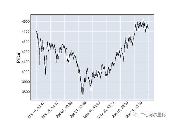
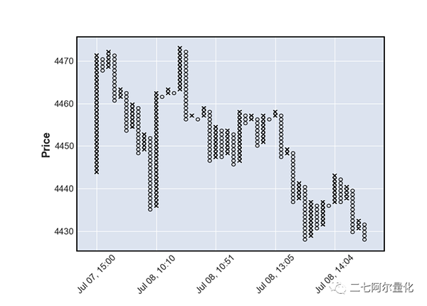
绘制蜡烛图(K线图),为了避免图表过大,我这里只取了240条K线:
# 公众号:二七阿尔量化
import pandas as pd
import mplfinance as mpf
mins = pd.read_csv('sh300_1min.csv',index_col=0,parse_dates=True)
mins["day"] = pd.to_datetime(mins["day"])
mins = mins.set_index("day")
mins.index.name = 'Time'
candle_chart = mins.tail(240)
mpf.plot(candle_chart, type='candle')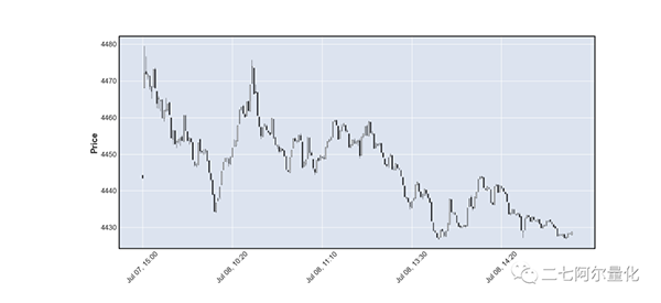
黑白颜色太单调了,我们可以换成“雅虎”配色:
mpf.plot(candle_chart, type='candle', style='yahoo')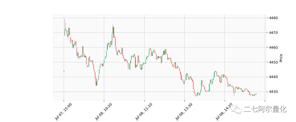
绘制线型图:
# 公众号:二七阿尔量化
import pandas as pd
import mplfinance as mpf
mins = pd.read_csv('sh300_1min.csv',index_col=0,parse_dates=True)
mins["day"] = pd.to_datetime(mins["day"])
mins = mins.set_index("day")
mins.index.name = 'Time'
mpf.plot(mins, type='line')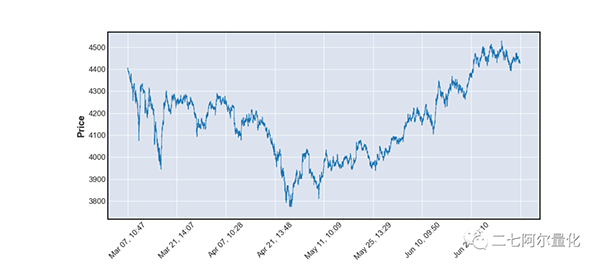
除了美国线、蜡烛图(K线)、线型图外,mplfinance还支持 renko、pnf 等图形。有兴趣的同学可以改个type看看效果:
3.添加技术指标
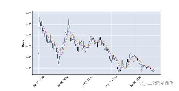
绘制简单移动平均线MA5,我们只需要多加一个参数:
# 公众号:二七阿尔量化
import pandas as pd
import mplfinance as mpf
mins = pd.read_csv('sh300_1min.csv',index_col=0,parse_dates=True)
mins["day"] = pd.to_datetime(mins["day"])
mins = mins.set_index("day")
mins.index.name = 'Time'
candle_chart = mins.tail(240)
mpf.plot(candle_chart, type='candle', mav=5)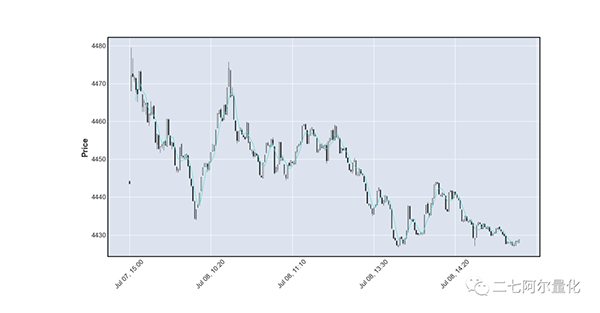
如果你需要多条移动平均线,只需要将mav改为元组参数,传入你需要的周期参数:
如果你还需要显示成交量(volume), mplfinance 也能实现:
# 公众号:二七阿尔量化
import pandas as pd
import mplfinance as mpf
mins = pd.read_csv('sh300_1min.csv',index_col=0,parse_dates=True)
mins["day"] = pd.to_datetime(mins["day"])
mins = mins.set_index("day")
mins.index.name = 'Time'
candle_chart = mins.tail(240)
mpf.plot(candle_chart, type='candle', mav=(5, 10, 20), volume=True)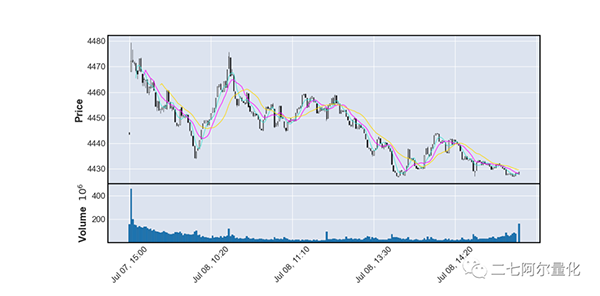
如果你还想给蜡烛上色、想更改线条颜色、想增加其他指标,请看第三部分高级使用。
4.高级使用
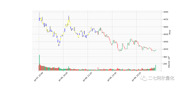
上色是非常简单的,正如我们之前换成雅虎配色一样,你只需要添加style参数即可换成我们传统的技术指标颜色。
如果你想自定义颜色也是可以做到的,这里我将前120根柱子设置为蓝黄相间,后120根柱子保留原形:
# 公众号:二七阿尔量化
import pandas as pd
import mplfinance as mpf
mins = pd.read_csv('sh300_1min.csv',index_col=0,parse_dates=True)
mins["day"] = pd.to_datetime(mins["day"])
mins = mins.set_index("day")
mins.index.name = 'Time'
candle_chart = mins.tail(240)
mco = ['yellow','blue'] * 60 + [None] * 120
mpf.plot(candle_chart, volume=True, style='yahoo', type='candle', marketcolor_overrides=mco)
效果如下:
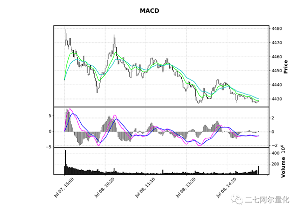
有些同学还希望能够绘制自己的技术指标,mplfinance也可以做到:
上滑查看更多代码
# 公众号:二七阿尔量化
# https://github.com/matplotlib/mplfinance/blob/master/examples/mpf_animation_macd.py#L28
import pandas as pd
import mplfinance as mpf
import matplotlib.animation as animation
mins = pd.read_csv('sh300_1min.csv',index_col=0,parse_dates=True)
mins["day"] = pd.to_datetime(mins["day"])
mins = mins.set_index("day")
mins.index.name = 'Time'
candle_chart = mins.tail(240)
df = candle_chart
exp12 = df['close'].ewm(span=12, adjust=False).mean()
exp26 = df['close'].ewm(span=26, adjust=False).mean()
macd = exp12 - exp26
signal = macd.ewm(span=9, adjust=False).mean()
histogram = macd - signal
apds = [mpf.make_addplot(exp12,color='lime'),
mpf.make_addplot(exp26,color='c'),
mpf.make_addplot(histogram,type='bar',width=0.7,panel=1,
color='dimgray',alpha=1,secondary_y=False),
mpf.make_addplot(macd,panel=1,color='fuchsia',secondary_y=True),
mpf.make_addplot(signal,panel=1,color='b',secondary_y=True),
]
s = mpf.make_mpf_style(base_mpf_style='classic',rc={'figure.facecolor':'lightgray'})
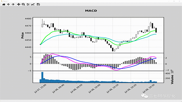
fig, axes = mpf.plot(df,type='candle',addplot=apds,figscale=1.5,figratio=(7,5),title='\n\nMACD',
style=s,volume=True,volume_panel=2,panel_ratios=(6,3,2),returnfig=True)
mpf.show()mpf.make_addplot 支持添加任意图形到任意panel上,panel参数默认为0,如果设为1则将图形添加到第二个图上,color参数能设置图形颜色,secondary_y 能将图形的值设置到y轴上。效果如下:
此外,如果你希望能动态看到整个绘制过程,增加个animation即可:
上滑查看更多代码
# 公众号:二七阿尔量化
import pandas as pd
import mplfinance as mpf
import matplotlib.animation as animation
mins = pd.read_csv('sh300_1min.csv',index_col=0,parse_dates=True)
mins["day"] = pd.to_datetime(mins["day"])
mins = mins.set_index("day")
mins.index.name = 'Time'
candle_chart = mins.tail(240)
df = candle_chart
exp12 = df['close'].ewm(span=12, adjust=False).mean()
exp26 = df['close'].ewm(span=26, adjust=False).mean()
macd = exp12 - exp26
signal = macd.ewm(span=9, adjust=False).mean()
histogram = macd - signal
apds = [mpf.make_addplot(exp12,color='lime'),
       mpf.make_addplot(exp26,color='c'),
       mpf.make_addplot(histogram,type='bar',width=0.7,panel=1,
                        color='dimgray',alpha=1,secondary_y=False),
       mpf.make_addplot(macd,panel=1,color='fuchsia',secondary_y=True),
       mpf.make_addplot(signal,panel=1,color='b',secondary_y=True),
      ]
s = mpf.make_mpf_style(base_mpf_style='classic',rc={'figure.facecolor':'lightgray'})
fig, axes = mpf.plot(df,type='candle',addplot=apds,figscale=1.5,figratio=(7,5),title='\n\nMACD',
                    style=s,volume=True,volume_panel=2,panel_ratios=(6,3,2),returnfig=True)
mpf.show()
ax_main = axes[0]
ax_emav = ax_main
ax_hisg = axes[2]
ax_macd = axes[3]
ax_sign = ax_macd
ax_volu = axes[4]
def animate(ival):
   if (20+ival) > len(df):
       print('no more data to plot')
       ani.event_source.interval *= 3
       if ani.event_source.interval > 12000:
           exit()
       return
   data = df.iloc[0:(30+ival)]
   exp12 = data['close'].ewm(span=12, adjust=False).mean()
   exp26 = data['close'].ewm(span=26, adjust=False).mean()
   macd = exp12 - exp26
   signal = macd.ewm(span=9, adjust=False).mean()
   histogram = macd - signal
   apds = [mpf.make_addplot(exp12,color='lime',ax=ax_emav),
           mpf.make_addplot(exp26,color='c',ax=ax_emav),
           mpf.make_addplot(histogram,type='bar',width=0.7,
                            color='dimgray',alpha=1,ax=ax_hisg),
           mpf.make_addplot(macd,color='fuchsia',ax=ax_macd),
           mpf.make_addplot(signal,color='b',ax=ax_sign),
          ]
   for ax in axes:
       ax.clear()
   mpf.plot(data,type='candle',addplot=apds,ax=ax_main,volume=ax_volu)
ani = animation.FuncAnimation(fig,animate,interval=100)
mpf.show()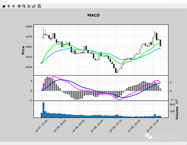
还有许多更有趣的玩法,你可以阅读mplfinance的examples学习更多的使用技巧:
https://github.com/matplotlib/mplfinance/tree/master/examples


 分享到微信
分享到微信  分享到微博
分享到微博Recommend
About Joyk
Aggregate valuable and interesting links.
Joyk means Joy of geeK