

React Resource Calendar with Editable Columns (Open-Source)
source link: https://code.daypilot.org/62447/react-resource-calendar-open-source
Go to the source link to view the article. You can view the picture content, updated content and better typesetting reading experience. If the link is broken, please click the button below to view the snapshot at that time.

Overview
React application that shows a resource scheduling calendar (with custom resources as columns).
Learn how to load resources (columns) and events using the React state and using the direct React calendar API.
The calendar columns can be edited using a modal dialog that opens after clicking the column header.
Use a drop-down list to select a group of resources that will be displayed in the calendar.
Change the date using a date picker or Next/Previous buttons (both methods work together).
Built using the free and open-source React calendar component from DayPilot Lite for JavaScript.
License
Apache License 2.0
How to Get Started with the React Resource Calendar
In this step, you will learn how to add the resource calendar to your React application.
Create a new React application and install the @daypilot/daypilot-lite-react package from NPM. This package includes the required calendar/scheduler components and the date picker.
npm install @daypilot/daypilot-lite-react
Create a new Calendar component (Calendar.js file) and add a <DayPilotCalendar> tag to the JSX in the render() method:
import React, {Component} from 'react';
import {DayPilotCalendar} from "@daypilot/daypilot-lite-react";

class Calendar extends Component {

  constructor(props) {
    super(props);

    this.state = {
      viewType: "Resources",
      startDate: "2022-11-07",
      columns: [
        {name: "Room 1", id: "R1"},
        {name: "Room 2", id: "R2"},
        {name: "Room 3", id: "R3"},
        {name: "Room 4", id: "R4"},
        {name: "Room 5", id: "R5"},
        {name: "Room 6", id: "R6"},
        {name: "Room 7", id: "R7"},
      ]
    };
  }

  render() {
    return (
      <DayPilotCalendar
        {...this.state}
      />
    );
  }
}

export default Calendar;
Lets go through the important elements of this example:
1. By default, the React calendar component displays a daily calendar view. In order to switch to the resources calendar view (with resources as columns), add viewType={"Resources"} to the configuration.
<DayPilotCalendar
  viewType={"Resources"}
/>
2. In order to make the configuration easier (and changeable), move the calendar properties to the state object and use the spread operator (…) to inject the properties as <DayPilotCalendar> attributes.
<DayPilotCalendar
  {...this.state}
/>
3. To define the resources, use the columns property:
constructor(props) {
  super(props);

  this.state = {
    viewType: "Resources",
    columns: [
      {name: "Room 1", id: "R1"},
      {name: "Room 2", id: "R2"},
      {name: "Room 3", id: "R3"},
      {name: "Room 4", id: "R4"},
      {name: "Room 5", id: "R5"},
      {name: "Room 6", id: "R6"},
      {name: "Room 7", id: "R7"},
    ]
  };
}
4. To set the initial date displayed by the calendar, add a startDate property to the state.
this.state = {
  // ...
  startDate: "2022-11-07",
};
5. To load events, use the events property:
constructor(props) {
super(props);
this.state = {
// ...
events: [
{
id: 1,
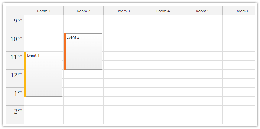
text: "Event 1",
start: "2022-11-07T11:00:00",
end: "2022-11-07T13:30:00",
barColor: "#fcb711",
resource: "R1"
},
{
id: 2,
text: "Event 2",
start: "2022-11-07T10:00:00",
end: "2022-11-07T12:00:00",
barColor: "#f37021",
resource: "R2"
},
// ...
]
};
}
Now we have the basic React resource calendar working. In the next chapter, you will see how to load the resources and events from an external source and add rich UI that lets users switch the calendar views.
How to Use the Direct API to Reach Resource Calendar Features
The reactive model we used so far lets us modify the calendar by simply updating the state. This is a simple approach that works fine in most cases.
In the next step, we will see how to use the direct API instead of the state to update the Calendar.
This approach gives you more precise control over the changes - you specify what gets updated and when.
In more complex scenarios, the direct API access makes is easier to manage state shared by multiple components.
The DayPilot.Calendar class provides additional methods that can help you perform additional actions (find an event, get the visible date range, clear the time range selection, etc.).
To access the direct API, we need a reference to the DayPilot.Calendar instance that represents the Calendar component.
import React, {Component} from 'react';
import {DayPilot, DayPilotCalendar} from "@daypilot/daypilot-lite-react";

class Calendar extends Component {

  constructor(props) {
    super(props);

    this.calendarRef = React.createRef();

    this.state = {
      // ...
    };
  }

  get calendar() {
    return this.calendarRef.current.control;
  }

  render() {

    return (
      <DayPilotCalendar
        {...this.state}
        ref={this.calendarRef}
        />
    );
  }
}

export default Calendar;
The get calendar() method creates a getter that returns the DayPilot.Calendar object from the calendar component reference stored in this.calendarRef.
Now we can use this.calendar to call the calendar component methods. In the next chapter, we will use it to update events and columns.
How to Load Calendar Columns and Events
Now we will remove the startDate and columns properties from the React state. The state now only defines the viewType:
this.state = {
  viewType: "Resources",
};
We create a new loadCalendarData() method which loads the data (this example defines simple static arrays) and updates the resource calendar using the update() method:
loadCalendarData() {
const startDate = "2022-11-07";
const columns = [
{name: "Room 1", id: "R1"},
{name: "Room 2", id: "R2"},
{name: "Room 3", id: "R3"},
{name: "Room 4", id: "R4"},
{name: "Room 5", id: "R5"},
{name: "Room 6", id: "R6"},
{name: "Room 7", id: "R7"},
];
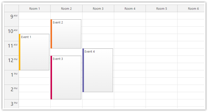
const events = [
{
id: 1,
text: "Event 1",
start: "2022-11-07T10:30:00",
end: "2022-11-07T13:00:00",
barColor: "#fcb711",
resource: "R1"
},
{
id: 2,
text: "Event 2",
start: "2022-11-07T09:30:00",
end: "2022-11-07T11:30:00",
barColor: "#f37021",
resource: "R2"
},
{
id: 3,
text: "Event 3",
start: "2022-11-07T12:00:00",
end: "2022-11-07T15:00:00",
barColor: "#cc004c",
resource: "R2"
},
{
id: 4,
text: "Event 4",
start: "2022-11-07T11:30:00",
end: "2022-11-07T14:30:00",
barColor: "#6460aa",
resource: "R3"
},
];
this.calendar.update({startDate, columns, events});
}
The structure of the events and columns arrays is described in the API documentation.
To load the data during application startup, call our loadCalendarData() method in componentDidMount():
componentDidMount() {
  this.loadCalendarData();
}
How to Edit Resource Calendar Columns
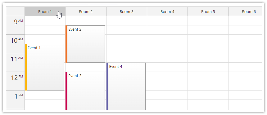
Our React application will let users edit column details on click.
To implement this feature, we need to handle the onHeaderClick event:
this.state = {
  viewType: "Resources",

  // ...

  onHeaderClick: async args => {
    const modal = await DayPilot.Modal.prompt("Resource name:", args.column.name);
    if (!modal.result) { return; }
    args.column.data.name = modal.result;
    this.calendar.update();
  }

};
To provide a hint that the column header is clickable, we add a custom CSS style to our application (Calendar.css) that changes the calendar header color on hover:
.calendar_default_colheader_inner:hover {
    background-color: #ccc;
    cursor: pointer;
}
The event handler opens a simple modal dialog that asks for an updated resource name:
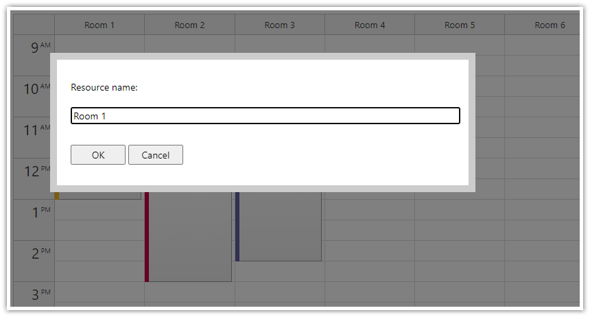
As soon as the user closes the dialog, we update the column and request a Calendar update.
How to Switch Between Different Resource Groups
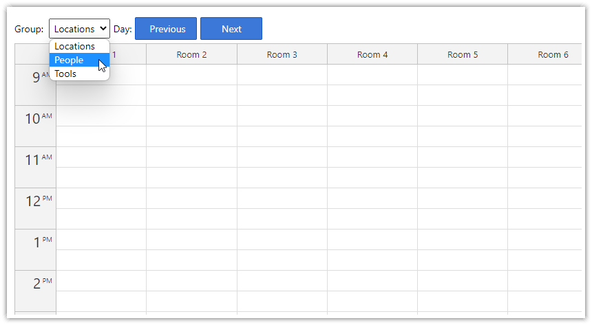
To switch between different resource groups, we will create a ResourceGroups React component that displays a drop-down list with all available groups.
import React, {Component} from 'react';

export class ResourceGroups extends Component {

  constructor(props) {
    super(props);
    this.selectRef = React.createRef();
  }

  find(id) {
    if (!this.props.items) {
      return null;
    }
    return this.props.items.find(item => item.id === id);
  }

  componentDidMount() {
    if (this.props.items && this.props.items.length > 0) {
      setTimeout(() => this.doOnChange(this.props.items[0]), 0);
    }
  }

  render() {
    return (
      <span>
        Group:
        <select onChange={ev => this.change(ev)} ref={this.selectRef}>
          {this.props.items.map(item => <option key={item.id} value={item.id}>{item.name}</option>)}
        </select>
      </span>
    );
  }

  change(ev) {
    const value = ev.target.value;
    const item = this.find(value);
    this.doOnChange(item);
  }

  doOnChange(location) {
    const args = { selected: location };
    if (this.props.onChange) {
      this.props.onChange(args);
    }
  }

  get selectedValue() {
    return this.selectRef.current.value;
  }

}
Now we can add the drop-down component to Calendar.js (just above the resource calendar):
<ResourceGroups onChange={args => this.groupChanged(args.selected)} items={this.loadGroups()}></ResourceGroups>
You can see that the ResourceGroups component reads the data from the items prop and fires onChange event when the selection changes.
The loadGroups() method returns the list of groups. Each group stores its members in the resources property:
loadGroups() {
    const data = [
      { name: "Locations", id: "locations", resources: [
          {name: "Room 1", id: "R1"},
          {name: "Room 2", id: "R2"},
          {name: "Room 3", id: "R3"},
          {name: "Room 4", id: "R4"},
          {name: "Room 5", id: "R5"},
          {name: "Room 6", id: "R6"},
          {name: "Room 7", id: "R7"},
        ]
      },
      { name: "People", id: "people", resources: [
          {name: "Person 1", id: "P1"},
          {name: "Person 2", id: "P2"},
          {name: "Person 3", id: "P3"},
          {name: "Person 4", id: "P4"},
          {name: "Person 5", id: "P5"},
          {name: "Person 6", id: "P6"},
          {name: "Person 7", id: "P7"},
        ]
      },
      { name: "Tools", id: "tools", resources: [
          {name: "Tool 1", id: "T1"},
          {name: "Tool 2", id: "T2"},
          {name: "Tool 3", id: "T3"},
          {name: "Tool 4", id: "T4"},
          {name: "Tool 5", id: "T5"},
          {name: "Tool 6", id: "T6"},
          {name: "Tool 7", id: "T7"},
        ]
      },
    ];
    return data;
}
The groupChanged() method loads resources and events for the selected groups:
groupChanged(group) {

  const columns = group.resources;

  const events = [
    {
      id: 1,
      text: "Event 1",
      start: "2022-11-07T10:30:00",
      end: "2022-11-07T13:00:00",
      barColor: "#fcb711",
      resource: "R1"
    },
    // ...
  ];

  this.calendar.update({columns, events});

}
For the sake of simplicity, this method uses a static array of events (instead of loading them using an HTTP call from a server) and doesn’t filter them (it includes events for resources that are not visible at the moment).
How to Change the Resource Calendar Date
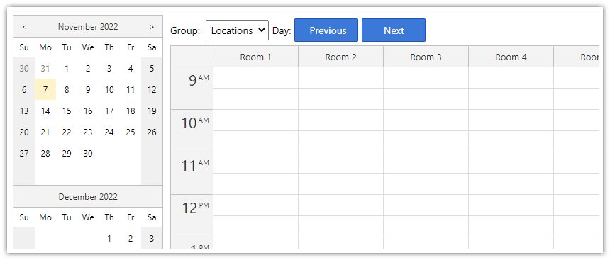
The user interface of this React application provides two ways to change the date:
A date picker displayed on the left side shows a small calendar with 3 months.
“Next” and “Previous” buttons displayed above the calendar.
To show the date picker, use the Navigator component (<DayPilotNavigator> tag):
<DayPilotNavigator
  selectMode={"Day"}
  showMonths={3}
  skipMonths={3}
  onTimeRangeSelected={ args => {
    this.calendar.update({
      startDate: args.day
    });
  }}
  ref={this.datePickerRef}
/>
The Navigator fires onTimeRangeSelected event when the selected date changes. Here, the event handler updates the startDate property of the resource calendar using update() method.
Note that we store the date picker component reference to this.datePickerRef using ref={this.datePickerRef}:
constructor(props) {
  // ...

  this.datePickerRef = React.createRef();

  // ...
}
Now we can access the Navigator methods using the datePicker getter:
get datePicker() {
  return this.datePickerRef.current.control;
}
If you need to set the initial date selection to something different than today (which is the default value), you can use the select() method of the DayPilot.Navigator class:
componentDidMount() {
  this.datePicker.select("2022-11-07");
}
The “Next” and “Previous” buttons use the onClick event to change the date:
<button onClick={ev => this.previous()}>Previous</button>
<button onClick={ev => this.next()}>Next</button>
The previous() method selects a new date using the select() method. This updates the date picker and fires the onTimeRangeSelected event which updates the resource calendar view.
previous() {
  const current = this.datePicker.selectionDay;
  const updated = current.addDays(-1);
  this.datePicker.select(updated);
}
The next() method is very similar but it adds one day instead of subtracting it:
next() {
  const current = this.datePicker.selectionDay;
  const updated = current.addDays(1);
  this.datePicker.select(updated);
}
Recommend
About Joyk
Aggregate valuable and interesting links.
Joyk means Joy of geeK