

How To Design a Date Picker in UI Design Shine
source link: https://www.uxpin.com/studio/blog/date-picker-ui-design/
Go to the source link to view the article. You can view the picture content, updated content and better typesetting reading experience. If the link is broken, please click the button below to view the snapshot at that time.

How to Design a Date Picker that Makes Your UI Design Shine

Date pickers are some of the most familiar UI patterns in digital product design. UX designers use date pickers on websites, applications, games, enterprise software, operating systems, and more.
Designers must understand how these date pickers will work across screen sizes, operating systems, devices, etc., to test the impact on the product’s aesthetics, functionality, and overall user experience.
UX designers can’t build date pickers using traditional image-based design tools…but they can with UXPin Merge!
Build fully functioning date pickers and other complex UI components with the world’s most advanced code-based design technology. Sign up for a free trial to try Merge and other advanced UXPin features.
What is a Date Picker?
Date pickers are UI patterns that allow users to choose a specific date, time, or combination of both–for example, selecting a date of birth. The purpose of these date pickers is to streamline date capture while ensuring format consistency.
Why are Date Pickers Necessary?
People worldwide use different date formats. For example, the United States places the month before the day (mm/dd/yyyy), whereas the UK uses the day, month, year format.
Although these differences seem subtle, a database cannot distinguish whether the user uses the US or UK format. It can only decipher a date correctly in one or the other format. Let’s look at October 1, 2022, numerically:
- US: 10/01/2022 (10 January 2022 in the UK)
- UK: 01/10/2022 (January 10, 2022, in the US)
In this example, the database would interpret each entry as January rather than October.
Users can also enter this same date multiple ways and use different separators. Here are a few examples:
- Oct 1, 2022
- Oct 1, 22
- 1 Oct 2022
- 1 Oct 22
- 10-01-22 / 01.01.2022 / 10/01/22
- 22/10/01 / 2022/10/01
Date pickers eliminate ambiguity and ensure systems receive a consistent, accurate format by users selecting the day, month, and year individually.
Date Picker UI Design for Mobile vs. Desktop
1. Mobile Date Picker
It’s important for designers to recognize how mobile operating systems like iOS and Android display date pickers to users. The native iOS picker uses an infinite scroll UI, while Android applications use a calendar view displaying the entire month.
A mobile date picker aims to make it accessible to a user’s thumb reach. iOS allows users to scroll using their thumb, while Android’s UI is optimized for thumb taps.
While you can use a custom date picker from your design system, using the native options creates familiarity and reduces the product’s learning curve. If you decide to use native date pickers for mobile apps, make sure you’re not creating usability issues, as we pointed out with iOS.
2. Desktop Date Picker
Most desktop websites and applications use calendar date pickers. The extra space and mouse make it easy for users to choose a date with just a few clicks. Many products also provide an input field for users to enter a date manually.
Numerical date input fields work well on desktops too. UX designers must include a placeholder and helpful error messages to guide users toward the correct format.
5 Types of Date Picker Design
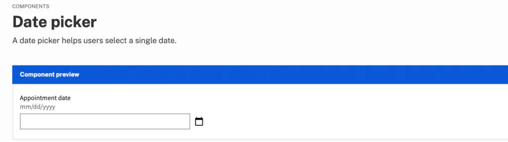
1. Numerical Input Field
The most basic date picker is a numerical input or text input field. These fields might include a modal popup with a date picker, or users must type out the date with separators.
Some products offer users the option to type the date or use a modal, like this example from US Web Design Systems.
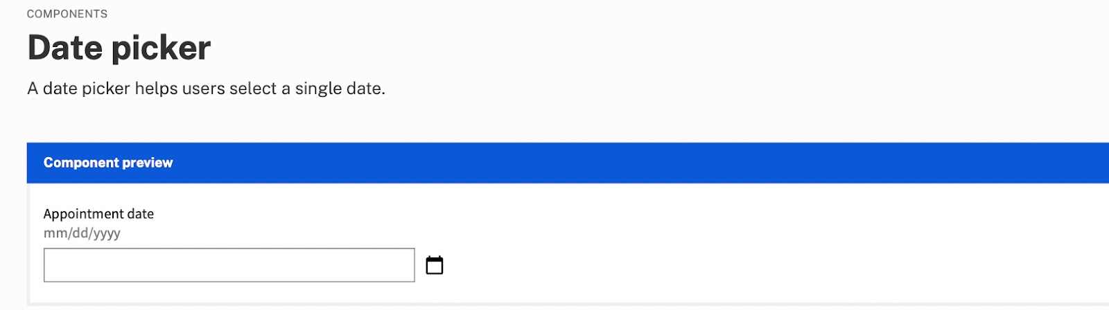
Placeholders must show users how to format the date, i.e., MM/DD/YYYY. UX designers can take this further by applying an auto-format for the date where separators appear as users complete the month and day. Designers can also add helper text below, so users know how to complete the form. See the example.
2. Dropdown Date Selector
Designers commonly use dropdown date-selectors for websites and desktop applications. These date pickers work well with a mouse, but with little space between options, they might be challenging for mobile device users, especially those with large fingers and thumbs.
Dropdown selectors take up more space than a single input field with a calendar modal. And they’re more time-consuming to complete because users have to select the day, month, and year individually.
Dropdown selectors are best for desktop applications and websites but might create bottlenecks for onboarding forms.
3. Scrolling Date Pickers
Scrolling date pickers work similarly to dropdowns as users choose a day, month, and year separately. These scrollers are most useful on mobile devices where users can use their thumbs to scroll to a day, month, and year.
Many users complain that scrolling date pickers are not suitable for dates far in the future or past. Scrolling through decades takes time and can be challenging for users, especially those with hand or finger disabilities.
The iOS default date picker is the most common example of a scrolling date picker; however, Apple often uses a calendar picker for dates far in the past or future.
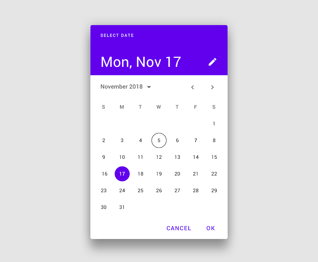
4. Calendar Date Picker
Calendar UIs are the most commonly used date pickers. These calendar date pickers work well across operating systems, devices, and screen sizes.
As people are used to seeing calendars in physical and digital formats, these date pickers create familiarity for users, reducing cognitive load and the product’s learning curve.
Calendar UIs are especially helpful for date range pickers, allowing users to visualize their choice and make quick adjustments.
5. Timeline Pickers
Timeline pickers work well for selecting a short date range (up to a week) or timeframe (a few hours). Timeline UIs are especially useful on mobile devices because users can drag indicators to choose a start and end date.
While you can use timeline pickers for dates, they’re best suited for selecting a time window.
Date Picker Best Practices
Date Picker Accessibility
Poorly designed date pickers can be frustrating for users with disabilities and screen readers. Keeping things simple is crucial to ensure date selection is accessible to all users.
Here are some recommendations for making date pickers accessible:
- Use explicit labels for your date fields. For example, if someone is booking an appointment, label the field Appointment Date or Choose an Appointment Date so screen readers and users with cognitive disabilities know what date you need.
- Include format hints in the placeholder and above or below the input field. This validation makes date pickets more accessible while benefiting all users with clear instructions.
- Users must be able to use a date picker using touch, a mouse, screen readers, and a keyboard. UX designers must test date pickers to ensure all users and devices can interact with the UI and choose a date effortlessly.
- Separating day, month, and year fields make it easy for screen readers and keyboard users to enter dates. UX designers can also include a button or calendar icon for users to complete their selection using a calendar, a win-win for all users. (See this date picker example from USWDS).
Date picker accessibility resources:
Show Current Date
It is important to show users the current date and their selection on calendar pickers. Highlighting the current date gives users a reference for their choice, which is especially important for booking travel and appointments.
Differentiating between the current date and the user’s selection is crucial to avoid confusion. Material UI clarifies this distinction with an outline for the current date and a shaded background for the selected date.
Block Unavailable Dates
Choosing a date only to find it’s unavailable is one of the most frustrating user experiences. Users have to start their selection over and try until they find availability. Blocking out unavailable dates allows users to choose without returning to the calendar.
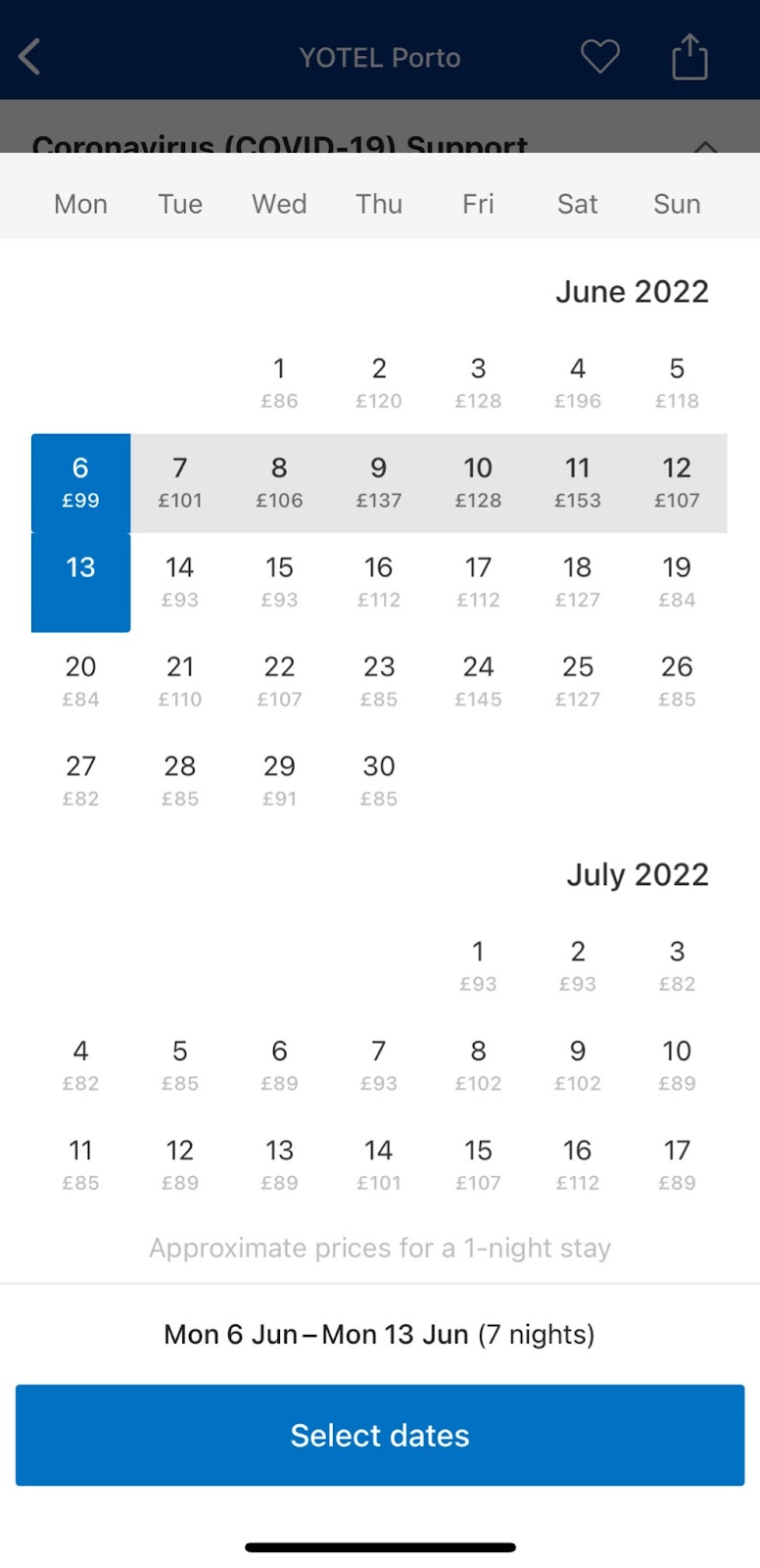
Provide Additional Critical Decision-Making Data
Many travel booking apps, including Booking.com and Airbnb, show the price per night below each date so users can find the best rates. This information creates a positive user experience because the product helps users save money.
Reduce Unnecessary Data
Calendar user interfaces can be busy and overwhelming. Designers must reduce as many UI elements, lines, and other content to make the calendar easier to read and complete tasks. For example, users don’t need to see the days of the week when choosing their date of birth.
UX designers must also use solid backgrounds for modal overlays to block out content behind the calendar, which may confuse users.
Building Date Picker Prototypes With UXPin Merge
UXPin Merge allows you to sync a design system or component library with UXPin’s design editor so designers can use the same components as engineers to build fully functioning prototypes.
One of the most significant benefits of using Merge’s code-based technology is the ability for designers to build prototypes that are impossible to do using popular image-based design tools.
No image-based tool is capable of building a functioning date picker without a multitude of frames and lots of imagination. No matter how advanced your design skills are, these static pickers don’t accurately replicate code’s fidelity and functionality.
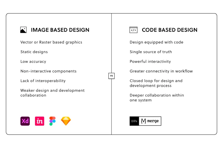
With Merge, UX designers can use a date picker component from a design system to build a fully functioning prototype. Users no longer have to imagine picking a date because code components have the same functionality in UXPin as they do in the repository.
Merge is also great for other complex components you can’t recreate in image-based design tools, like tables, graphs, data grids, charts, etc.
Design, prototype, test, and release amazing product experiences your customers will love with UXPin Merge. Request access today.
Recommend
About Joyk
Aggregate valuable and interesting links.
Joyk means Joy of geeK