

Building Workbench. How we created the Timeline component | by Josh Cusick | Gus...
source link: https://medium.com/gusto-design/building-workbench-b7b6a232508b
Go to the source link to view the article. You can view the picture content, updated content and better typesetting reading experience. If the link is broken, please click the button below to view the snapshot at that time.

Building Workbench
How we created the Timeline component
Thanks to Jordan, Eric, Daniel, Lise, Juliann, and Amy for the help with this article.
The Design Systems team at Gusto has been working hard over the past three years to provide designers and engineers with a robust, extensive, and accessible design system called Workbench. But it wasn’t always this way.
A few years back there was a grassroots effort to deliver a more cohesive experience at scale in Gusto’s product. This manifested a component library that lived inside of Storybook.
The library was created to centralize existing components built for specific business needs and scenarios but it came with some tradeoffs. Components were shipped faster but were less modular and compositional. They solved immediate problems but were less flexible.
Gusto’s growth since the inception of our component library has introduced needs that its components cannot easily remedy.
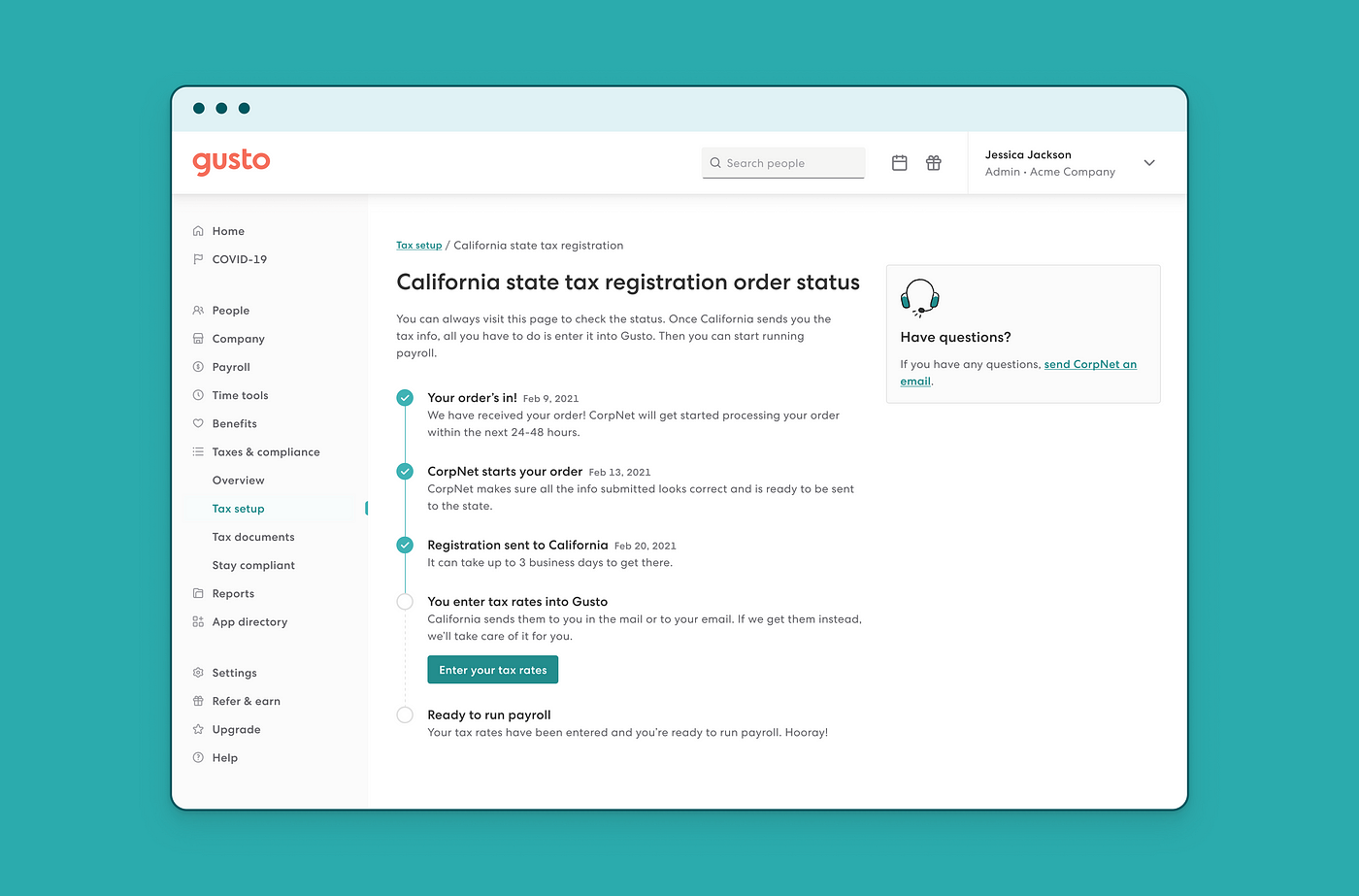
These needs are addressed by investigating, evaluating, and validating how a new Workbench component can solve our customers’ evolving use cases. One of the components that needed to be rebuilt was our <StepList /> component.

Building a component for a design system can be quite a tedious task. At Gusto, we follow a highly-collaborative, end-to-end component design process. This process continues to evolve, but for this component here are the steps:
- Project scoping
- Component research and auditing
- API/design explorations and reviews
- Accessibility research
- Design and engineering specs
- The Figma component build
- The React component build
- Usage guidelines and documentation
- Final checks and ship
This article covers how my team and I collaborated to build the <Timeline /> component which was born from <StepList />. I’d like to say a special thanks to Jordan Cutler (my engineering counterpart) and Juliann Wheeler (my manager) for working with me on this project.

Project scoping
The first phase of building a component requires that we understand as much of the problem as possible. The <StepList /> is basically an <ol> with <li>s. At Gusto, this component is commonly used to visualize the status of tasks.
Migrating a component from an old system to a new one provides a great opportunity to redesign that component and refactor its code.
We first need to understand any current or new use cases for said component. We solve this by auditing our app and conducting an exercise based on our customers and their needs.
Here are the findings from our exercise for <StepList />:
Customer journey and scenarios
When will the customer interact with this component?
- On the app’s landing page.
- Setting expectations within a new feature or process in the product.
Goals
What is the customer trying to accomplish with this component?
- They want to see how many steps they need to finish a task.
- They want to track the progress of a task and report it to someone.
- They want to know how long a task will take.
- They want to know if a step is required or optional.
- They want to know the status of individual steps.
- They want to know if they can assign a step to someone.
- They want to be notified by Gusto when a step is completed either in-app or out-of-app.
- They want to notify the admin of their organization of the status of individual steps.
Motivations
What is motivating the customer to use this component?
- They need to complete a task.
- They want to get paid or pay employees.
- They want to be in compliance with state and federal law and Gusto.
Mindset
What headspace is the customer in while using this component?
- They might feel overwhelmed with new information.
- They might feel confident when they see all the steps laid out in front of them.
- They might feel unsure that they have all the necessary documents or information to complete the steps.
This part is especially important because when a customer is stressed or overwhelmed, they may have trouble processing a lot of information. We need to simplify potentially stressful experiences as much as possible, while still ensuring we cover all use cases.
Research and auditing
At this point, we had a good understanding of what problems this component could solve. I next turned outwards to see how other design systems are building similar components.
I always want to ensure that we follow the best practices and build something ergonomic and familiar to designers and engineers. I do this by auditing around a dozen similar components’ APIs. This helps me to make recommendations and design decisions.
The term API is an acronym, and it stands for “application programming interface.”
“Think of an API like a menu in a restaurant. The menu provides a list of dishes you can order, along with a description of each dish. When you specify what menu items you want, the restaurant’s kitchen does the work and provides you with some finished dishes. You don’t know exactly how the restaurant prepares that food, and you don’t really need to.”
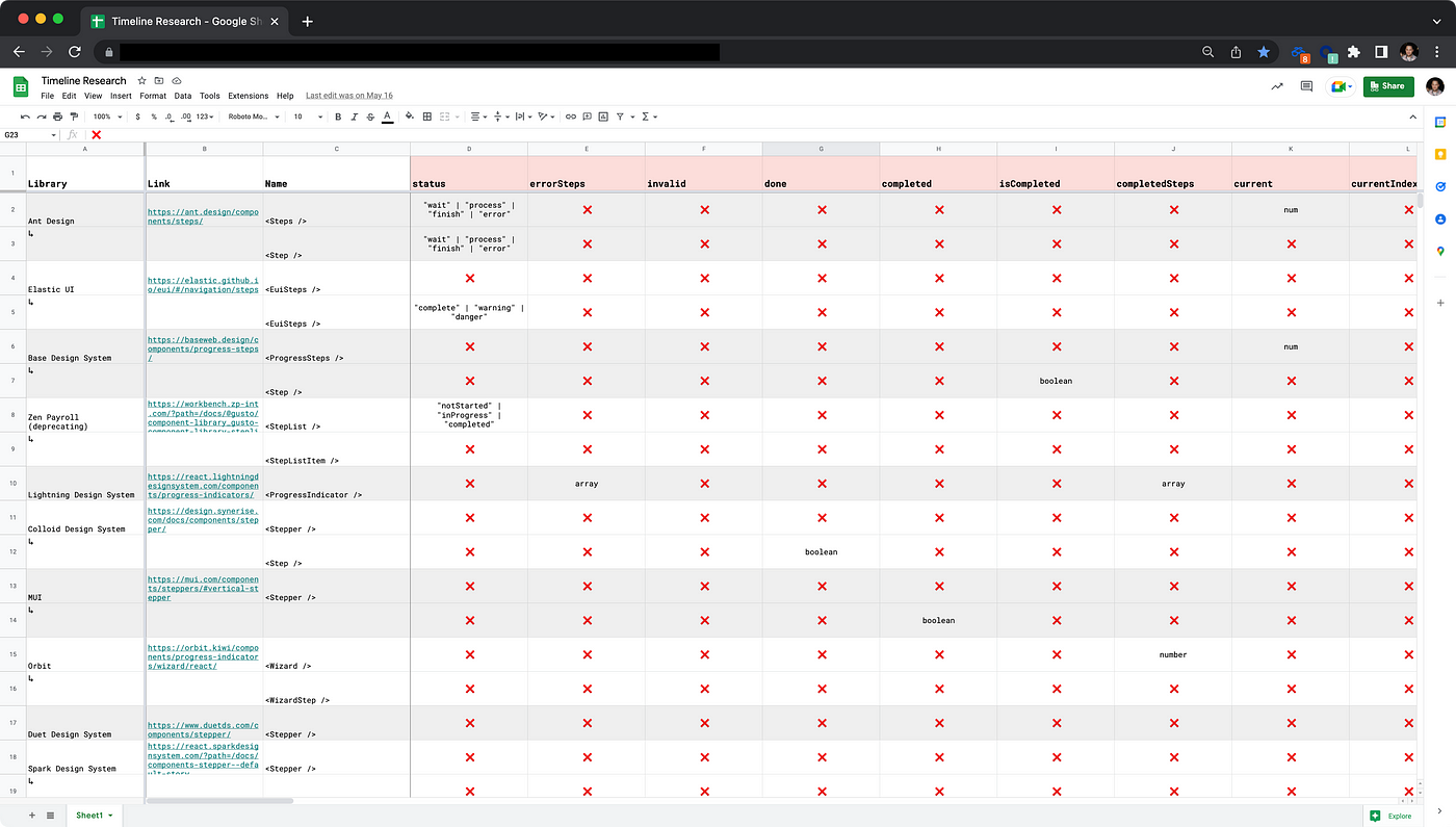
Here are the APIs I looked at with Jordan:
I also included our old <StepList /> component and Jordan and I found a few accessibility issues to address.
After my audit was complete, I felt confident about what to propose for the component’s features. I also realized that we should probably call our component <Timeline /> and its children <TimelineStep /> s versus <StepList /> and <Step />. Normally I like to use a more common name, but our use cases heavily influenced the name change since time was a prominent factor in this component.
API/design explorations and reviews
This step is where the real fun begins. At this stage, we know where and how this component will be used, and how other design systems have built similar components.
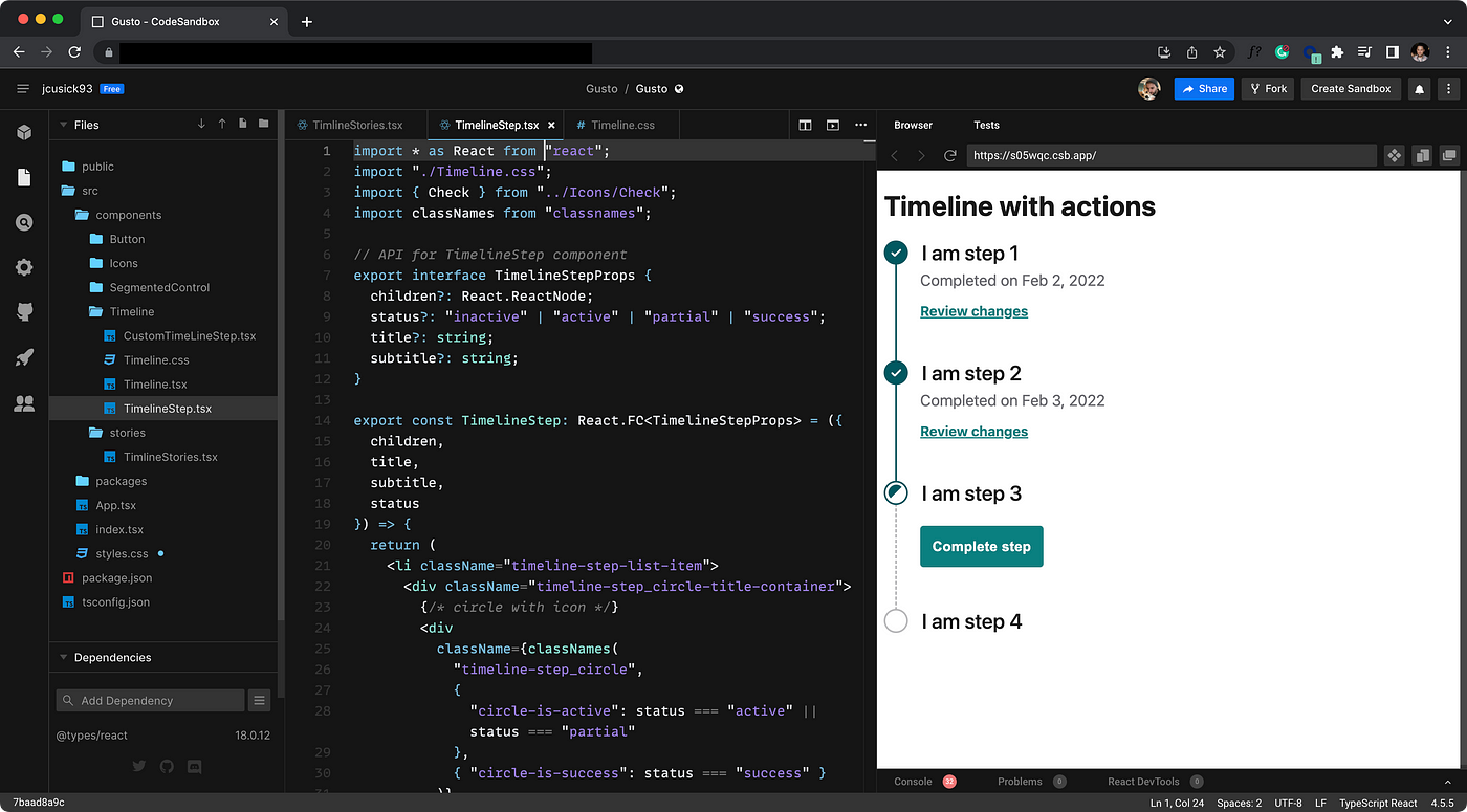
Loaded with all this information, I started some design explorations in Figma and eventually built a prototype in CodeSandbox.
Some designers like to build prototypes in Figma or a similar tool, but I prefer to code where possible. This helps me to better understand any technical constraints and continue to grow my technical skillset.
Along with my prototype, I leaned on Jordan’s expertise to flesh out the API and code.
The initial API (in TypeScript) looked something like this:
interface TimelineStepProps {
   children?: React.ReactNode;
   status?: "inactive" | "active" | "partial" | "success";
   title?: string;
   subtitle?: string;
}
We use the composition model when it comes to constructing our components, leaving control up to the consumers. This results in minimal enforcement of our components and heavy reliance on guidance in our documentation. It also minimizes the number of props on the component.
So the above API (in TypeScipt) turned into:
interface TimelineStepProps {
   children?: React.ReactNode;
   status?: "inactive" | "active" | "partial" | "success"
   ̶t̶i̶t̶l̶e̶?̶:̶ ̶s̶t̶r̶i̶n̶g̶;̶
   s̶u̶b̶t̶i̶t̶l̶e̶?̶:̶ ̶s̶t̶r̶i̶n̶g̶;̶
}
There really was no need to define title or subtile properties since we have a <Heading /> component that gives our consumers the flexibility to define the heading level with a level prop and font-size with a typePreset prop. This means that instead of constructing our <TimelineStep /> like this:
<li>
  <h3>
    <div>{title}</div>
    <div>{subtitle}</div>
  </h3>
  {children}
</li>
we’d construct it like this:
<li>
  {children}
</li>
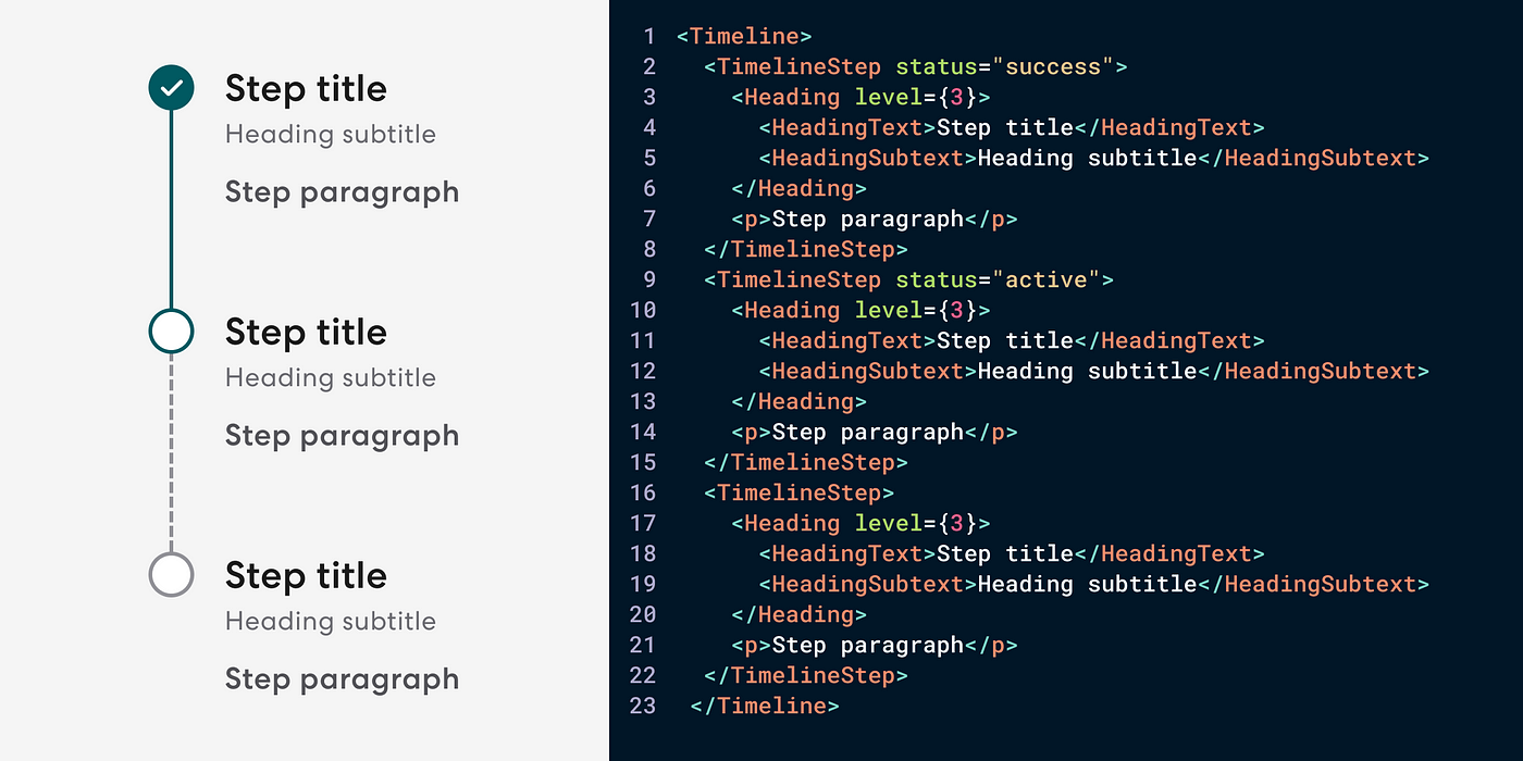
and our consumers could compose like this:
<TimelineStep>
  <Heading level={3}>
    <HeadingText>Step title</HeadingText>
    <HeadingSubtext>Step subtitle</HeadingSubtext>
  </Heading>
  {/* additional content goes here */}
</TimelineStep>
Again, less restrictive and more flexible.
Once I had some artifacts to show, I did a few reviews with product designers that I knew were going to use this component. They provided great feedback and context for us to leverage.
Accessibility research
If you want your digital experiences to be accessible, you have to do the work to produce accessible components.
Accessibility is always at the forefront when creating components. But we really dig deep while building and writing documentation. We lean heavily on W3C when making design and engineering decisions for our components. We also do accessibility testing including using screen readers on our components before shipping them.
Here are some of the accessibility considerations for <Timeline />:
- The icon and its background meet the minimum requirements of a 3:1 contrast ratio for non-text content.
- It is not recommended to skip steps or move in a non-linear direction. Each step’s
statusshould be set tosuccessbefore moving to the next step. - An
h2is recommended to describe what task the Timeline is outlining. - The Timeline implements an
<ol>and the Timeline Step implements an<li>. - This component uses
visuallyHiddentext (and notaria-current) to announce to the screen reader the status of the step. - Wrap dates and times in a
<time>element with an appropriatedatetime.
Curious about our sources? Take a peek:
Design and engineering specs
After a few feedback loops and reviews with product designers and my team, I created a design spec. This document contains a component blueprint and best practices. The design spec is the handoff artifact that I provide our engineers. They use it to build the component and populate our documentation site.
Working through this documentation helps us to flush out all the details and semantics before the final build. The design spec covers:
- Anatomy and component blueprint (sizing, padding, margins, etc.)
- Design tokens
- Best practices and examples
- Customer problems the component should solve
Alongside my design spec, Jordan built out his engineering spec. The eng spec covers:
- Semantic tags
- DOM (Document Object Modal)
- Slots and composable areas
- Auxiliary components and props
- How might an engineer might use it
- Known use cases
- CSS considerations
- Accessibility factors
- Interactivity
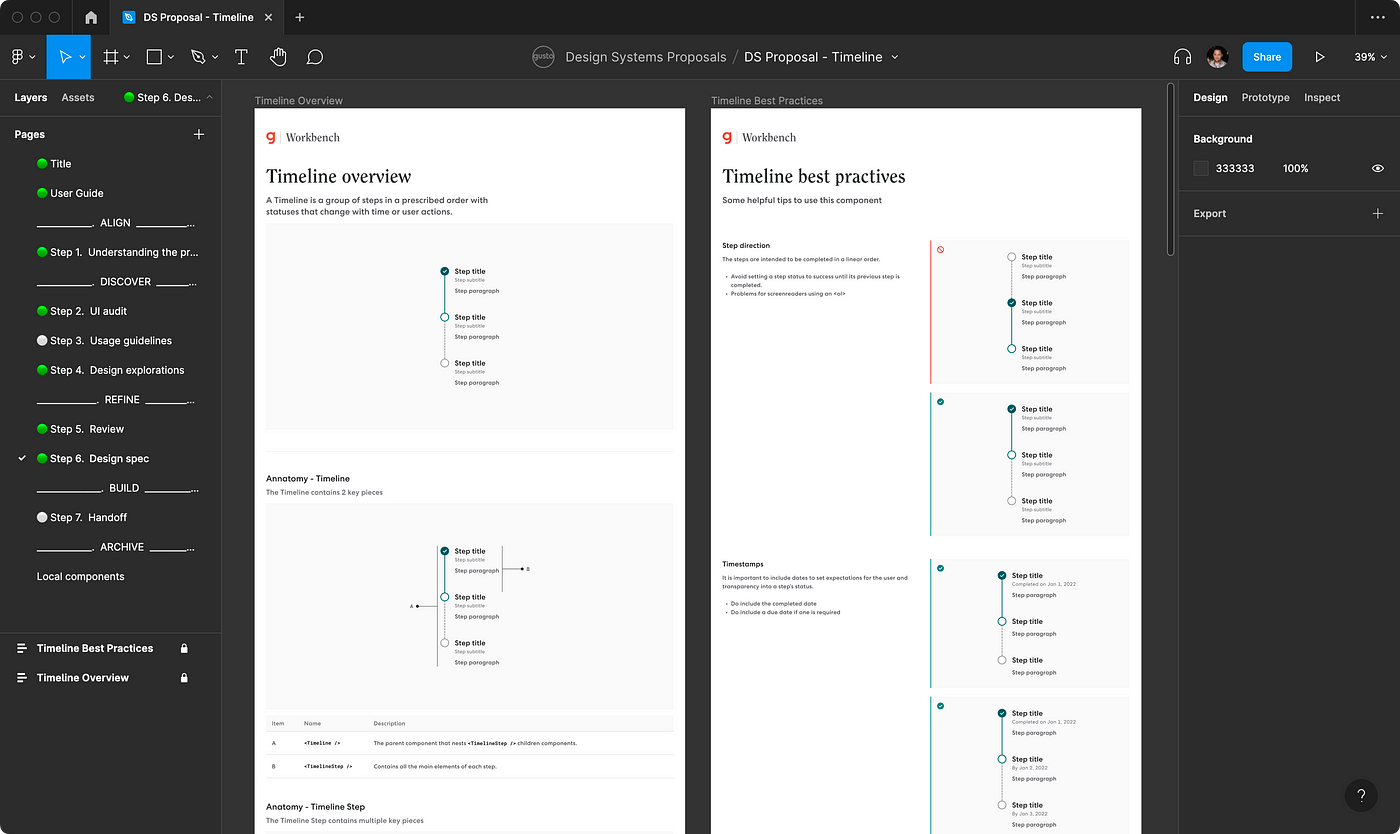
The Figma component build
We now are ready to construct our component. Jordan went to work on his final build in React and I built the component inside of Figma.
As I mentioned earlier, we like to leverage composition with our components, but we are more opinionated regarding our Figma components. We do this for ease of use, convenience, and guidance.
To be more designer-centric in Figma, we opt to use title casing for our component and prop names, separate compound words, and omit brackets. So in code, we would write <Timeline /> and <TimelineStep />and in Figma, we’d just write Timeline and Timeline Step.
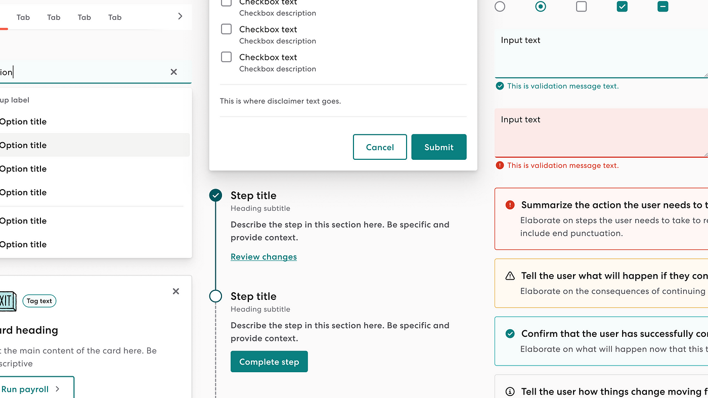
Let’s review Timelineand Timeline Step inside of Figma:
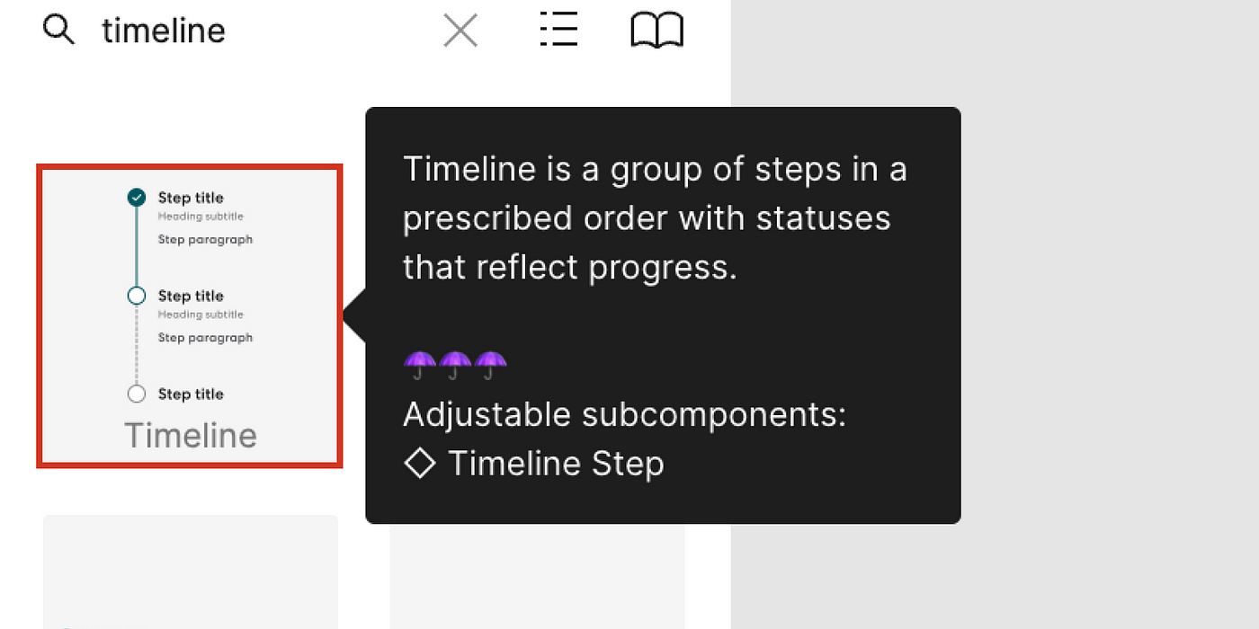
Out-of-the-box, Timeline handles some logic and lets the user define a step count from 3 to 10.

In the image below, the left side is what Timeline looks like once dragged onto a designer’s canvas in Figma, and on the right is how an engineer might compose it in code.
If a designer needs more than 10 or less than 3 steps (which is not recommended) — they can import the Timeline Step component and compose their own Timeline.
The Timeline Step in Figma is quite a bit more configurable than Timeline. I try to anticipate all the common use cases for a component and enforce guidance through props.
Let’s break down the API:
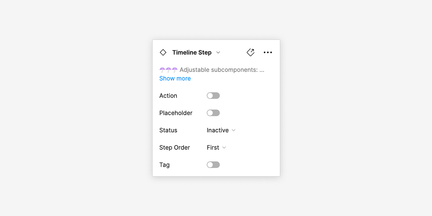
The Action prop
I always sort the props in Figma from A-Z. So let’s start with Action.
The Action prop is a boolean that adds either a Button or a Link depending on what the Status is defined as.

To maintain our action hierarchy, we only recommend rendering a single primary button in Timeline at a time. Designers don’t have to worry about which style to select since the type of action will change for them in Figma when they configure the Status prop.

If Action is true and:
- If
Status="Inactive"then noButtonorLinkis rendered. - Or if
Status="Active"then a primaryButtonis rendered. - Or if
Status="Partial"then a primaryButtonis rendered. - Or if
Status="Success"then aLinkis rendered.
Keep in mind, in code, these actions would either be links styled as buttons or vice versa depending on if the user is completing something on the page or being taken to a new page.
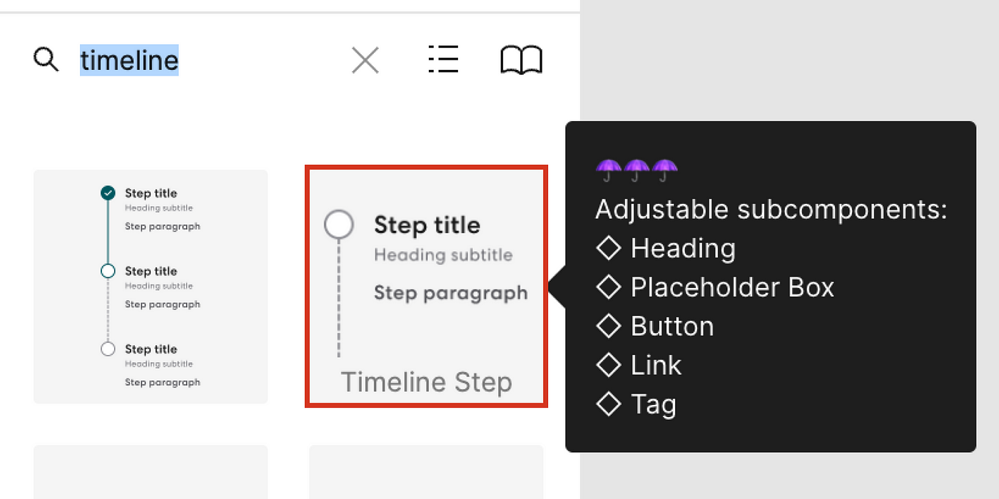
The Placeholder prop
My workaround for children in Figma is to pass in a prop called Placeholder which acts as a catch-all.

We don’t want designers to “break” components inside Figma. Doing so would result in not being in sync with the Design System and its updates. When Placeholder is true a component called Placeholder Box is rendered and all content is cleared except for the Headingcomponent. This allows designers to swap in a local component.

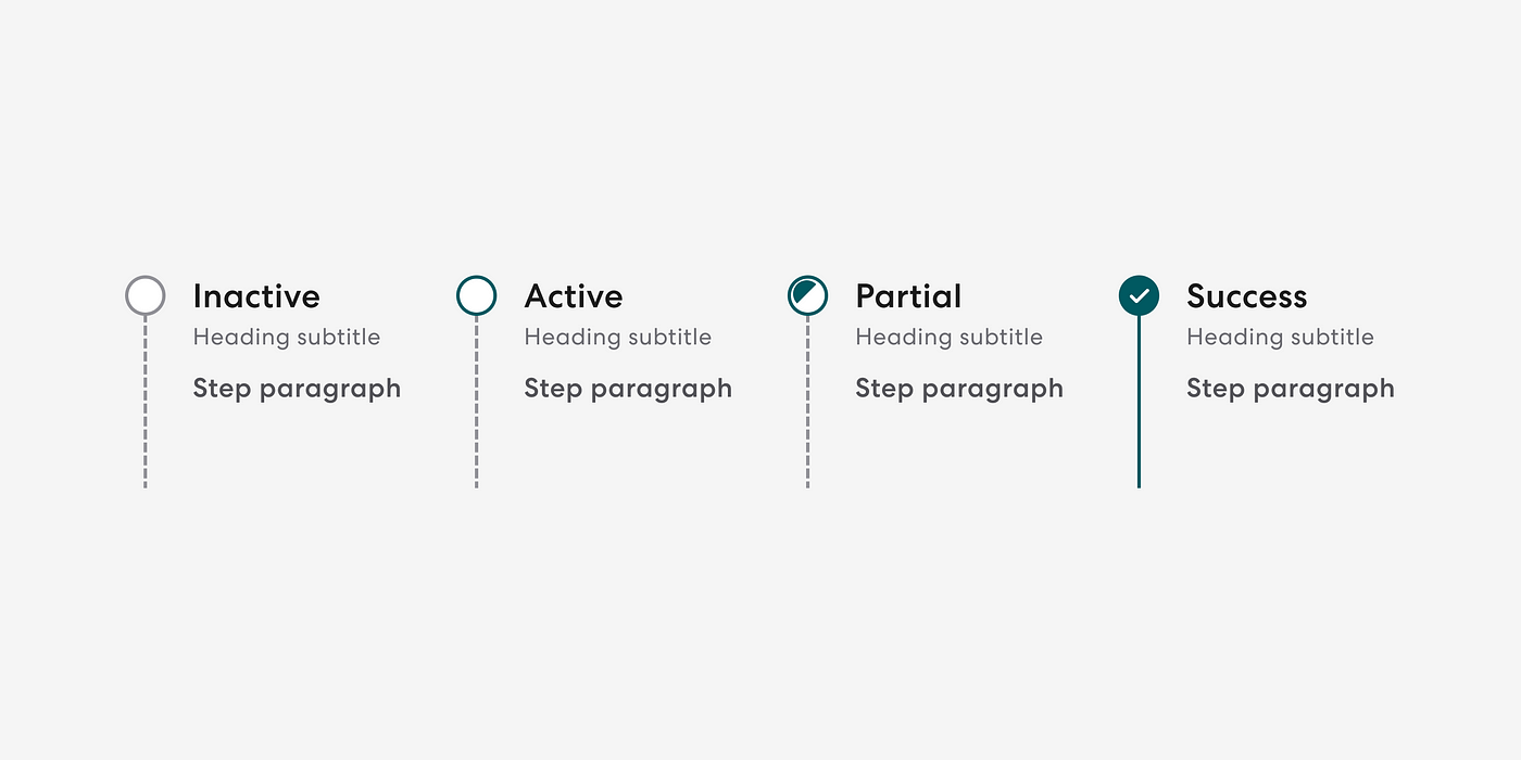
The Status prop
In addition to determining what type of action to render, the Status prop handles the styling of the circle and line next to the step’s content.
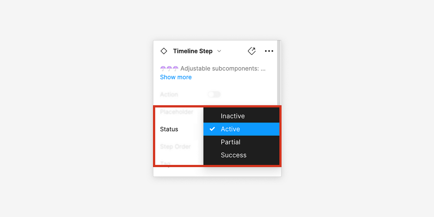
- If
Status="Inactive"theborder-colorof the circle is$salt-700, thebackground-colorof the circle is$salt-100, the line’sborder-styleisdashed, and the line’sborder-coloris$salt-700. - If
Status="Active"theborder-colorof the circle changes to$kale-800. - If
Status="Partial"a half circle with thebackground-colorof$kale-800is rendered inside of the circle and theborder-colorof the circle changes to$kale-800. - If
Status="Success"thebackground-colorof the circle changes to$kale-800, the line’sborder-stylechanges tosolid, the line’sborder-colorchanges to$kale-800and theCheckicon is rendered inside the circle with a color of$salt-100. If the step is the last step, there is no line.
The Step Order prop
The Step Order prop is only relevant in the edge cases where a designer needs more than 10 steps but less than 2. This prop handles the styling and conditional rendering of the line next to the step’s content.
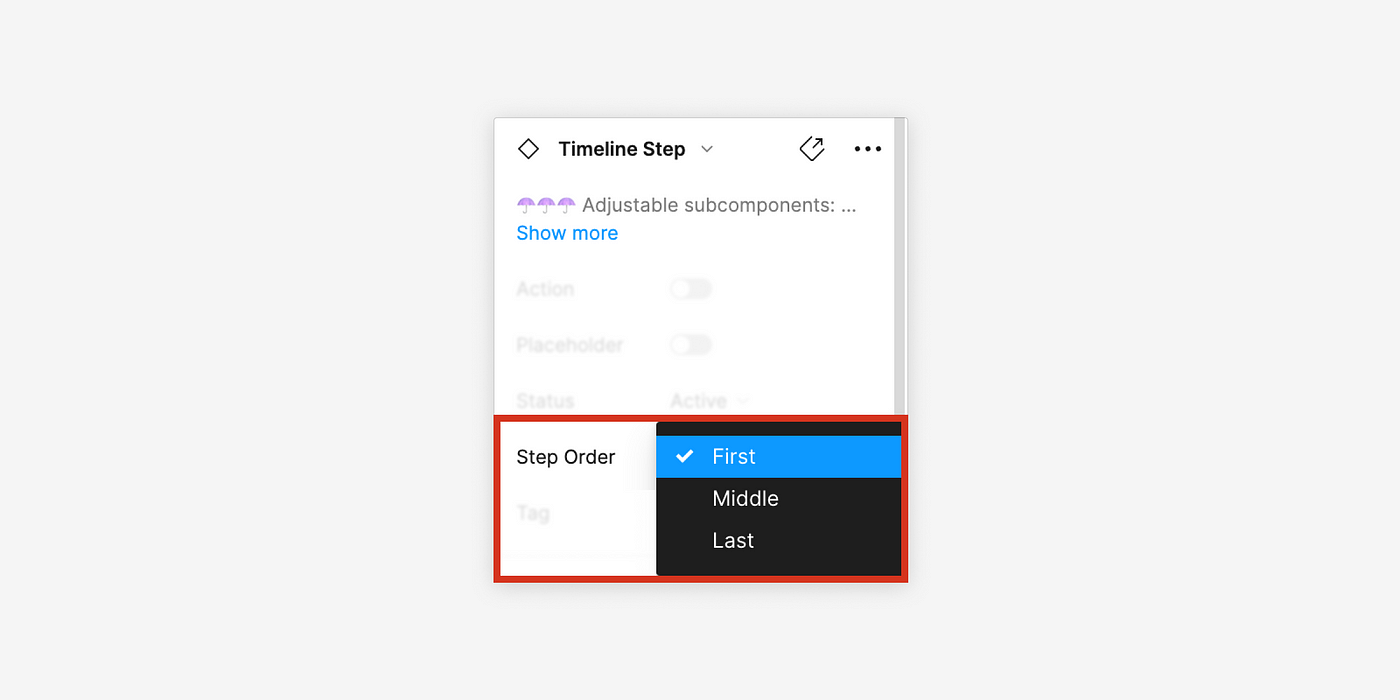
- If
Step Order="First"a line is only rendered below the circle - If
Step Order="Middle"a line is rendered both above and below the circle. - If
Step Order="Last"a line is only rendered above the circle and thepadding-bottomof the step’s content is set to0px.

In reality, we would not provide a prop for this case in code, rather, in our Timeline.css we could write something like:
/* hides line on last step */li:nth-last-child(1) .timeline-step_progress-line {
display: none;
}/* removes padding from bottom on last step */li:nth-last-child(1) .timeline-step_content {
padding-bottom: 0;
}
The Tag prop
The Tag prop is a boolean that adds a Tag.

The name of this prop initially came from our <CardHeader /> component where we have a predefined slot for a <Tag /> or multiple <Tag />s called tags. In code, we would pass <Tag /> or multiple <Tag />s to <CardHeader /> like:
<Card>
   <CardHeader
      illustration={<PalmTree />}
      tags={<Tag variant="filled">New</Tag>}
      <Heading level={3}>Location tools</Heading>
   </CardHeader>
   <CardBody>
      {...}
   </CardBody>
   <CardFooter>
      {...}
   </CardFooter>
</Card>
Which would render:

I only identified the need for a single Tag in Figma so I stuck with the name Tag for the prop.

In code, we’d simply pass a <Tag /> into the children slot, but it helps our designers to provide them with this option.
The React component build
The title of this step is a bit deceptive since prototyping is done earlier to determine how feasible the designs are. So, by this stage, Jordan had already built his own <Timeline /> prototype and he went to work on finalizing the build. In this final build, he ensured that:
- The API was consistent and aligned with developer expectations.
- The component met or exceeded WCAG 2.1 AA standards.
- Competitive research was leveraged.
Usage guidelines and final documentation
Our documentation aims to provide clear guidance on component usage, accessibility, and implementation. We combine the design and engineering specs as well as add on some additional context such as accessibility notes and resources. Once we are confident with a working draft, we share out with the broader design systems team for review. After collecting feedback and making changes, our documentation is ready.

Final checks and shipping
Before we ship the component in Figma and code, we perform final checks.
Inside of Figma, we check for:
- Consistent layer names
- Consistent prop names and prop orders
- Typos
- Variant testing
- Propper layout
- Responsiveness
- Common use cases
- Customization
The lead engineer on the component will perform extensive accessibility and performance testing including:
Depending on the component some of the following may not apply.
- Screenreader testing across browsers.
- Responsiveness and reflow testing across browsers.
- Checking and confirming the accessibility attributes such as the name, description, and
role. - Creating examples of how a consumer would consume the component.
- Testing any animations, and creating interactive examples.
- Checking the different variation combinations. Testing the happy, unhappy, and very happy paths.
- If the component is using a
flexorgridlayout ensuring it behaves appropriately when scaling. - Testing different types of content and the content overflow.
- Testing error states.
- Testing mouse and keyboard interactions e.g. hover, focus, disabled, etc.
- Testing on a mobile device e.g iPhone or Android.
- Testing voice control.
Ready to ship
Now that we have our Figma component, coded component, and documentation, we release. It’s important to let our designers and engineers know when new components are available, so we will publish this news in a Slack channel, inside of the Figma release notes, and in our newsletter.

Final thoughts
If you have made it this far in the article, thank you! We appreciate you taking the time to learn about our work. While we have a well-defined process, we know that we can always improve and are ever-evolving.
Stay tuned for updates by following this publication on Medium and show your support by clicking the 👏 “clap” button and leaving a comment!
Sources
- Ferdinandi, C. (2020, July 21). Revisiting aria-label versus a visually hidden class. Go Make Things. Retrieved July 7, 2022, from https://gomakethings.com/revisting-aria-label-versus-a-visually-hidden-class/
- Hoffman, C., & Duino, J. (2021, August 12). What is an API, and how do developers use them? What Is an API, and How Do Developers Use Them? Retrieved July 7, 2022, from https://www.howtogeek.com/343877/what-is-an-api/
- Meta Platforms, Inc. (n.d.). Composition vs inheritance. React. Retrieved July 7, 2022, from https://reactjs.org/docs/composition-vs-inheritance.html
- Perrier, J.-Y., et al. (2022, May 20). CSS Grid Layout — CSS: Cascading Style Sheets: MDN. CSS: Cascading Style Sheets | MDN. Retrieved July 11, 2022, from https://developer.mozilla.org/en-US/docs/Web/CSS/CSS_Grid_Layout
- Perrier, J.-Y., et al. (2022, May 27). CSS flexible box layout — CSS: Cascading style sheets: MDN. CSS: Cascading Style Sheets | MDN. Retrieved July 11, 2022, from https://developer.mozilla.org/en-US/docs/Web/CSS/CSS_Flexible_Box_Layout
- Perrier, J.-Y., et al. (2022, May 27). Introduction to the DOM — web apis: MDN. Web APIs | MDN. Retrieved July 7, 2022, from https://developer.mozilla.org/en-US/docs/Web/API/Document_Object_Model/Introduction
- W3C. (n.d.). Accessible Rich Internet Applications (WAI-ARIA) 1.1. Web Accessibility Initiative (WAI). Retrieved July 7, 2022, from https://www.w3.org/TR/2017/REC-wai-aria-1.1-20171214/#aria-current
- W3C. (n.d.). H48: Using OL, UL and DL for lists or groups of links. Web Accessibility Initiative (WAI). Retrieved July 7, 2022, from https://www.w3.org/TR/WCAG20-TECHS/H48.html
- W3C. (n.d.). Labeling controls. Web Accessibility Initiative (WAI). Retrieved July 7, 2022, from https://www.w3.org/WAI/tutorials/forms/labels/#note-on-hiding-elements
- W3C. (n.d.). Understanding Success Criterion 1.3.2: Meaningful Sequence. Web Accessibility Initiative (WAI). Retrieved July 7, 2022, from https://www.w3.org/WAI/WCAG21/Understanding/meaningful-sequence
- W3C. (n.d.). Understanding Success Criterion 1.4.10: Reflow. Understanding success criterion 1.4.10: Reflow. Retrieved July 7, 2022, from https://www.w3.org/WAI/WCAG21/Understanding/reflow.html
- W3C. (n.d.). Understanding Success Criterion 1.4.11: Non-text Contrast. Web Accessibility Initiative (WAI). Retrieved July 7, 2022, from https://www.w3.org/WAI/WCAG21/Understanding/non-text-contrast.html
- W3C. (n.d.). Web content accessibility guidelines (WCAG) 2.1. W3C. Retrieved July 12, 2022, from https://www.w3.org/TR/WCAG21/
- WebAIM. (n.d.). CSS in Action Invisible Content Just for Screen Reader Users. WebAIM. Retrieved July 7, 2022, from https://webaim.org/techniques/css/invisiblecontent/
- Wilhelm, A. (2021, June 30). Gusto is now offering pieces of its service to other companies via API. TechCrunch. Retrieved July 11, 2022, from https://techcrunch.com/2021/06/30/2171608/
- Xue, F. (2022, March 4). : The (date) time element — HTML: Hypertext markup language: MDN. MDN Web Docs. Retrieved July 7, 2022, from https://developer.mozilla.org/en-US/docs/Web/HTML/Element/time
- YouTube. (2018). React already did that — Developer ergonomics in 2018 — Dylan Schiemann — JSConf Us 2018. YouTube. Retrieved July 7, 2022, from https://www.youtube.com/watch?v=lHRuIA7cyU0&t=489s.
Recommend
About Joyk
Aggregate valuable and interesting links.
Joyk means Joy of geeK