

HarmonyOS - 自定义组件之Stepper步进器-51CTO.COM
source link: https://os.51cto.com/article/713853.html
Go to the source link to view the article. You can view the picture content, updated content and better typesetting reading experience. If the link is broken, please click the button below to view the snapshot at that time.

HarmonyOS - 自定义组件之Stepper步进器-51CTO.COM

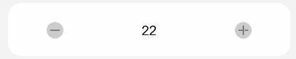
组件支持:步长、最大值、最小值、标题、当前值、精度,功能支持:增大、减小、禁用,在增大减小的同时,按钮高亮。
step.hml:
<div class="step-wrapper {{ disabled ? 'step-wrapper-disabled' : 'step-wrapper-not-disabled' }}">
  <div class="step-minus">
    <div class="icon">
      <div
        class="step-minus-icon {{ num <= min ? 'step-btn-disabled' : 'step-btn-not-disabled' }}"
        disabled="{{ disabled || num <= min }}"
        @click="minusHandle">
      </div>
    </div>
  </div>
  <div class="step-state">
    <div if="{{ ! disabled || ! title }}" class="step-num {{ title ? 'small-top' : 'big-top' }}">
      <text>
        {{ showNum }}
      </text>
    </div>
    <div if="{{ title }}" class="{{ disabled ? 'step-disabled-title' : 'step-title' }}">
      <text>
        <span>{{ title }}</span>
      </text>
    </div>
  </div>
  <div class="step-add">
    <div class="icon">
      <div
        class="step-add-icon {{ num >= max ? 'step-btn-disabled' : 'step-btn-not-disabled' }}"
        disabled="{{ disabled || num >= max }}"
        @click="addHandle">
      </div>
    </div>
  </div>
</div>
step.js:
export default {
  props: {
    disabled: {
      default: false
    },
    num: {
      default: 0
    },
    min: Number,
    max: Number,
    title: {
      default: ""
    },
    step: {
      default: 1
    },
    precision: {
      default: 0
    }
  },
  computed: {
    showNum() {
      let num = this.num
      return num.toFixed(this.precision);
    }
  },
  addHandle() {
    this.$emit("change", {
      num: this.num + this.step
    });
  },
  minusHandle() {
    this.$emit("change", {
      num: this.num - this.step
    });
  }
}
step.css:
.step-wrapper {
  width: 100%;
  height: 64px;
  margin: 12px;
  border-radius: 16px;
  background-color: #fff;
}
.step-wrapper-disabled {
  opacity: 0.4;
}
.step-wrapper-not-disabled {
  opacity: 1;
}
.step-minus, .step-add, .step-state {
  flex: 1;
}
.step-minus, .step-add {
  justify-content: center;
}
.icon {
  width: 100%;
  margin-top: 21px;
  justify-content: center;
}
.step-minus-icon, .step-add-icon, .step-minus-icon:active, .step-add-icon:active {
  width: 24px;
  height: 24px;
  background-position: center;
  background-repeat: no-repeat;
  background-size: cover;
}

.step-minus-icon {
  background-image: url("/common/images/ic_minus_disabled.png");
}
.step-add-icon {
  background-image: url("/common/images/ic_add_disabled.png");
}
.step-minus-icon:active {
  background-image: url("/common/images/ic_minus_active.png");
}
.step-add-icon:active {
  background-image: url("/common/images/ic_add_active.png");
}
.step-btn-disabled {
  opacity: 0.4;
}
.step-btn-not-disabled {
  opacity: 1;
}
.step-state {
  flex-direction: column;
  align-items: center;
}
.step-num {
  margin-bottom: 2px;
}
.small-top {
  margin-top: 13px;
}
.big-top {
  margin-top: 21px;
}
.step-num > text {
  font-size: 16px;
  height: 21px;
  line-height: 22px;
}
.step-title > text {
  height: 16px;
  font-size: 12px;
  line-height: 16px;
}
.step-num, .step-title {
  width: 100%;
  font-family: HarmonyHeiTi-, HarmonyHeiTi;
  font-weight: normal;
  color: #000000;
  justify-content: center;
}
.step-disabled-title {
  width: 100%;
  margin-top: 21px;
}
.step-disabled-title > text {
  width: 100%;
  text-align: center;
  height: 21px;
  font-size: 16px;
  line-height: 22px;
}
1、基本用法
<step num="{{ num }}" @change="stepChange"></step>
<step num="{{ num }}" disabled="{{ true }}" @change="stepChange"></step>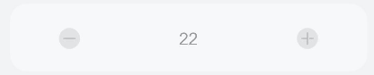
3、指定精度
<step num="{{ num }}" precision="{{ 2 }}" @change="stepChange"></step>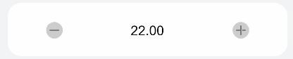
4、指定步长
步长需要搭配对应的精度来使用
<step num="{{ num }}" precision="{{ 2 }}" step="{{ 0.01 }}" @change="stepChange"></step>
5、指定最大值、最小值
<step num="{{ num }}" min="{{ 20 }}" max="{{ 26 }}" @change="stepChange"></step>
6、指定标题
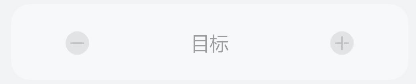
<step num="{{ num }}" title="{{ '目标' }}" @change="stepChange"></step>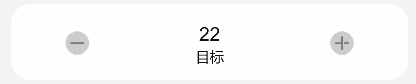
指定标题后的禁用状态。
Number | 组件显示的部分,和父组件进行关联 | ||
disabled | Boolean | false | 是否禁用,禁用的样式根据有无title属性进行了区分显示 |
Number | false | 计算的最小值 | |
Number | false | 计算的最大值 | |
title | String | false | 是否显示标题 |
Number | false | 指定计算的步长,需要搭配precision使用 | |
precision | Number | false | 指定数值的精度 |
change | 绑定值被改变时触发,通过e.detail来获取 |
- 动态绑定样式。
class="step-wrapper {{ disabled ? 'step-wrapper-disabled' : 'step-wrapper-not-disabled' }}"- 0.00在页面中显示为0。
这里尝试过num.toString()和num += ""转为字符串,无效,所以使用了toFixed()转为对应精度的字符串。
computed: {
    showNum() {
        let num = this.num
        return num.toFixed(this.precision);
    }
}
编写这个组件,简单用到了组件间通信、动态类名等,在这里列出官方API,以便后续查看。
Props
自定义组件可以通过props声明属性,父组件通过设置属性向子组件传递参数,props支持类型包括:String,Number,Boolean,Array,Object。camelCase (驼峰命名法) 的 prop 名,在外部父组件传递参数时需要使用 kebab-case (短横线分隔命名) 形式,即当属性compProp在父组件引用时需要转换为comp-prop。给自定义组件添加props,通过父组件向下传递参数的示例如下:
<!-- comp.hml -->
<div class="item">
  <text class="title-style">{{compProp}}</text>
</div>
// comp.js export default {   props: ['compProp'],}
<!-- xxx.hml -->
<element name='comp' src='../../common/component/comp/comp.hml'></element>
<div class="container">
  <comp comp-prop="{{title}}"></comp>
</div>说明:自定义属性命名时禁止以on、@、on:、grab: 等保留关键字为开头。
Props添加默认值
子组件可以通过固定值default设置默认值,当父组件没有设置该属性时,将使用其默认值。此情况下props属性必须为对象形式,不能用数组形式,示例如下:
comp.hml:
<div class="item">
    <text class="title-style">{{ title }}</text>
</div>
<!-- comp.jsexport default {   props: {    title: {      default: 'title',    },  },} -->
本示例中加入了一个text组件显示标题,标题的内容是一个自定义属性,显示用户设置的标题内容,当用户没有设置时显示默认值title。在引用该组件时添加该属性的设置:
xxx.hml:
<element name='comp' src='../../common/component/comp/comp.hml'></element>
<div class="container">
    <comp title="自定义组件"></comp>
</div>
1、Props子组件向上传递参数
comp.hml:
<div class="item">
  <text class="text-style" onclick="childClicked">点击这里查看隐藏文本</text>
  <text class="text-style" if="{{showObj}}">hello world</text>
</div>
comp.js:
export default {
    childClicked () {
        this.$emit('eventType1', {text: '收到子组件参数'});
        this.showObj = !this.showObj;
    },
}
2、父组件通过e.detail获取参数:
xxx.hml:
<div class="container">
    <text>父组件:{{text}}</text>
    <comp @event-type1="textClicked"></comp>
</div>
xxx.js:
export default {
    data: {
        text: '开始',
    },
    textClicked (e) {
        this.text = e.detail.text;
    },
}
在编写组件的过程中,发现一些js方法在FA中并不适用,需要反复的尝试来实现。
Recommend
About Joyk
Aggregate valuable and interesting links.
Joyk means Joy of geeK