

Enabling people to choose the Best Electric Car — Website Case Study
source link: https://uxplanet.org/helping-users-make-an-informed-choice-for-buying-their-next-electric-vehicle-65d724b71703
Go to the source link to view the article. You can view the picture content, updated content and better typesetting reading experience. If the link is broken, please click the button below to view the snapshot at that time.
Enabling people to choose the Best Electric Car — Website Case Study
In this article, I will explain my process and design decisions made while designing the MVP of the zecar website and the various calculators, to help users make an informed choice to buy their new EV!

Some context on the project
About zecar
Zecar is a web product that helps you switch to electric cars and clean energy easily. The zecar platform is your trusted guide, in what will be one of the most significant purchases in your life — an electric car.
This is the brainchild of Danny Thai, who is an expert in the clean energy industry and is on the mission to:
⚡️Accelerate sustainable energy and transport
⚡ Reduce information asymmetry i.e. “keep the bastards honest”
⚡Ensure the customers are at the center of the energy transition
I got the opportunity to work with Danny, Jimmy Zamani (Growth consultant at North of Zero), and the engineering team at NOZ, as a product designer, on this amazing project capable of creating an impact in the EV industry
Here’s a sneak peak of the landing page I designed 👀

The problem space
This project started as a simple electric vehicle database website, but eventually, after talking to users we realized that there were a few problems that the users were facing before they could even think about buying an electric vehicle. What were they?
- Lack of knowledge about the technology
- Lack of knowledge about the cars available in the space
- Lack of knowledge about the exact costs and comparisons with a similar fuel car.
Exploring possible solutions
An easier approach would’ve been to make the database more robust and provide supporting articles to spread awareness about the technology.
But we wanted to make this a more personalized experience for our users and nudge them to make an informed choice based on their personal use.
After analyzing the space very closely and with the expertise of Danny we came up with some of the metrics that would help us suggest a suitable car for the users
- Understanding their driving patterns like distance traveled on a regular weekday, distance traveled on a weekend, the furthest destination they might want to travel to on a given occasion, and their percentage of driving in urban areas.
- What kind of car are they interested in?
- Understanding their price range.
- What are their charging specifications like charger preferences, charging space availability, electricity cost etc.
These questions will help us give the users suggestions about which car might match their needs.
So let’s talk about our first tool — The EV match tool

After finalizing the questions to be asked to the user, there were a few possible approaches to take.
- Some of the obvious ones were designing a single-page long-form to ask about their preferences. But this would result in a bad user experience and might lead to a lot of drop-offs ❌
- We also thought about designing a filtered search option, where all these questions might be filters. But the problem here was that users usually wouldn’t apply all the filters and we would get incomplete data to give them a close to perfect match. ❌
- The best approach was to make a step-wise form that helped them answer these questions one at a time ✅
We optimized for the questions to be short and to the point and did not want the users to type out the answers, hence this flow is very efficient and does not create a lot of cognitive load on the user.
I won’t be explaining all the steps here but would talk about some crucial design decisions that we took while designing some steps of this tool.


Now, let’s see how the results of the EV match look like
Some important design decisions for the results screen
- Making sure that the users don’t need to restart the process to change their preferences, the side panel helped them modify their preferences.
- Did not want to keep the results restricted to the values of the preferences, hence the results can be sorted according to the match score.
- Showing car details that would help the user make an informed choice to go further into the flow

Now let’s see the results cards in detail, but before that, I want to show you how many iterations we went through before finalizing the cards

This is how the final card looks like

“Well, but how do I understand the hidden charges? What might be the potential cost of electricity I will need to charge my car? Will this car be suitable for the distance I travel?” — Our users
Just finding a suitable car wasn’t enough. We also wanted to educate our users about all the hidden charges or the cost of actually buying the car, what is the real range of the car (calculated by the driving patterns, climatic conditions, etc), what is the time required to charge the car (depending on their preferred charger type), what might be their 5-year ownership cost compared to a petrol car
This led us to create 2 more calculators. The cost calculator and charging calculator
Cost Calculator
Depending on their preferences we created a report that will help them understand the various costs they will incur concerning their car.
The designs for the questions are similar to the EV match tool. Let’s have a quick look at some of the screens

The goal of this tool is to understand the different costs associated with a particular model of car based on the driving patterns of the user.
The results screen of this calculator was one of the most challenging screens to design.
- It was very data-heavy
- A lot of values for the user to consume at once
- Most of the values were industry-specific and the users might not understand what they meant
After a lot of iterations, we came up with a version that solved the above-mentioned problems quite efficiently.
Let’s have a look at how the results of the cost calculator look like


How did we solve the problem?
- Used data visualization and typography efficiently so it was easy for the users to consume the data
- Showed how the values correlated to their preferences and what values matched with their preferences
- Gave a small insight that helped them summarise the report.
Eg — “Your charging setup comfortably meets your day-to-day driving needs”
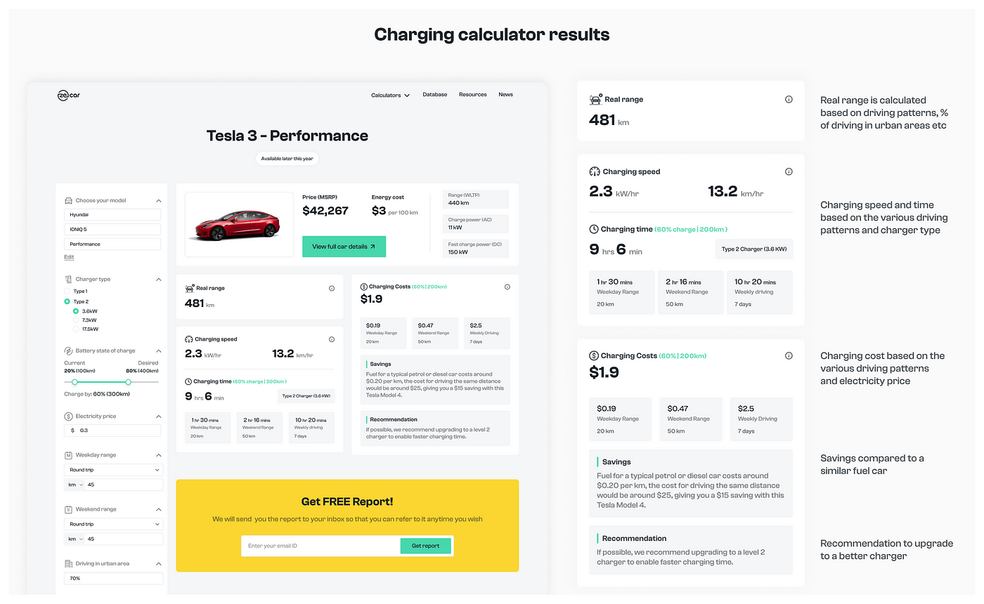
Charging calculator
Depending on their preferences we created a report that will help them understand the various aspects associated with the charging of the vehicle.
We kept the design for the questions coherent with the previous tools

The goal of this tool is to understand the nuances and costs associated with the charging of the EV based on the driving patterns of the user
Let’s quickly jump to the results screen now!
If you have stuck by till here then that’s awesome!! But that’s not it!
Apart from the calculators I also designed the other screens of the website like the landing page, Car details page, compare tool and the blogs! I’m gonna show some of them here
Homepage / Landing page
The goal of this page was to clearly show what zecar is all about,
give them quick access to the various tools and the database!

Car details page
The goals of this page were to:
- Give all the specifications of the car in a detailed but consumable way
- Give additional information about each of the specifications which will help the users understand how these specifications are useful
- Reduce cognitive load by not making the specifications too monotonous
- Ability to easily switch between the variants of the model
- Guide the users to book a test drive (complete their buying journey) or guide them to the various calculators to get more details with respect to their driving patterns

Database and comparison
The goals of this page were
- A place to see all the available electric vehicles on the market
- Easily sort and filter results according to the user's preferences
- Ability to quickly add various cars to compare
- Ability to see a summary and modify preferences of the compare tool before seeing the details
- Compare various cars concerning their specifications, categorize the specifications in an easy-to-consume way to reduce cognitive load

Okay, Just one more quick thing and we’re done! :p
I also worked on the mobile responsive screens for all the flows! Here’s a quick glimpse

Hope you liked this detailed case study! And if this piqued your interest to know more about electric vehicles, don’t forget to head over to zecar.com(P.S This tool is currently specific to the Australian continent, but will be a global tool very soon!)
Reflections and learning
- This project was a great opportunity for me to build something right from the scratch and work with the best people in the industry!
- Had a lot of challenges designing these information-heavy screens and learned the power of typography to create the right hierarchy and visual guidance
- Got to dive deeper into the EV industry and understand the various aspects of buying and owning an electric vehicle
- I got to learn a lot of nuances involved in designing a product from end to end, collaborating with engineers to see how the designs come to life
Also, special thanks to
for advising me during this project!
🤝 I’m currently open to opportunities as a Product Designer. Do reach out to me on LinkedIn, Twitter,oremailfor any feedback, discussions, or collaborations!
I’d be more than happy to have a chat with you!
Recommend
About Joyk
Aggregate valuable and interesting links.
Joyk means Joy of geeK