

Designing user interface aesthetics that sync with the natural environment
source link: https://uxdesign.cc/can-user-interface-aesthetics-sync-with-the-natural-environment-f556088d9587
Go to the source link to view the article. You can view the picture content, updated content and better typesetting reading experience. If the link is broken, please click the button below to view the snapshot at that time.

Designing user interface aesthetics that sync with the natural environment
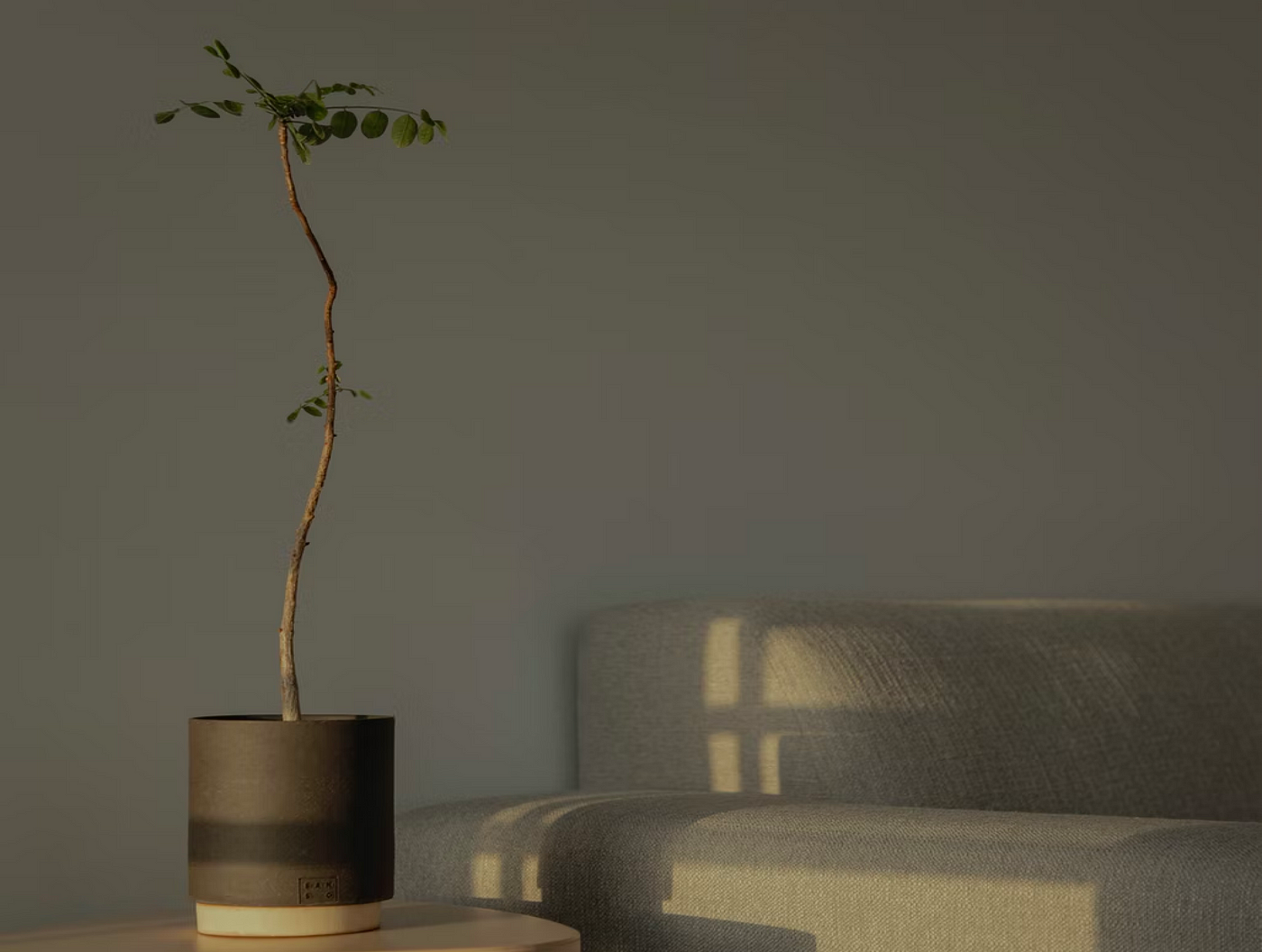
Studies have shown that lights have functions beyond just illuminating our environment; they also have a direct impact on our health and wellbeing. Light has biological effects on our sleep, cognition, circadian rhythms and also psychological effects on our mood, depression scores and cognitive performances such as reaction time and activation (Kaplan and Kaplan, 1988).
Understanding the nuances of how such effects can be realised in digital interface design can potentially lead to designing interface aesthetics that improve our health and well-being.
A speculative exploration
Visual effects of light such as shape, intensity, contrast and shadows are often expressed and explored in digital interface designs but only in isolation from the user’s environment. The premise of this speculative exploration is to create a conceptual model for user interfaces that promote aesthetics that sync with the lights in the user’s environment.
Visual effects of light are explored in digital interface designs but only in isolation from the user’s environment.
Based on the theoretical understanding of lights and shadows, this speculative exploration looks at how these physical phenomenons in the natural environment can dynamically influence the user interface and re-think how the environment can be a part of the aesthetics of digital projects. The aim is to generate discourse on such interplays and further improve our understanding of their underlying health benefits.
1. Understanding lights and shadows in the natural environment
The interplay of lights on materials creates reflections and shadows. Material placed directly under the sun creates stronger reflections and harsher shadows. Under natural ambient lighting that occurs when sunlight is diffused through the clouds or reflected inside the built environment, the resulting reflection and the shadows on the materials are also ambient.
In Material Design guidelines, Google highlights the need for a virtual light to illuminate the user interface in digital devices. These virtual lights are in the form of Key lights that create sharper, directional shadows, called Key shadows and Ambient lights that appear from all angles to make diffused, soft shadows, called ambient shadows.

Material Design Shadows by Google
While material design promotes static shadows independent of lights from the environment, the following explorations look at promoting an interplay of lights and shadows on materials that include environmental data to create digital interface aesthetics that offer a more dynamic experience to the user.
2. Superimposing virtual lights with data from the environment
The virtual lights in the material design environment are fixed to a point and cast the same shadow throughout the day. A more dynamic implementation of the virtual lights could be one where the virtual light syncs with the sunlight to create abstract visual aesthetics that highlight the passing of the day.
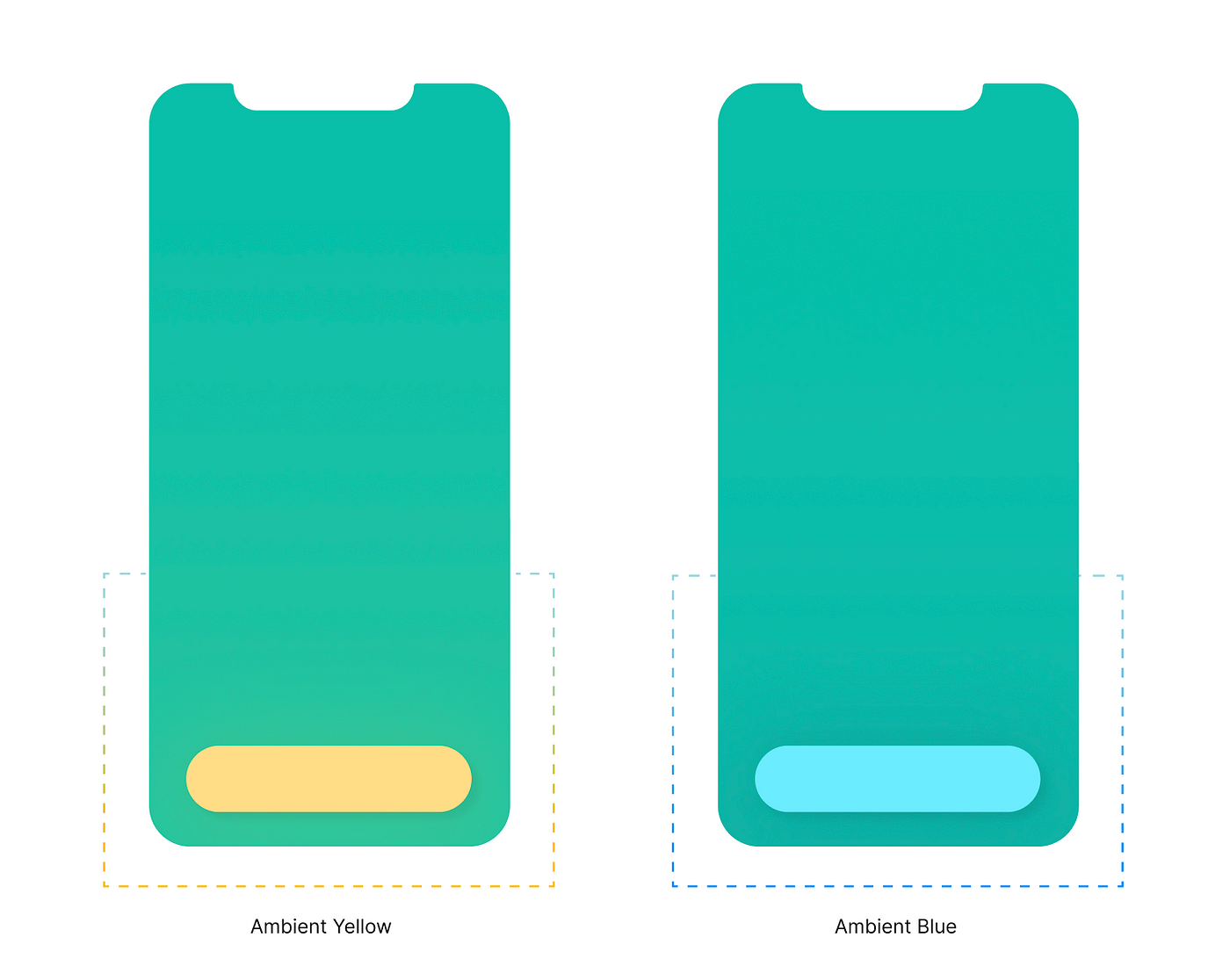
2.1. Dynamic Reflection
The commonly observed effects of light on solid materials are absorption, reflection and the creation of shadows. In the exploration below, we see how the passing of the day can influence the colour of the user interface. The materials in the environment reflect only a particular wavelength of light and absorb the rest. Variations in the light source’s colour also affect the colour reflected from the material.
Since there are dynamic shifts in environmental hues during the day such colour shifts can also influence the digital interface and thereby create a connection between the physical and the digital experience of the environment.

A dynamic hue that is a combination of the real hue of the interface and the early morning hue

Shifting hues throughout the day
While some devices offer a built-in approach to this (iOS’s night shift), where the display adapts to the time of the day to create warmer or cooler tones, such an approach creates a generalisation of the hue over UI elements and offers less room for play with specific UI components — texts, images, buttons and brand elements. Aligning the environmental hues with the brand colours and introducing subtle reactions to the UI component states can offer a richer user experience.

Subtle hues reflect the changing seasons
Such dynamic interplay of lights can also be extended to express the subtle changes in hues observed throughout the year. As seasons change, the hues can shift, from a warmer tone in autumn to a cooler tone in winter, from a vibrant spring to a muted monsoon.
Apple goes one step beyond by rendering nature realistic images that express the time of the day and the weather outside in the iOS Weather App.
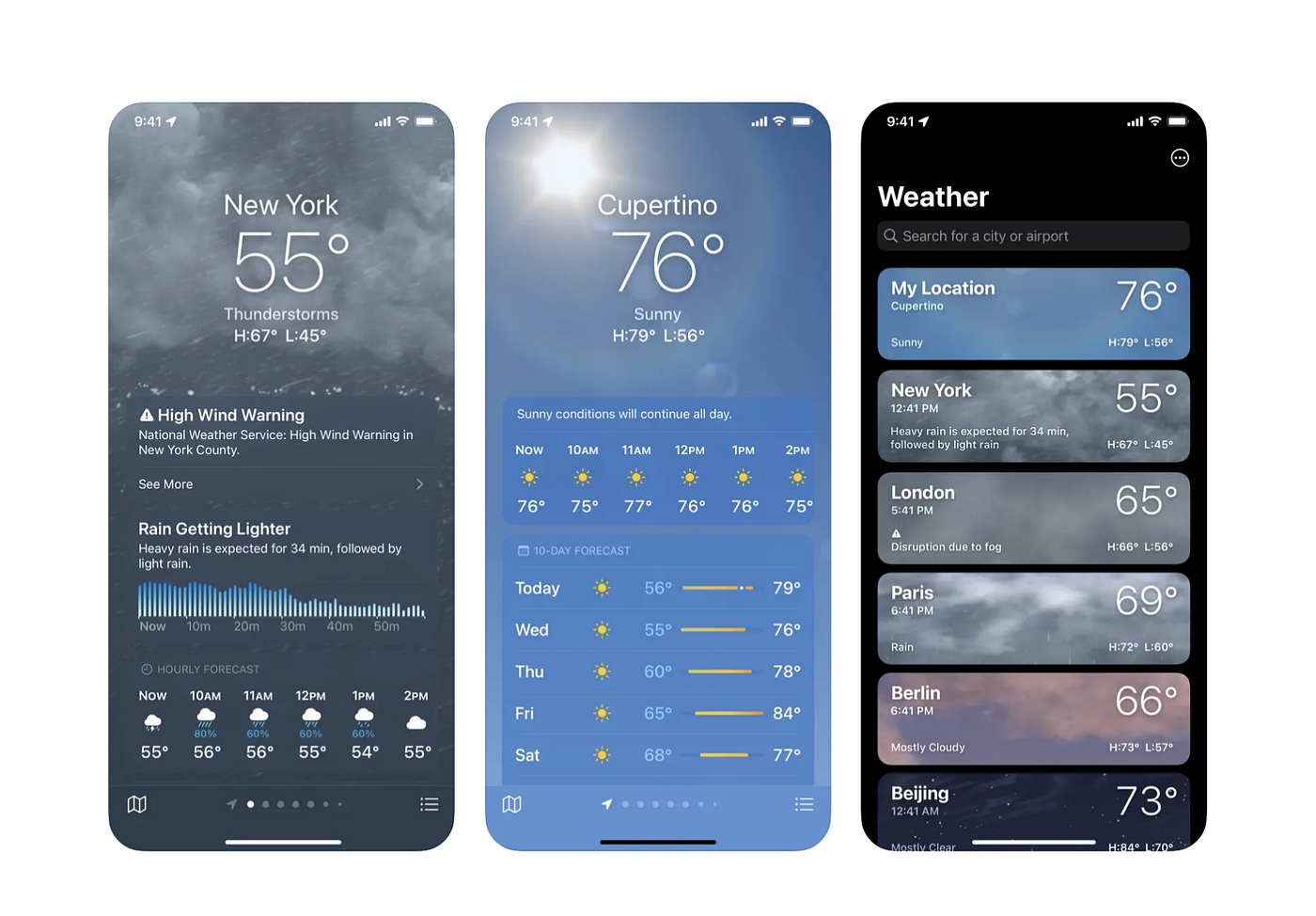
Weather App in iOS 15
However, such detailed expression in a non-weather app can take the user’s attention away from the primary task/purpose of the application which is why the proposed interface recommends subtlety in the realisation of such expressions
2.2. Dynamic Shadows
As with the changes to their hue, materials also render shadows when they block light sources. This can be expressed in the user interface designs by assuming the sun as a virtual source of light and dynamically rendering the spread and direction of the material shadows to sync with the sun’s movement during the day. The orientation sensor can guide the direction of the shadows. Additionally, the camera, based on its sensitivity to light can guide the harshness or softness of the shadows. Thus a sense of connection can be created between the users and their environment.

Bob Burrough, a former SD manager at Apple, takes this concept further by using lights in the room to create reflections on the objects in the interface.
Bob Burrough’s video explains UI that reacts to the environment
His working concept of an environmentally lit user interface takes information from a device’s surroundings and uses it to render physically-accurate things on the screen. It appears as if the lights around the user are shining on the things on the screen.
2.3 Ambient Reflections
Introducing ambient reflection into the interface aesthetics can further improve the material realism of the UI components. All materials reflect light (unless it is a blackbody). All naturally occurring visual compositions are a combination of ambient reflections from various sources.

Ambient Reflection — The soft blue outer shadows of the material
Ambient reflection in interfaces can occur when UI elements reflect their dominant hues onto the surrounding elements. Such reflections can create a dynamic interplay of colours in the interface. Combing this as an extension to dynamic shadows can further enhance the materiality of UI elements and create a quasi-realistic state for interfaces.
Ambient reflection from the UI buttons as a source of reflection
3. The future of dynamic interface
There is much to be desired and explored in the interplay of various environmental factors and their influence on the user interface. Imagine the effects of touch that vary with the environment — a floaty touch on a rainy day vs a feathery swaying touch on a windy day; Interface elements that have material weights associated with them, that weight and behave differently under varying environmental conditions.
Google Material Design 3 guidelines introduce dynamic colours, giving users more control over the personalisation of their apps. The interface now can adapt to the universal colour theme set by the user on their android device.
Material 3 Dynamic Colours “https://m3.material.io/foundations/customization”
Such personalisation of colours was a much-needed development in the direction of delightful user experiences and also opens up the space to introduce environmental influence on the digital interfaces.
Closing thoughts
With the myriad of digital applications that compete to capture our diminishing attention spans, it is easy to be completely removed from our fundamental connection to this planet and the natural environment. The speculative concepts here explore deliberate visual patterns that relate to and sync with the user’s environment and can give the user an opportunity, to not only experience the environment around them but also strengthen their connection to it. While research is underway to improve our understanding of how lights and colour in the digital medium can improve health and well-being, more speculative implementations in this space can help further such understanding.
Recommend
About Joyk
Aggregate valuable and interesting links.
Joyk means Joy of geeK