

Why do we call it breadcrumbs? Diving into the history of UI components
source link: https://uxdesign.cc/why-do-we-call-it-breadcrumbs-diving-into-the-history-of-ui-components-b35b813733e4
Go to the source link to view the article. You can view the picture content, updated content and better typesetting reading experience. If the link is broken, please click the button below to view the snapshot at that time.

Why do we call it breadcrumbs? Diving into the history of UI components
It started off with a toast. As I was crisping my bread, I wondered why UI notifications were called ‘toasts’. Curious, I started digging into the etymology of UI components.
Toast

How do you like your toast?
When your toast is ready, it pops up from the toaster to signal that to you. Similarly, toast notifications are time-based UI elements used to display short messages. Like breakfast toast, they also disappear in a few seconds.
Breadcrumbs
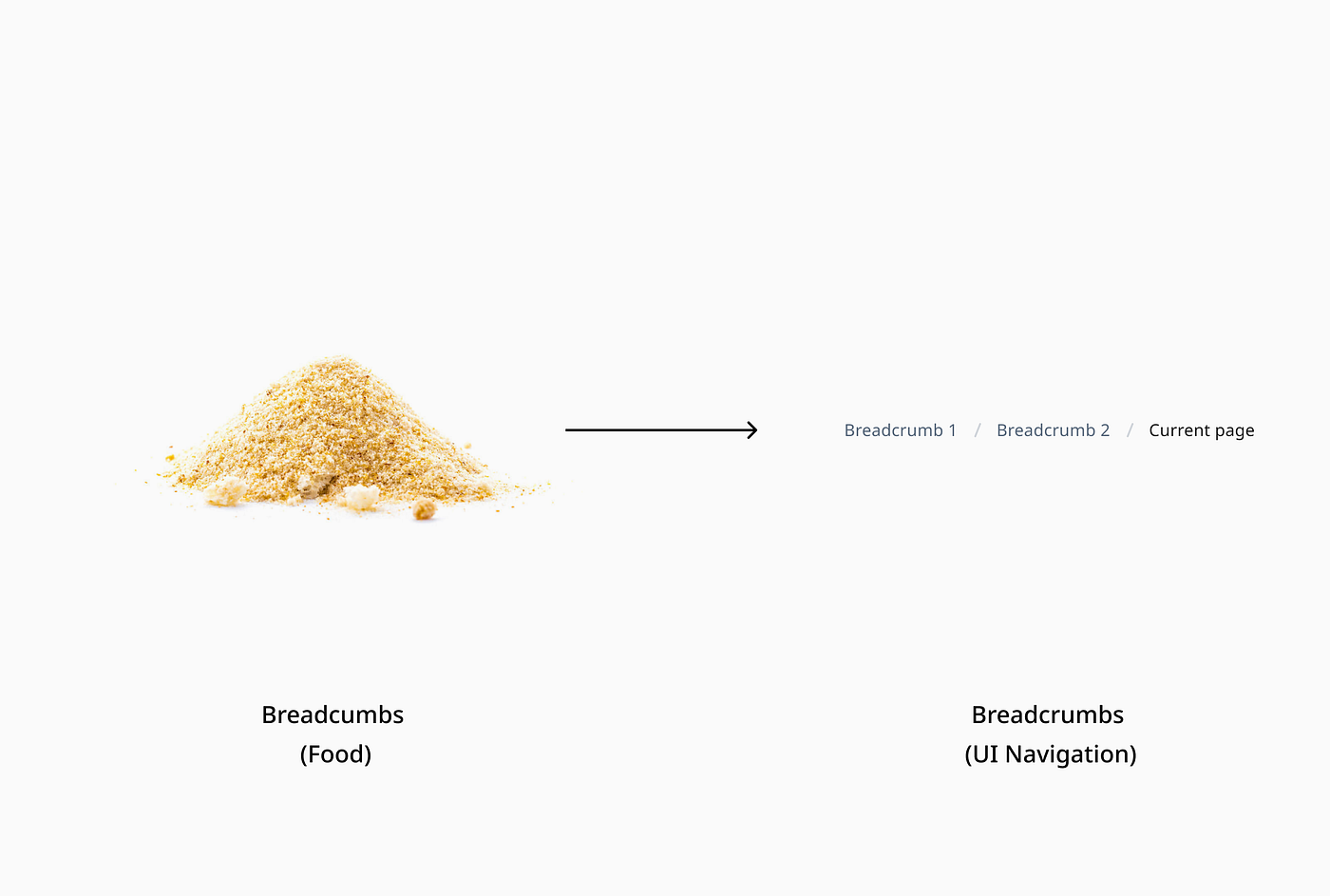
Not a mouse trap
More bread-inspired terms?
“Breadcrumbs” are a metaphor for leaving a trail behind, which is the modern-day term for UI navigation patterns. Breadcrumbs navigation helps a user understand the hierarchy among levels and navigate back through them.
Radio buttons

Who killed the radio star?
A relic from history, the name “radio button” comes from the actual physical buttons that were used in old radios. Push one in and the others pop out.
This explains why today radio buttons are used when you have a group of mutually exclusive choices and only one selection from the group is allowed.
Sliders

Sliding in
Like volume sliders on a radio, sliders allow users to increase or decrease a value by moving the handle along a horizontal track.
The UI interpretation of sliders is very similar and enhances the experience by allowing users to input more precise numeric values.
Carousel

Merry go round we go
Like a merry-go-round, a UI carousel displays images in a cyclic view.
The UI adaption features navigational controls (arrows left and right) to suggest additional content that is not currently visible and encourages users to continue exploring.
Accordion

Space efficient instruments
Named after the musical instrument, an accordion is a user interface component that hides or reveals content. Its name choice is reflective of its usage.
Accordions can make information processing and discovery more effective. The header title gives the user a high-level overview of the content, allowing the user to decide which sections to read.

Tabs to organize content
As a kid, I went to school with a file folder where I had tabs for each subject to organize my worksheets.
In a similar vein, UI tabs are used today to organize content. They allow the user to navigate between groups of information that appear within the same context.
Toggle

Flip the switch
Switches came into existence way back in the 80s. They were used to quickly switch between two possible states usually for On-Off purposes. This led to the birth of the toggle component in UI.
Today, toggles are used for binary actions that occur immediately after the user “flips the switch”. Quite a neat interpretation!
Recommend
About Joyk
Aggregate valuable and interesting links.
Joyk means Joy of geeK