

Unpacking Figma’s smart animate — Design a floating action button
source link: https://uxplanet.org/get-the-most-out-of-smart-animate-6403e252227c
Go to the source link to view the article. You can view the picture content, updated content and better typesetting reading experience. If the link is broken, please click the button below to view the snapshot at that time.

Unpacking Figma’s smart animate — Design a floating action button
Figma Prototyping series — Lesson 2
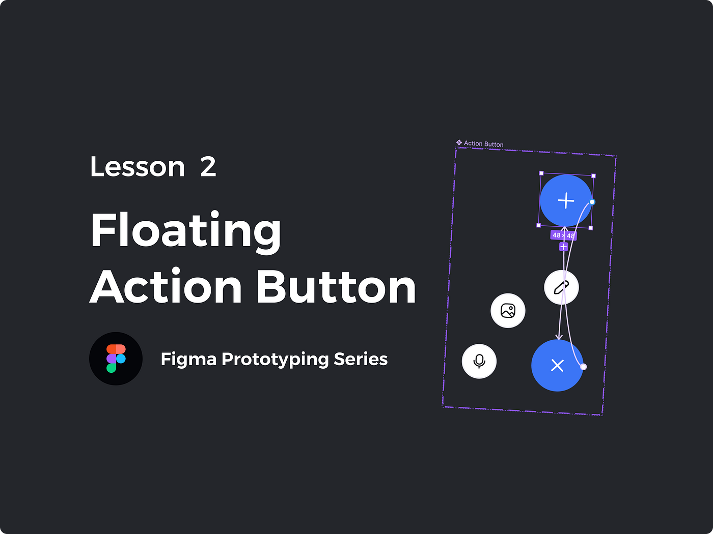
In lesson two we will be making a floating action button, similar to the post button as seen on twitter. We will be expanding on the concepts we covered in the first lesson. We will also expand our knowledge of smart animate.
Download the free Figma Community File and follow along.
If you are new to prototyping, Check out Lesson 1.
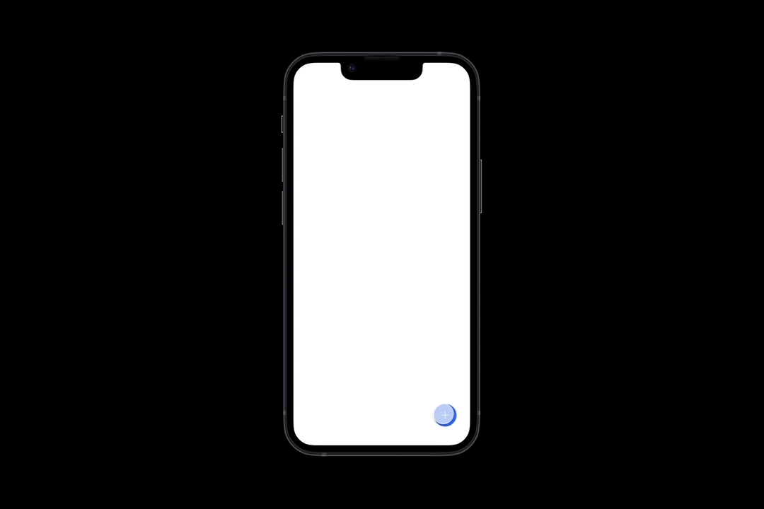
End result
Becoming a master of smart animate
In this lesson our focus is on smart animate. Smart animate creates transitions between states. It will look for changes in objects between states and animate between them. From a design standpoint ,we design the start and end states, and smart animate will create the transition between the two states.
Layering
The most important factor in smart animate is proper layering and naming. Smart animate will analyze the layer changes and animate them. It’s important that we have all layers in both states, even if they aren’t shown in one state. Without the same layer in both states, smart animate can’t perform its magic.
We will also want to organize our layers with intent. Switching layer order from instance to instance can cause undesired effects. Sometimes we are after this effect. So break this rule when you deem necessary.
Naming
Layer naming is also important. The name of our layers must be identical in each state for smart animate to work. If they aren’t named the same, smart animate assumes the layers to be different objects. I find it best to name our layers and then duplicate to keep layers named and organized.
Design Properties
Smart animate can detect any design property change. We can change the size, position, rotation, auto layout properties, constraints, fills, and strokes of any layer. We can use these individually or all together, depending on the effect we are after.
Transition Types
Within smart animate we can choose from a variety of transition types. Each transition type creates a different animation between states. These transitions can be personal preference. Take some time to mess around with each type to see how they change the feeling of the animation.
How To:
1. Create and name 4 buttons: Add, Write, Media, Speak
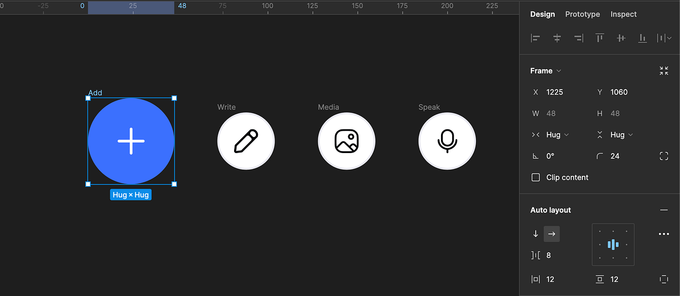
We will start with our end state. For this component we need 4 circular buttons each with an Icon. One button will be our main button, the others will be sub menu buttons. We will name each button accordingly: Add, Write, Media, and Speak.
Design tip: Add a group to the icon layer and apply auto layout — centered. Add your fill to the auto layout layer. Add padding and corner radius to reach desire effect. This allows us to make changes much quicker, with less layers.
2. Add frame around the ‘Add’ button, named ‘Action Button’, uncheck ‘Clip Content’
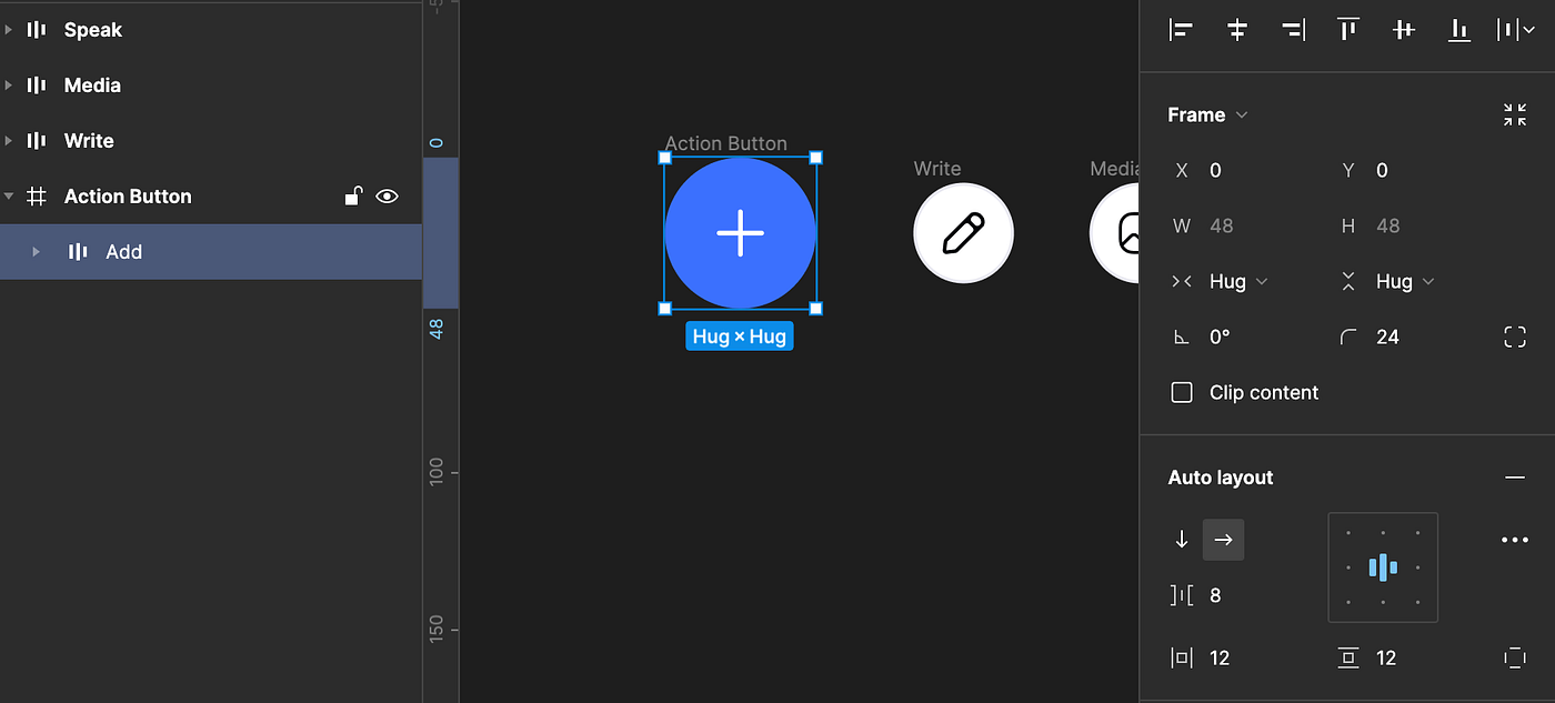
Unchecking clip content allows us to show elements outside of the frame. This will allow us keep our component the same size between states. Additionally, because this button has a fixed position on scroll, we can maintain alignment as the state changes.
3. Organize and align buttons
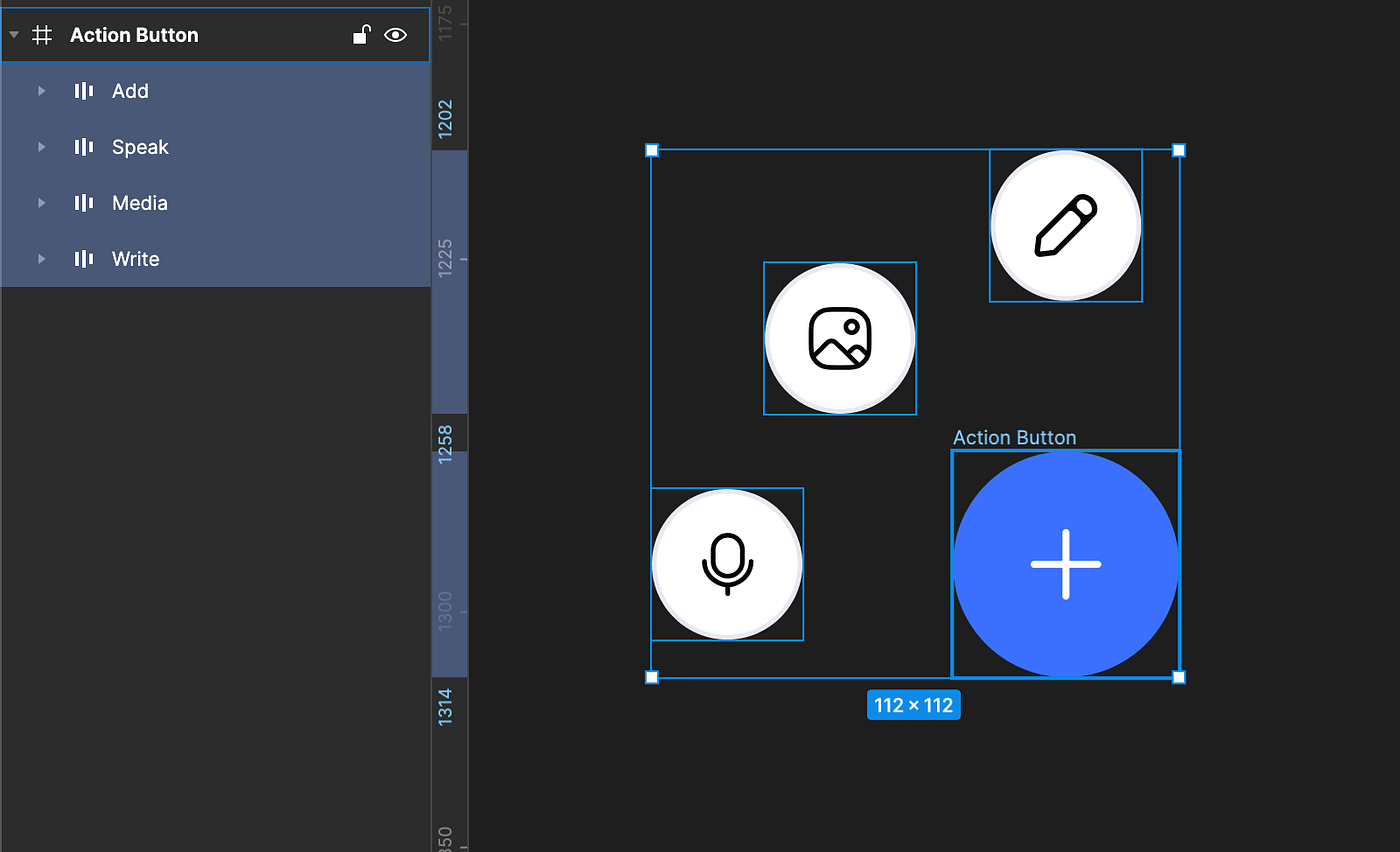
Fan out the sub menu items and add to Action button frame. Confirm ‘Add’ button layer is the top layer. For spacing, I aligned ‘Edit’ 32px above the ‘add’ button, ‘Speak’ 32px left of ‘add’, and finally media, is 16px above ‘Speak’ and 16 px left of ‘Edit’.
4. Duplicate Action button frame, align all items in the center.
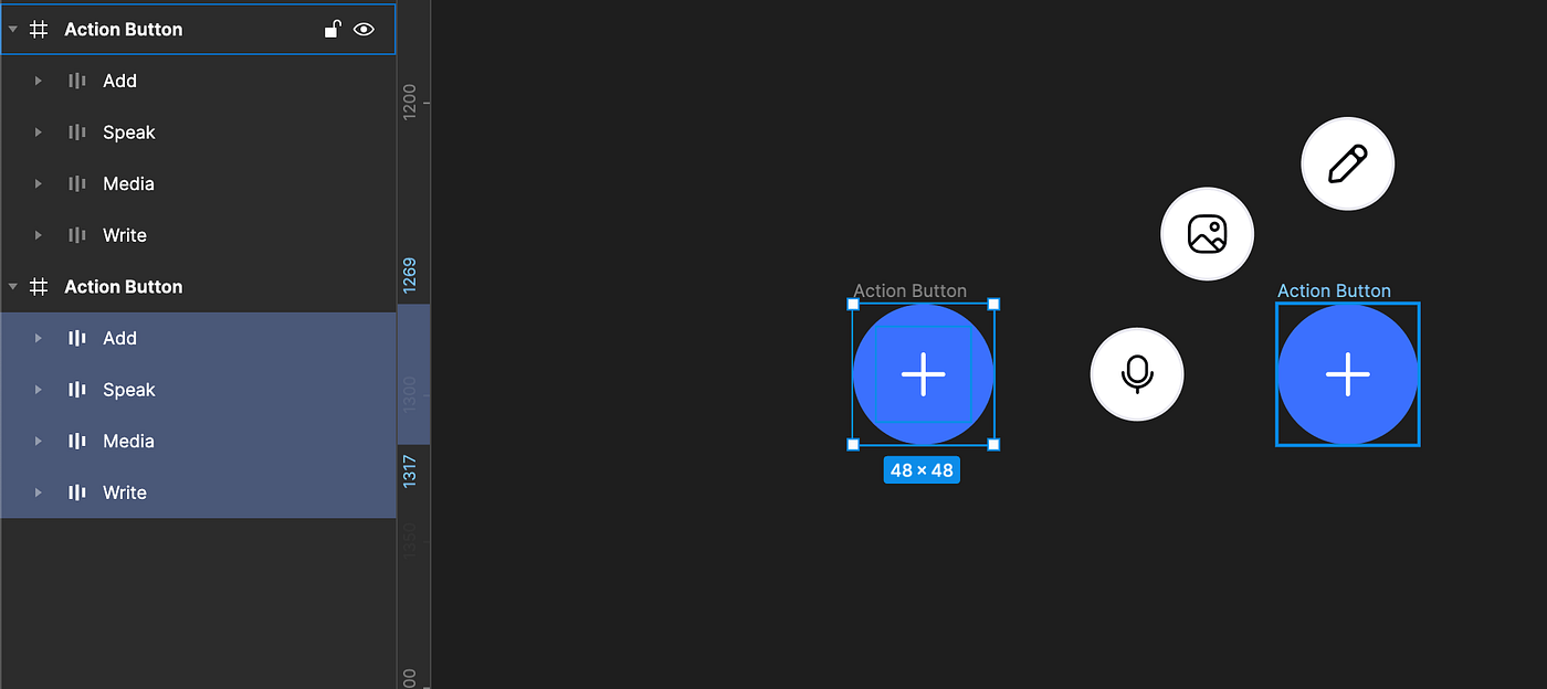
This will be our closed state. With all items selected, align to center.
Quick tip: With all items selected, align Right and Bottom first, then align center. If we align center first all items move to center, which requires us to then re center all layers in the frame. This way we can quickly align with the frame as well
5. Rotate Add Button icon -45 Degrees
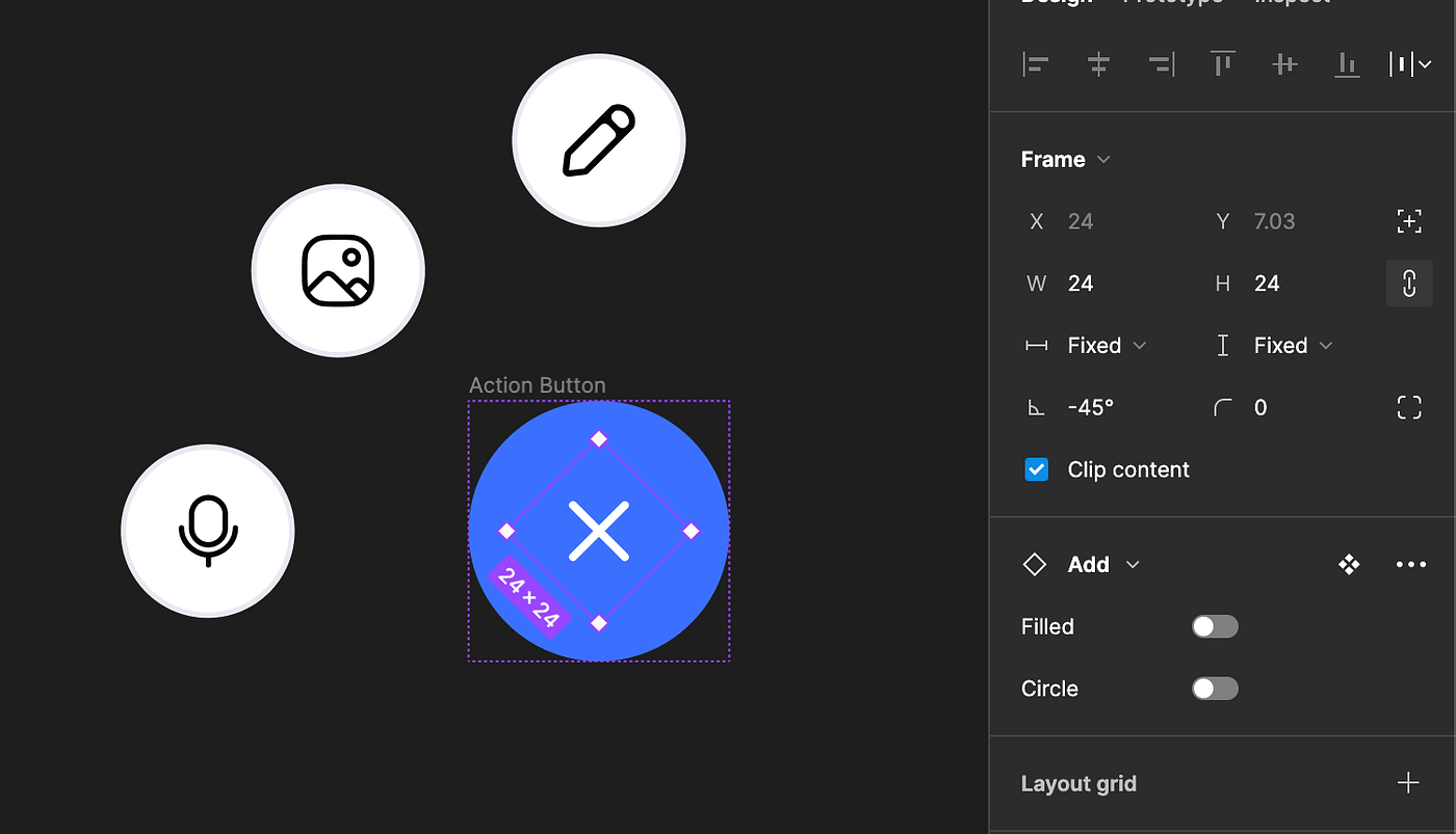
Back on our open state, rotating the add icon, giving the effect of the plus icon turning into a close Icon. If using auto layout, make sure our frame height and width is set to ‘Fixed’.
6. Create component set, Name instances
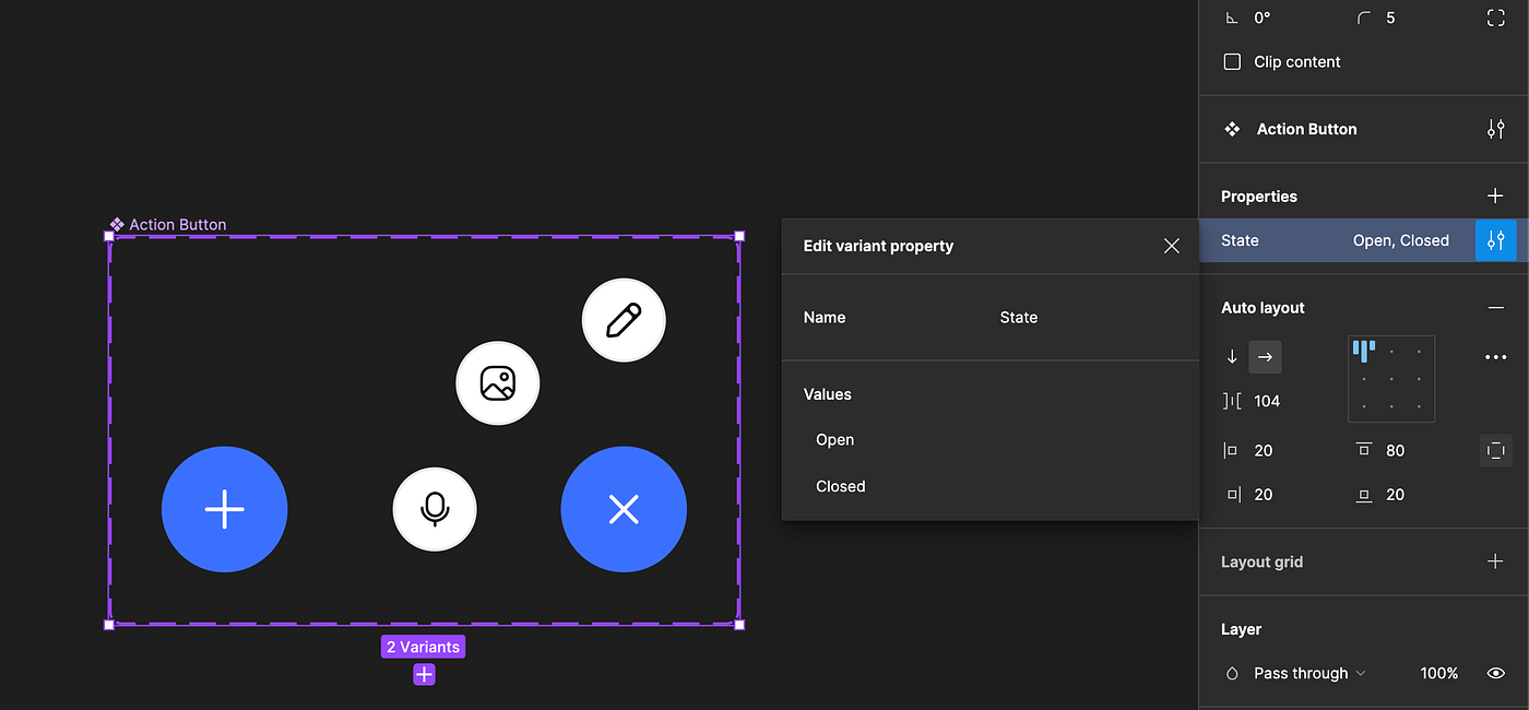
We will name the property ‘State’ and the variants open & closed respectively.
7. Prototype states together
From the Add button of the closed state to the open state and vise versa
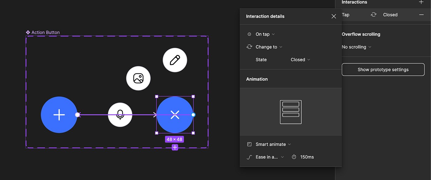
8. Setting smart animate
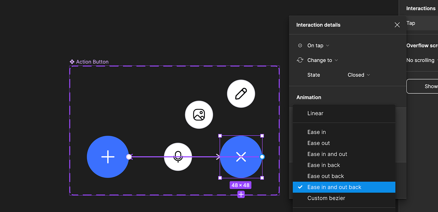
In our interaction details pane, select smart animate. Select the transition type, ‘ease out and back in.’ Feel free to mess with the timing. I used the default 300ms.
9. Add Action button instance to frame, set constraints and check fix position
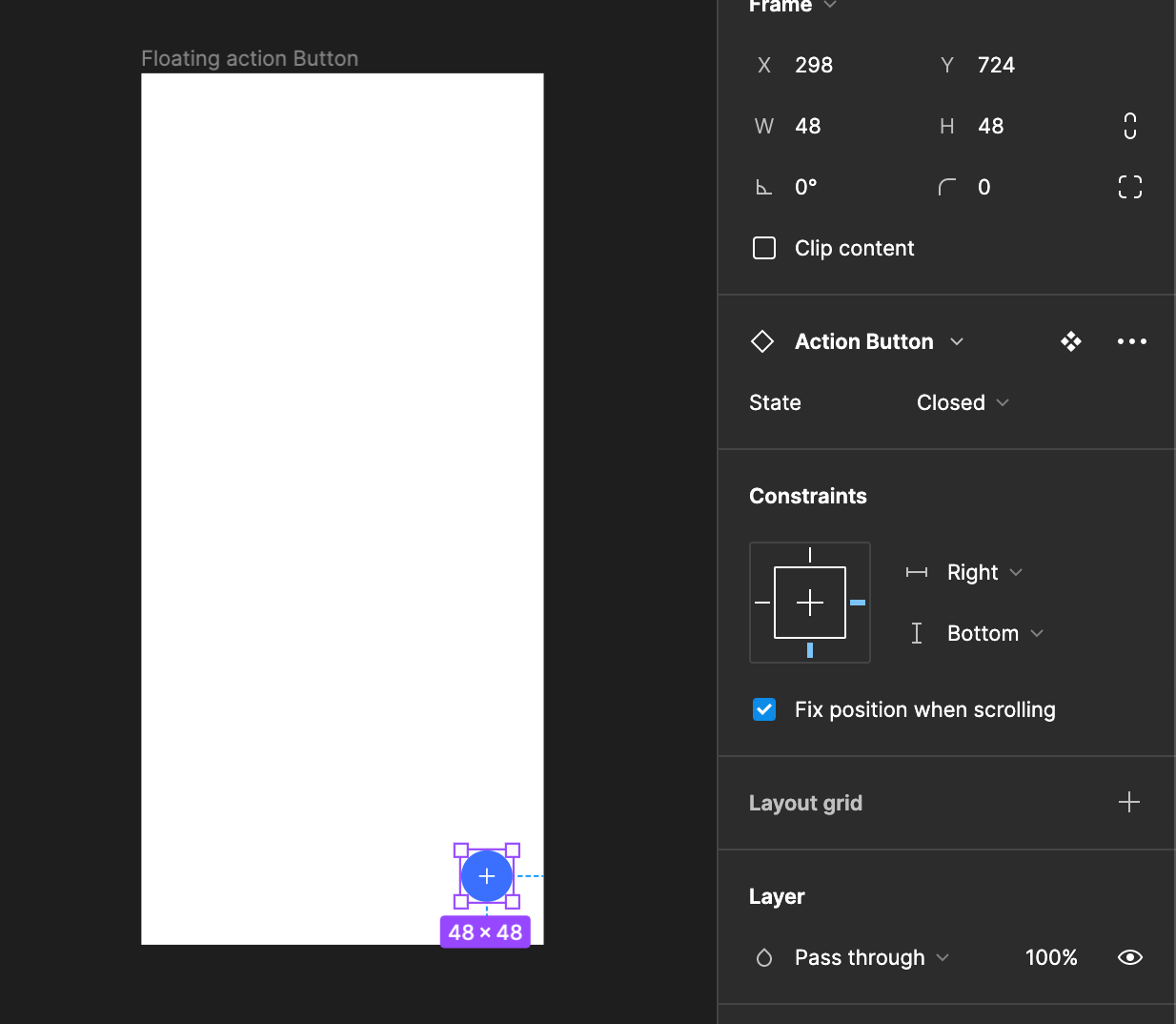
Now we get to test our prototype. Add an instance to our frame. Set the constraints to right and bottom. Finally, check fix position, to keep it in place when we scroll.
Recap
In this lesson changed the position of buttons and rotated an icon. Using smart animate we transitioned between the states to give us our end result.
In our next lesson we will look at the ‘while pressing’ interaction to add refinement to our components.
Did you find this helpful? What else would you like to learn? Leave a comment and let me know.
For more like this see the Table of contents.
Recommend
About Joyk
Aggregate valuable and interesting links.
Joyk means Joy of geeK