

Component Encyclopedia
source link: https://storybook.js.org/blog/component-encyclopedia/
Go to the source link to view the article. You can view the picture content, updated content and better typesetting reading experience. If the link is broken, please click the button below to view the snapshot at that time.

Component Encyclopedia
Explore the world’s UI components to learn techniques that actually work
How do you build UIs that are accessible, responsive, performant, and multifaceted all at the same time? There are plenty of learning resources available, but most are for beginners. Few of them consider a real team’s requirements and the tradeoffs therein.
The fastest way to level up in UI development is to observe what your peers do. That way, you can experiment with their techniques in your own projects.
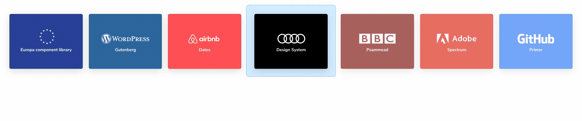
I’m thrilled to launch Component Encyclopedia. We cataloged the top UI components across the world in one place for you to browse, reference, and reuse as you build your own projects. It features 5,132 components from the likes of Airbnb, Microsoft, Zendesk, and dozens more.
- 🌎 Browse components visually
- 🔍 Search 5,132 components
- ▶️ Demo live examples in browser
- 🗺 View source
- ♻️ Reuse components
Why an encyclopedia?
Thousands of teams rely on Storybook to develop UI components everyday. But Storybook is only as smart as the people using it. Even with the most advanced tools, there’s still a knowledge gap between sophisticated teams and regular developers like you and me.
UIs have countless intertwined requirements – many of which are out of your control (browser, network connectivity, device APIs, etc). Misplaced markup or the wrong abstraction can force you to rethink everything.
We’re building Component Encyclopedia so that devs can reference battle-tested UI components from the smartest teams. Think of it as “View Source” but for the component era. This helps you research how UI engineering challenges are solved in real life.
Monday.com, Microsoft, D2IQ, Shopify, Drei, KickstartDS, Grommet, JSTOR
Component Encyclopedia
Component Encyclopedia is a visual showcase of UI components from public Storybooks. Thousands of teams rely on Storybook everyday. GitHub and the European Union use it to keep track of countless edge cases in their apps. Startups like Brex and Sourcegraph use it to assemble new features with less work.
Earlier this year, we launched a beta Component Encyclopedia. Countless community contributors submitted their projects into the index. But with more and more data streaming in, we needed a way to structure it all. Today’s release introduces faceted search, browsable tags, new project overview pages, and even more data!
Our data is updated all the time
With Storybook’s widespread adoption, we’re in a perfect position to build the most comprehensive database of UI components in the world. So far, there are 5,132 components, 14,949 stories, and 85 projects in the index. Each week new public projects are added or updated to their latest versions.

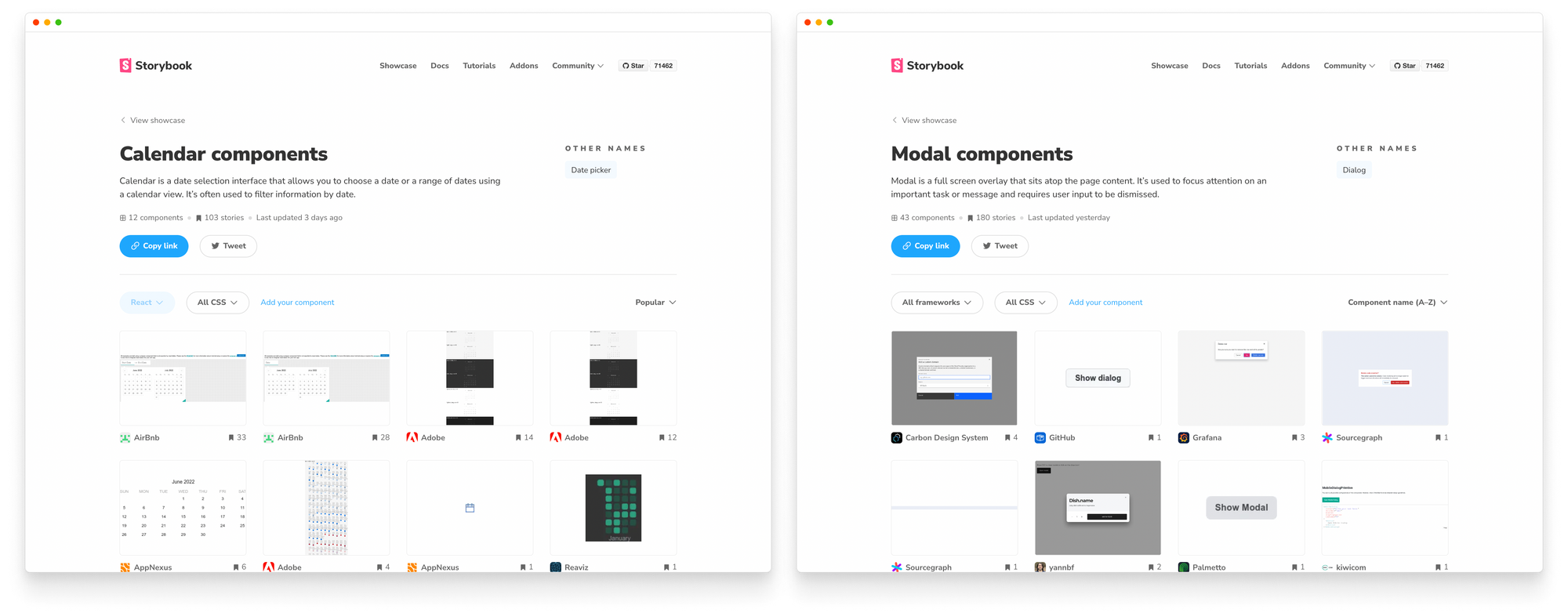
Search components and projects
Search by component or project name. Our guiding philosophy is to highlight the most relevant components that you’d want to reuse in your project.
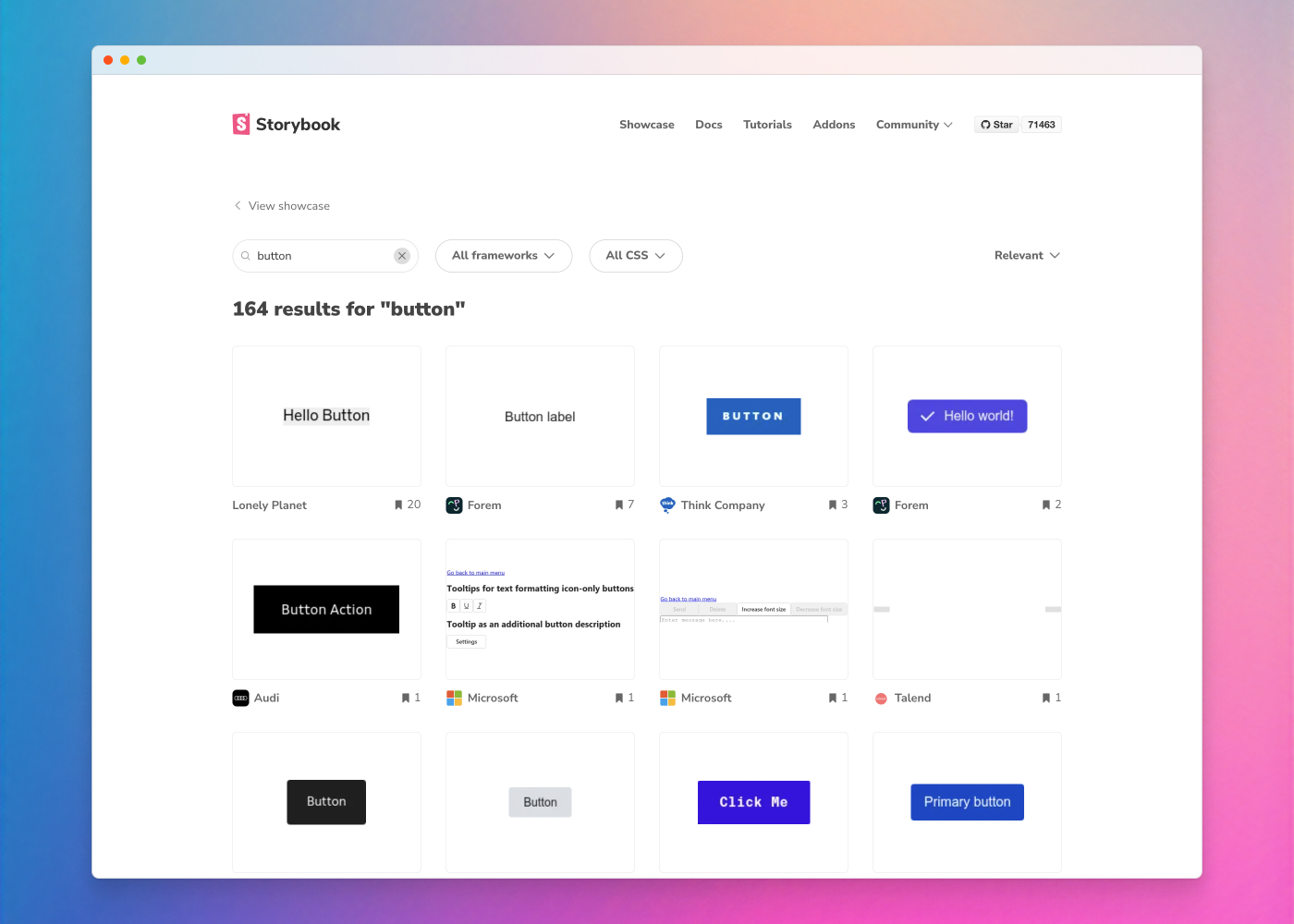
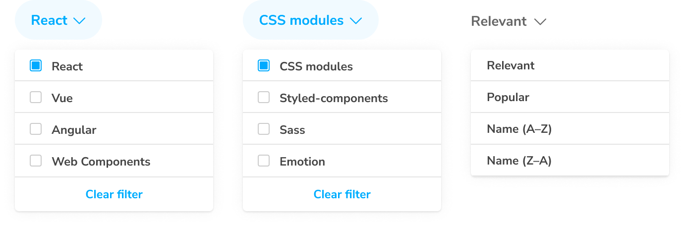
Each component’s metadata is tagged then ranked according to heuristics like maintenance, story count, and downloads. Filter the results by view layer (React, Vue, Angular) or CSS library (Emotion, CSS modules, Sass) to find components that are compatible with your tech stack.
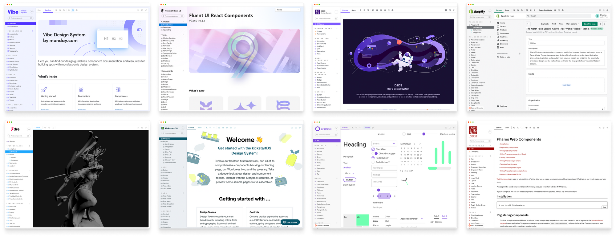
Browse components visually
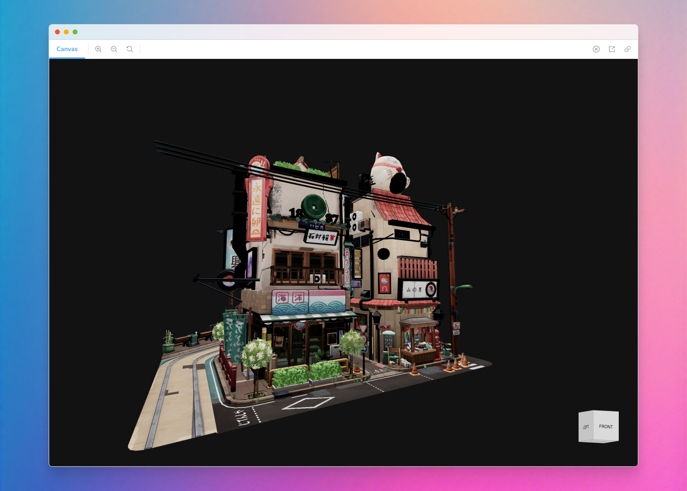
Components encapsulate the visual and functional aspects of a piece of code. Component Encyclopedia takes a reference picture of every component in a library, design system, or app.
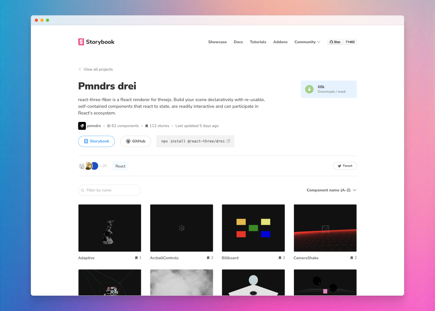
This helps you visualize a component’s “essence” before deciding to investigate further. When you find something to inspect, click to demo it in your browser. No need to compile code on your machine or spelunk through a GitHub readme.
Compare components
Component Encyclopedia groups components by type. Each type includes a definition along with a set of canonical examples of that component in situ.
You get a comprehensive overview of prior art for the most used UI patterns. Browse all the components by keyword or skim the featured components curated by our team.
What’s next
At Storybook, we believe the world is moving toward Component-driven UIs. Our goal is to accelerate the industry's shift to components by helping folks learn how to build them in the first place.
We’re starting with Component Encyclopedia, a comprehensive reference point for all frontend developers. We need your help to add more projects, suggest features, and report issues.
This project is made by Kyle Gach, Gert Hengeveld, Tom Coleman, and Dominic Nguyen (me!) with feedback from the entire Storybook community.
Component Encyclopedia is live!
— Storybook (@storybookjs) June 9, 2022
We're indexing every UI component in the world for you to learn from. We have 5,132 components so far—from Airbnb MSFT Adobe etc.
🌎 Browse visually
🔍 Search & filter
▶️ Demo live examples
♻️ Reuse componentshttps://t.co/wtnLyssq43
🧵But why? pic.twitter.com/lNfFoi8l7A
Recommend
About Joyk
Aggregate valuable and interesting links.
Joyk means Joy of geeK