

First impressions of SwiftUI in WWDC22
source link: https://sarunw.com/posts/first-impressions-swiftui-wwdc22/
Go to the source link to view the article. You can view the picture content, updated content and better typesetting reading experience. If the link is broken, please click the button below to view the snapshot at that time.
First impressions of SwiftUI in WWDC22
Table of Contents
WWDC22 just started, and it looks like this is a year of SwiftUI.
I will highlight exciting features in Platforms State of the Union session.
You can easily support sarunw.com by checking out this sponsor.
Sponsor sarunw.com and reach thousands of iOS developers.
NavigationView deprecated
I think the biggest change is the deprecation of NavigationView. Fundamental change like this is a sign that Apple finally figured something out and committed to the new direction, which is good for SwiftUI.
The replacement of NavigationView are NavigationStack and NavigationSplitView.
So, instead of this.
NavigationView { // This is deprecated.
    /* content */
}
.navigationViewStyle(.stack)

NavigationView { // This is deprecated.
    /* column 1 */
    /* column 2 */
}

NavigationView { // This is deprecated.
    /* column 1 */
    /* column 2 */
    /* column 3 */
}
We use this.
NavigationStack {
    /* content */
}

NavigationSplitView {
    /* column 1 */
} detail: {
    /* column 2 */
}

NavigationSplitView {
    /* column 1 */
} content: {
    /* column 2 */
} detail: {
    /* column 3 */
}
The old NavigationLink is still there, but it got an enhancement for programmatic navigation.
Here is an example of how we use NavigationLink.
struct ContentView: View {
    var body: some View {
        NavigationStack {
            List {
                NavigationLink("Red") { Color.red }
                NavigationLink("Green") { Color.green }
                NavigationLink("Blue") { Color.blue }
            }
            .navigationTitle("Colors")
        }

}
}
And this is a new way.
struct ContentView: View {
    var body: some View {
        NavigationStack {
            List {
                NavigationLink("Red", value: Color.red)
                NavigationLink("Green", value: Color.green)
                NavigationLink("Blue", value: Color.blue)
            }
            .navigationDestination(for: Color.self) { color in
                color
            }
            .navigationTitle("Colors")
        }
    }
}
We provide a value for each NavigationLink. Then in the .navigationDestination modifier, we capture that value and return a destination view for a particular type and value.
This is just a simple example. The new navigation system can do much more sophisticated routing than this. I will write a detailed post in the upcoming post.
ViewThatFits
ViewThatFits is a view that lets you define a list of views that suit different sizes of available space.
When used, SwiftUI will select the first child whose ideal size on the constrained axes fits with the available size.
I think the idea is good, but I need to play with it a bit before saying more about it.
In this example, I create TextThatFits that utilize ViewThatFits where I have three text views options that suit for different width.
struct TextThatFits: View {
    var body: some View {
        ViewThatFits(in: .horizontal) {
            Text("Very Very long text")
                .frame(minWidth: 300)
            Text("Medium text")
                .frame(minWidth: 100)
            Text("Short")
                .frame(minWidth: 20)
        }
    }
}
Here I use it on different available width.
struct ContentView: View {
    var body: some View {
        VStack {
            TextThatFits()
                .frame(maxWidth: 300)
            TextThatFits()
                .frame(maxWidth: 100)
            TextThatFits()
                .frame(maxWidth: 20)
        }
    }
}
And this is the result.
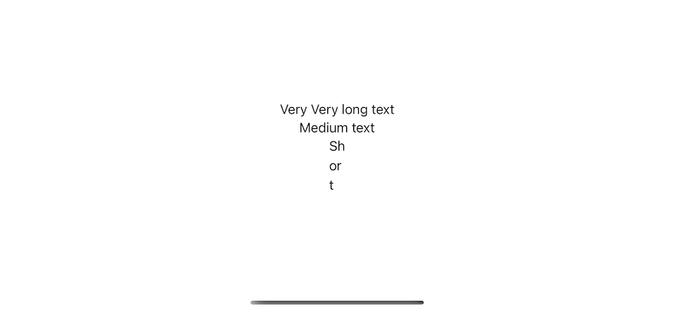
A different view is selected based on available space.
Native Bottom Sheet
Last year, UIKit got ahead of SwiftUI with a new native bottom sheet, UISheetPresentationController.
SwiftUI got it this year in the form of a .presentationDetents modifier.
You specified support detents to a sheet content.
struct ContentView: View {
    @State private var showDetail = false

var body: some View {
        Button("Modal") {
            showDetail = true
        }
        .sheet(isPresented: $showDetail) {
            Text("Detail")
                .presentationDetents(
                    [.fraction(0.1), .medium, .large]
                )
        }
    }
}
Bottom sheet in SwiftUI.
Swift Charts
SwiftUI no longer plays catch-up with UIKit anymore. This year, it got a new native view, Swift Charts, a framework for building effective and customizable charts with minimal code.
import Charts

public struct DataPoint: Identifiable {
    public var id = UUID()
    public var name: String
    public var count: Int
}

struct ContentView: View {
    var data: [DataPoint] = [
        DataPoint(name: "X", count: 10),
        DataPoint(name: "Y", count: 4),
        DataPoint(name: "Z", count: 12),
    ]

var body: some View {
        Chart {
            BarMark(
                x: .value("Name", data[0].name),
                y: .value("Total Count", data[0].count)
            )
            BarMark(
                 x: .value("Name", data[1].name),
                 y: .value("Total Count", data[1].count)
            )
            BarMark(
                 x: .value("Name", data[2].name),
                 y: .value("Total Count", data[2].count)
            )
        }
    }
}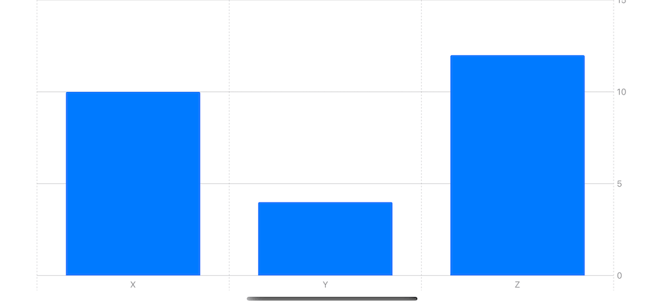
Swift Charts.
Swift Charts support a wide range of charts covering most of our use cases. You can check the documentation here.
Increment adopting SwiftUI
UITableView and UICollectionView is a core of most UIKit app. This year, Apple gave us a way to use SwiftUI view as cell content.
cell.contentConfiguration = UIHostingConfiguration {
  // SwiftUI view
}
This will help people who want to try SwiftUI incrementally adopt it.
Easy Mac menu bar
SwiftUI has a new API for easily adding a menu bar on a mac.
I think we can expect improvement like this in many areas of all platforms.
struct what_new_in_swiftui_wwdc22App: App {
    var body: some Scene {
        WindowGroup {
            ContentView()
        }
#if os(macOS)
        MenuBarExtra(content: {
            Text("This is content")
        }, label: {
            Label("Menu Bar", systemImage: "swift")
        })
        .menuBarExtraStyle(.window)
#endif
    }
}
Moving away from UIKit
All these years, some components of SwiftUI have been backed by UIKit, but that might no longer be the case.
From iOS 16 release notes.
The implementation of list no longer uses UITableView. (81571203)
In theory, we don't have to care about the implementation detail like this.
In reality, we try to hack around and modify things that don't become available in the previous version of SwiftUI. So, if you are relying on UIKit implementation, please check your app. It might break.
You can easily support sarunw.com by checking out this sponsor.
Sponsor sarunw.com and reach thousands of iOS developers.
Conclusion
There are too many new features I can fit into this article. I think you can sense a big improvement from the handful of changes I show you. I can't wait to learn more about all of them.
I think this is the year where the famous controversial topic about SwiftUI might go to an end 🤞.
You may also like
In iOS 15, we finally have native UI for a bottom sheet. Let's explore its behavior and limitation.
iOS 16 add the ability to integrate a text field in an alert.
SwiftUI WWDC22Leaning tips and tricks about the tool will help you down the road. Today, I will show you 4 Xcode shortcuts that I find helpful when dealing with SwiftUI.
SwiftUIRead more article about SwiftUI, WWDC22,
or see all available topic
Enjoy the read?
If you enjoy this article, you can subscribe to the weekly newsletter.
Every Friday, you'll get a quick recap of all articles and tips posted on this site. No strings attached. Unsubscribe anytime.
Feel free to follow me on Twitter and ask your questions related to this post. Thanks for reading and see you next time.
If you enjoy my writing, please check out my Patreon https://www.patreon.com/sarunw and become my supporter. Sharing the article is also greatly appreciated.
How to change SwiftUI list row background color
Learn a dedicated modifier to change a list row background color in SwiftUI.
Little big improvements in Xcode 14
Small improvements that make a big difference in day-to-day coding.
Recommend
About Joyk
Aggregate valuable and interesting links.
Joyk means Joy of geeK