

DAYU200体验官之App欢迎页-51CTO.COM
source link: https://os.51cto.com/article/710564.html
Go to the source link to view the article. You can view the picture content, updated content and better typesetting reading experience. If the link is broken, please click the button below to view the snapshot at that time.


- 开发板:DAYU200
- 系统版本:OpenHarmony 3.2.2.3
- SDK版本:ohos-sdk 3.2.2.3
- 开发工具:DevEco Studio 3.0.0.900(For OpenHarmony)
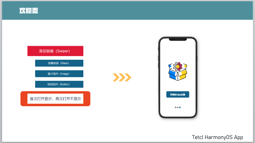
二、知识要点及示例图
三、核心代码
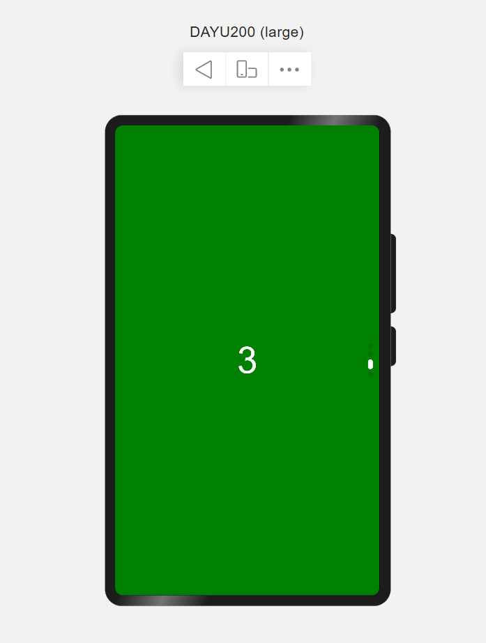
1、滑动容器(Swiper)
滑动容器是提供子组件具备切换的能力,除当前激活的索引值组件,其他组件处于隐藏状态。使用场景如图片轮播,内容轮播等。
简单示例(swiperSimple.ets)
@Entry
@Component
struct SwiperSimple {
  private swiperCtr: SwiperController = new SwiperController();
  build() {
    // Swiper(value: {controller?:SwiperController})
    // controller 给组件绑定一个控制器,用来控制组件翻页
    Swiper(this.swiperCtr) {
      Text('1')
        .fontSize(100).fontColor(Color.White)
        .backgroundColor(Color.Blue)
        .width('100%')
        .height('100%')
        .textAlign(TextAlign.Center)
      Text('2')
        .fontSize(100).fontColor(Color.White)
        .backgroundColor(Color.Red)
        .width('100%')
        .height('100%')
        .textAlign(TextAlign.Center)
      Text('3')
        .fontSize(100).fontColor(Color.White)
        .backgroundColor(Color.Green)
        .width('100%')
        .height('100%')
        .textAlign(TextAlign.Center)
      Text('4')
        .fontSize(100).fontColor(Color.White)
        .backgroundColor(Color.Orange)
        .width('100%')
        .height('100%')
        .textAlign(TextAlign.Center)
    }
    .width('100%')
    .height('100%')
    .index(2) //当前激活状态的子组件索引值,从0开始
    .autoPlay(false) //是否自动播放
    .loop(true) // 是否循环
    .vertical(true) //是否纵向滑动
    .indicatorStyle({
      size: 20, //导航点的直径
      selectedColor: Color.White //选中导航点的颜色
    })
  }
}
详细参见:Swiper滑动容器组件。
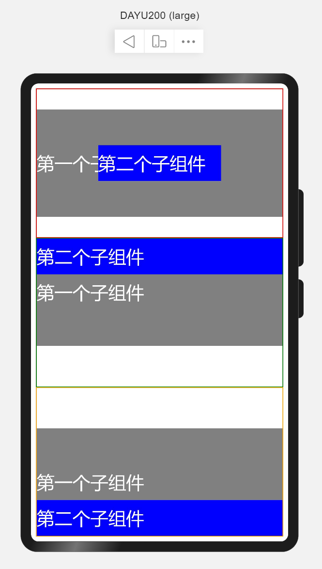
2、堆叠容器(Stack)
堆叠容器,即将子组件叠放在一起,后入先呈现的方式在UI中展示。可以理解为在箱子中装东西,最后放入箱子的在最上层。 使用场景如首页读秒跳转、页面悬浮按钮等。
简单示例(stackSimple.ets)
@Entry
@Component
struct StackSimple {
  build() {
    Flex({direction: FlexDirection.Column}) {
      // Stack(value: {alignContent?: Alignment })
      // alignContent: Alignment 默认Center 设置子组件在容器内的对齐方式,可缺省
      // 设置子组件在容器内的对齐方式为默认,即居中对齐
      Stack() {
        Text('第一个子组件').width('100%').height(300)
          .fontSize(50).fontColor(Color.White)
          .backgroundColor(Color.Grey)
        Text('第二个子组件').width('50%').height(100)
          .fontSize(50).fontColor(Color.White)
          .backgroundColor(Color.Blue)
      }
      .layoutWeight(1)
      .border({
        width: 2,
        style: BorderStyle.Solid,
        color: Color.Red
      })
      // 设置子组件在容器内的对齐方式为顶部对齐
      Stack({alignContent: Alignment.Top}) {
        Text('第一个子组件').width('100%').height(300)
          .fontSize(50).fontColor(Color.White)
          .backgroundColor(Color.Grey)
        Text('第二个子组件').width('100%').height(100)
          .fontSize(50).fontColor(Color.White)
          .backgroundColor(Color.Blue)
      }
      .layoutWeight(1)
      .border({
        width: 2,
        style: BorderStyle.Solid,
        color: Color.Green
      })
      // 设置子组件在容器内的对齐方式为底部对齐
      Stack({alignContent: Alignment.Bottom}) {
        Text('第一个子组件').width('100%').height(300)
          .fontSize(50).fontColor(Color.White)
          .backgroundColor(Color.Grey)
        Text('第二个子组件').width('100%').height(100)
          .fontSize(50).fontColor(Color.White)
          .backgroundColor(Color.Blue)
      }
      .layoutWeight(1)
      .border({
        width: 2,
        style: BorderStyle.Solid,
        color: Color.Orange
      })
    }
    .width('100%')
    .height('100%')
    .padding(14)
  }
}
详细参见:Stack堆叠容器组件。
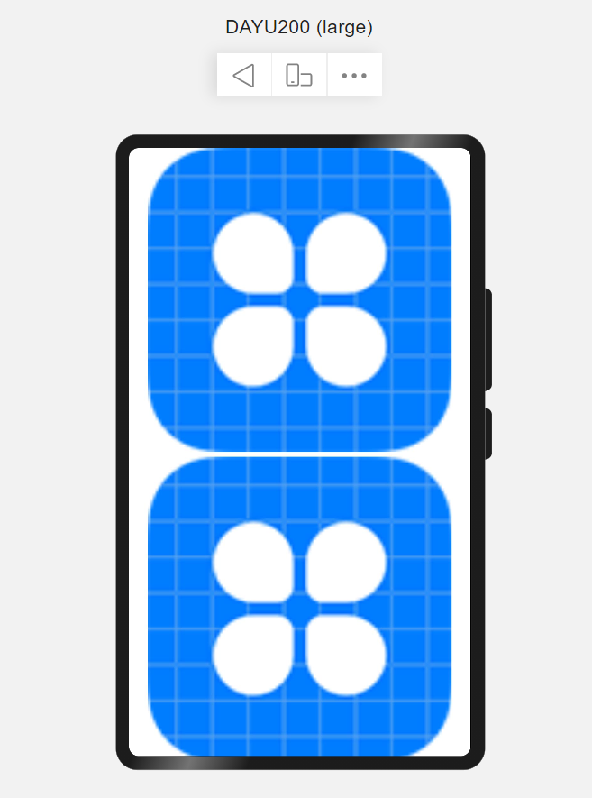
3、图片组件(Image)
图片组件和文本组件一样,也是最常用的组件。文本组件用于呈现文本,而图片组件用于渲染展示图片。使用场景如用户头像、文章封面、书籍封面等。
简单示例(imageSimple.ets)
@Entry
@Component
struct ImageSimple {
  build() {
    Column({space: 10}) {
      // Image(value:{uri: string|PixelMap})
      // uri: 图片的uri,支持本地图片和网络图片路径
      Image($r('app.media.icon'))
        .alt('加载时显示的展位图,支持本地图片和网络路径')
        .objectFit(ImageFit.Contain) //设置图片的缩放类型
        .objectRepeat(ImageRepeat.NoRepeat) //设置图片的重复样式
        .layoutWeight(1)
      Image($r('app.media.icon'))
        .objectFit(ImageFit.Contain)
        .objectRepeat(ImageRepeat.NoRepeat)
        .layoutWeight(1)
    }
    .width('100%')
    .height('100%')
  }
}
详细参见:Image图片组件。
4、按钮组件(Button)
按钮组件也是最常用的组件之一,按钮组件用于给用户提供明显的交互效果。使用场景如数据提交、跳转页面等。
简单示例(buttonSimple.ets)
@Entry
@Component
struct ButtonSimple {
  build() {
    Column({space: 10}) {
      // Button(options?:{type?:ButtonType, stateEffect?: boolean})
      // type 描述按钮风格
      // stateEffect 按钮按下时是否开启切换效果
      Button({type: ButtonType.Normal}) {
        Row() {
          Image($r('app.media.icon'))
            .width(64).height(64)
            .margin({left: 12})
          Text('Logo')
            .fontSize(50).fontColor(Color.White)
            .margin({left: 5, right: 12})
        }
        .alignItems(VerticalAlign.Center)
      }
      .backgroundColor(Color.Blue)
      .width('90%')
      .height(120)

      // Button(label?:options?:{type?:ButtonType,stateEffect?:boolean})
      //label 按钮文本内容
      Button('这是一个胶囊按钮', {type: ButtonType.Capsule})
        .fontSize(50).fontColor(Color.White)
        .backgroundColor(Color.Red)
        .width('90%').height(120)

      Button('+', {type: ButtonType.Circle})
        .fontSize(100).fontColor(Color.White)
        .backgroundColor(Color.Green)
        .width(120).height(120)
    }
    .width('100%').height('100%')
    .margin({top: 20})
  }
}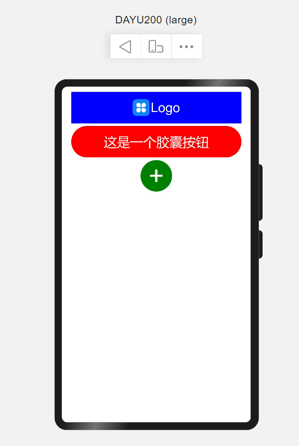
详细参见:Button按钮组件。
5、路由(Router)
路由是页面间跳转常用的API,需要在页面中导入路由模块import router from '@ohos.router',常用router.push来做应用内跳转到指定页面。
简单示例(routerSimple.ets)
import router from '@ohos.router';
@Entry
@Component
struct RouterSimple {
  build() {
    Flex({justifyContent: FlexAlign.Center, alignItems: ItemAlign.Center}) {
      Button('跳转到首页')
        .width(300)
        .height(50)
        .fontSize(25)
        .onClick(() => {
          router.push({
            url: 'pages/index'
          })
        })
    }
    .width('100%')
    .height('100%')
  }
}- 注意:跳转页面必须是在
config.json的js->pages中配置的页面。
详细参见:Router路由。
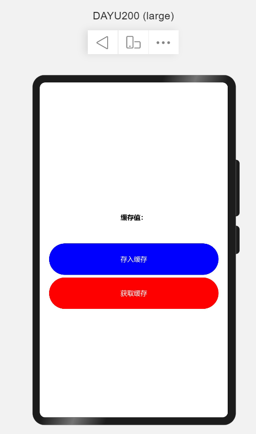
6、利用缓存(Storage)实现首次打开加载再次打开不加载
简单示例(storageSimple.ets)
import dataStorage from '@ohos.data.storage';
import featureAbility from '@ohos.ability.featureAbility';

@Entry
@Component
struct StorageSimple {
  @State storageStr: string = '';
  private storageFilesName = '/mystore';
  private context;
  build() {
    Flex({direction: FlexDirection.Column, justifyContent: FlexAlign.Center, alignItems: ItemAlign.Center}) {
      Text(`缓存值:${this.storageStr}`)
        .fontSize(25).fontWeight(FontWeight.Bold)
        .textAlign(TextAlign.Center)
        .height(200)
      Button('存入缓存')
        .fontSize(25).fontColor(Color.White)
        .backgroundColor(Color.Blue)
        .width('90%').height(120)
        .onClick(() => {
          this.context.getFilesDir((err, path) => {
            console.log('getFilesDir err: ' + JSON.stringify(err));
            if (err.code) {
              console.info("Get the storage failed, path: " + path + this.storageStr)
              return;
            }
            console.info('getFilesDir successful. path: ' + JSON.stringify(path));
            let storage = dataStorage.getStorageSync(path + this.storageStr);
            storage.putSync('username', 'bxming')
            storage.flushSync();
          })
        })
      Button('获取缓存')
        .fontSize(25).fontColor(Color.White)
        .backgroundColor(Color.Red)
        .width('90%').height(120)
        .margin({top: 10})
        .onClick(() => {
          this.context.getFilesDir((err, path) => {
            console.log('getFilesDir err: ' + JSON.stringify(err));
            if (err.code) {
              console.info("Get the storage failed, path: " + path + this.storageStr)
              return;
            }
            console.info('getFilesDir successful. path: ' + JSON.stringify(path));
            let storage = dataStorage.getStorageSync(path + this.storageStr);
            let value = storage.getSync('username', 'default')
            this.storageStr = value.toString();
          })
        })
    }
    .height('100%')
    .width('100%')
  }

  aboutToAppear() {
    this.context = featureAbility.getContext();
  }
}
详细参见:Storage轻量级存储。
四、欢迎页实现
利用3小节介绍的容器、组件构建完整页面,代码如下所示:
@Entry
@Component
struct Welcome {
  private swiperCtr: SwiperController = new SwiperController();
  build() {
    Swiper(this.swiperCtr) {
      Image($r('app.media.w01'))
        .objectFit(ImageFit.Fill)
      Image($r('app.media.w02'))
        .objectFit(ImageFit.Fill)
      Image($r('app.media.w03'))
        .objectFit(ImageFit.Fill)
      Stack({alignContent: Alignment.Bottom}) {
        Image($r('app.media.w04'))
          .objectFit(ImageFit.Fill)
        Button('开始使用', {type: ButtonType.Normal})
          .width(200)
          .fontSize(22)
          .borderRadius(12)
          .padding({top: 16, bottom: 16})
          .backgroundColor(0x567754)
          .margin({bottom: 60})
      }
    }
    .width('100%')
    .height('100%')
    .indicatorStyle({
      size: 20,
      selectedColor: Color.Orange
    })
  }
}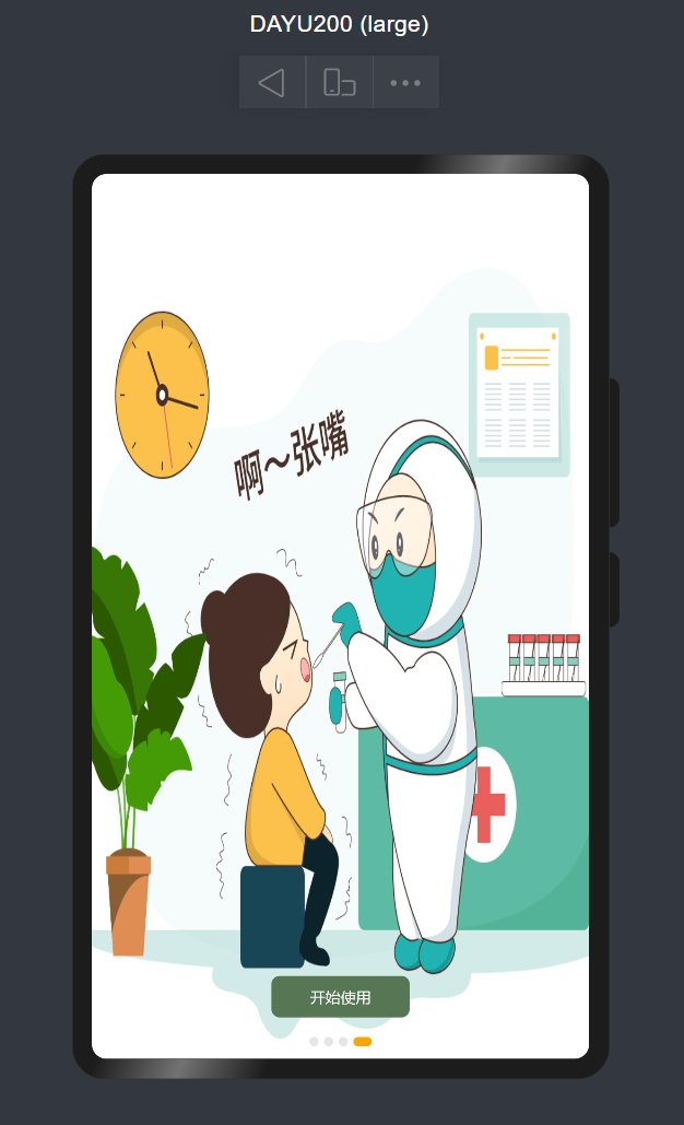
说明:所有素材均来自于插画2【木乀】,且均用于演示示例,若有侵权,请联系我删除。
欢迎页是应用程序的简要说明,比如发布的新特性、主要解决什么问题等,为了满足用户友好特性,需要在第一次安装或者更新App后的第一次打开应用程序显示,其他状态下则不显示。需要使用storage轻量级存储做标记,在App启动时判断标记是否为初始值(如true),若为初始值则显示欢迎页,否则不显示欢迎页。显示欢迎页后,在点击【开始使用】则改变初始值为其他(如false)。
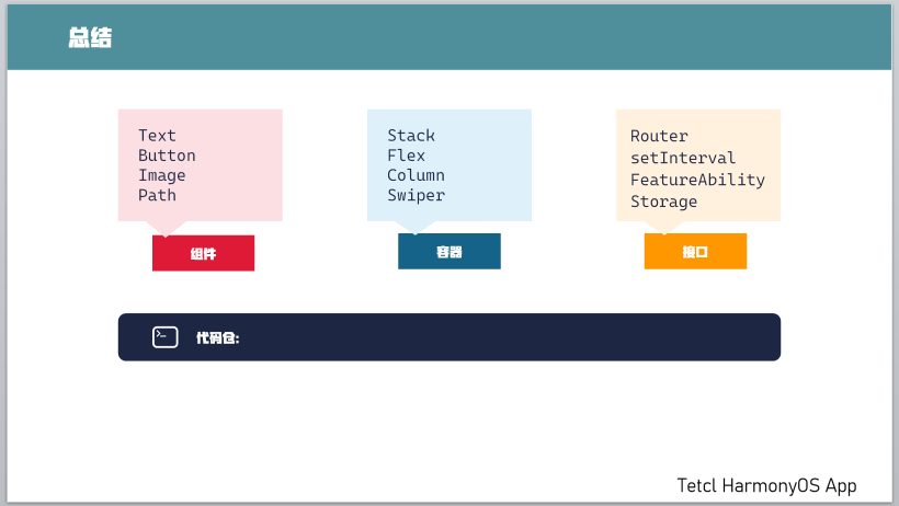
通过示例掌握了最新系统镜像烧写,SDK配置,及一些基础组件、容器、接口的使用。
演示效果见: OpenHarmony App启动页及欢迎页。
[A] 升级DAYU系统为OpenHarmony3.2.2.3
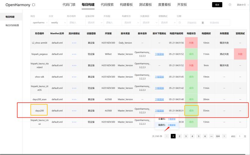
步骤一: 从每日构建中下载形态组件为dayu200且构建状态为成功的镜像包。
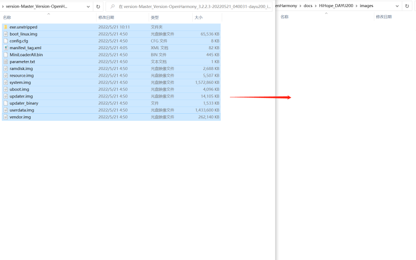
步骤二: 解压镜像包,并把包中的文件拷贝至提前准备好的HiHope_DAYU200文件夹下的images文件夹中(没有该文件创建即可)。
注:烧录工具、说明等需要通过git从仓库中获取,HiHope IOT仓库。
步骤三: DAYU200开发板通电,并通过USB与电脑连接(记得安装驱动DriverAssitant,位于在烧写工具及指南)。
步骤四 打开烧写工具(位于烧写工具及指南)。
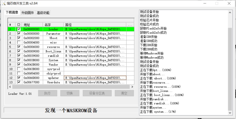
注:最新烧录方法见润和软件HiHope的DAYU200最新烧录OpenHarmony系统教程。
[B] 使用最新的SDK
打开DevEco Studio 3.0.0.900(For OpenHarmony)并创建项目后,点击运行后出现App Launch: The hdc_std version of the SDK does not match the hdcd version of the device.则说明hdc_std的版本不一致,需要把DevEco Studio的hdc_std改成最新版本。
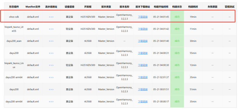
步骤一 从每日构建中下载最新的ohos-sdk。
步骤二 解压复制相关的文件到DevEco Studio SDK 文件夹中。
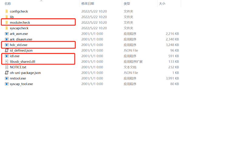
注意:拷贝时先关闭DevEco Studio,拷贝到toolchains -> 3.1.5.5。

步骤三 启动DevEco Studio,并运行项目查看是否可以直接在设备上安装应用。
Recommend
About Joyk
Aggregate valuable and interesting links.
Joyk means Joy of geeK