

Full-scale expression with Grilli Type
source link: https://www.figma.com/blog/variable-fonts-a-conversation-with-grilli-type/?ref=sidebar
Go to the source link to view the article. You can view the picture content, updated content and better typesetting reading experience. If the link is broken, please click the button below to view the snapshot at that time.

Full-scale expression with Grilli Type
Type can suffer from scaling problems: When you increase the size of a font, say, from a business card to a billboard (or even from a mobile device to a desktop), you’re also changing the spatial perception between each letter. Lines of copy that you might easily read in a given form factor will start to deform and become illegible in another. Balancing size and legibility often requires minute, exacting adjustments to the kerning (the spacing between individual letters) and tracking (the spacing between groups of letters), so that typography looks consistent and readable. Plus, managing different weights and styles requires multiple files, which can be tricky from a development perspective—more font styles means more code and assets to download, resulting in additional work, potential room for error, and slower loading times.
In short, making sure a font shows up in the best way can require a lot of finessing. That’s why we launched support for variable fonts, single font files that can be manipulated to achieve a variety of expressions by giving designers the ability to adjust type along a series of axes. Need to balance the optical size and weight of a font simultaneously? Go ahead. Want to play with the slant of a font? Have at it.
Variable fonts are also an exciting way to bring more dynamic expression to the web, a subject that Thierry Blancpain, co-founder of Grilli Type, an independent font foundry based in Lucerne and New York City, is passionate about. Grilli Type’s fonts and their accompanying mini sites have pushed the traditional boundaries of type design to enticing new heights. Blancpain asked Figma for variable fonts support back in 2020, and after exchanging DMs with Figma Design Manager Marcin Wichary, he and his team joined Figma's variable fonts beta. We spoke to Blancpain about what it takes to develop a typeface, the importance of dynamic web design, and what variable fonts mean for accessibility and user experience.
After asking Figma to support variable fonts, how does it feel to see it launched?
It feels really good. I think the design community is used to companies ignoring very obvious feature requests for decades. I don’t want to speak for Figma here, but the company’s origin as a user interface tool and as a product design tool probably helped in the decision to develop a feature that benefits the corporate world as well as designers who want to do interesting things for the web.
Grilli has always been an early proponent of variable font development. Why do you think variable fonts are so critical to a modern design practice?
First of all, it's the new standard format, and supporting the overall tool chain for fonts is really important. If the main tools of the trade like Figma don't support those standard formats, it becomes this endless process of trying to find workarounds.
But what’s nice about variable fonts, is that it’s one file with an entire font in it. You can actually use it across the board, and you don't need this version for that tool, this version for some other one. Just based purely on that efficiency, it’s really nice to have. From a broader perspective, it allows for precise typography in a way that previous formats didn't. Some people might not need it, but if you do need it, it's super useful, especially when creating designs that can be converted by developers into actual code.
We have [created] variable font websites without being able to use variable fonts in Figma. It works for me, personally, because I'm a developer and a designer, but in a more traditional environment where designers and developers are separate, it doesn't work.
Why do you think variable fonts are such an empowering tool for designer-developer collaboration?
Understandably, developers don’t want to complicate their lives for something that they might not have a deep interest in. I think the nice thing about variable fonts is that it offers a little bit for everyone. Developers love the idea that they only have to use a single font file for the entire family, and that's super helpful to them: it makes updating things easier, makes keeping the code clean easier, etc.
Designers love the ability to pick their specific weights, and really fine tune typography in terms of optical size. But they’re also able to use really fun effects like in GT Maru Mega, where you can have this very exuberant typeface and still make it work at really small sizes. The other part is animation. I think the web will become more and more of a moving experience. A purely static site often feels very old school nowadays.
GT Maru Mega is "the fullest expression of roundness" in the GT Maru family
How do you think variable fonts move us towards a more dynamic version of web design?
Typography can be expressive beyond just providing information. And sometimes that's just going from regular to bold if a user hovers over something. I think that dynamism just improves the experience, but it can also go further.
I think our mini site for GT Flexa is a really good example of where we see that going. Our mini sites generally try to push web design, and we want to show that our typefaces can lead the way.
It took six years to get the GT Flexa concept just right
Our friends at XXIX made a website that was the first use of GT Flexa in the wild. The type appears to breathe very slightly in and out—it sort of creates this calming experience with a certain rhythm to it. I think more and more, we're going to see expressive experiences like that, where type supports the overall brand value and how the brand feels on the web. Every website is a chance to communicate, and not using type to its fullest to do that job is missing something.
It's very easy to forget the fact that, ten years ago, we were all using Verdana, Times New Roman, Georgia, and Arial on the web. So I think the explosion of type also means that there's a lot of expressive potential that's being used now. And being able to access the entire family out of a single file, animating it, using all of these aspects in interesting new ways, allows for further expression.
But that can also go too far! We're going to see websites that use this potential to produce pretty terrible results. But that's okay. I think as the web design community, we've evolved from that position where everything has to be as boring as possible in order to be as usable as possible. We now understand that there's a tradeoff between expression and functionality, and we can push that boundary forward as well.
Every website is a chance to communicate, and not using type to its fullest to do that job is missing something.
As a type foundry, what role does Grilli play in pushing those boundaries forward?
Grilli is sort of like a record label and mixing studio that works with artists to create these typefaces. Instead of a recording session lasting a few weeks, our typefaces take years to develop.
GT Planar was designed by Dominik Huber. After Dominik shared a first draft with us, the project went back and forth between our team and Dominik, with many dozens—even hundreds—of rounds of revisions over the last few years. Each revision sharpens the concept further and further. We aim for each of our typeface releases to have a really clear-cut concept that succeeds on both the visual and functional level.
For GT Planar, the team focused on functionality, "no matter the length, size, or angle"
With GT Planar, we wanted to crystallize the idea of the typeface doing one really specific thing. It's very easy to try to make a typeface that does 15 things and is interesting; it's very hard to do a typeface that does one thing—has a really clear expression and clear concept—and does it in an interesting way.
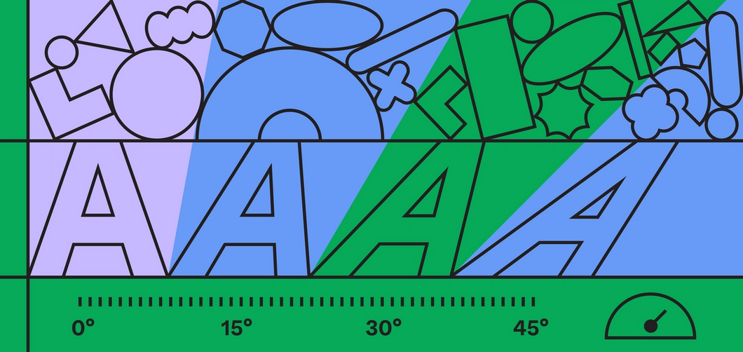
GT Planar goes from Thin to Black
GT Planar is a beautiful typeface on its own, but it does things that no other typeface does. And to achieve that, it has to push how we think a proper typeface should look. Because at the -45° and +45° angles, you have to do such weird stuff to make it work. This is very often part of our design process—as you expand the typeface, you reach the limits, and you have to adjust how you get there, how that works.
GT Planar transitions from -45° Retalic to +45° Italic
Variable fonts can be challenging to develop, compared to traditional type—what is Grilli Type’s approach?
Variable fonts work along axes, which is different from traditional type design where you only use weight and end up with static instances. What’s really different is that we want to create families that contain more than just weights, whether that's with weight and italic, like in GT Flexa's case, or weight and slant angles, like in GT Planar.
Our approach has become more about type systems than about typefaces. And it's a very small difference, but I think the end result is that we all—brands, people, us—think about how to use type in a certain way. So the really cool thing about variable fonts is that it opens up that customization to the end user. And instead of getting these static instances, you get a design space. You can pick whatever fits in that design space for your brand, so you're not bound to exactly that width, or exactly that weight.
So it’s more about creating an adaptive design space than showcasing new typefaces?
We have no interest in just providing BS marketing. We want to say things that are true, that are interesting, that are helpful. I feel that by giving people the tools to better understand the fonts that they're using, they're also going to use them in more interesting and better ways. That’s why we have the GT Academy; that’s why we have the mini sites. It’s to give more control to the user to understand what they're doing. I think if people use our fonts better, our fonts become better. It's how people use fonts that makes them interesting.
How do you think variable fonts impact accessibility and user experience?
Variable fonts use optical sizes. [Historically], as a design was translated into different type sizes, the type cutter would make adjustments to the typeface as they saw fit. If you look at a lowercase ‘a’ across different sizes in a metal typeface, each is completely different and sort of gradually changes at different sizes. That changed as people started making fonts in a single size.
So, with variable fonts, we’re going back to that century-old practice. We’re getting tools to effectively make type that translates one-to-one to legibility and accessibility for the end user. If the type is more appropriate for the end user, their reading and browsing experience is going to be better automatically.
Do you think that’ll evolve as variable fonts get picked up more?
Designers are going to feel empowered to use these tools with their own judgment, but users are also going to be free to challenge that. I think that's going to be really cool when people start feeling empowered to question the type designer—each use is a little different and you can't really know ahead of time how a type piece is going to be used in a particular environment. Those kinds of questions are going to be really interesting over the next few years.
Check out Grilli Type’s work, and learn more about variable fonts in Figma.
Recommend
About Joyk
Aggregate valuable and interesting links.
Joyk means Joy of geeK