

The Instagram rebrand embraces the “squircle” – a perfect union between the circ...
source link: https://www.itsnicethat.com/news/instagram-rebrand-graphic-design-230522?ref=sidebar
Go to the source link to view the article. You can view the picture content, updated content and better typesetting reading experience. If the link is broken, please click the button below to view the snapshot at that time.

The Instagram rebrand embraces the “squircle” – a perfect union between the circle and square

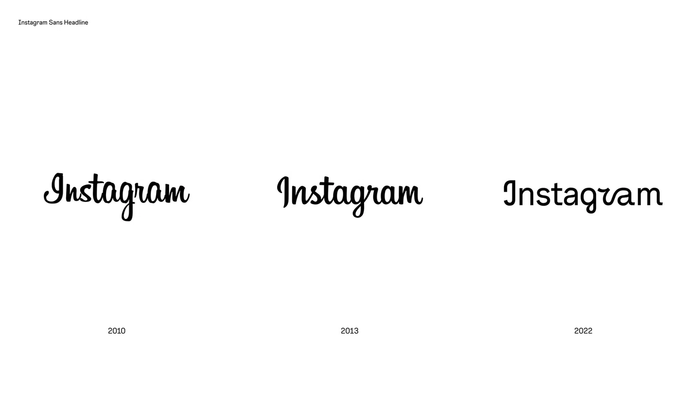
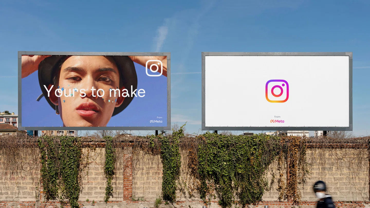
Instagram has rebranded with a new identity that draws from the platform’s well-established branding history, while taking significant steps since its last refresh in 2016 – when the brand first moved from its polaroid logo to the well-known pink gradient mark. The new design sees two major changes in the platform’s brand architecture; the first is a vibrant update to the its existing gradient motif via 3D modelling. The second, is the introduction of a new brand typeface, Instagram Sans, which uniquely embodies the softly-rounded corners of the brand’s wordmark and logo. Typography, incidentally, was also the most crucial and challenging element in rebranding a platform utilised by more than a billion worldwide.
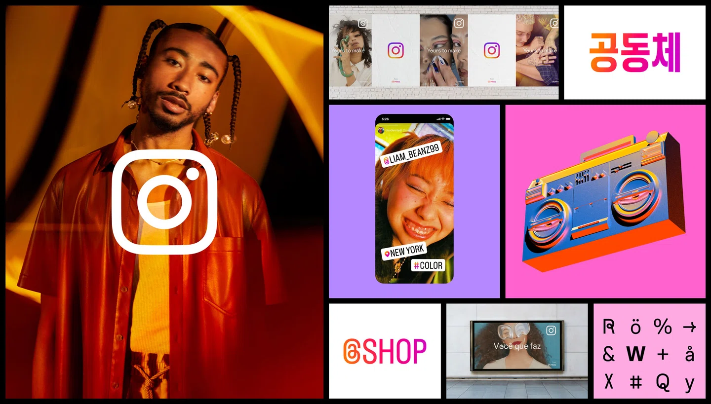
“The single most important part of the brief for Instagram Sans was to develop a typographic DNA that prioritised accessibility and global scripts from the beginning,” Cynthia Pratomo, Instagram from Meta creative director, tells It’s Nice That. Creating a system that would house multiple global scripts, including Korean, Arabic and Kannada, while staying true to the soft, looping style the team had in mind, was an extensive project in and of itself. Both an in-depth audit into community needs and the collaboration with over 40 typographers and language experts went into the final scripts. “From there,” Instagram’s Daniel Soedderstedt explains, “we imagined it as a contemporary but timeless remix of typographic styles – it’s neither a traditional geometric nor grotesque.”
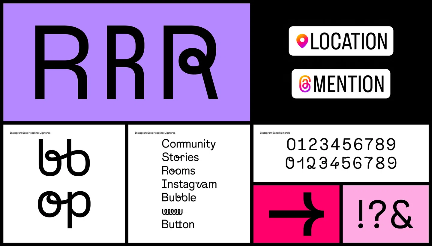
Instagram Sans is a brilliant example of the brand staying rooted in the history of the Instagram script while pushing it in new directions. Still prioritising legibility, the looping typeface is full of quirks that nod to the human hand, like the design of the ‘Q’ and ‘@’, and references to the Instagram script wordmark. It also embraces the near-spherical traits of the Instagram logo itself. Cynthia explains: “We knew we wanted the typeface to work harmoniously with our logo, but it was one of those aha moments when we unlocked the delightful story of literally referencing its’ form. Those in-between moments of a perfect circle and a square, which we lovingly call the ‘squircle’, show up throughout the typeface.”
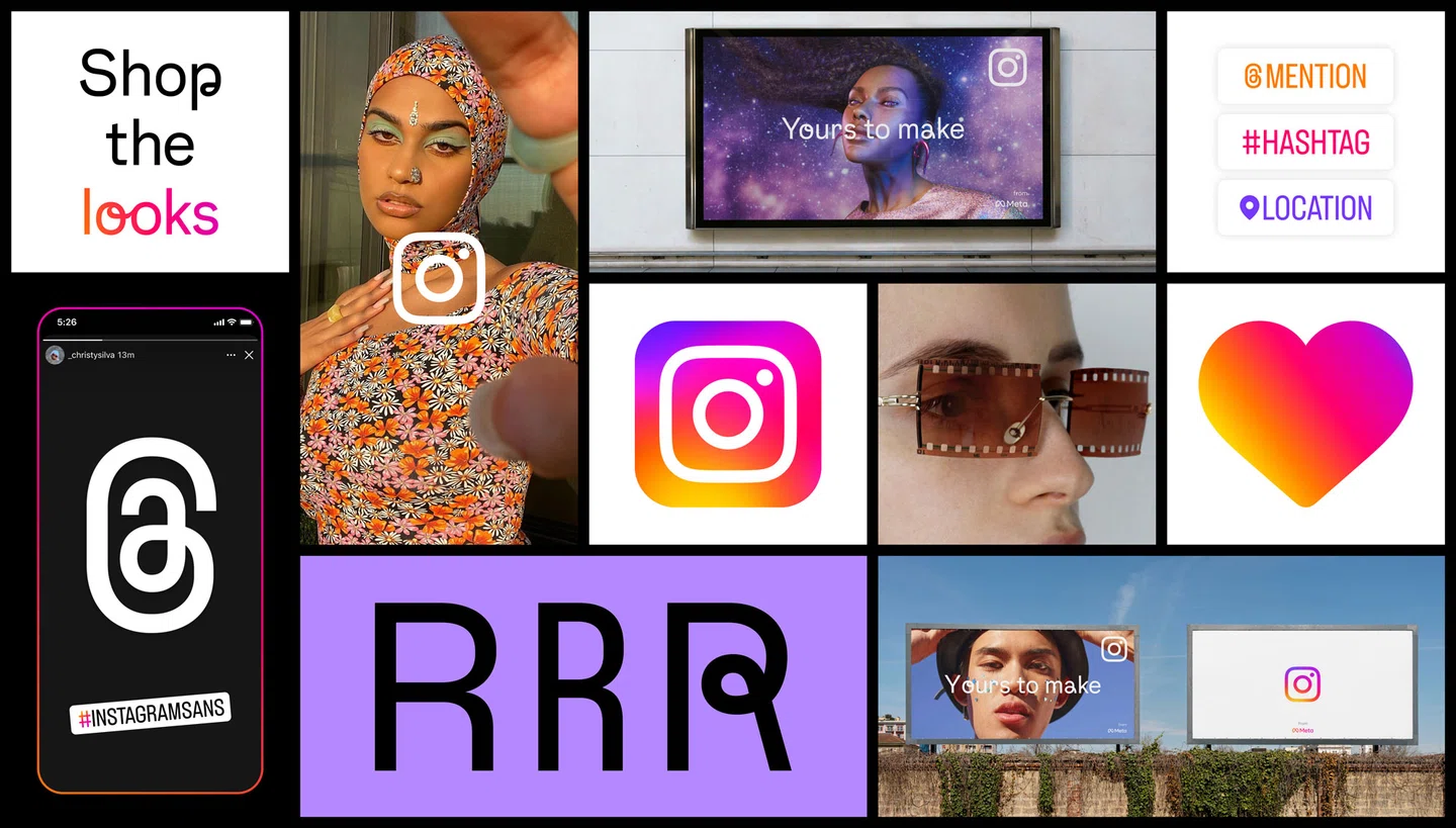
Instagram Sans was made in collaboration with Colophon Foundry and several global type foundries and is available in three styles: Regular, Headline and Condensed, which can now be used across Instagram Stories.
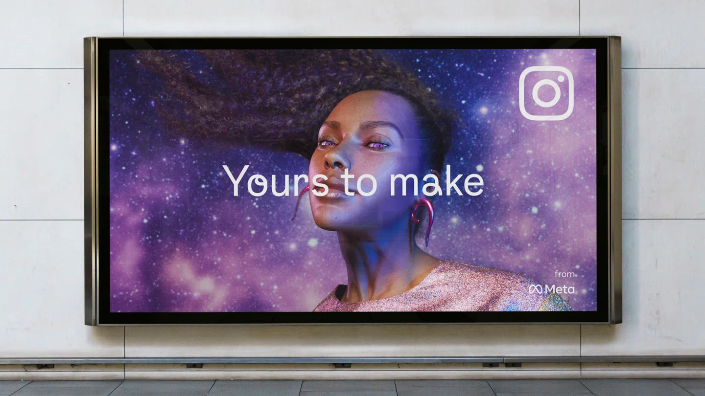
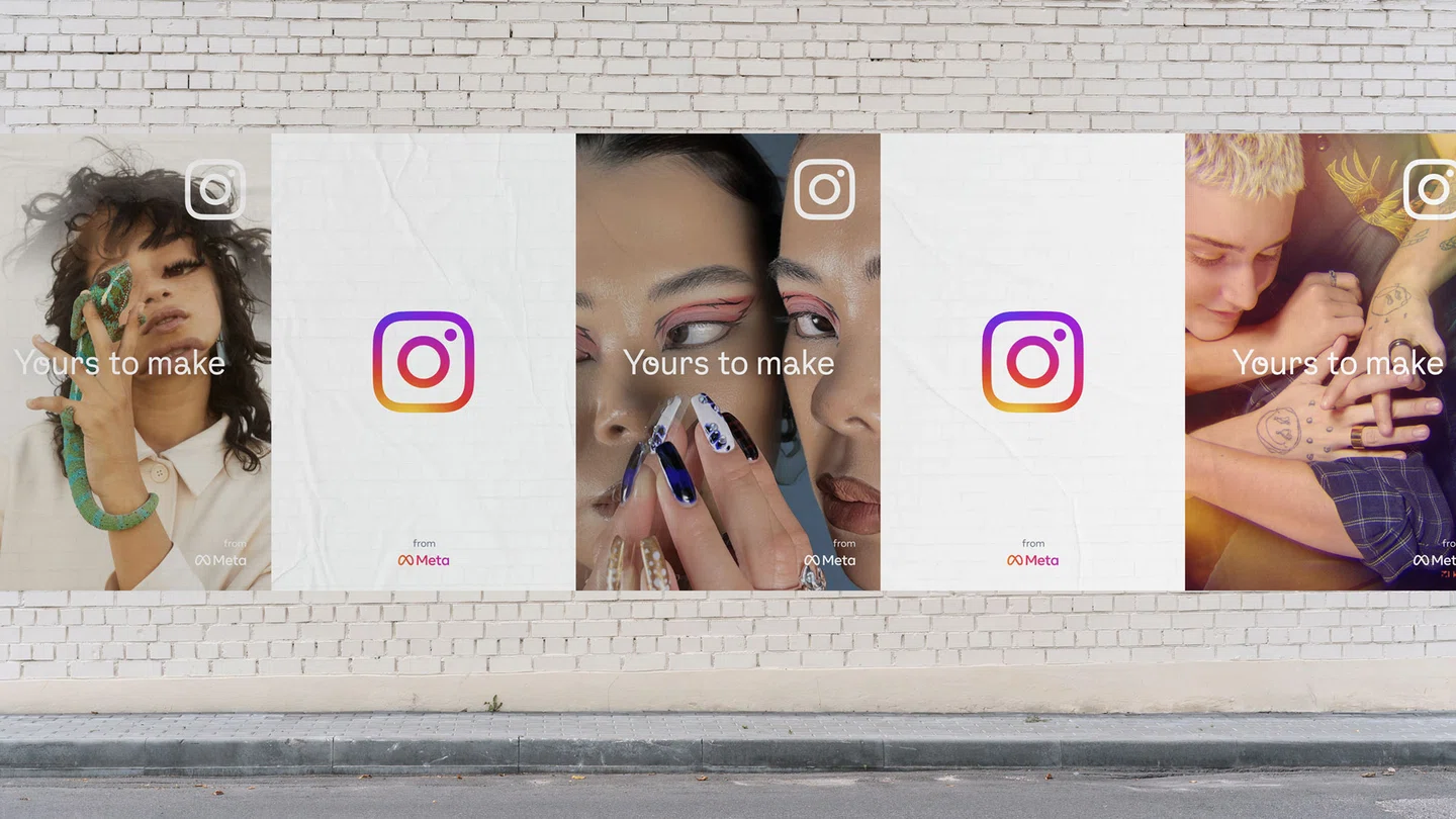
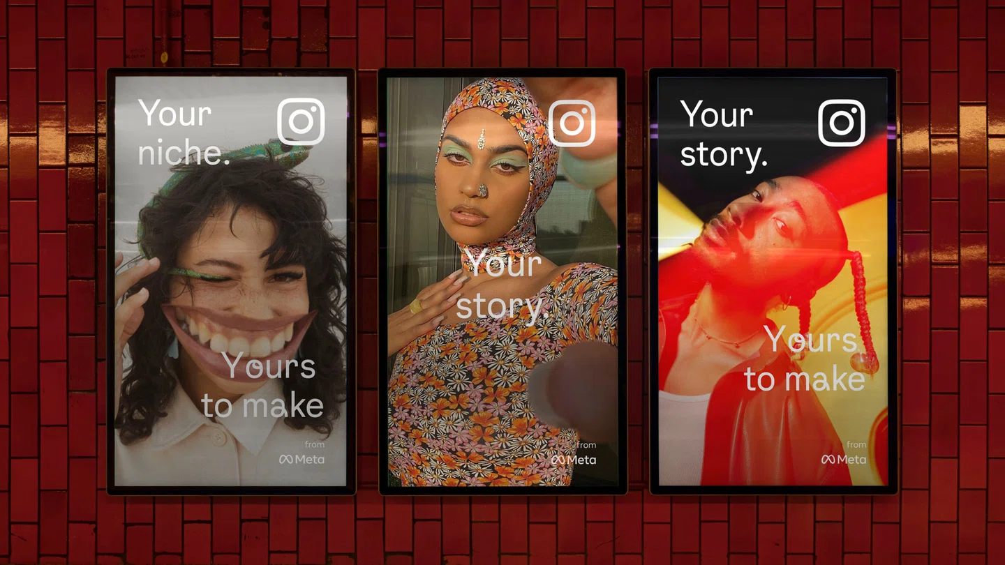
Gradients – perhaps one of Instagram’s most recognisable signatures – were already in use across the brand, but only as a simple static asset and often showing up in multiple different iterations across the site. Breathing life into the visual, or rather, making it feel lit from within, was a key aim for the design team. To create this sense of depth, Instagram worked with 3D digital artist and motion designer Rose Pilkington, who created an illuminated update that can be customised depending on usage – users may have already spotted the update across the app icon last week. The gradient is created from the brand’s new 5-colour palette, also created with vibrancy in mind.
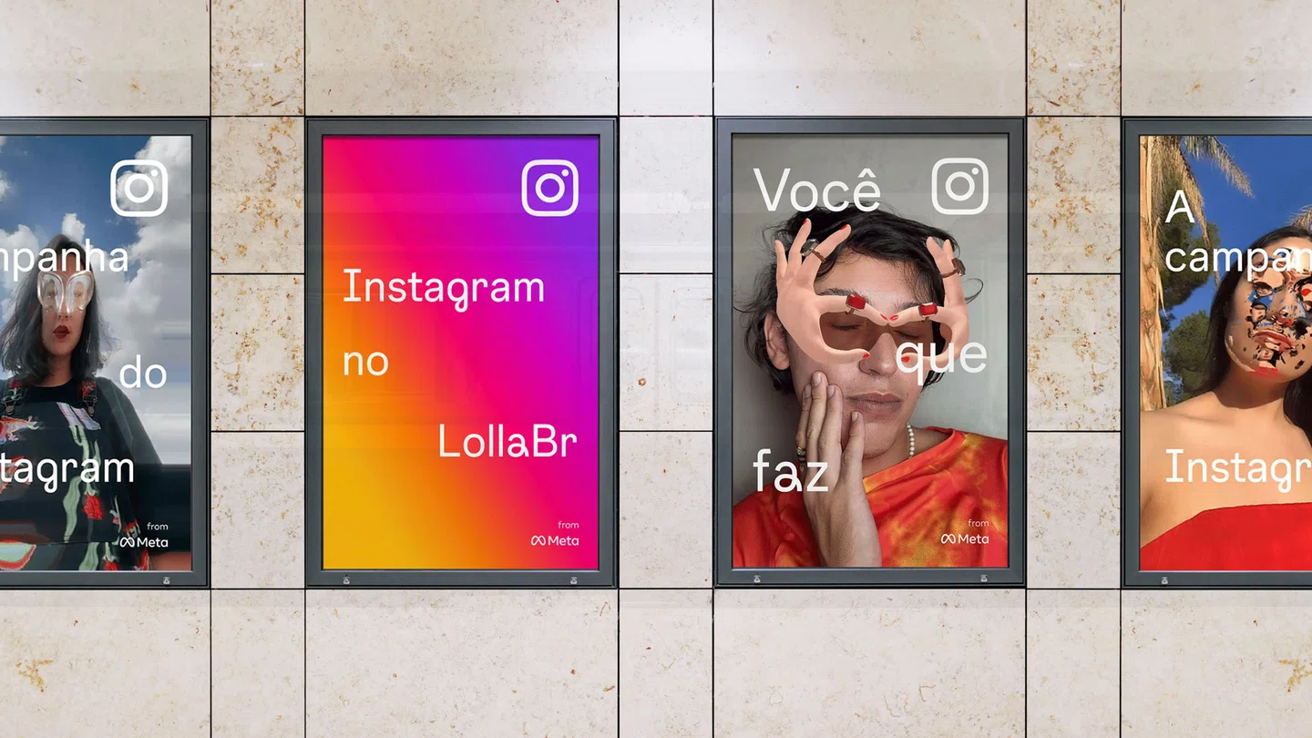
Elsewhere, the platform’s layouts have been refreshed to put community at the forefront through full-bleed imagery of users. This aim to place community first, and create an inclusive experience through legibility, unites much of the work on the project.
Cynthia concludes: “The world is so familiar with the Instagram brand that making any type of change is challenging. We want our system to be true to the spirit of Instagram – not simply change for the sake of change. That’s why the simplicity of the design system refers to what we all love most about using Instagram – it’s always content and community-first.”


Instagram: Instagram from Meta (Copyright © Meta, 2022)
Recommend
About Joyk
Aggregate valuable and interesting links.
Joyk means Joy of geeK