

Webflow most common issues
source link: https://uxplanet.org/webflow-most-common-issues-ba949bd2f207
Go to the source link to view the article. You can view the picture content, updated content and better typesetting reading experience. If the link is broken, please click the button below to view the snapshot at that time.

Webflow most common issues
Here a compilations of the most common issues pitfalls and fixes I find while working as a Webflow Developer
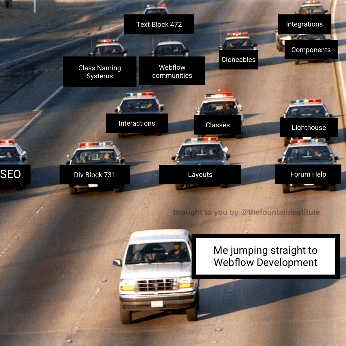
Scaping from/to Webflow Development
No design for big HD screens
You don´t have design for big screens. Client says: ‘This is how I see things on my screen’. OMG! After so many years of UX and we still hear this. First: Tell your client: ‘You are not the User’. Second: This is all about containers width and margins. What is the max width of your main container for each resolution? Maybe it is made for desktop but not for big HD desktop resolutions.
Not Mobile Design
You don´t have Mobile design or you have Mobile design with different measures. Usually you find width at 375px from Figma when you have 320px at Webflow. What do you do? Work with percentages or viewport units and fix margins/paddings. Same for images, you´d better move to aspect ratios.
The Desktop/Tablet issue
This happens with big menus, Navigation Bars with many items, it is ok for big desktop resolutions but if it is a low resolution there is not enough space for all the items.
Best solution is using custom code to change font-size for low desktop resolutions, something as follows:
/* reduce font size of navbar on screens less than 1200px width */
<style>
@media screen and (max-width: 1200px){
.navbar_link{font-size: 0.8rem;}
.Text-navbar{font-size: 0.8rem;}
.dropdown-text{font-size: 0.8rem;}
.button-login{font-size: 0.8rem;}
</style>
No Semantics
Your headings don´t follow proper way or you are avoiding hierarchy. Maybe thinking about SEO before making your layouts. Or even more: There are no headings. Sometimes there are sections without titles, maybe talking to designers about it also.
Flex or Grid?
So, what are you using? I think, at the beginning you do all with Flex, so you don´t care about grid for nothing. But, there is one day when you work with a template or a cloneable and find nice use of grids. Actually in advanced class naming systems they almost use grids for everything (finsweet ie.) So what should you use? If you master both that´s a point.
Div Block 731 and Text Block 472
This is about nomenclature. How do you name things? There are thirty words for snow in the north pole. Also there are legible classes, it is not the same “Hero-layout-2-grid” than “Container medium”. And then sometimes you have “Container medium”, “Container medium 2” and “Container medium Hero”. Yes it happens. A Class Naming System nomenclature or your own? When to choose which one? Probably it depends if you work on a team or not.
The Container Content container
How many containers do you need? How many divs? What is the record? One container for max width, other for padding, other for text styles… Is this too much? Some say “Stop using so many divs!” It is about structure and semantics, there are other tags: section, headers, main… Do you want that Bootstrap Classes train? Make a Combo Class Tekken movement? Go to Wordpress… Anyway we keep focusing on divs…
CMS Design
What happens when the Data is not ready for the Design. The clients wants the Design to put the data into it. The Designer wants the content to design. This is another loop and dummy texts and pics are not enough. You don´t have content, what about empty states, what about SEO?
Accessibility
Recently I went to visit my QA friends to the hell hole at Turkmenistan. Also known as the Door to Hell or Gates of Hell, is a burning natural gas field collapsed into a cavern near Darvaza, Turkmenistan. And yes, that is the place where all QA come from (just joking). So I discover some Chrome Extensions thanks to these QA people: WAVE Evaluation Tool and https://www.accessi.org/ among others.

Darvaza gas crater — The origin of QA
Also I would like to tell you about my pupils when I teach Webflow and I tell them that they should move to rem. Mmmm maybe it is too much for an introductory course.
No Design System, no Style guide.
So they send you the Figma file. It has UI for Desktop and Mobile but nothing about a Design system or a Style guide. What do you do? I make one, at least a style guide. Maybe you spend a day doing so but you win later. This should be compulsory.
Team work
A Webflow Developer comes into a bar (a Webflow space), he finds there: The client, the designer, the editor and other Webflow Developers from his team. How do they do? How to work in teams? Sometimes it is at playing Cluedo: Who was online at Pacific time at 15 pm hours? Was he fixing the home or working in the CMS? Nice clues there. Looks more like a communication breakdown problem. Just talk
The Flash Festival
Let´s talk about interactions! But before that, I must say that my first impression of Webflow some years ago was like seeing a festival. I saw some sites and everything was moving, maybe too much. I come from Advertising and I was one of those Adobe Flash guys some years ago, so didn´t want to the same path again. Fortunately it was only a first impression althought sometimes I think there is a lot of demand for interactions, as I see on Webflow jobs.
I prefer to do all with code, CSS or JS, don´t mind. Also, I don´t know why they made the timeline vertical, it was strange first time I saw it. I have seen something similar at animation software suchs a Flinto or Principle, but all Adobe software has a horizontal timeline. Maybe they didn´t have enough space, I am sure they considered it.
CMS structure
How to do things?
Lighthouse trap.
Pareto principle. The green cost. What is the cost of improving your score? Do you have time? Also, they should improve this please -> The Webflow wishlist
Looking for Help
You are stuck, yes you are. Where to go? I found two issues: The forum sometimes is obsolete as there are new features so, you have to look for one or two years past as much. Also, I don´t think technical support is really friendly. Or if they are, they could be more friendly. They should take into account that there are many people on their first steps at Webflow, so instead of asking for a site preview, they could be more friendly. Remember what happened to the boys at Stack Overflow: Lots of critics for the way people answer.
Anyway if you are stuck, think that:
- That issue has probably happened to other user. Change the approach. Search at Cloneables, ask on Twitter, look at the Forum, search at Google, make a demo or look at Codepen. There are many communities that could help you.
- Remember what we said when working at technical support: There are no errors there are issues, solutions, bugs and fixes
- Divide and win
Webflow limitations
Yes there are a lot. The most hated for me: limits on Collection lists on a page, Custom code limit 🤦♂️, limitations when working with svg 🤦♂️🤦♂️🤦♂️. Well there is a wishlist for all these
Webflow Space
A Webflow Developer comes into a bar again. He has a client: Should he begin on client´s Webflow space or at his agency´s?
If you do the first, there is an advantage: No one will have a hand on the project until you transfer it. For the second, you avoid transfer problems from the beginning, an client can get used to the Editor in time.
I like this tweet from
:
Recommend
About Joyk
Aggregate valuable and interesting links.
Joyk means Joy of geeK