

UX CASE STUDY | GROCERY MATTERS
source link: https://uxplanet.org/ux-case-study-grocery-matters-c8666982828d
Go to the source link to view the article. You can view the picture content, updated content and better typesetting reading experience. If the link is broken, please click the button below to view the snapshot at that time.

UX CASE STUDY | GROCERY MATTERS
A UX perspective into making online grocery shopping more user centric

Hey! I am an architect by profession and an aspiring UX designer. As a designer at heart, I have always been fascinated with people, the problems they face every day and why they behave the way they do. A good design for me is all about iterations, discovering a better version as you progress further.
“Design is thinking made visual.” — Saul Bass
My journey through the ‘UX dimension’ so far under the mentorship of Mr. Anudeep has brought me certain realizations. Design as a human construct has existed from the moment human thoughts took birth. But design as something universal is present all around us- from the cells inside an organism to the products that make our lives easier. And in each of them, a better design was arrived through continuous iterations.

THE PROJECT
As part of the research project, we were asked to choose a business problem statement and the associated research problem statement from a list of 10 statements.

This project is about the journey that I went through in understanding the heart of research and how it helps mould solutions. To guide you, the reader, on this journey, I would like to introduce you to your guide and my friend- DIPET.

I felt that I could brainstorm to develop my own statements with the help of my mentor, and doing the same gave me perspectives on what businesses to keep in mind when framing the statements. Since, it was my first time, I had to go through a number of attempts before finally arriving at my business and research problem statements.
Business problem statement
As an aftermath of the pandemic during which there was a huge rise in ordering groceries online, it has been noticed that users have continued to avail this model due to its ease of use and accessibility. But it tends to get hard for users to keep track of their groceries or identify items already available at their residence. Design a subscription model for a popular grocery app to keep track of items they have purchased or are planning to, so as to make it easiest for the user to place orders.
Research problem statement
It can get very hard to keep track of groceries purchased and items required over a grocery app. As a UX Designer, first understand the purchase behaviors of the different categories of users involved and how they plan out their shopping. Plan research to identify the behavioral patterns of the users to help the business cater to the users in a more efficient manner.

After defining the problem statements, there was the task of figuring out how to achieve this through research. When it comes to design though, time needs to be invested in what really matters. The ‘what’ will always be validated.
THE PROCESS
The steps to be followed for successful completion of the research project is laid out as shown below:
- Understanding the problem statements
- Secondary research
- Primary research
- Research analysis
- Forming ‘How Might We’ questions
- Ideation and wireframing
- UI and prototyping
- Usability testing
- Improved prototyping
Let us visit each step as we progress through our journey.

In order to successfully complete this project, I understood that it is going to require both my design thinking skills and research analysis skills.

It’s time to dive into this tale of research and design!
STAGE 01 — UNDERSTANDING THE PROBLEM STATEMENTS
To understand the problem statement better we need to dive deep and learn the different aspects behind it. To narrow down our research and achieve a more streamlined approach, we frame the 5Ws — Who, What, When, Where and Why. This stage helps us establish exactly what needs to be researched and why.

The reason why each of the 5Ws mentioned above are important is mentioned here.
This stage helped me realize the importance of narrowing down our research so that we don’t define the core essence behind the problem statement as something vague. It allows us to focus on what really matters.
STAGE 02 — SECONDARY RESEARCH
Secondary research or desk research is done by analysing data which is already present. This can be in the form of books, articles, journals and even previous surveys. Secondary research with respect to the problem statement was conducted which resulted in understanding the present landscape of the problem and gain deeper insights. The following insights were gathered through secondary research:

Article 01 — Making online grocery a winning proposition,
July 02,2021 By Bill Aull, Steven Begley, Vishwa Chandra, and Varun.• Due to the pandemic, e-commerce penetration rates shot from 3–4% to 9–12% between 2019 and 2020, with predictions of it hitting 14–18% by 2025.
• 36% of consumers were willing to pay a premium when shopping online and two-thirds of this group would only pay a premium of less than 5%.
• Online grocery was used to stock-up or top-up.
• Fresh and frozen categories got higher representation as people wanted safe and hygienic food, easily accessible and ease of use. This pattern stayed even after the initial wave.

Article 02 — Online Grocery Shopping in India: Anticipating Trends Post-Pandemic
2020 By Nikita Kashyap, MBA(HR) Symbiosis Institute of Management Studies, Pune.• 93% of grocery sales happened in the unorganized sector but shifts took place due to the pandemic.
• Pandemic created a sense of fear among consumers to visit shops. People support the unorganized sector due to goodwill and legacy but do prioritize safety and security.
• Study by Accenture 2020 shows customer behaviour stays same even after COVID-19.

Article 03 — What’s cooking in India’s e-grocery market?
July 25,2021 By Ebojyoti Ghosh and Prerna Lidhoo.• $24B to be hit by 2025 for e-grocery, which is 3% of the entire grocery market in India.
• Indian e-grocers are vendor agnostic.
• Grocery is one of the largest components of an individual’s consumption basket.

Article 04 — How e-groceries have finally come of age
27 October 2020 By Mihir Dalal.• Festive seasons are the most important when it comes to shopping in India.
• Festive spending has increased to 6–7% in 2020 from 2–2.5% in 2019, which shows high retention rates (RedSeer Consulting and Forrester Research).
• Sales went up by 40% for Grofers and 20% for Bigbasket. Grofers added a total of 1.7M users as of March 2020. Grofers marked retention rates of 70%.
• Customers who were skeptical at first have shifted to e-commerce as the pandemic affected them. The ease of use and accessibility made them stay.
• As time went by accessibility shifted to lower priced alternatives and their availability.

Article 05 — Grocery shopping trends in India: Reframing Big Events purchases
21 July 2021 By Pallavi Suresh, Retailer Vertical Lead, India• 67% of Asians were willing to buy private labels as they were cheaper and available.
• Publicity and promotions, competitive pricing gains more importance.
• Brand preferences became secondary as people went for availability and value. Challenger brands were offered at less prices and more availability.
• Brand loyalty was maintained for items such as snacks, noodles, vermicelli etc.
• Cautious spending and delay of premium spending except for health and wellness brands.
• Fresh categories have become key drivers of repeat purchases as home cooking became a mainstay.

Article 06 — Consumer’s Purchase Intentions for E-Grocery Shopping in India
27 October 2020 By Himanshu Budhiraja , Kanav Mittal (Research Scholar, Chitkara Business School, Rajpura, India)• A simulation shows that e-grocery is 43% cheaper than physically going to stores.
• The order in number of users in each profession category is as follows: Service profession > Business > Retired people.
• The number of users who are working Women > Men.
• Situational factors such as somebody falling sick, birth of a baby could lead to people shifting to using e-grocery temporarily.
• Users tend to have safety concerns regarding whether the online platform can be trusted or not.
• Even though there was stigma before, most people prefer buying fruits, vegetables because of ease of availability and time saving.

STAGE 03 — PRIMARY RESEARCH
Primary research involves people that will fall under your target user base. It allows us to get first-hand data from real people with real problems. The insights gathered from primary data leads to a better understanding of what the problem is and how to go about solving it.

After conducting secondary research, we are able to better understand the sample space of users that we need to focus on so as to arrive at our target users:

Once the target pool of users is identified, the next step is to find people in the real world who best suit the target set. For the purpose of finding users, we had to create a Google form , which had a series of questions to screen out potential people belonging to the target set.
To make this process more genuine and human, I added a photograph of myself and explained in the form, the purpose of this experiment. I also made a video of myself explaining the same and had it circulated across different social media platforms. In a period of one week, I got a total of 64 responses, out of which 18 people were ready to have a conversation regarding the topic.
As a result of the screening activity, I was able to finally arrive upon 6 users. The users were selected on the basis of relevance to the target user group and minimum bias.

Before we conduct the interviews, we need to prepare an interview session guide. A session guide will make an interview more conversational in nature. It allows us to dive deeper into the user’s mind. The session guide needs to be prepared keeping in mind the fact that users tend to do grocery online, offline or both.

There is an important thought to keep in mind before taking an interview- “Who are the users?”. This step allows us to take ourselves (the designer) out of the equation, so that we don’t bias ourselves into thinking that we are the users.
“I am not the user. I do not know what the problems my users are facing on my own. I cannot assume anything”.
The following insights were gathered after interviewing the users
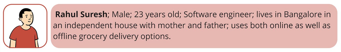
• Rahul does both online and offline shopping, but feels there is not much planning to it.
• Swiggy Instamart is used for smaller items such as snacks, ice cream etc. while offline shopping or BigBasket is usually used for larger orders.
• “I feel that it’s easier though in a physical environment to do grocery shopping. As a result, we don’t forget any item. For online shopping we tend to forget items usually”.
• “I feel a feature that keeps tracks of grocery would be interesting, but I would not want to personally keep updating the items as they get over in my pantry. If it is done by the app on its own, it would be very useful”.
• He feels was exposed to more products due to online grocery shopping, and also tried them. This would not have happened in offline shopping.
• He opts for online platforms due to convenience.

• Ajitesh and his family are very health conscious and want the best ingredients on a daily basis to help them achieve their dietary needs.
• Enjoys offline shopping of fruits and vegetables as there is personal assurance of getting high quality items. He has a personal relationship with local vendors and feels the need to support them. These items are home delivered to him by the local vendor.
• Always on the lookout for offers on Amazon, and if requirements meet, would opt for online shopping, but this happens very rarely. His family is conscious on where they spend.
• Does online shopping for milk on a daily basis due to daily needs and does a well-planned monthly offline shopping at D-Mart with family which could average into spending of INR 8,000- 10,000.
• “I feel grocery shopping should not be just about the business, it is also about creating a relationship with your customers”. He feels if a relationship could be initiated via the app between producers and customers, it will attract more people.

• Tanya and her family never used to do online shopping until the pandemic hit. Even though they were forced to buy online due to COVID-19, they now embrace it as something of convenience.
• She does monthly shopping from a nearby Metro store with planning being done a day before. She uses online grocery shopping for day-to-day needs.
• “I feel there is a difference in the way we consider what ‘Health’ is, before and after COVID”. She feels mindsets have changed from actually holding the ingredients in hand to taking deliveries online.
• She feels that adding more items to the cart after placing the order should be a feature. The idea of having two separate delivery personnel transporting items is a concern for her.

• Suman feels that online grocery shopping is a blessing as she gets all her requirements delivered to her quickly within minutes. As a result, 90% of shopping is usually done through online platforms.
• She already knows and plans ahead of what she is going to cook and keeps track of all items in memory and orders accordingly.
• Was already keeping track of expenses from pre-COVID and has control of what is being bought through grocery shopping.
•She is able to prepare all 3 meals for the day at home and finds it easier to do so because of the help of online delivery apps.
• She feels if charges are low and response time is good, she would even place a second order in case she forgot certain items while placing the first order.
• “I like cooking meals and trying out new dishes. Online shopping has helped me out by quickly acquiring materials on demand”.

• Riddhi prefers shopping offline. “I want to personally see what all items are available and the different flavors associated with a certain product. I rarely find such variety on online platforms”.
• “I hate waiting for the delivery to happen and so I think it’s easier for me to run down to the store and buy what I need”. This effects other plans she has for the day.
• Shopping is more of outing with friends and she finds herself buying snacks like ramen, biscuits etc.

• Divya does her grocery shopping from the corner convenience store very week, and all other necessities that come in between are done through online platforms.
• She also feels she opts online grocery shopping if she is feeling lazy or has urgent requirements.
• “I have a personalized grocery calendar on an excel sheet. My friends do make fun of me for having this, but it helps me a lot in planning orders as I am almost always busy with work.”
• She had a very erratic shopping schedule before the pandemic. Once pandemic hit, she became more organized and started making home cooked meals.
• She feels a feature which could keep track of groceries would be cool, as the method she devised for herself works.
• She feels offline shops do make you feel a sort of trust and the shopkeeper also helps her out in identifying new ingredients and how to cook them.
STAGE 04 — RESEARCH ANALYSIS

Once research is completed, it is time to jump onto the analysis of the data collected. Analysing data is important to verify, learn and broaden our perspectives on the problem at hand. It also helps us see if there are resemblances or differences between both primary and secondary data collected, so as to draw conclusions.

After the insights are analysed, we are able to arrive at forming user sets. A user set is a set of patterns observed that best describes a group of individuals. The following user sets were identified based on their grocery shopping behaviors:
- The Explorer — someone who is all about exploration.
- The Strategist — someone who plans and organises.
- The Sprinter — someone who plans on the go.
The user sets are described in details as shown below:

To understand each user set further, we draw upon what each user set says, thinks, does and feels. This is what is referred to as Empathy mapping, and is illustrated below:
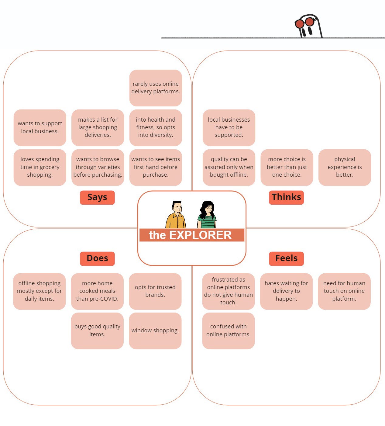


Now that we have behavioral insights of all 3 user sets, it is time to condense this data and arrive at the respective user personas.
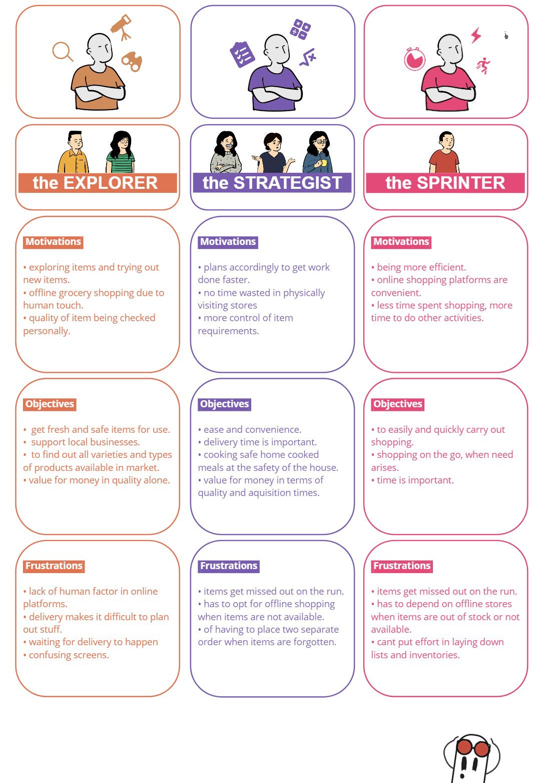
Even though we have formed 3 separate user personas to broadly categorize the users, we have to keep a very important thought in mind- the users are humans and human being are defined with respect to their behaviors. As a result, the following is noted:
• User sets can overlap with one another to form an ‘amalgam’ of user behavior- What this means is that users may tend to shown certain behaviors of another user set but not all of them.
• User behavior is highly dependent on situational factors- What this means is that users may drift along user sets depending on what happens in their environment.
• Users are not just these 6 people who have been interviewed- The insights gathered from them are to be used for the greater usability ease of the society in general.

The representation above shows that even if we are solving a particular problem, it has a way of helping users in more indirect ways in the course of time. So let us get on with finding solutions to these problems!
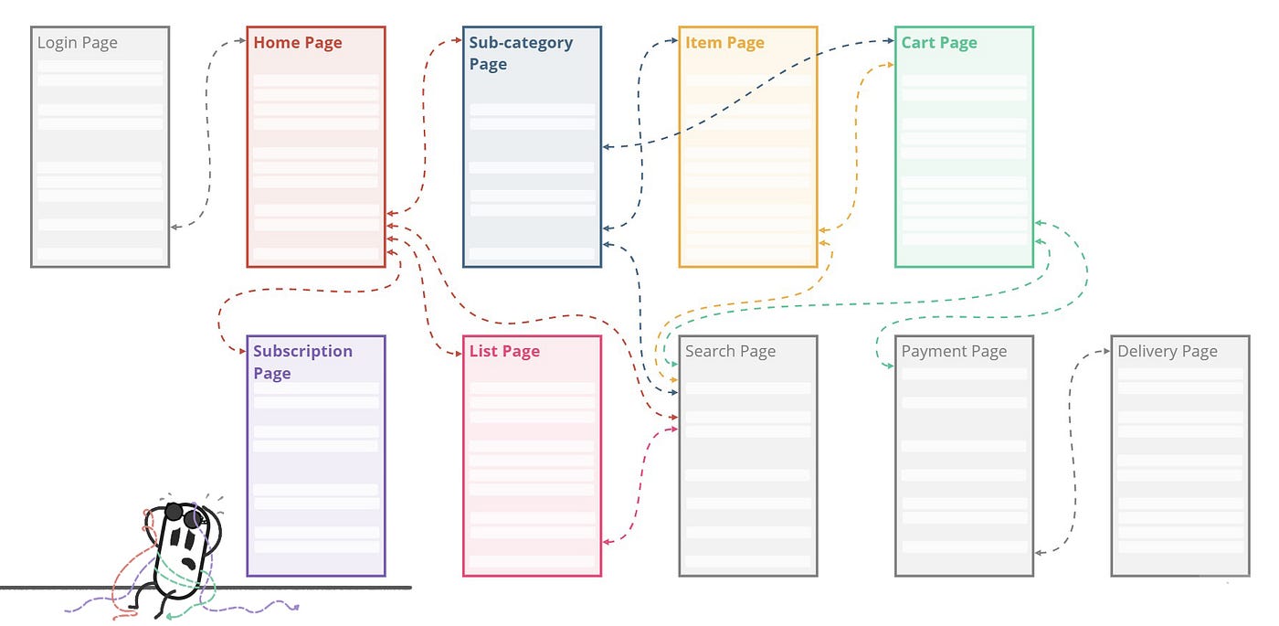
STAGE 04a — USER JOURNEY MAPPING
Before we go ahead we need to have an idea of the user flow associated with grocery shopping (both online and offline) to get a better understanding of ‘when’ actions and reactions occur. The following is the user flow chart:

As a result of empathy mapping, persona creation and user journey mapping, I was able to shortlist the most important problems that needed to be solved based on priority. The following problems are selected for solving :
Problem 01 — Tracking of groceries on an app is difficult.
Most users on the online grocery platform are finding it difficult to keep track of groceries. They tend to miss out on items or are not able to recall the items to be purchased. When they do miss out on items, they go to offline stores and buy them. They also have to do a great deal of planning before going shopping, which can get frustrating.This problem has to be solved as this is something that a lot of users must be facing. Solving it would help users to plan their grocery shopping in a better way. Reminding users to add items to their cart, directly helps the business as the ticket value for each purchase increases.
Problem 02 — There is no human element in apps.
Some users felt that a human element was missing in the app. A sense of assurance and quality control from a human would allow users to make better decisions of where they buy groceries from. Online platforms are missing the assurance users receive from offline grocery shops.Solving this problem will allow the business to tap into the emotional quotient of users. A sense of assurance and trust from a human element inside a e-grocery platform is enough to boost morale and even adopt news users into the system.
STAGE 05 — FORMING HMW QUESTIONS
A How Might We question is the first step towards understanding the core of the frustrations felt by users. A HMW question takes into account the pain points and frustrations of users and opens up an avenue to arrive at different ways to solve a particular issue. HMWs were framed for the problems already identified in the previous stage:

Problem 01 — The tracking of groceries on the app is difficult.
The above statement means two things:
• difficulty in tracking items available at the household and required by the household
• difficulty in tracking items on the grocery app.
Insights from problem 01 lead to the following HMW questions:
1. How might we make it easier for users to plan and prepare for grocery shopping?
2. How might we help users find items and categories easily?
Problem 02 — There is no human element in the app.
The above statement means two things:
• a human factor is missing.
• a sense of assurance is missing.
Insights from problem 02 lead to the following HMW questions:
1. How might we include human assurance for online grocery shopping?
STAGE 06 — IDEATION AND WIREFRAMING
STAGE 06a — IDEATION

This stage is where we brainstorm for ideas to solve HMW statements from the previous stage. For this, a method known as ‘Crazy 8’ was applied. In this method, we come up with a maximum of 8 solutions for each of the problem statements in a span of 8 minutes.

STAGE 06b —WIREFRAMING
A wireframe is a blueprint that helps us think and communicate the structure of the application to be built. Through wireframing process I am trying to solve the following problems:
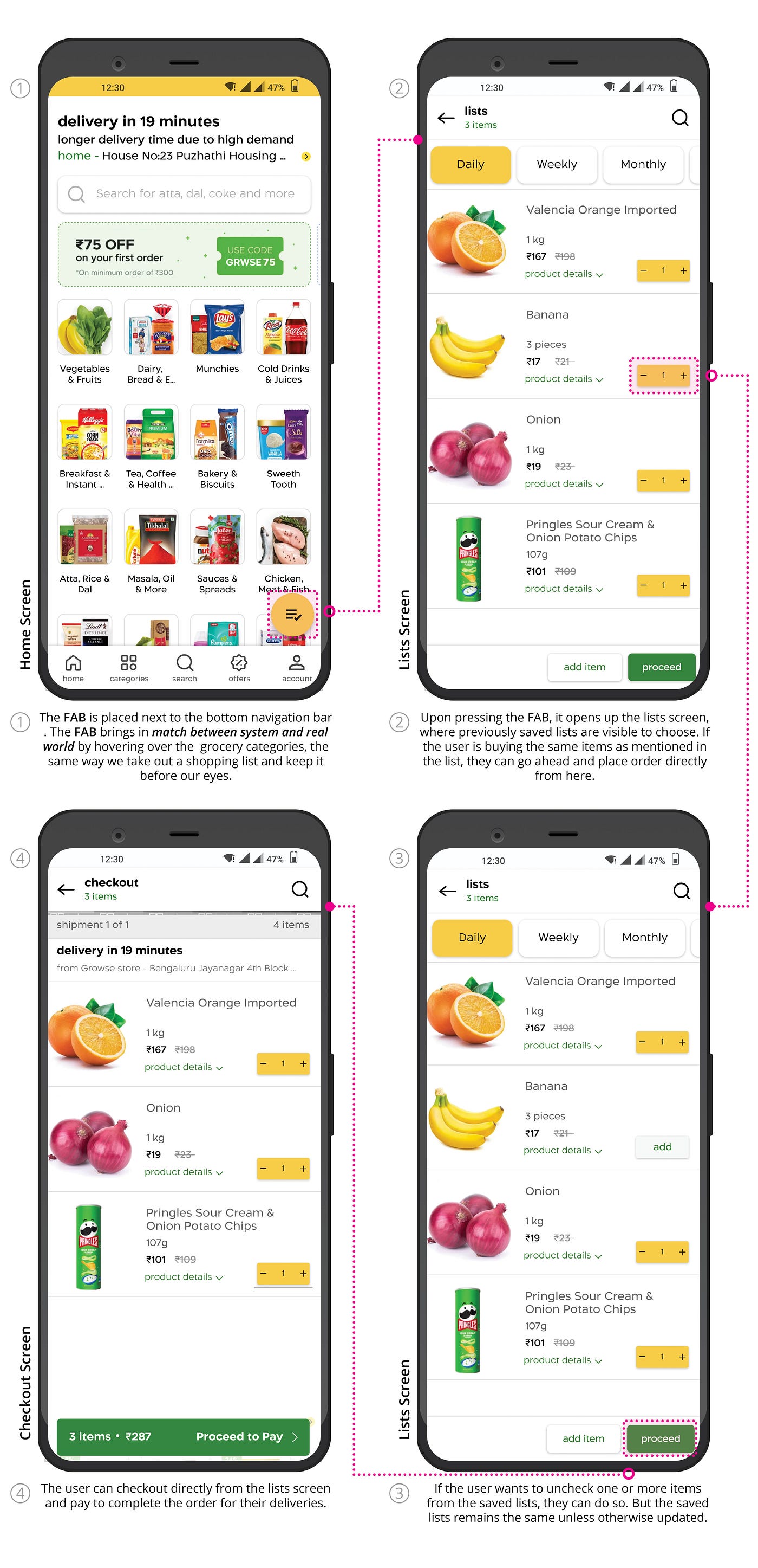
• A list feature that automatically adds items purchased into personalized lists. The items from the list will be signified throughout the app to help users not forget items while shopping.
• An information add-on to let users know the origin of products on the individual item screen.
Low to Mid Fidelity Wireframe

As an architect, we are used to sketching out our initial ideas on paper before going ahead with software. This allows us to form a connection with the concepts that we are trying to bring into reality. Referring to my past experience, I sketched out some low fidelity wireframes on paper. They allowed me to understand the flow and components of the UX solution.
Home page

Lists page

Sub-category page

Individual item and checkout page

Since the solutions are to take place on an existing app, we need to come up with solutions that don’t drastically change the layout of the screens. We also need to keep in mind consistency and standard. The above screens have been sketched keeping this in mind but also adding on features which will help in usability as per the research conducted.
High Fidelity Wireframe
High fidelity wireframe allows us to arrive at a more detailed understanding of the UI layout. It allows us to think about all types of interactions that are to be addressed before going into final UI and prototyping. I noticed that as I moved from low to high, both clarity and diversity came into picture. This allowed me to think further on the solution.

The following is a flow diagram between the different screens which allows us to understand the flow patterns and interactions required at each stage of using the app and its new feature.
I educated myself with the design language of my base app- the Blinkit app. I also started learning about the anatomy of different components from Material Design while I was figuring out solutions. I also was going through numerous similar apps to draw inspiration from. This exercise helped me realize the vast potential the UI dimension had and it was a very enriching experience.
A number of iterations for each screen in question was tried out in figma so as to arrive at the best way to represent the solution to the problem. This allows us to arrive at a better way to solve a particular problem.
Link to figma file(High fidelity prototypes)
The final solutions selected from the iterations contain the following insights:
• Introducing an access pathway to the new feature on home screens and other existing screens.
• A better design in terms of usability, practicality and which draws inspiration from how things work in the real world.
• Designing for the solution keeping in mind not to disturb the existing ecosystem of the base app.
• Thinking on the micro-interactions between components introduced, their relationships and states they might have.
The following are the High-fidelity wireframes that were shortlisted on the basis of usability and heuristic evaluation:
Home page

Subscription page

Lists page

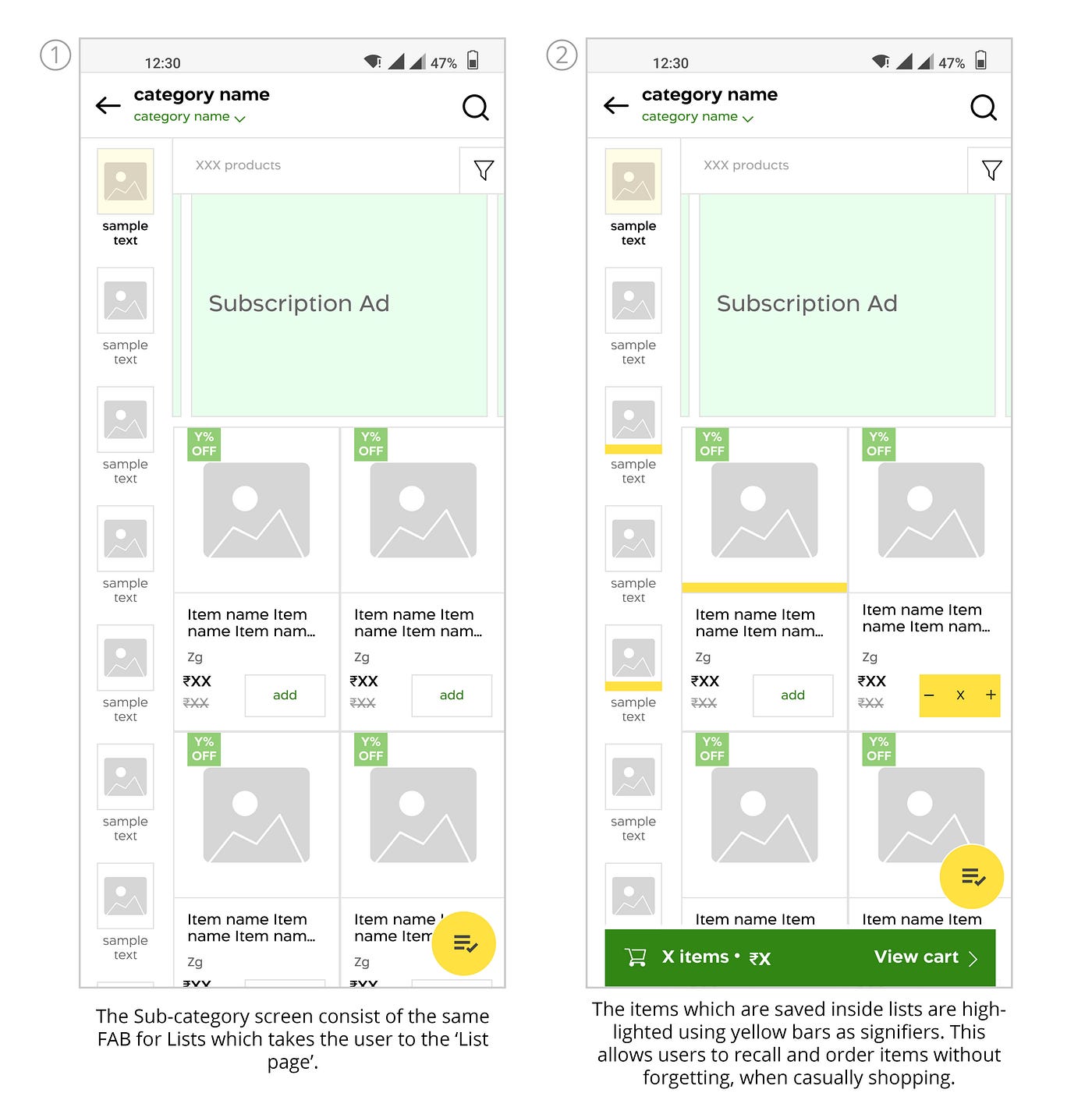
Sub-category page
Individual item page

Check-out page


STAGE 07 — UI AND PROTOTYPING
Now that we have finalised our design solutions, it is time to move to UI and prototyping. Before jumped in, I did a study on how UI designs are managed in the real world and learnt about design systems, project hand off stages and much more. I also asked around and discussed with my peers from the growthschool community about how to work efficiently in figma.

Doing this allowed me to add concepts of design styles, variants and component sets to my existing knowledge. This made me realise how efficiently I could work.
I went ahead and applied these concepts and prepared a more well-documented figma file which is attached below:
Link to figma file (UI prototype)
The explanation to the final UIs is listed below:
Flow from Home screen to Lists screen
Flow from Home screen to Sub-category screen and Individual item screen

Flow from Home screen/Sub-category screen to Subscription screen

Flow from Checkout screen to Add items Lists screen

Flow from Checkout screen to Payment

STAGE 08 —USABILITY TESTING

The usability testing stage is where things get really interesting. This stage is where we test out the design with users belonging to the user set. The core of this experiment is to know the following:
• Getting to know what users understand from the screens.
• Asking probing questions to know what users comprehend from the screen.
• Catching spontaneous reactions from users when they interact with the prototype.
Before testing out with users, a set of guidelines and tasks were outlined so that the testing goes according to plan and touches all major parts of the solution presented. The following illustrated card shows the outline:

With this, calls were scheduled with users belonging to the user set and testing was conducted.
The link to the prototype is attached below:
Link to Prototype
STAGE 08a — TESTING INSIGHTS
For the testing stage, I recruited 3 users from STAGE 03 — PRIMARY RESEARCH. This allowed me to understand the users I have talked to and conducted the testing stage based on the User tasks prepared.
The following insights were gathered from the testing stage :

• All of the users liked the idea of a list feature being added to the grocery app platform and were easily able to identify the FAB button that lead to the ‘lists screen’. They felt it will save a lot of time and would be a very beneficial feature. Some users pointed out the need to make this aware for first time users.
• Most of the users were not able to understand that items saved in lists were highlighted via signifiers throughout the app.
• One of the users suggested the inclusion of a microphone option for the search bar, which will allow the user to add items to lists via voice input.
• Most users felt that the additional information about where a particular item was sourced from gave them a feeling of trust and assurance. One of the users, who is a app developer himself felt — “ It has to be made sure that this particular feature is something that would help a majority of users, since adding another set of data and a photograph of the person acting as the source, translated to storage which in turn translates to money.” He felt unsure about this feature.
• Although most users were able to toggle on and off the ‘items from daily list’ at the checkout page, they were not clear as to why this particular feature was there.
• Most users felt stuck at the pop-up card that came up just before paying for the delivery. They did not understand what list updating the card was referring to or what items the app was talking about.
After going through the insights, the features I decided to work further on are listed below:

• I understood the list feature was an important improvement in the grocery delivery app experience as suggested by my users, and so decided to go ahead with it. To make new users aware I decided to add an information pop-up that appears on the screen to guide the user.
• Since most of the users were not able to identify the meaning of the signifier, I decided to work on it to make it more easily identifiable. This feature is important as it will create the possibility of users adding more items to the cart to increase the ticket value.
• I decided to stick with the feature of an item’s source information, as it made sense to most of the users and allowed them to trust the experience.
• I decided to stick with the feature of toggling on and off lists from the checkout, as it enabled users to compare the price between buying items from the list or sticking to not including them in the purchase.
• Since most user felt stuck and didn’t understand the pop-up card that came right before proceeding to pay, I decided to work on it to make it more understandable.
STAGE 09 — REVISED PROTOTYPE

The revised figma file is attached below:
Link to revised figma file ( revised UI prototype)
The explanation to the updated UI is listed below:


I decided to name my grocery app ‘Whoosh!’ and went ahead with creating it’s experience based on my research.0

The link to the revised prototype is attached below:
Link to Revised Prototype
With this we have come to the end of our UX research journey. We understood how research and design allows us to arrive at the best possible solution for our users.Let us now move on to what the future of the product holds.

FUTURE SCOPE
I believe design is a continuous process of iterations and it improves with each feedback that we gain. Keeping this in mind, I would like to address the future scope of the product:
• I would like to work on including a voice feature built into the app to make adding items to list and checkout much more smoother through voice commands.
• I would want to include more factors that add a touch of human element into the app so as to attract more users and increase adoption rates.
KEY LEARNINGS

• I learned the importance of research and how it guides us through the vast sea of information and opinions. It sets the base of the entire design process so that we are reminded of what is important and why something is important.
• I learned to learn by doing and take the ‘non-textbook approach’ to learning things in life. This approach really helps to solidify our learnings and push us to find out the reasons behind each and every step during the design process. This way we are always keen to learning and growing more.
• I also learned the importance of asking questions. Questioning everything allows us to dive into a deeper state of understanding. A deeper understanding leads to deeper insights and deeper insights lead to better solutions.

Thank you for being a part of this journey. If you liked it, do let me know in the comments. All feedback is welcome. You can reach me at [email protected].
If you want to learn more about my design thinking journey and about how ‘DIPET’ found his design thinking crown, do check out the link given below:
Design Thinking ProjectIf you want to read more content regarding user experience design, don’t forget to follow me on Medium!
Thank you once again!
Recommend
About Joyk
Aggregate valuable and interesting links.
Joyk means Joy of geeK