
5

HarmonyOS 自定义列表组件
source link: https://os.51cto.com/article/707282.html
Go to the source link to view the article. You can view the picture content, updated content and better typesetting reading experience. If the link is broken, please click the button below to view the snapshot at that time.

HarmonyOS 自定义列表组件-51CTO.COM
HarmonyOS 自定义列表组件
作者:韦海 2022-04-24 15:17:56
根据鸿蒙官网组件,结合相关技术,尝试列表组件的封装,提高开发的效率。

根据鸿蒙官网组件,结合相关技术,尝试列表组件的封装,提高开发的效率。
封装组件代码:
hml代码:
<!--start判断是不是switch开关列表,不是就加点击阴影事件-->
    <div class="container {{ start ? 'background' : '' }}">
        <!--下划线-->
        <div class="underline" >
            <!--标题-->
            <div class="list-left">
                <div>
                    <text class="title">{{ title }}</text>
                </div>
                <!--describe判断是switch按钮还是图标-->
                <div class="list-des"
                     if="{{ subheading }}">
                    <text class="list">
                        <span>{{ subheading }}</span>
                    </text>
                </div>
            </div>
            <!--switch开关-->
            <div class="list-right">
                <switch class="switch-list"
                        if="{{ whether }}"
                        @change="switchHandle">
                </switch>
                <!--图标-->
                <image else @click="launch()" class="list-icon" src="../images/right.png">
                </image>
            </div>
        </div>
    </div>
css代码:
.container {
    justify-content: center;
    align-items: center;
    padding-left: 48px;
    padding-right: 35px;
    overscroll-effect: spring;
}
.background:active {
    background-color: #f6f6f6;
}
.underline {
    border-bottom: 1px solid #ccc;
}
/*标题样式代码*/
.list-left {
    flex: 1;
    flex-direction: column;
    justify-content: center;
}

.title {
    font-family: FZLTHJW--GB1-0;
    font-size: 32px;
    color: rgba(0, 0, 0, 0.9);
    letter-spacing: 0;
    font-weight: 400;
    height: 70px;
}
.list-des {
    width: 530px;
    flex-wrap: wrap;
    margin-bottom: 10px;
}
.list {
    font-family: HarmonyOS_Sans;
    font-size: 28px;
    color: rgba(0, 0, 0, 0.6);
    letter-spacing: 0;
    line-height: 35px;
    font-weight: 400;
    padding-bottom: 2px;
}
/*switch开关样式代码*/
.list-right {
    justify-content: flex-end;
    width: 115px;
    min-height: 100px;
    align-items: center;
}
.switch-list {
    width: 115px;
    height: 120px;
}
.list-icon {
    width: 14px;
    height: 26px;
    right: 20px;
}
js代码:
export default {
    props: {
        //数据绑定
        title: {
            default: ''
        },
        //数据绑定
        subheading: {
            default: ''
        },
        //true是switch开关,false是图标
        whether: {
            default: true,
            type:Boolean
        },
        //判断是不是switch开关列表,不是就加点击阴影事件
        start: {
            default: true,
            type:Boolean
        },

    },
    computed: {
        //判断是不是switch开关列表,不是就加点击阴影事件
        start() {
            return  !this.whether
        },
    },
    /**
     * 切换开关
     */
    switchHandle({checked: checkedValue}) {
        this.$emit('switchHandle', checkedValue);
        this.checkStatus = checkedValue;
    },
};
引入组件代码,实现列表功能:
hml代码:
  <element name="list-page" src="../../common/listitem/listitem.hml"></element>
<div class="container">
      <list-page whether="{{ true }}"
          @switch-handle="showDialog"
          title="标题1"
          subheading="副文本">
    </list-page>
    <list-page whether="{{ true }}"
          title="标题2">
    </list-page>
    <list-page whether="{{ false }}"
          title="标题3">
    </list-page>
    <list-page whether="{{ false }}"
          title="标题4"
          subheading="副文本">
    </list-page>
</div>
css代码:
.container {
flex-direction: column;
color: #fff;
background-color: #fff;
overscroll-effect: spring;
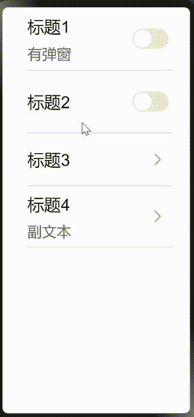
}效果图为:
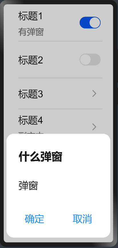
在标题1加弹窗:
hml代码:
<!--标题1的弹窗-->
    <dialog id="dataRoamDialog" class="dialog-main">
        <div class="dialog-div roaming">
            <text class="text ">什么弹窗</text>
            <div class="inner-txt">
                <text class="txt distance">弹窗</text>
            </div>
            <!--确定取消开关-->
            <div class="inner-btn">
                <button type="capsule"
                        value="确定"
                        onclick="setList"
                        class="btn-txt">
                </button>
                <div class="btn-l"></div>
                <button type="capsule"
                        value="取消"
                        onclick="setList"
                        class="btn-txt">
                </button>
            </div>
        </div>
    </dialog>
css代码:
/*弹窗样式*/
.dialog-main {
    width: 95%;
}
.dialog-div {
    flex-direction: column;
    align-items: flex-start;
}
.roaming {
    height: 340px;
}
.text {
    font-family: HarmonyOS_Sans_Medium;
    font-size: 36px;
    color: rgba(0, 0, 0, 0.9);
    letter-spacing: 0;
    line-height: 38px;
    font-weight: bold;
    height: 112px;
    padding: 40px 0 0 40px;
}
.inner-txt {
    width: 90%;
}
.txt {
    font-family: HarmonyOS_Sans;
    font-size: 32px;
    color: rgba(0, 0, 0, 0.9);
    letter-spacing: 0;
    line-height: 38px;
    font-weight: 400;
    flex: 1;
    height: 75px;
    justify-content: space-between;
    font-family: PingFangSC-Regular;
}
.distance {
    padding-left: 40px;
    margin-top: 20px;

.inner-btn {
    width: 100%;
    height: 120px;
    line-height: 80px;
    justify-content: center;
    align-items: center;
    margin: 10px 20px 0 20px;
}
.btn-txt {
    width: 230px;
    height: 80px;
    font-size: 32px;
    text-color: #1e90ff;
    background-color: #fff;
    text-align: left;
    align-items: center;
    flex: 1;
    text-align: center;
}
.btn-l {
    width: 2px;
    height: 50px;
    background-color: #ccc;
    margin: 0 10px;
}
js代码:
export default {
    /**
     * 标题1弹窗开启
     */
    showDialog() {
            this.$element('dataRoamDialog').show();
    },
    /**
     * 标题1弹窗取消
     */
    setList() {
        this.$element('dataRoamDialog').close();
    },
}
以上是所有的代码,写这个不难。主要用到了数据绑定跟三元运算和弹窗组件。相当于学习了鸿蒙的开发,自己尝试封装,让自己更加了解鸿蒙开发。本次分享希望对大家的学习有所帮助。

Recommend
About Joyk
Aggregate valuable and interesting links.
Joyk means Joy of geeK