

Why it’s hard to read the time on Infograph
source link: https://marco.org/2018/10/09/infograph-legibility
Go to the source link to view the article. You can view the picture content, updated content and better typesetting reading experience. If the link is broken, please click the button below to view the snapshot at that time.

Marco.org
I’m Marco Arment: a programmer, writer, podcaster, geek, and coffee enthusiast.
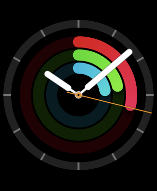
Quick, what time is it?
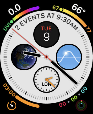
If that took you a bit longer than usual to tell the time on the Apple Watch’s new default Infograph face, you’re not alone:
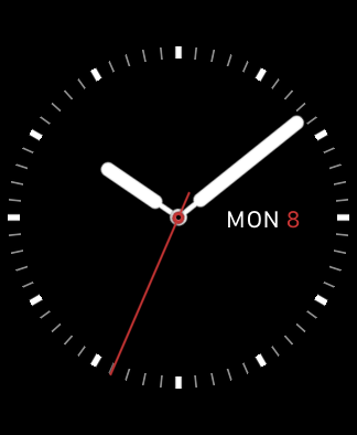
I’ve configured mine acceptably, but Utility is still far more legible for telling the time at a quick glance:
Infograph, Utility
Infograph suffers from two major issues:
- The center complications reduce the contrast between the dial and hands, often making the hands hard to locate. This is avoidable with customization, although the defaults should be much more conservative.
- It takes too much cognitive effort (and therefore time) to distinguish the current hour. This is simply a flawed design.
It’s faster and easier to read analog time with the 1–12 numerals displayed on a watch, but many people prefer the cleaner look of a watch that uses lines, dots, or other shapes as hour markers instead. (Watch people call these “indices”.)
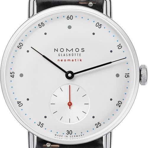
And it’s absolutely possible to design a highly legible dial with hour indices in many different styles. Here are some classics and modern takes:11
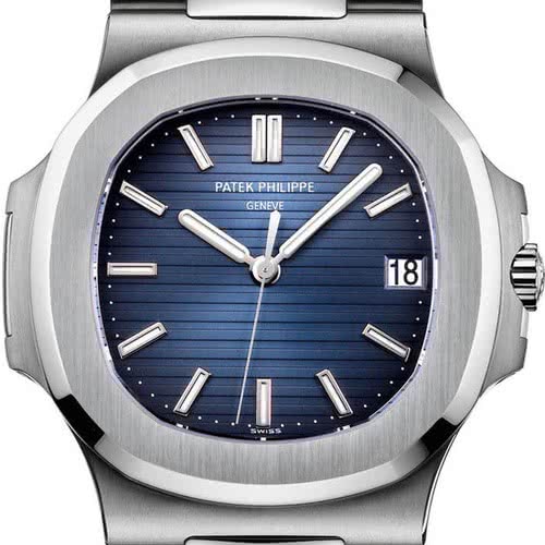
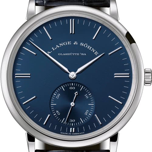
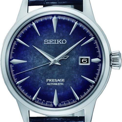
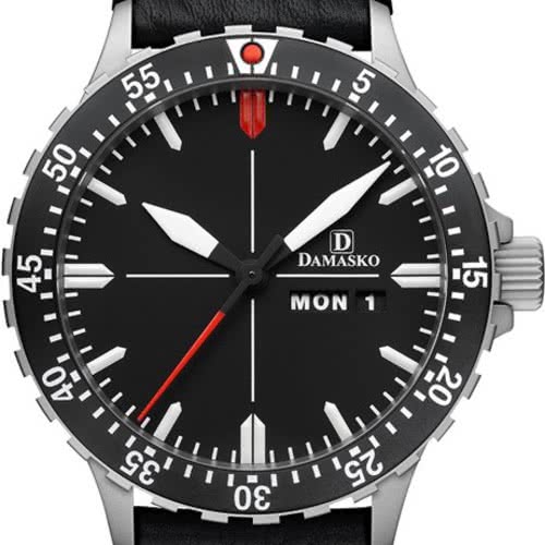
Across a wide variety of brands, styles, and price points, a few key design principles are clear:
- The hour markers for 12 (and often 3/6/9) are more prominent.
- The hour indices are much larger than the minute markings.
- The hour hands nearly touch the hour indices.
These all improve legibility by making it as fast and easy as possible to know which hour is being indicated (and minimize the chance of an off-by-one error), first by orienting your eyes to the current rotation with the 12 marker, then by minimizing the distance between the hour hand and the indices it’s between.
Apple Watch’s analog faces all fail to achieve these principles:22
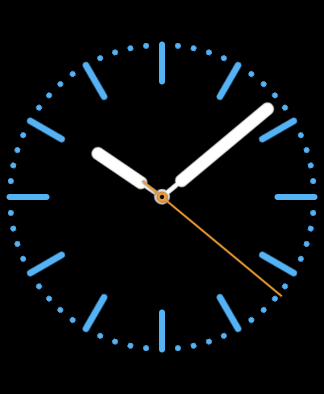
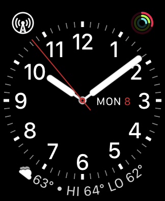
Color, Simple, Explorer
Color, Simple, and Explorer have easily distinguished hour markers, but Explorer’s are a bit too far from its hour hand.
None of them have distinguished 12 markers to aid in orientation.
While Explorer omits minute markings altogether, Simple bafflingly uses 30-second markings in place of its minute track, making time-telling even harder. I’ve never seen another watch with sub-minute markings identical to its minute markings.
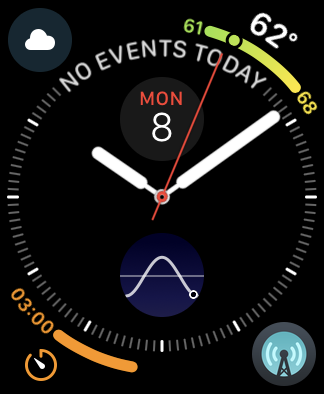
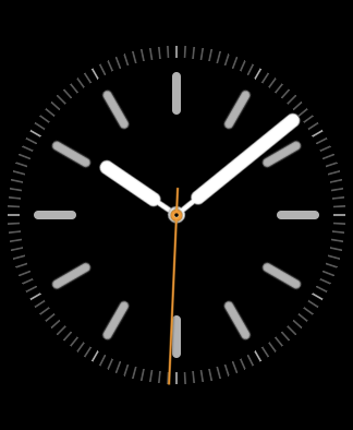
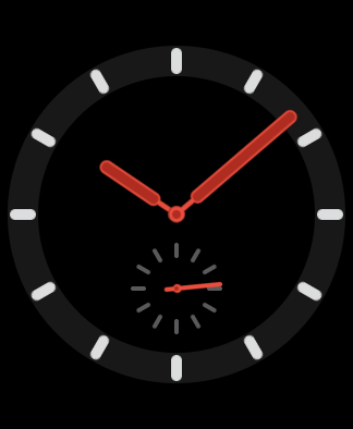
Activity Analog, Utility, and Infograph without most complications
Activity Analog’s hour markers are faint and far from its hour hand, and the central activity rings quickly eliminate the hands’ contrast against the dial as they progress.
Utility (when configured without numbers) improves legibility slightly with its bold hour indices, but they’re still too small and too far from its hour hand, and there’s no differentiation for the 12 index.
Infograph is similar, but even worse: its hour indices are more faint, it uses 30-second markings instead of minute markings, and its default Calendar display wipes out the top three indices. (At least you can tell which way is up.)
Even with almost no complications, the basic essence of the Infograph dial has poor time legibility.
When it’s being used as Apple seems to intend, time-telling at a glance is so difficult that many people have actually suggested setting the digital time as the center complication, at which point the hands are just a nuisance and we should stop pretending it’s an analog face.
It’s great for Apple to offer a wide variety of Apple Watch faces, but most of them are short-lived novelties at best. We’re three years and four generations into the Apple Watch, and almost every Watch owner I know still uses the same handful of “good” faces.
If you want digital time with a good deal of complications, Modular is your only good choice (or Infograph Modular on the Series 4).33 If you want analog time with numerals, Utility is the only good option. If you want indices instead of numerals — probably the most popular analog watch style in the world — I don’t think there is a good option.
By now, we’ve seen Apple’s design range that they’re willing to ship as Watch faces, and while it seems broad at first glance, it’s actually pretty narrow.
And we’re restricted to the handful of good watch faces that Apple makes, because other developers aren’t allowed to make custom Watch faces.
The Apple Watch is an amazing feat of technology. It’s a computer. It can display anything. With no mechanical or physical limitations to hold us back, any watch-face design from anyone could plausibly be built, enabling a range of creativity, style, and usefulness that no single company could ever design on its own.
But they won’t let us. In a time when personal expression and innovation in watch fashion should be booming, they’re instead being eroded, as everyone in the room is increasingly wearing the same watch with the same two faces.
Open this door, Apple.
-
You can even see which model the Apple Watch’s hand shape comes from, which is not a coincidence. ↩︎
-
For Apple Watch faces offering multiple hour/minute styles, I selected the best one that didn’t have hour numerals, and most complications were disabled. ↩︎
Recommend
About Joyk
Aggregate valuable and interesting links.
Joyk means Joy of geeK