

Part 2 — Apply 20 Essential rules of Graphics Design to UI Design
source link: https://blog.prototypr.io/part-2-apply-20-essential-rules-of-graphics-design-to-ui-design-9ad08e7daa1d
Go to the source link to view the article. You can view the picture content, updated content and better typesetting reading experience. If the link is broken, please click the button below to view the snapshot at that time.

DESIGN
Part 2 — Apply 20 Essential rules of Graphics Design to UI Design
Practice until they become your muscle memory.

There are two ways to gain experience in something:
- Work your fingers to the bone, then gain experience
- Learn the knowledge, apply it to the work, and gain experience
Although it sounds like you can choose one either way, ultimately, we still have to learn the knowledge to make the work easier and get consistent output.
The 20 basic rules of graphics design in these two articles are knowledge I found on the internet, memorized, and applied to my work for the past ten years. They are foundational rules of lasting value for both Graphics and UI Design fields.
This article will complete the last ten rules. Not only will it describe the rules but also add to my thoughts and experiences. I hope this can be a handy reference for you.
11. Hierarchy
There’s hierarchy everywhere, in nature, in culture, and even within our family.
The purpose of hierarchy is to indicate the order of importance of different targets. In designing, hierarchy helps us emphasize the critical information and help the viewer find the content they are looking for more easily. Hierarchy has two main functions:
- Help navigate user on the design
- Signify the importance of information elements
The designer can create a hierarchy within the following features:
- Size: Something bigger is more recognizable
- Color: Bright colors quickly draw more attention than dark colors
- Contrast: Stronger contrast is more eye-catching
- Alignment: Unaligned elements will stand out more than aligned ones
- Repetition: More repetition will get more attention
- Proximity: Elements that are close to each other are related
- Whitespace: More white space around will make the subject easier to notice
- Texture and Style: A subject with a distinctive style will stand out more
If you can manage this hierarchy properly, you will not need to instruct users on how to get started with your design.

12. Framing
It is a technique of visuals by puts elements in a “frame”.
This “frame” can be a physical frame, as in the wooden frame of a painting. It can also be basic shapes like borders or even visual elements related to the subject.
This technique creates balance and unity of images in a composition. It can be used to decorate, highlight or trim visual elements in a design, depending on the designer’s goals.
Another usage of this technique is to create a hierarchy, guiding the eyes by drawing attention to the main element when it is highlighted and distinct from its surroundings. Also, Frames prevent the design from being boring and bland.
Types of framing in UI design:
- Margins: is a border of equal thickness that encloses image elements.
- Bleeds: when images and visual elements fill the space — the size of the design.
- Partial bleeds: same as overflow, but the image has to stop points in one direction.
- Shaped framing: use shapes that match the Mood & Tone of the product or brand. As in the illustration design, I used the logo’s shape to “frame” the mountain to make the image more interesting.

13. Grid
This is one of the most crucial rules of designing. Grids are invisible to the viewer but visible to the designers. It makes considering and arranging graphic elements easier, more intentional and makes the design more meaningful.
Perhaps of the 20 rules, the grid is the first one, way back to 150 BC. The Jewish temple documents were recorded in columns and lines in a long, roll-able document for easier reading and storage.
Grid examples:
- Baseline grid: a grid of evenly spaced horizontal lines that define the position of the typography. It is similar to our writing practice book.
- Column grid: this is a standard grid, dividing the page — frame into many columns to organize the image elements.
- Modular grid: an upgraded form of column grid, when adding rows, the intersection of rows and columns creates modules that expand the options and give a more diverse layout.
- Manuscript grid: mainly used in the layout of newspapers and books to determine the position of typography on a page.
- Pixel grid: any graphic design software would have a function to display pixel grids. If the design is viewed on electronic devices, the designer will have to pay attention to placing graphic elements on these grids.
- Hierarchical grid: an advanced form of a grid, possibly formed due to 2 grids stacked on top of each other and having a high degree of liberty for hierarchical purposes.

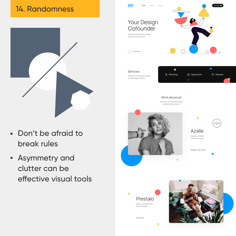
14. Randomness
Being neat, orderly, and staying within the framework will not be considered “designed”.
But as I have said many times, design is about doing things on purpose — including creating “random-looking” visual elements.
Once you have completed the essential parts of the design, add a bit of randomness to create freshness and interest. However, be careful to moderately use this method if you do not want your design to become disordered and cluttered.
15. Direction
When we do something with guidance”, we spend less time and energy on it.
Therefore, if we want to quickly attract attention and make viewers stay longer with our design, we will create a “guide” for the viewer’s gaze.
Let’s start by understanding reading habits and behaviors. Most languages are read from left to right, top to bottom. For Common scanning patterns: F-shaped, E-shaped, Z-shaped.
In addition, you can still use design rules such as hierarchy, lines, contrast, etc., to draw attention to the design at first glance. This technique is called creating “anchor points of the eye”. Then, we purposefully guide the viewer to the following elements.

16. Movement
The most effective method of navigation is to create a sense of “motion”. Ignoring the literally moving designs, we can apply the following techniques to create motion for static designs:
- Motion lines: wavy or zig-zag lines.
- Opacity: align the shapes close to each other and reduce the opacity.
- Blur: use directional blur to create fast movement.
Moreover, the movement might make your design more dynamic.

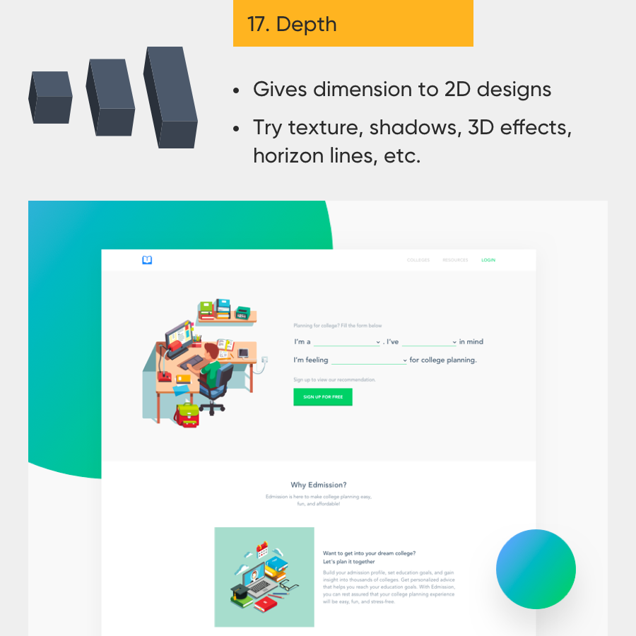
17. Depth
Graphic design — UI is usually 2-dimensional. The designs are placed on a flat surface which is the computer screen. Creating more depth in the design helps viewers feel it is being spread into the space, makes it more vivid, and brings interesting visual effects. The techniques:
- Size and scale: memorize the mantra “Near clearly, far blurry”.
- Overlapping objects: another name for the “Layering” technique, builds multiple layers of objects to create depth.
- Layering transparent objects: similar to the above technique, use transparency effects to add exciting results.
- Perspective: 3/4 perspective, fisheye view, etc. These types of perspectives will create a 3-dimensional element. Back when people had been tired of flat design, Isometric illustrations took on things with a much more interesting approach…
- Other effects: Drop shadow, Texture, Pattern, Horizon lines, etc.
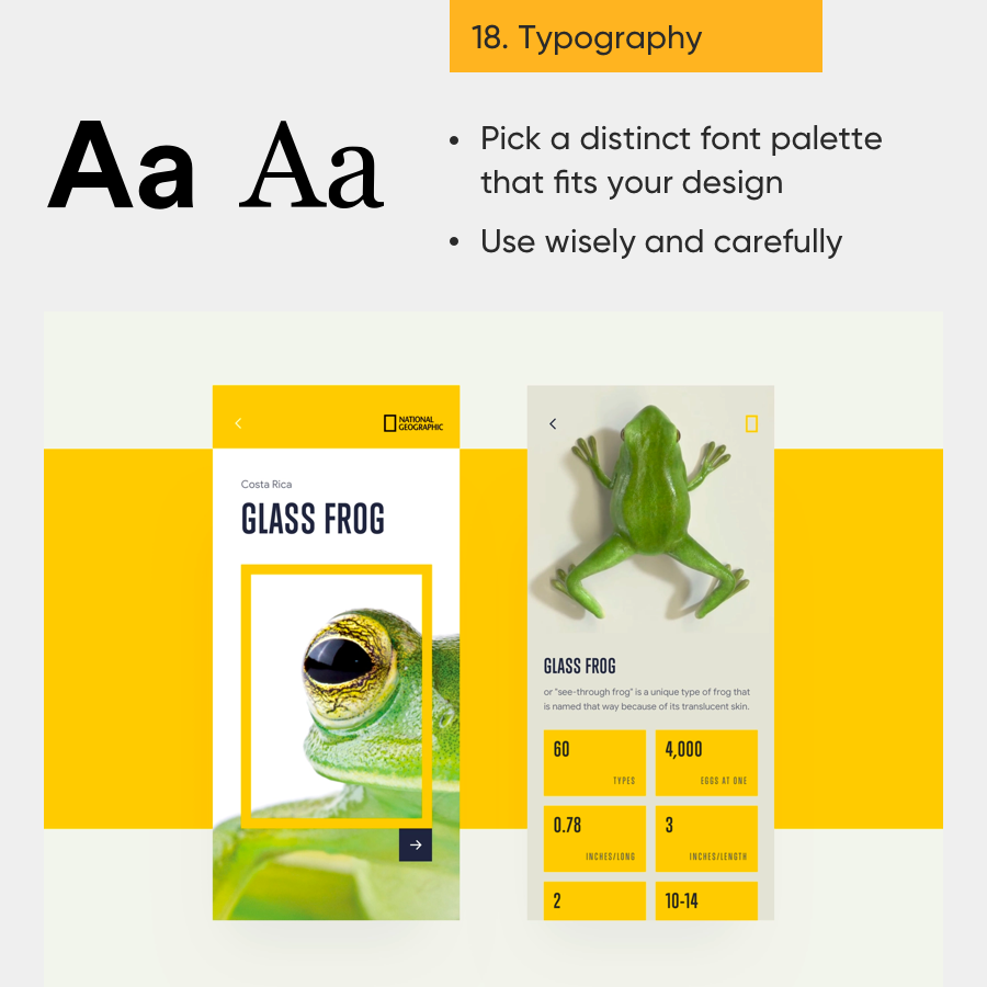
18. Typography
Although the brain processes images faster than words, words are much easier to understand and visually more apparent.
For that, typography is a critical core foundation in design, especially in clean, minimalist design orientations. With this orientation, design resources will be limited. Being able to do well in typography will help you a lot.
There is so much to be said about typography, but here are a few tips to keep in mind:
- Left alignment always makes your long paragraphs easier to read.
- Do not use too many fonts in one design.
- Fonts with serifs are traditionally formal; fonts without serifs are modern.
- Do not make it too small because it’s hard to read. And do not make it too big because it might be uncomfortable to look at.
- The safest size contrast ratio is 1.618. For example, 20pt headlines then body is 12pt or 13pt (20/1,618 = 12.36).
19. Composition
Consider this a general rule that uses the previous 18 rules to organize the content of the design. We must keep in mind the purpose of design. Apply the rules with different combinations, different orders, and different quantities to create different layouts.
As long as these layouts ensure the original purpose of the design, they will create different options — different choices for your clients and product team.
As Princess Shuri in Black Panther said: “Just because something works doesn’t mean it can’t be improved”.
If there is enough time, experiment with your project as much as you can.

20. Break the Rules
Combining age-old jigsaw puzzles to make Face ID scans more fun, why not?
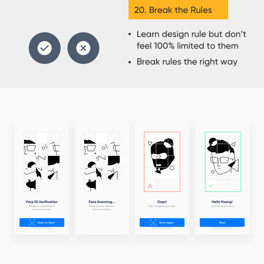
To break the rules, you must thoroughly understand the rules.
You might say this rule is an instigation. However, try to notice that there is one common thing in people who achieve high positions in their fields and are recognized by the community. When asked how they find their style or inspiration for work, they will have different answers. This implies that at some point, they have stepped outside of the basic framework and found what works for them.
I hope that these design rules here can help you get a starting foundation. Then you can continuously apply and practice so that they become a kind of information similar to “muscle memory”.
And at some point, with confidence and a deep understanding of these rules, you can “break the rules” to create personal direction for your designs. I wish you all the best of luck!
Read more if you are interested in other Domain Knowledge:
Reference:
Recommend
About Joyk
Aggregate valuable and interesting links.
Joyk means Joy of geeK