

How to create Variants & Auto Layout button in Figma
source link: https://uxplanet.org/how-to-create-variants-auto-layout-button-in-figma-b7fcb73f991f
Go to the source link to view the article. You can view the picture content, updated content and better typesetting reading experience. If the link is broken, please click the button below to view the snapshot at that time.

How to create Variants & Auto Layout button in Figma

In this article, I want to share with you the experience of creating a button for our bestselling product — Figma Design System. In just a few steps, I will teach you how to create universal and easy-to-use buttons in Figma using it’s actual features.
Before reading this article you can try and use our Button (Figma Community)
1. Properties and Variants
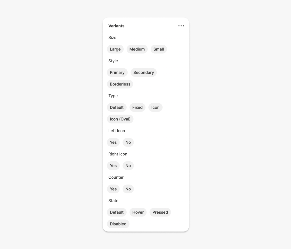
Before starting to create a button, you need to decide what properties and variants it will consist of. Your button can have multiple options for size, color, content, etc.
Below I have shown what properties and variants my button will consist of:

Tip 1. Add only those options that you will use when creating your interface. Unnecessary options will weigh down your options component.
Tip 2. “Yes” or “No” variants are needed to show or hide elements with the help of a switcher.

2. Base Components
The first thing you need to do is create the base components for the button. When adding a new button, the base component properties will help you add the new button quickly and easily because you will already have pre-defined the variants for your new button.
For example purposes of this article, our components will consist of three types of sizes (Large/Medium/Small) and three button types (Default/Fixed/Icon), in total we will have 9 different component variations.

You know about the button sizes, but let me explain to you the differences between the button types.
- Default: This is a default button that changes the width size by the help of Auto Layout feature according to the text inside of the button.

- Fixed: This type of button is fixed in width size and does not change according to the text inside the button. You will need to manually change the width size to fit your content.
- Icon: This type of button consists of an icon.

Now you know the button types, we can go ahead and start creating the components, here we go!
To increase the functionality of the button, I recommend you to download a free icons library and a color & text styles library.
• Download: Material Icons Library
• Read article: Create switchable styles from light to dark mode in Figma
Default Button
When you create a default button you must first group the counter, text & icon placeholders properties together.
Now create the text placeholder with these parameters (or you can setup your own text style):
- Font: Inter
- Style: Medium
- Size: 20
- Line height: 28
- Fill: #1C1C1C or set own color style

Next, you need to create a counter. To create a counter you need a text layer with these parameters:
- Font: Inter
- Style: Semi Bold
- Size: 10
- Line height: 16
- Fill: #1C1C1C (or set own color style)
After you group the text layer (cmd+G/ctrl+G) and hit Auto Layout feature with these parameters:
- Left/Right paddings: 4
- Top/Bottom paddings: 0
- Align: Center
- Fill: #FFFFFF
- Stroke: 1, inside, #E8E8E8
- Border Radius: 96 (or other values to create a circle shape)

Lastly add an icon placeholders with size “24x24”. You can create your own or copy from Material Icons Library for free.
Group (cmd+G/ctrl+G) all elements in this order: Icon/Text/Counter/Icon.

And hit Auto Layout with parameters:
- Direction: Horizontal
- Spacing: 8
- Left/Right paddings: 16
- Top/Bottom paddings: 12
- Align: Center
- Fill: #FFFFFF
- Border radius: 8

In the end rename the layer name to “x-Base/Large/Default” and hit the Create Component.

Tip 1: Why x-Base? We will not use base components when creating the interface, they are only needed to create variants. Figma shows the component library in alphabetical order so that our base components are at the bottom.
Tip 2: In base components, you can assign any color values. The desired color values will be assigned when creating variants.
Fixed Button
To create a fixed button we must first duplicate elements (Icon/Text/Counter/Icon) from default button and hit Auto Layouts with these parameters:
- Direction: Horizontal
- Spacing: 8
- All paddings: 0
- Align: Center

Next create a frame:
- Width: 256
- Height: 52 (take the height size from Default Button, each type of button size has its own height)
- Border radius: 8
- Fill: #FFFFFF

Add content elements in this frame and set Constraints & Resizing parameters like the picture below.

Our button is ready, now we can rename the layer name “x-Base/Large/Fixed” and hit to Create Component.

Icon Button
To create this type of base button we need icon placeholder (24x24) group it and hit Auto Layout:
- Direction: Horizontal
- All paddings: 14 (change the padding values based on the heights of each type of button size)
- Spacing: 0
- Fill: #FFFFFF

Next rename the layer name “x-Base/Large/Icon” and hit Create Component.
Finally our x-Base components are ready!
3. Variants
This is the last and most interesting step in creating our universal button. To create the variants component, we need to duplicate the x-Base components and create several button variants based on the structure we made in the beginning.
We already have defined the size and type properties. We now need to create others properties by changing color styles and hide/show content elements. To make it easier for us when creating variants, we need to divide our process into several steps.
Step 1: Content
First, we need to create several variants for buttons that differ in content by changing the hide/show values of the elements.

Tip: To create an oval icon button just change border radius — I set it to 128.
Step 2: Style
In this step we change the colors for Style (Primary, Secondary & Borderless) & State (Default, Hover, Pressed & Disabled) properties. Just duplicate the set of components you created in the first step and change color styles.

Step 3: Variants
Choose all components and hit Create Component set. It automatically creates variant components.

Create properties and variants:
And set variants for each button:

Congrats, your powerful button is ready!
Conclusion
The structure of variants for this button is based on my experience in creating interfaces. There are no unnecessary elements here, there are only those button variants that will increase the level and speed of your interface design. Using this structure and steps, you can create your own button with your own styles as you wish. For more examples, you can visit our Dribbble profile, there are many sample templates created with Figma Design System.
Recommend
About Joyk
Aggregate valuable and interesting links.
Joyk means Joy of geeK