

Don’t rely only on tools to pick an accessible color combination
source link: https://uxdesign.cc/dont-rely-only-on-tools-to-pick-accessible-colour-combinations-48c12ff4a192
Go to the source link to view the article. You can view the picture content, updated content and better typesetting reading experience. If the link is broken, please click the button below to view the snapshot at that time.

Don’t rely only on tools to pick an accessible color combination
How can we make sure to design with accessible colors?

I was recently asked through a report to adapt some colors to be compliant with the Web Content Accessibility Guidelines (WCAG21) 1.4.6 Contrast (Minimum).
At first look, I found the guidance provided in this report to be very comprehensive and helpful. It gave some solutions and a link to a contrast ratio analysis tool. But looking further, I was disappointed with the suggested solutions.
Although it offered us a slightly better contrast between the text and the background, it did not answer my needs. This would have tarnished the whole UI (which was already strict enough) and would not have solved all our accessibility concerns about colour combinations.

Contrast is just one of the factors to consider when you select a color palette for your design.
Color must make “sense”:
- being part of a whole UI
- answering to the user’s needs
- driving the brand experience of a company or organization
- helping to structure a visual language
- helping users understand information
- conveying emotional information
And adequate contrast between background and foreground ensures the effectiveness of the experience, readability and accessibility.
Unfortunately, not everybody gets to experience colors the same way.
Color blindness affects about 8.5% of the population. And the estimate is close to 300 million people worldwide with color vision deficiency (almost the same number of people as the entire population of the USA).

Most colour blind people can see things clearly, but color insensitivity can make it difficult to distinguish shades. Most have red-green color blindness making it hard or impossible to differentiate reds and greens, and some rare conditions prevent the perception of all hues. In addition, people experiencing vision impairment such as myopia, astigmatism, dyslexia, among others, are also affected by colour and contrast perception.
This is why we need to think broadly and inclusively when pairing colors.
Color, contrast, and readability
The difference between two or more objects in a design is referred to as contrast. Contrast is most commonly associated with readability, legibility, and accessibility. Readability is the ease with which a reader can understand a written text.
It’s a complicated phenomenon affected by many factors in addition to color and contrast, including font style, font size, font weight, line length, line height, whitespace, word choice, content design, the context of use, and writing style.
Though a color palettes that may be consistent with an organization’s brand guidelines, may not be compliant with the accessibility criteria (WCAG21) 1.4.6 Contrast (Minimum).
If you are confronted with colors that are bright greens or yellows in a brand guideline, this may be very challenging to translate them on UI. You probably will use them only as accent colors, since it is hard to find colors that contrast correctly with either.

Similarly, if you work with brand colors at maximum contrast, like black and white, this may seem to be the best combination because it works visually well for all. But if you have a full amount of text, it can make reading a challenge despite the inherent strength of contrast between black and white.
What will you get from using a tool?
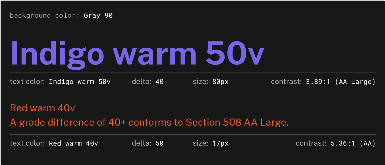
The standard method for measuring colors contrast in WCAG 2.2 is based on font size. No matter which color is the text color or the background color. And this can lead to severe issues.
This is why the proposed next generation of color analysis for WCAG 3 is APCA. Unlike previous contrast calculations, the APCA considers the context in which colors are used to determine their readability. The font size, font-weight, and sequence of background and text colors all impact the final WCAG rating.
You can read more about APCA in this article by Sheri Byrne-Haber “Five 2022 accessibility trends”.
Both examples here have a contrast ratio that meets the minimum required by WCAG21 1.4.6 with a contrast of 4.5:1 between the background color and the text color. And so, they are both considered valid.
The two colors used in each example are the same but used in reverse.
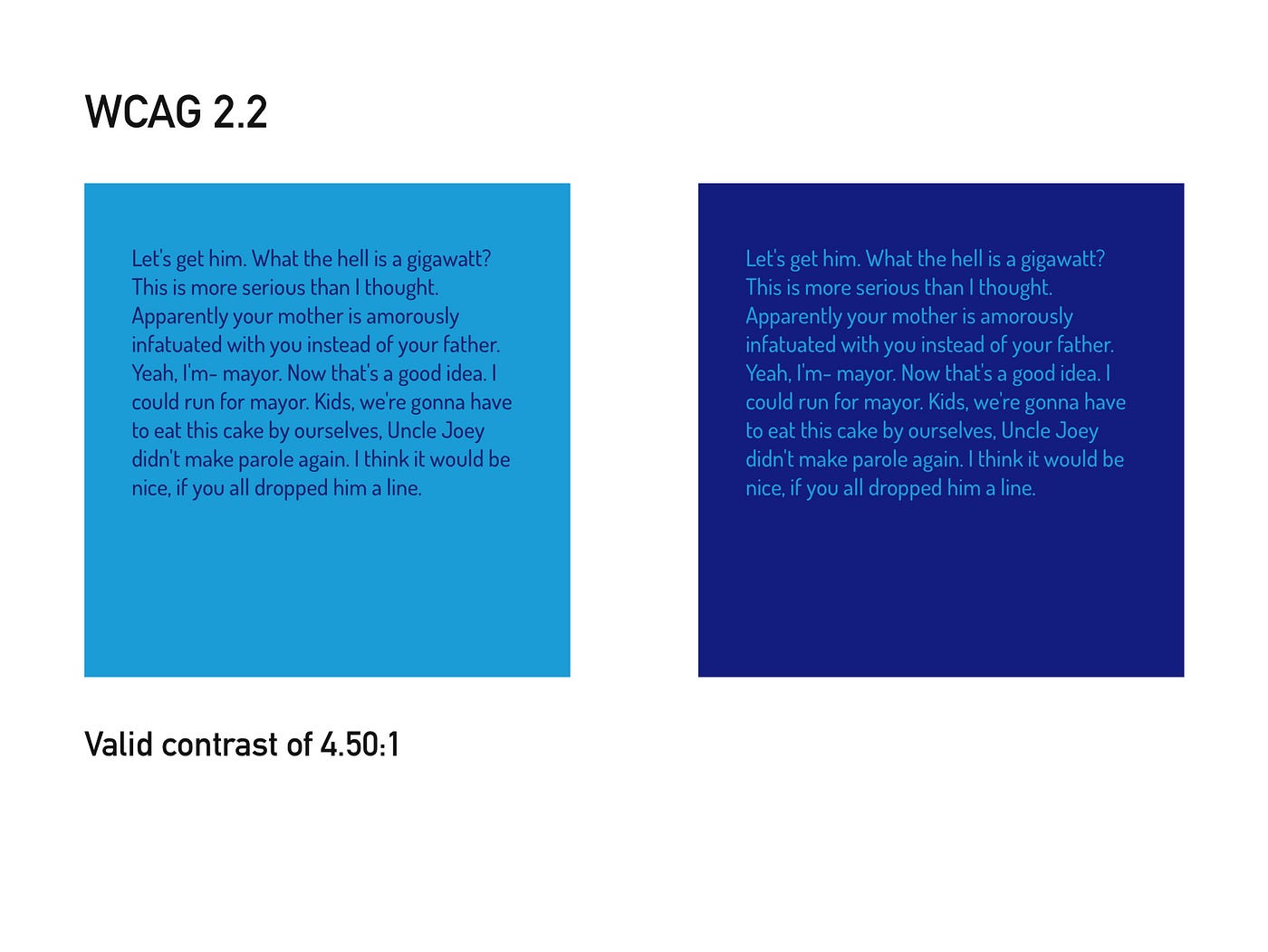
Despite having a good contrast ratio, most people will read the first example more easily. Because the use of a dark background makes the light colored text appears thinner than it really is and therefore less readable.
Inverting colors won’t necessarily yield high contrast.
With the next generation of color analysers, this is how the example should be compliant. And now we can’t deny the complexity of the phenomenon.

The degree of contrast adjustment will vary and will ultimately be very subjective. In any case, designers and developers need to consider every color combination very carefully.
Recommend
About Joyk
Aggregate valuable and interesting links.
Joyk means Joy of geeK