

Cancel as a button or a link? Which is best UX practice? | by Karim Maassen | UX...
source link: https://uxdesign.cc/cancel-as-a-button-or-a-link-67ccbf9df81e
Go to the source link to view the article. You can view the picture content, updated content and better typesetting reading experience. If the link is broken, please click the button below to view the snapshot at that time.

Should “cancel” be a button or a link?
Which one is UX best practice?

A common type of dialogue that is often presented when interacting with a web app, is the “cancel” option. Usually when the user is filling out a form, or manipulating data (e.g. inside a side panel, detail page or modal view). One would typically see it next to a primary action, presented as a link. More and more however, this cancel option is presented as a button. Is this good or bad practice, and why?
Navigation vs. Action
When looking at a web app, a user typically has to deal with two types of interaction: navigation and actions. Both types of interactions are usually represented in a different but distinct way.
- Navigation is a link.
- Action is a button.
Why is this? Links stem from the early days of the world wide web. It’s what it makes it be a web (and also world-wide). Buttons are a form of skeuomorphism that translates the physical world of flipping switches and pressing buttons to do stuff, into the digital world of the internet. And thus, they are used differently:
Actions are manipulation of data the user is managing through the interface of the web app, while navigation is a state change of the interface the user is, well, navigating through. In other words, links (or navigation) don’t lead to changes of the underlying data, but can lead to the presentation of new pages, or a different presentation of the current page the user is navigating in (i.e. change the view). So when we look at it this way, we are basically saying that navigation is a state change of the UI and an action is data manipulation. In other words, going from one state to the other is the same as navigating from one state to the other. I’d like to note that actions (buttons) can lead to navigation, but it’s not a requirement.
UI Design
How one would visualize a link and button is of course a design style decision, but typically links are blue underlined text and buttons are boxes with text inside of them. Both links and buttons can contain icons to emphasize the intended action or navigation (Relying on icons only is discouraged, as this would make a user needlessly think about said action or navigation, but that’s a different topic to discuss).
Information Architecture
Obviously, having your web application adhere to a certain information architecture which allows for this behavior, is beneficial to the user experience of your solution. That said, understanding the principles of how an application is representing its data, is key to understanding the difference between data manipulation and state changes of your user interface.
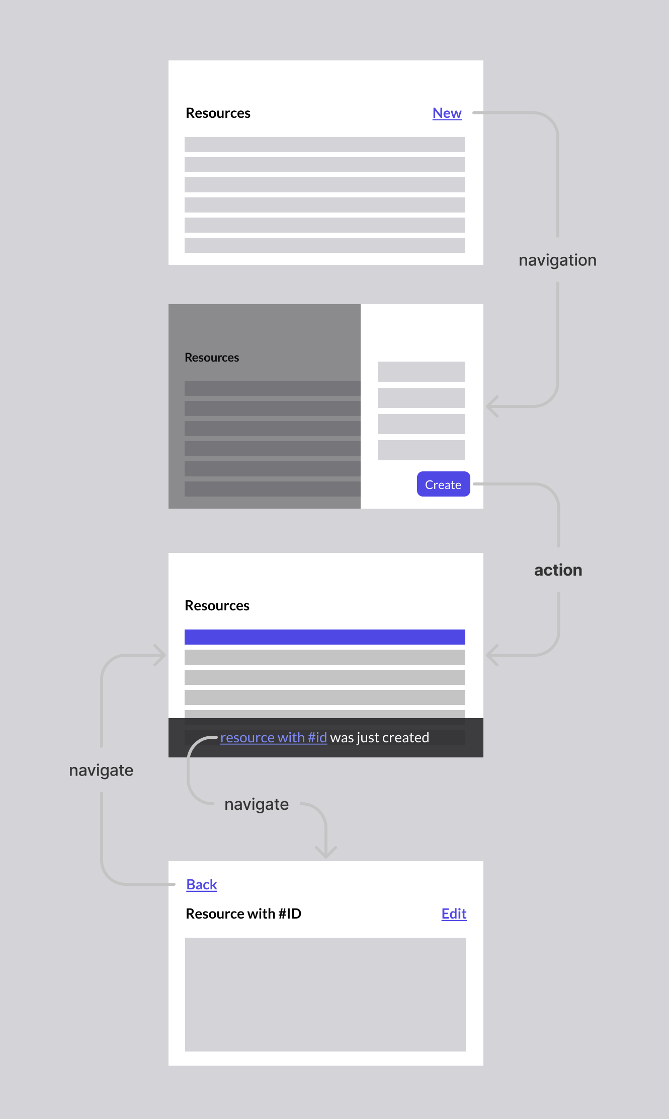
Let’s take the example of a fruit shop, which sells fruit. This shop could have a list of all fruits they sell. This “list of resources” would be the “list of fruits” for this specific shop:

A user can decide to do the following:
- Add a new fruit to the list.
- Filter or sort the list of fruits
- Go to the detail view of a specific fruit from the list
- Go to the detail view of the origin of a specific fruit from the list
Let’s find out how these user interactions would look like when applying our logic to it.
Applying this logic to a typical user interface
Add new fruit
When wanting to add a new fruit to the list, the user clicks the “add fruit” link, which would lead to a state change of the UI (i.e. a form to fill out the new fruit appears).
Typically these days, one would often see a button (or FAB) instead of a link for the “add new fruit” interaction. However, this interaction itself is not an action. It’s merely a state change that shows the view to create a new fruit. Hence, it’s navigation. By doing this, it sends the message to the user they are not doing data manipulation directly when clicking on “add new fruit” but can expect a new view to perform said task. Therefore, I advice against the FAB or a button in general for this interaction.
Buttons instead of links where navigation is the default interaction. Thanks, Material UI.Once navigated to that view, the user can indeed perform the action, hence one would expect a button stating the user does indeed “add new fruit” to the list:
"Add Fruit" here indeed is an action. It confims the intention of the user and sends a data change request to the server.This interaction actually brings up an interesting discussion: what will the user see when having added the new fruit? Will they go back to the list of fruits, or will they go to the newly added fruit detail page? This really depends on what is important for the user and is something that needs to be determined through user research. Both options are valid, but both are navigation, albeit triggered by the performed action. (remember I said that actions can lead to navigation?)
Ignoring the “cancel” interaction for a second and let’s dive into the other interactions a user can do, so that we can build up to the final answer:
Filter & Sort
When going through the list of fruits, the user can decide to narrow their list by applying a filter. They decide to apply the “apples” filter and sort the list by “weight”. Surely, this is data manipulation and merits a button, right? Well, when looking at what the user actually is doing, we come to notice that no data has been manipulated at all. All fruits in the list still exists. None were added or altered. The only thing the user did, was applying a different view, or, changing the state of the UI. This means, filters or sorting would warrant a link instead of a button:
Clearing a filter
This also makes it easier to understand that a user interaction that denotes “clear all filters” or “reset sorting” should not be a button (i.e. it’s not an action), but warrants a link (i.e. it’s a state change of the UI, or navigating back to the preview state of the UI) as no data has been altered:
Going back to the preview page
As said earlier, it’s a valid interaction to have the user automatically navigate to the newly added fruit page after the action has been performed. But what if the user wants to go back to the previous page (list of fruits)? Well, this of course depends heavily on how this is presented in the UI, but typically one would expect the user to have access to either one of these options (or both):
- Back navigation
- Breadcrumb
Realizing the fact that in both cases, the user would still just be navigating back to a previous state of the UI (and thus, not undoing the performed action on the data, nor doing any new type of data manipulation), both options would be links:
Back navigation through either a link back, or a full breadcrumb. Bonus: an Edit link to trigger edit navigation. (not an action!)Now, a third option would also typically exist; the back button of the browser. Yes, this is a button, not a link. I will address the OS elephant in the room later in this article.
Closing the side panel
And thus this brings us one step closer to the main question of this article. What if the user wants to close the side panel of the “add new fruit” view? Well, typically this would be done by either clicking outside of the view (dismissing it), or clicking a “close” option. Again, asking the question what is it the user is actually doing when “closing” the side panel, we come to the conclusion they are basically aborting the action they are performing. In other words, they are navigating back to the previous state of the UI. This means, it warrants a link, and not a button:
The same can be said about closing any view:
Closing is not an action; it's a UI state change.Cancel the action
Whether it be inside a side panel, or inside a pop-up (modal view), or maybe even just on a full page form (edit a fruit on the fruit detail page), whenever a user wants to “cancel” the action(s) they are trying to perform, they are basically doing the exact same thing as described in the “Closing the side panel” section; they are aborting the action and thus navigating back to the previous state of the UI. Thus, it requires a link, and not a button.
The answer to this article's question.“But cancelling is like an action, no?”
As you by now might expect, to this, I state a hard “no”! A user cancelling an action is quite the opposite of performing an action; it’s the “noping out” of an action. In all the cases described above, cancelling would entail navigating back to the previous state of the UI.
“But what about cancelling my Netflix subscription?”
This is an interesting exception, but is simply explained when understanding that in this case, “cancelling” is the primary action. A user can still abort the primary action through a cancel link. Of course, it’s probably best not to call it “cancel” and “cancel”:
“But what about iOS, or Windows or MacOS?”
Sure enough, as addressed earlier, the actual user interface of your operating system basically only uses buttons. For pretty much everything. This completely breaks anything I just wrote. However, you have to realize that a web application is not the same thing as an operating system. It’s best to avoid the uncanny valley of UI. Users are confused by mimicking an actual OS, plus one would ignore the power of web UI conventions users are familiar with, which would break usablilty. Let the OS be the OS and the web be the web.
It’s also why responsive design is not the same thing as building a native mobile application. They are two kinds of different UI.
“What about the main menu? That certainly is navigation?”
Yes, very true. They are indeed navigable items and would only lead to a state change. Therefore, one would expect links instead of buttons. And in reality, the way of visualizing main menu items as a row of buttons has become somewhat of a standard. Users probably won’t be confused anyway, so I don’t think it’s a big issue in this specific case.
However, back in the days of ye old interwebs, it was quite common to represent main menu items as links too! (because, you know, they are navigation). And to this day, those items are still links in code, and not buttons, when written in semantically correct HTML.
Aah, the old digg. Links everywhere! Even in the main navigation.Google's main navigation used to be hyperlinks.Empowering the user by being consistent
When we look at the difference between buttons and links, we can easily see that there is a fundamental difference when presented both interactions:
These imply actions directly done on the item in the row:
These imply navigation where the action is done in a different view:
When done consistently, a user understands what to expect from the interaction.
Conclusion
The subject of a cancel link or button has been asked previously. I think UX movement’s article about this subject almost has it correct: the cancel is indeed not an action, but it should also not be a button. (I also think that a grey button looks more like a disabled button, but that’s a different subject). Luke Wroblewski’s almost famous blog post comes close to the same conclusion as I do (On top of that it also addresses the position of said UI).
To summarize
The cancel option is similar to aborting an action, and therefore similar to navigating back to the previous state of the UI. Navigation is represented in web UI as hyperlinks, and thus the cancel option should be a hyperlink. As with everything, this too can (and should!) be debated. I definitelty can see the visual appeal to using a button instead of a link. And as with the main navigation convention, things can change over time.
Feel free to ping me if you want. I can be found on Twitter.
Recommend
About Joyk
Aggregate valuable and interesting links.
Joyk means Joy of geeK