
2

通过编写计算器学习ArkUI组件之四
source link: https://os.51cto.com/article/704202.html
Go to the source link to view the article. You can view the picture content, updated content and better typesetting reading experience. If the link is broken, please click the button below to view the snapshot at that time.

通过编写计算器学习ArkUI组件之四-51CTO.COM
通过编写计算器学习ArkUI组件之四
作者:Tuer白晓明 2022-03-17 16:04:16
本节先对Text文本组件的用法做了简单介绍,然后通过之前小节中学习的Column、Row、Button组件实现了标准计算器的功能按钮区。

3.8 Text组件
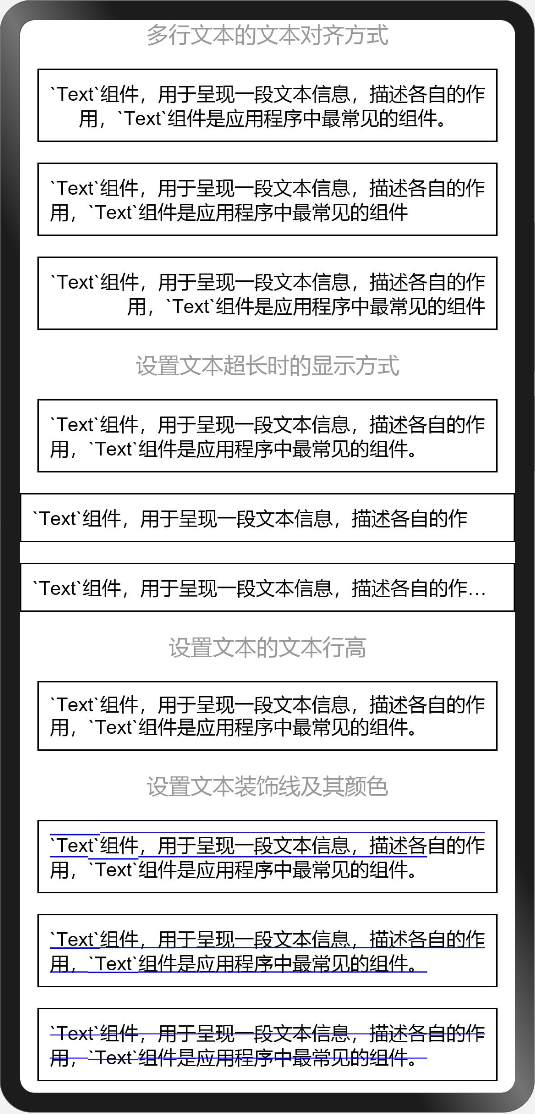
在前面的小节中无论是自定义按钮还是组件示例中都用了Text组件,用于呈现一段文本信息,描述各自的作用,Text组件是应用程序中最常见的组件。
@Entry
@Component
struct TextExample {
  build() {
    Column({space: 15}) {
      Text('多行文本的文本对齐方式').fontSize(16).fontColor('#999')
      Text('`Text`组件,用于呈现一段文本信息,描述各自的作用,`Text`组件是应用程序中最常见的组件。')
        .fontSize(14).textAlign(TextAlign.Center).border({width: 1}).padding(8)
      Text('`Text`组件,用于呈现一段文本信息,描述各自的作用,`Text`组件是应用程序中最常见的组件')
        .fontSize(14).textAlign(TextAlign.Start).border({width: 1}).padding(8)
      Text('`Text`组件,用于呈现一段文本信息,描述各自的作用,`Text`组件是应用程序中最常见的组件')
        .fontSize(14).textAlign(TextAlign.End).border({width: 1}).padding(8)
      Text('设置文本超长时的显示方式').fontSize(16).fontColor('#999')
      Text('`Text`组件,用于呈现一段文本信息,描述各自的作用,`Text`组件是应用程序中最常见的组件。')
        .fontSize(14).textOverflow({overflow: TextOverflow.None})
        .border({width: 1}).padding(8)
      Text('`Text`组件,用于呈现一段文本信息,描述各自的作用,`Text`组件是应用程序中最常见的组件。')
        .fontSize(14).textOverflow({overflow: TextOverflow.Clip})
        .maxLines(1).border({width: 1}).padding(8)
      Text('`Text`组件,用于呈现一段文本信息,描述各自的作用,`Text`组件是应用程序中最常见的组件。')
        .fontSize(14).textOverflow({overflow: TextOverflow.Ellipsis})
        .maxLines(1).border({width: 1}).padding(8)
      Text('设置文本的文本行高').fontSize(16).fontColor('#999')
      Text('`Text`组件,用于呈现一段文本信息,描述各自的作用,`Text`组件是应用程序中最常见的组件。')
        .fontSize(14).lineHeight(16).border({width: 1}).padding(8)
      Text('设置文本装饰线及其颜色').fontSize(16).fontColor('#999')
      Text('`Text`组件,用于呈现一段文本信息,描述各自的作用,`Text`组件是应用程序中最常见的组件。')
        .fontSize(14).decoration({type: TextDecorationType.Overline, color: Color.Blue})
        .border({width: 1}).padding(8)
      Text('`Text`组件,用于呈现一段文本信息,描述各自的作用,`Text`组件是应用程序中最常见的组件。')
        .fontSize(14).decoration({type: TextDecorationType.Underline, color: Color.Blue})
        .border({width: 1}).padding(8)
      Text('`Text`组件,用于呈现一段文本信息,描述各自的作用,`Text`组件是应用程序中最常见的组件。')
        .fontSize(14).decoration({type: TextDecorationType.LineThrough, color: Color.Blue})
        .border({width: 1}).padding(8)
    }
    .width('100%')
    .height('100%')
  }
}
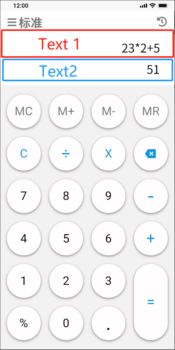
3.9 标准计算器显示区
在实战标准计算器设计中,显示区域是上下两个Text组件,居上Text显示点击功能按钮区的录入信息,居下Text显示计算结果。
  // 回显及结果显示区
      Flex({direction: FlexDirection.Column}) {
        Text('23+24+5').fontSize(24).fontColor('#999999')
          .textAlign(TextAlign.End)
          .width('100%')
          .height(60)
          .alignSelf(ItemAlign.Center)
          .padding({left: 10, right: 10})
        Text('52').fontSize(28).fontColor('#444444')
          .textAlign(TextAlign.End)
          .width('100%')
          .height(60)
          .alignSelf(ItemAlign.Center)
          .padding({left: 10, right: 10})
      }
      .width('100%')
      .height(120)
      .backgroundColor('#FFFFFF')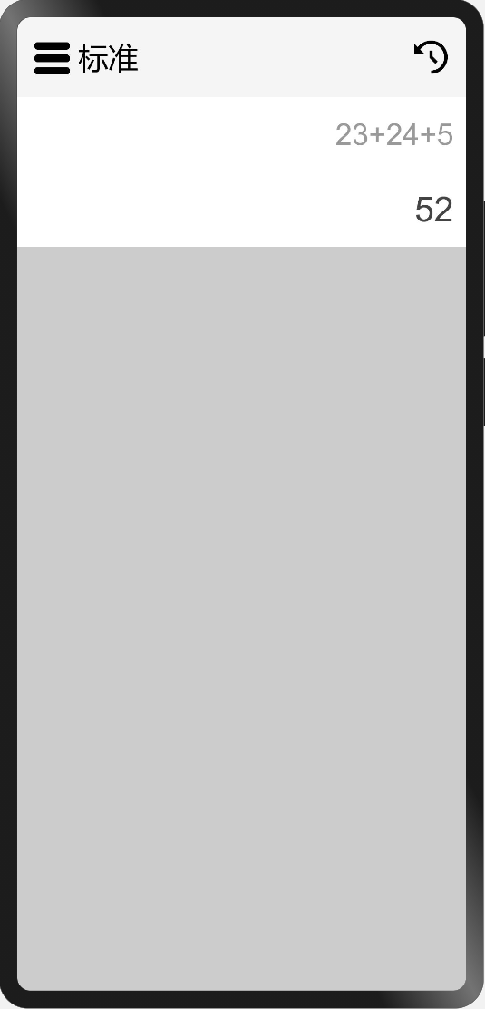
3.10 使用Column、Row容器组件、Button组件实现功能按钮区
使用前面已经掌握的Column容器组件、Row容器组件以及Button组件实现功能按钮区,代码如下:
  // 功能按钮、符号按钮、数字按钮
      Flex({direction: FlexDirection.Column, justifyContent: FlexAlign.Center, alignItems: ItemAlign.Center}) {
        Column({space: 20}) {
          Row({space: 20}) {
            Button('MC', {type: ButtonType.Circle})
              .width(64).height(64)
              .fontSize(20).fontColor('#7D7B7B').fontWeight(FontWeight.Bold)
              .backgroundColor('#FFFDFD')
              .borderRadius(32)
              .shadow({radius: 16, color: 0x7D7B7B, offsetX: 0, offsetY: 2})
            Button('M+', {type: ButtonType.Circle})
              .width(64).height(64)
              .fontSize(20).fontColor('#7D7B7B').fontWeight(FontWeight.Bold)
              .backgroundColor('#FFFDFD')
              .borderRadius(32)
              .shadow({radius: 16, color: 0x7D7B7B, offsetX: 0, offsetY: 2})
            Button('M-', {type: ButtonType.Circle})
              .width(64).height(64)
              .fontSize(20).fontColor('#7D7B7B').fontWeight(FontWeight.Bold)
              .backgroundColor('#FFFDFD')
              .borderRadius(32)
              .shadow({radius: 16, color: 0x7D7B7B, offsetX: 0, offsetY: 2})
            Button('MR', {type: ButtonType.Circle})
              .width(64).height(64)
              .fontSize(20).fontColor('#7D7B7B').fontWeight(FontWeight.Bold)
              .backgroundColor('#FFFDFD')
              .borderRadius(32)
              .shadow({radius: 16, color: 0x7D7B7B, offsetX: 0, offsetY: 2})
          }
          Row({space: 20}) {
            Button('C', {type: ButtonType.Circle})
              .width(64).height(64)
              .fontSize(20).fontColor(0x1296DB).fontWeight(FontWeight.Bold)
              .backgroundColor('#FFFDFD')
              .borderRadius(32)
              .shadow({radius: 16, color: 0x7D7B7B, offsetX: 0, offsetY: 2})
            Button('÷', {type: ButtonType.Circle})
              .width(64).height(64)
              .fontSize(32).fontColor(0x1296DB).fontWeight(FontWeight.Bold)
              .backgroundColor('#FFFDFD')
              .borderRadius(32)
              .shadow({radius: 16, color: 0x7D7B7B, offsetX: 0, offsetY: 2})
            Button('×', {type: ButtonType.Circle})
              .width(64).height(64)
              .fontSize(32).fontColor(0x1296DB).fontWeight(FontWeight.Bold)
              .backgroundColor('#FFFDFD')
              .borderRadius(32)
              .shadow({radius: 16, color: 0x7D7B7B, offsetX: 0, offsetY: 2})
            Button('⇐', {type: ButtonType.Circle})
              .width(64).height(64)
              .fontSize(32).fontColor(0x1296DB).fontWeight(FontWeight.Bold)
              .backgroundColor('#FFFDFD')
              .borderRadius(32)
              .shadow({radius: 16, color: 0x7D7B7B, offsetX: 0, offsetY: 2})
          }
          Row({space: 20}) {
            Button('7', {type: ButtonType.Circle})
              .width(64).height(64)
              .fontSize(20).fontColor('#000').fontWeight(FontWeight.Bold)
              .backgroundColor('#FFFDFD')
              .borderRadius(32)
              .shadow({radius: 16, color: 0x7D7B7B, offsetX: 0, offsetY: 2})
            Button('8', {type: ButtonType.Circle})
              .width(64).height(64)
              .fontSize(20).fontColor('#000').fontWeight(FontWeight.Bold)
              .backgroundColor('#FFFDFD')
              .borderRadius(32)
              .shadow({radius: 16, color: 0x7D7B7B, offsetX: 0, offsetY: 2})
            Button('9', {type: ButtonType.Circle})
              .width(64).height(64)
              .fontSize(20).fontColor('#000').fontWeight(FontWeight.Bold)
              .backgroundColor('#FFFDFD')
              .borderRadius(32)
              .shadow({radius: 16, color: 0x7D7B7B, offsetX: 0, offsetY: 2})
            Button('-', {type: ButtonType.Circle})
              .width(64).height(64)
              .fontSize(32).fontColor(0x1296DB).fontWeight(FontWeight.Bold)
              .backgroundColor('#FFFDFD')
              .borderRadius(32)
              .shadow({radius: 16, color: 0x7D7B7B, offsetX: 0, offsetY: 2})
          }
          Row({space: 20}) {
            Button('4', {type: ButtonType.Circle})
              .width(64).height(64)
              .fontSize(20).fontColor('#000').fontWeight(FontWeight.Bold)
              .backgroundColor('#FFFDFD')
              .borderRadius(32)
              .shadow({radius: 16, color: 0x7D7B7B, offsetX: 0, offsetY: 2})
            Button('5', {type: ButtonType.Circle})
              .width(64).height(64)
              .fontSize(20).fontColor('#000').fontWeight(FontWeight.Bold)
              .backgroundColor('#FFFDFD')
              .borderRadius(32)
              .shadow({radius: 16, color: 0x7D7B7B, offsetX: 0, offsetY: 2})
            Button('6', {type: ButtonType.Circle})
              .width(64).height(64)
              .fontSize(20).fontColor('#000').fontWeight(FontWeight.Bold)
              .backgroundColor('#FFFDFD')
              .borderRadius(32)
              .shadow({radius: 16, color: 0x7D7B7B, offsetX: 0, offsetY: 2})
            Button('+', {type: ButtonType.Circle})
              .width(64).height(64)
              .fontSize(32).fontColor('#1296DB').fontWeight(FontWeight.Bold)
              .backgroundColor('#FFFDFD')
              .borderRadius(32)
              .shadow({radius: 16, color: 0x7D7B7B, offsetX: 0, offsetY: 2})
          }
          Row({space: 20}) {
            Column({space: 20}) {
              Row({space: 20}) {
                Button('1', {type: ButtonType.Circle})
                  .width(64).height(64)
                  .fontSize(20).fontColor('#000').fontWeight(FontWeight.Bold)
                  .backgroundColor('#FFFDFD')
                  .borderRadius(32)
                  .shadow({radius: 16, color: 0x7D7B7B, offsetX: 0, offsetY: 2})
                Button('2', {type: ButtonType.Circle})
                  .width(64).height(64)
                  .fontSize(20).fontColor('#000').fontWeight(FontWeight.Bold)
                  .backgroundColor('#FFFDFD')
                  .borderRadius(32)
                  .shadow({radius: 16, color: 0x7D7B7B, offsetX: 0, offsetY: 2})
                Button('3', {type: ButtonType.Circle})
                  .width(64).height(64)
                  .fontSize(20).fontColor('#000').fontWeight(FontWeight.Bold)
                  .backgroundColor('#FFFDFD')
                  .borderRadius(32)
                  .shadow({radius: 16, color: 0x7D7B7B, offsetX: 0, offsetY: 2})
              }
              Row({space: 20}) {
                Button('%', {type: ButtonType.Circle})
                  .width(64).height(64)
                  .fontSize(20).fontColor('#000').fontWeight(FontWeight.Bold)
                  .backgroundColor('#FFFDFD')
                  .borderRadius(32)
                  .shadow({radius: 16, color: 0x7D7B7B, offsetX: 0, offsetY: 2})
                Button('0', {type: ButtonType.Circle})
                  .width(64).height(64)
                  .fontSize(20).fontColor('#000').fontWeight(FontWeight.Bold)
                  .backgroundColor('#FFFDFD')
                  .borderRadius(32)
                  .shadow({radius: 16, color: 0x7D7B7B, offsetX: 0, offsetY: 2})
                Button('.', {type: ButtonType.Circle})
                  .width(64).height(64)
                  .fontSize(32).fontColor('#000').fontWeight(FontWeight.Bold)
                  .backgroundColor('#FFFDFD')
                  .borderRadius(32)
                  .shadow({radius: 16, color: 0x7D7B7B, offsetX: 0, offsetY: 2})
              }
            }
            Column({space: 20}) {
              Button('=', {type: ButtonType.Capsule})
                .width(64).height(148)
                .fontSize(32).fontColor(0x1296DB).fontWeight(FontWeight.Bold)
                .backgroundColor('#FFFDFD')
                .borderRadius(32)
                .shadow({radius: 16, color: 0x7D7B7B, offsetX: 0, offsetY: 2})
            }.margin({left: -20})
          }
        }
        .padding({left: 20})
      }
      .width('100%')
      .borderRadius(8)
      .backgroundColor('#F2F2F2')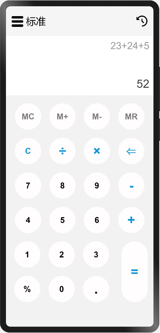
是不是看起来代码很多,每个Button除了内容,及个别颜色和字体大小不一样之外,其他的都是一样的呢?可以思考以下,如何抽出公用的自定义Button组件,根据传参不同显示不同的按钮,这部分会在后面的小节中分享。学习之初先是多用,用熟了,才是灵活使用。
在实现功能按钮区的时候,我给Column容器组件添加了padding({left: 20})这个属性,其代表什么含义?解决了什么问题?你还有没有其他的方法?
本节先对Text文本组件的用法做了简单介绍,然后通过之前小节中学习的Column、Row、Button组件实现了标准计算器的功能按钮区。下一小节将带你一起实现标准计算器的计算功能和计算历史留存。

Recommend
About Joyk
Aggregate valuable and interesting links.
Joyk means Joy of geeK