

Aligning Content In Different Wrappers
source link: https://ishadeed.com/article/aligning-content-different-wrappers/?ref=sidebar
Go to the source link to view the article. You can view the picture content, updated content and better typesetting reading experience. If the link is broken, please click the button below to view the snapshot at that time.

Aligning Content In Different Wrappers
The other day, I was working on an article layout and I stumbled upon an interesting problem to solve. Here it is:

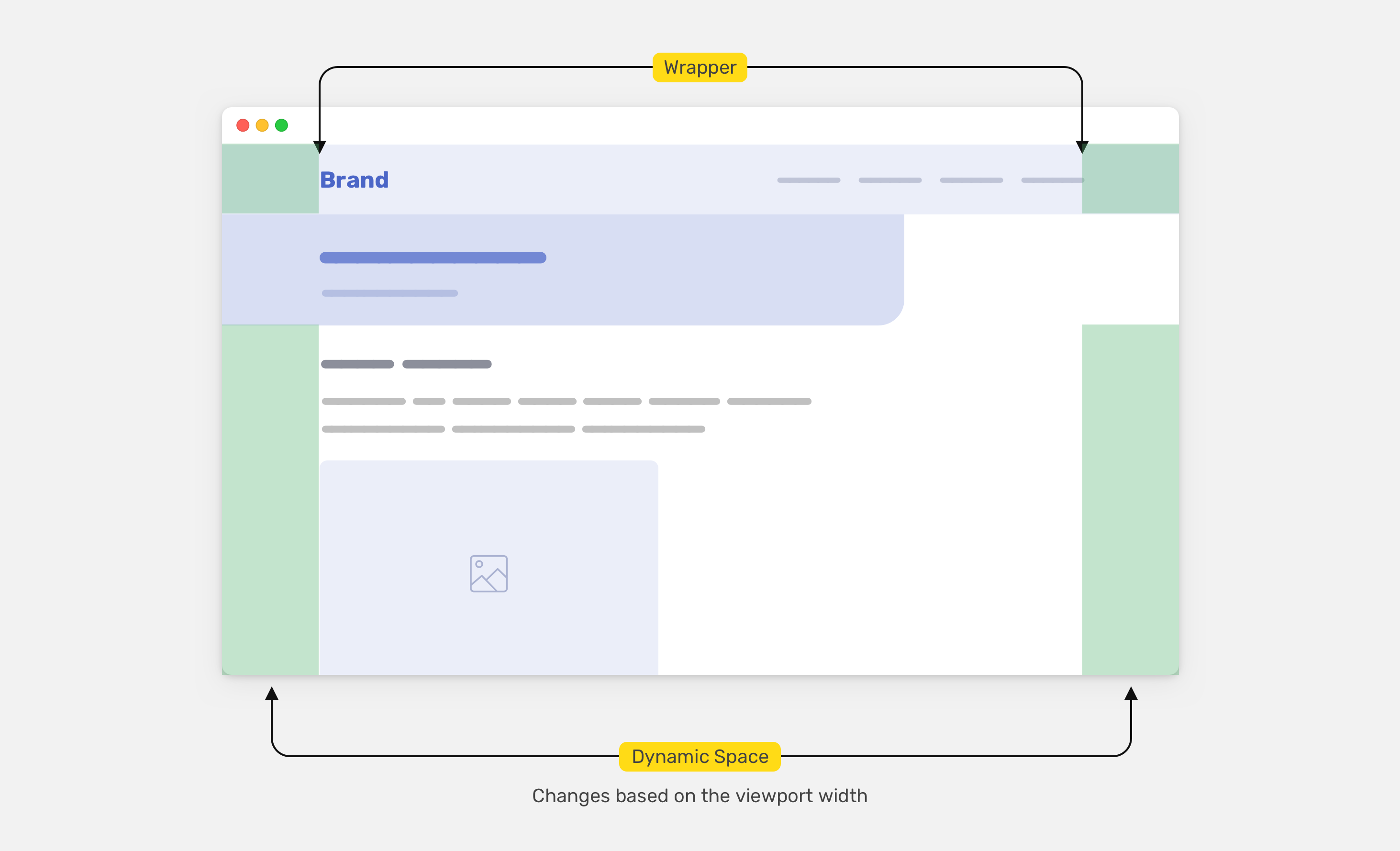
As you see, we have the following:
- Main header: logo and navigation
- Article header: headline and teaser
- Body content
The main header is wrapped with a fixed-width element that is centered horizontally.
<header class="site-header">
    <div class="wrapper">
        <!-- Header content -->
    </div>
</header>
.wrapper {
    max-width: 1100px;
    margin-left: auto;
    margin-right: auto;
    padding-left: 1rem;
    padding-right: 1rem;
}
For the article header, it’s not wrapped into anything and lives on its own.
<header class="site-header">
    <div class="wrapper">
        <!-- Header content -->
    </div>
</header>
<div class="article-header">
    <h1><!-- Title --></h1>
    <p>!-- Description --></p>
</div>
The problem here lies in the article header. If you notice in the figure above, it has left padding that makes it aligned with where the logo starts. At first, it seems doable, but you will change your mind when resizing the screen.
In the following figure, the screen size got larger. Notice how the article header isn’t aligned with the logo.

When the screen size is smaller, the issue will also happen.

To recap, the problem we’re trying to solve here is to have a padding-left value that is dynamic based on the space from the left edge of the screen to the start of the content wrapper.
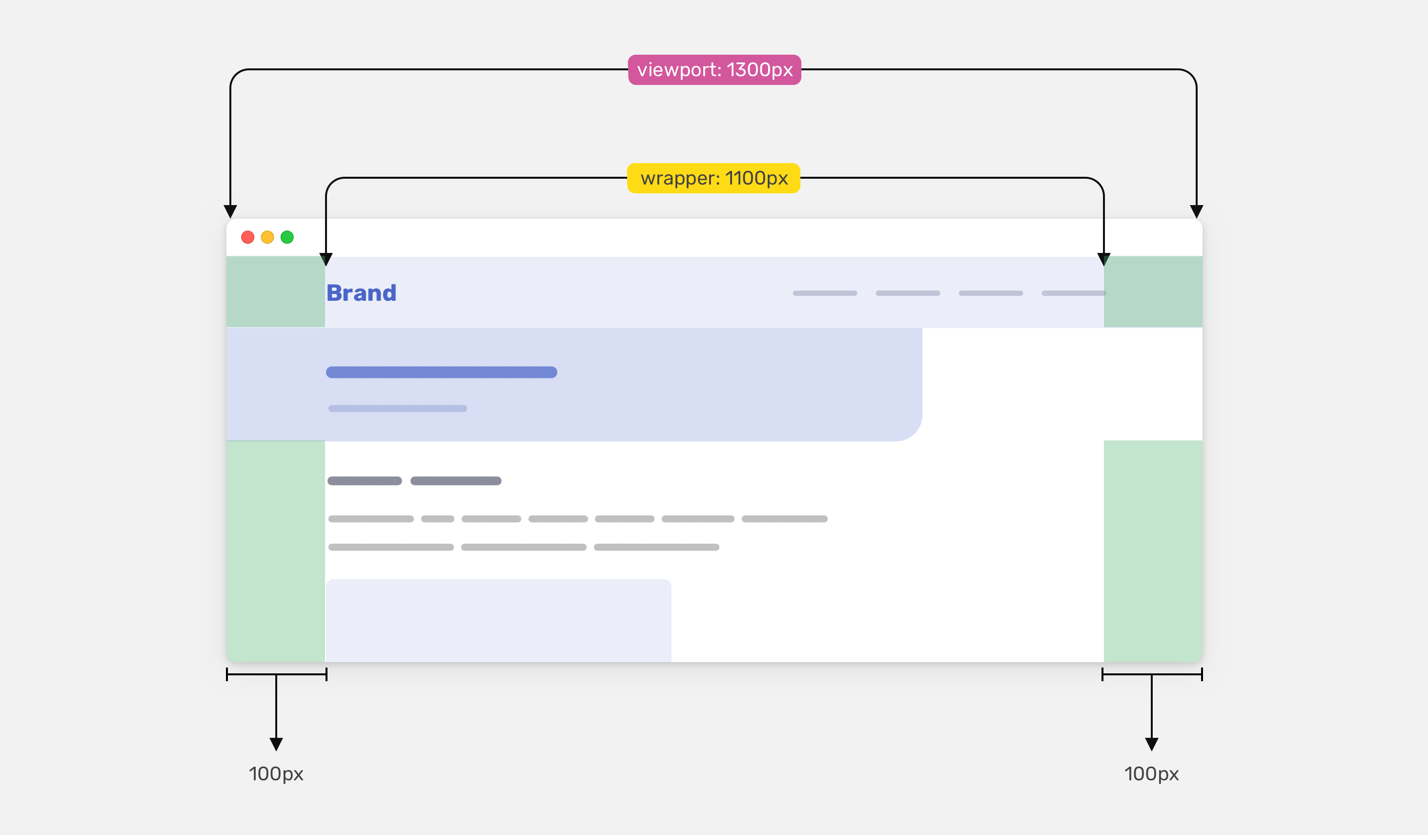
Consider the following figure. The main header and body content are both wrapped into a fixed-width element, but the article header is not. What we want to achieve is a dynamic padding value for the article header.
To achieve that, we need to do some math. Here it is in plain words:
dynamic padding = (viewport width - wrapper width) / 2
Let’s take the following example.
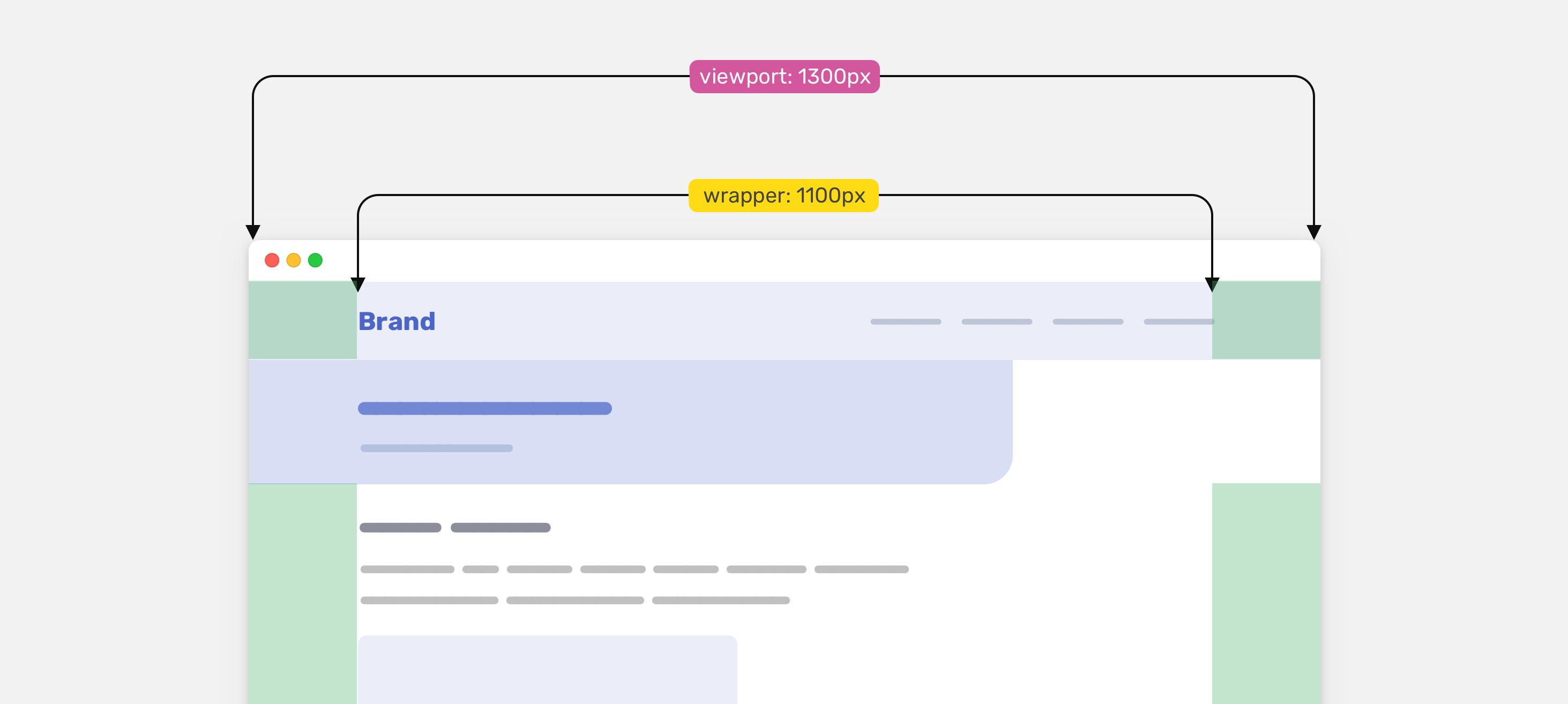
Given the values we have, here is the dynamic padding value:
dynamic padding = (1300 - 1100) / 2 = 100
You might be wondering, why divide by 2? Well, because we have dynamic areas on both left and right, we only need one side.
The solution
In CSS, we will use the following to achieve the above:
- Viewport units
- calc() function
- max() comparison function
- CSS variables
We can use the value 100vw to get the full width of the viewport
.article-header {
    padding-left: calc(100vw - calc(1100px / 2));
}
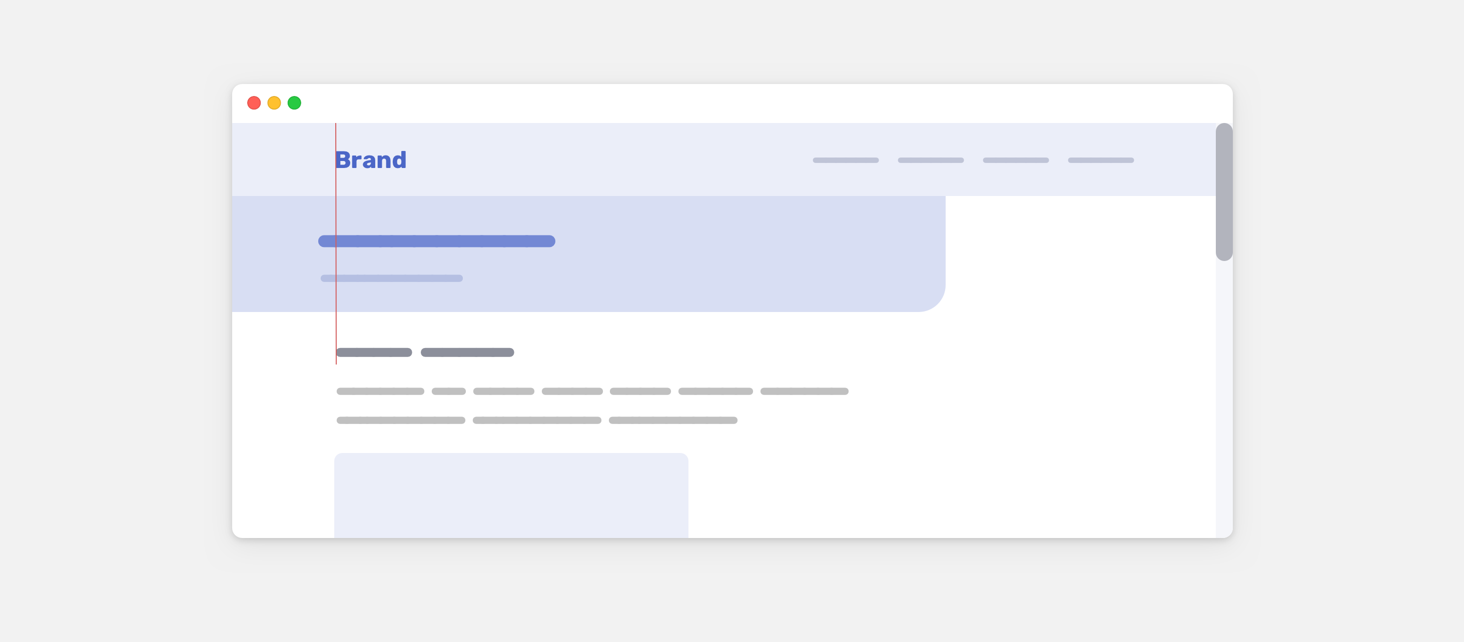
That way, the value of the padding-left will be dynamic and will make the article header content aligned with the logo and navigation.
Though, we’re not finished. We need to account for the .wrapper horizontal padding.
.article-header {
    padding-left: calc(100vw - calc(1100px / 2) - 32px);
}
The 32px is the sum of the left and right padding.
Handling the padding on mobile
Since we subtracted the padding value from the wrapper, the article header padding will be zero on mobile.

To revert the padding back, we need to get help from the CSS max() function. The goal is to give it a minimum value for the padding.
.article-header {
    padding-left: max(1rem, calc(100vw - calc(1100px / 2) - 32px));
}
That way, the horizontal padding will be at least 1rem, and will become dynamic when the viewport size gets larger.
You can learn more about max() and its friend in this article by yours truly.
Using CSS variables
To make things even more abstract, we can add all the above within one CSS variable so we can use it in different places.
:root {
  --wrapper-width: 1100px;
  --wrapper-padding: 16px;
  --space: max(
    1rem,
    calc((100vw - calc(var(--wrapper-width) - var(--wrapper-padding) * 2)) / 2)
  );
}

.article-header {
    padding-left: var(--space);
}
The only issue with 100vw
On Mac OS, the scrollbars aren’t visible by default unless the user chose that from the system preferences. If the scrollbars are visible by default, the 100vw will be equal to 100% of the viewport width minus the scrollbar width. This will cause a misalignment issue.
Since the element doesn’t live in a wrapper, we can replace the 100vw with 100% instead, and it will work as expected.
:root {
  --wrapper-width: 1100px;
  --wrapper-padding: 16px;
  --space: max(
    1rem,
    calc((100% - calc(var(--wrapper-width) - var(--wrapper-padding) * 2)) / 2)
  );
}

.article-header {
    padding-left: var(--space);
}
Update: 15 March 2022
Dannie Vinther reminded me that max() will do the math without the need of the calc() function. Neat!
:root {
    --space: max(
        1rem,
        100% - (var(—wrapper) - ((var(—wrapper-padding) * 2) / 2))
    );
}
That’s it for this little CSS trick. I hope you’ve learned something new!
Recommend
About Joyk
Aggregate valuable and interesting links.
Joyk means Joy of geeK