

HTML and CSS in Emails: What Works in 2022?
source link: https://designmodo.com/html-css-emails/
Go to the source link to view the article. You can view the picture content, updated content and better typesetting reading experience. If the link is broken, please click the button below to view the snapshot at that time.

- Share
- Tweet
- Share
- Pin It
HTML and CSS in Emails: What Works in 2022?
Email Design • HTMLDaniel Schwarz • March 10, 2022 • 6 minutes READ
Arguably, one of the most exciting aspects of web development in recent years has been a significantly more consistent level of support for new HTML, CSS, and ECMAScript (JavaScript) standards amongst web browsers. However, the same cannot be said for email clients despite the introduction of fresh features such as media queries, flex, rem units, and more.
Let’s take a look at some of these features and how we can make them work for all email clients, in 2022.
Internal CSS
Undoubtedly, one of the most annoying aspects of creating emails is having to declare styles for every individual element within its style attribute (for example <element style=”style:value;”></element>), otherwise known as ‘inline CSS’.
Luckily, internal CSS (i.e. styles written within a <style> element) has more support now. Internal CSS is way more efficient since it enables us to combine selectors and write less code that’s more readable.
According to Can I Email, internal CSS works in 84.85% of today’s email clients, but there are a few rules that must be followed in order to make this happen.
Luckily, all of the rules can be complied with by using two <head> elements/inserting the <style> element into the second one. See the example below…
With Postcards you can create and edit email templates online without any coding skills! Includes more than 100 components to help you create custom emails templates faster than ever before.
Try FreeOther Products<head>…</head><head><style>…</style></head>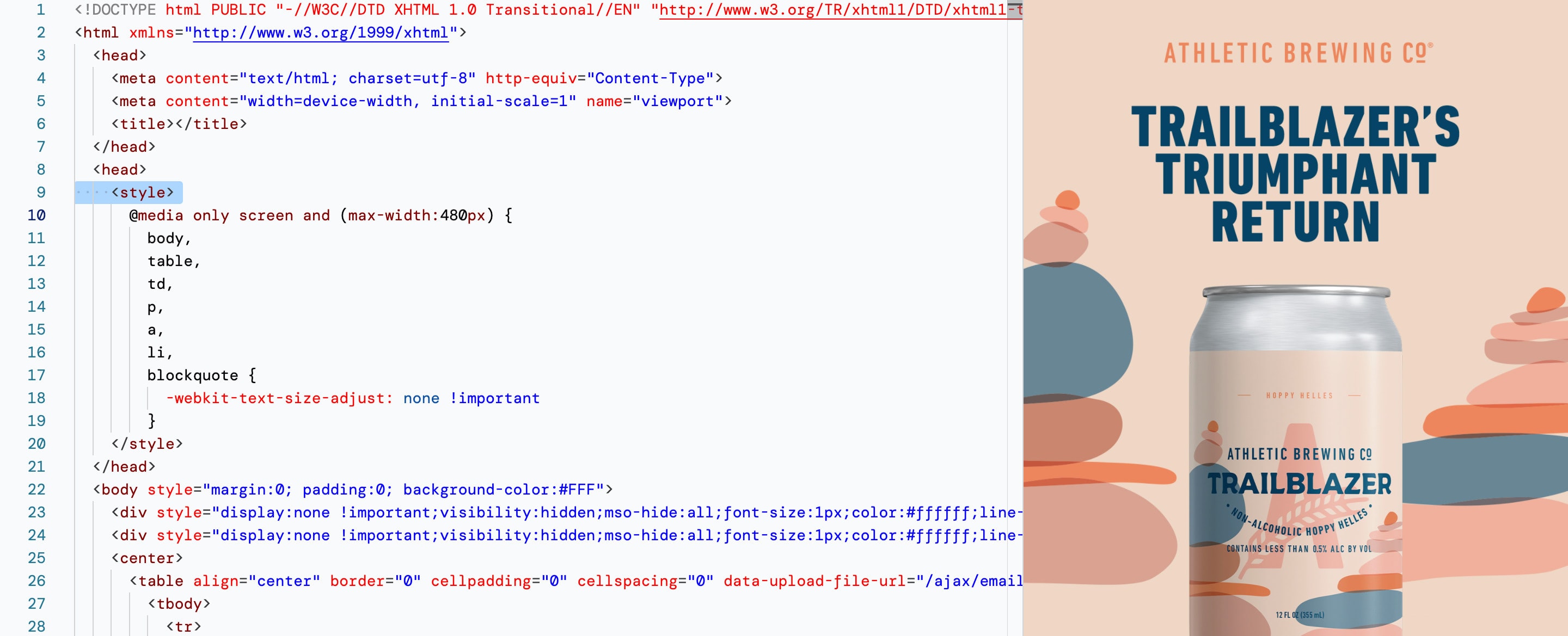
However, while the days of styling using ancient XHTML attributes (e.g. <element align=”center”>) are over, support for internal CSS isn’t as high as we’d like it to be, so many email developers still choose inline CSS depending on the target audience.
It’s worth noting that some features (e.g. media queries and custom fonts) can’t be ‘inlined’, so a common approach to coding emails is to use internal CSS for progressive enhancements only and inline CSS for everything else (unless you’d be willing to forfeit custom fonts and cool layouts, of course).
It’s not an ideal approach, but it is what it is.
Note: external CSS (i.e. the <link rel=”stylesheet”> method) only works in 21.21% of today’s email clients, which is a huge shame because it somewhat rules out creating email design systems.
Media Queries
Internal CSS allows us to use media queries, a necessary component of responsive design. Without media queries, emails can end up looking dreadfully linear, and while there’s absolutely nothing wrong with that from a minimalist viewpoint, a vertical design won’t be the right choice in every scenario.
Media queries only work in 75.75% of modern email clients so we recommend designing responsive layouts that degrade into vertical layouts very gracefully.
Additionally, there are some rules to remember…
- Avoid nested media queries
- Limit conditions to screen, min-width, and max-width or omit them entirely (@media { … })
As mentioned before, media queries can’t be used inline. They must be used within a <style> element, so you’ll very likely be using at least some internal CSS even when inline CSS is your default approach.
With Startup App and Slides App you can build unlimited websites using the online website editor which includes ready-made designed and coded elements, templates and themes.
Postcards helps designers create emails and then automagically outputs code that makes them work in all modern email clients. Internal CSS? Inline CSS? Both? Postcards takes care of everything while you focus on design.
Flexbox or Grid Layout
Unsupported CSS isn’t the only bane of creating emails. Traditionally, HTML <table> has been the backbone of email, but must we still do it this way in 2022? Can we not use the modern <div> element with Flex or Grid?
<div> is supported in 100% of today’s email clients, so no issues there. Grid, however, isn’t well supported at all, although display:flex surprisingly works in 84.85% of email clients (it actually has better support than media queries!).
However, flex’s related CSS properties (flex-wrap:, align-items:, flex-direction:, justify-content:, etc.) have terrible support — tables are the better choice.
Naturally, this rules out the possibility of using semantic HTML elements (e.g. <article>) too, which is a shame for readability and accessibility reasons.
Combined with a lack of full support for internal CSS, this means that in practice email development hasn’t really advanced at all and tools are very much needed if we want to avoid the excruciating task of manually coding emails using extremely old HTML/CSS.
While tables are hard to write (and read), don’t worry, Postcards absolutely loves tables and codes them for you.
Custom Fonts
Although custom fonts are somewhat cosmetic, beautiful typography is the best way to make emails more intriguing, but the easiest method of embedding custom fonts (<link rel=”stylesheet”>) only has 21.21% support in today’s email clients.
Naturally, this only leaves the @font-face approach, which sadly isn’t well supported either (36.36%). However, both approaches afford us the opportunity to suffix font declarations with fallback fonts, so there’s no harm in using @font-face regardless. It’s a relatively simple approach and font embedding services such as Google Fonts* and Adobe Fonts will still work.
@font-face {font-family: Roboto;src: url(“https://fonts.gstatic.com/s/roboto/v...}selector {/* Google font, fallback, fallback */font-family: Roboto, Arial, sans-serif;}
*Oddly, Gmail has the worst support for custom fonts, which includes their very own Google Fonts!
If you don’t want to use a font embedding service or host the font files yourself, you can Base64-encode the fonts, making it easy to embed them into the email itself.
Here’s what that @font-face might look like (simplified):
@font-face {font-family: Roboto;src: url(data:font/ttf;base64,AAEAAAATAQAABAAwR1BPU+Df...}All-in-all, custom fonts aren’t well supported, however it doesn’t take a lot of work to implement them for the email clients that do support them. In the world of email development, this is a rare win.
Postcards can embed any of the 1,358+ Google Fonts, with multiple fallbacks that closely resemble your ideal typeface.
SVG Images
SVGs typically have lower file sizes than their bitmap equals, and when served inline, they don’t delay the loading of the email. Unfortunately, SVG has terrible support. It’s fallback approach (i.e. <picture> with PNG/JPG fallback) is even worse.
Generally speaking, I would avoid SVG for now and stick with PNG/JPG images. If you’re using Postcards it’ll compress them anyway so you don’t have to worry too much about emails loading slowly. In any case, it’s best to avoid excessive imagery anyway, not only because of slow devices but also so that users don’t have to scroll too often when using handheld devices.
As a final note on image formats, it’s worth mentioning that WebP images are unusually supported in 97.05% of modern email clients. They’re safe to use.
What about [x] feature?
We’ve now covered the most in-demand features in email development, but that certainly doesn’t cover all of the limitations that modern email clients still impose today. For example, text-decoration:, a CSS ‘feature’ that you’d expect to work everywhere, in fact doesn’t work in iOS and Android versions of Gmail when using a non-Gmail email address. For email clients that do support text-decoration:, you’ll need to explicitly declare it — it’s not automatic.
We must consider every HTML/CSS feature carefully because even some of the most basic ones don’t work when certain (sometimes odd!) rules aren’t followed:
- CSS border: (100% support, but the border width can’t exceed 8px in Windows Outlook)
- CSS !important (91% support, but they must begin with a space and be in lowercase)
- CSS border-radius: (91% support, but the shorthand slash /doesn’t work in some cases)
- CSS background: (100% support with a quite a few rules, although nothing too concerning)
Here are some HTML/CSS features that you’ll want avoid though, at least until there’s more support:
- CSS box-shadow: (58% support)
- CSS aspect-ratio: (33% support)
- CSS :calc() (7% support)
- CSS rem units: (53% support)
- CSS Variables: (06% support)
- Semantic HTML (low support and unsupported tags are usually stripped rather than converted to <div>)
Parting words of wisdom
As you can see, email development is still very complicated even though modern features are being introduced. Can I Email is an incredible resource for researching specific HTML or CSS email features, but it can be time-consuming.
Alternatively, you can skip the migraine and use Postcards’ drag and drop builder to create the email design you want without worrying about which HTML/CSS features work. Postcards knows so you don’t have to.
Like what you're reading? Subscribe to our top stories.
Recommend
About Joyk
Aggregate valuable and interesting links.
Joyk means Joy of geeK