

Jetpack Compose Accessibility: Getting Started [FREE]
source link: https://www.raywenderlich.com/30117730-jetpack-compose-accessibility-getting-started
Go to the source link to view the article. You can view the picture content, updated content and better typesetting reading experience. If the link is broken, please click the button below to view the snapshot at that time.

Jetpack Compose Accessibility: Getting Started
Almost everyone will experience a disability that impacts their ability to use a mobile phone at some point in their life. Adding accessibility features to your app will help broaden access to it.
Version
At some point in their life, almost everyone will experience at least a short-term disability — if not a long-term disability — that impacts their ability to use a mobile phone. In fact, you may have already experienced being unable to distinguish items on your screen in bright sunlight or struggling to use your phone one-handed while holding a wiggly child or pet. Maybe you’ve experienced difficulties using your phone while wearing gloves or being in a cast.
According to the Centers for Disease Control and Prevention (CDC), “1 in 4 of adults in the United States have a disability”. This can include someone born blind or who’s lost fine motor skills in an accident. It can include hearing loss due to old age and those who struggle with memory and concentration. That’s a quarter of the population experiencing decreased vision, hearing, mobility or cognitive function! Without a doubt, it’s worth building your product with them in mind.
In this tutorial, you’ll learn how to make your app accessible when building with Jetpack Compose. You’ll do this by updating a menu app to make it more accessible. While accessibility has many aspects, you’ll just learn the basics here. Along the way, you’ll learn:
- Some of the accessibility tools people use with their mobile devices.
- What Jetpack Compose semantics are.
- How to test for some accessibility issues.
- Modifiers to make your app easier to use for everyone.
Getting Started
Bon Appetit is a menu app where you can order breakfast before your day of coding. It has lots of tasty treats, but it’s not very accessible. It’s your job to fix that!
Download the project using Download Materials at the top or bottom of the tutorial, and open the starter project in Android Studio.
Build the project. While you’re waiting for that initial Gradle sync, it’s important to learn why accessibility is so significant.
Understanding Why Accessibility Matters
An app isn’t accessible for someone when there’s a mismatch between the app and that person’s abilities. This mismatch puts barriers between a user and the task they’re trying to accomplish. By making apps accessible, you allow more people to use the app without help from others.
And there are lots of reasons why you should make your app accessible:
- Opens your app to a wider audience: More people will be able to use your app. By not having an accessible app, you’re cutting out up to 1/4 of your potential user base.
- Minimizes risk of legal battles: Because of the Americans with Disabilities Act (ADA), if your app is inaccessible, you leave yourself open to lawsuits.
- Makes a better product: Accessible apps tend to have a more thought-out user experience, making the app more usable and enjoyable for all people, regardless of ability.
- Drives innovation: Building an accessible app adds constraints to your designs. Constraints often feed creativity!
- Increases developer productivity: Accessible apps are often more testable and foster smart reuse. This allows developers to move faster with the confidence of a testable app.
- Recognize revenue potential: When someone can’t use your app — or can’t use it well — they’re more likely to go to a competitor. On the other hand, if they can use your app, they’re more likely to pay more for it and recommend it to their friends.
- Treats others with care: If nothing else, building an accessible app is kind. It shows your users that you care and that you’re building for the inclusive world you want to live in.
Exploring the Bon Appetit App
Build and run the app. You’ll see a list view with some menu items organized by food or drink.
You can’t interact much with it yet. Later, you’ll add the option to select what you want to order and improve the interaction while working with accessibility services.
You’ll spend most of your time editing existing composables, so it’s worth getting familiar with them:
- MenuList.kt: This is the composable that describes the menu list. It controls the list items and the headers.
- MenuItem.kt: Here, you’ll find the code that describes the rows in the list. It shows all the information you want to know about each menu item.
- DishAttributes.kt: Used within the menu items, these attributes show icons to let you know if a dish is spicy, contains gluten or is vegetarian.
Finally, you’ll also add to the tests in MenuItemTest.kt.
Enabling Accessibility Tools
An accessibility tool or service is anything that eliminates a barrier to someone using a product. On mobile devices, this could be using a stylus or an external keyboard. People also sometimes use software solutions. One solution, in particular, TalkBack, is what you’ll use for manual testing in this tutorial.
Before getting into what TalkBack is and how to use it, you need to make sure your test device or emulator has the services downloaded.
Creating an Emulator (Optional)
If you’re using an emulator, you need one that has the Play Store available. If you already have an emulator with the Play Store, you can skip to Downloading Accessibility Services. Otherwise, follow this section’s instructions for setting one up.
In Android Studio, start by opening the AVD manager at Tools ‣ AVD Manager. Then, select Create Virtual Device.

On the next screen, select a device that includes the Play Store symbol.
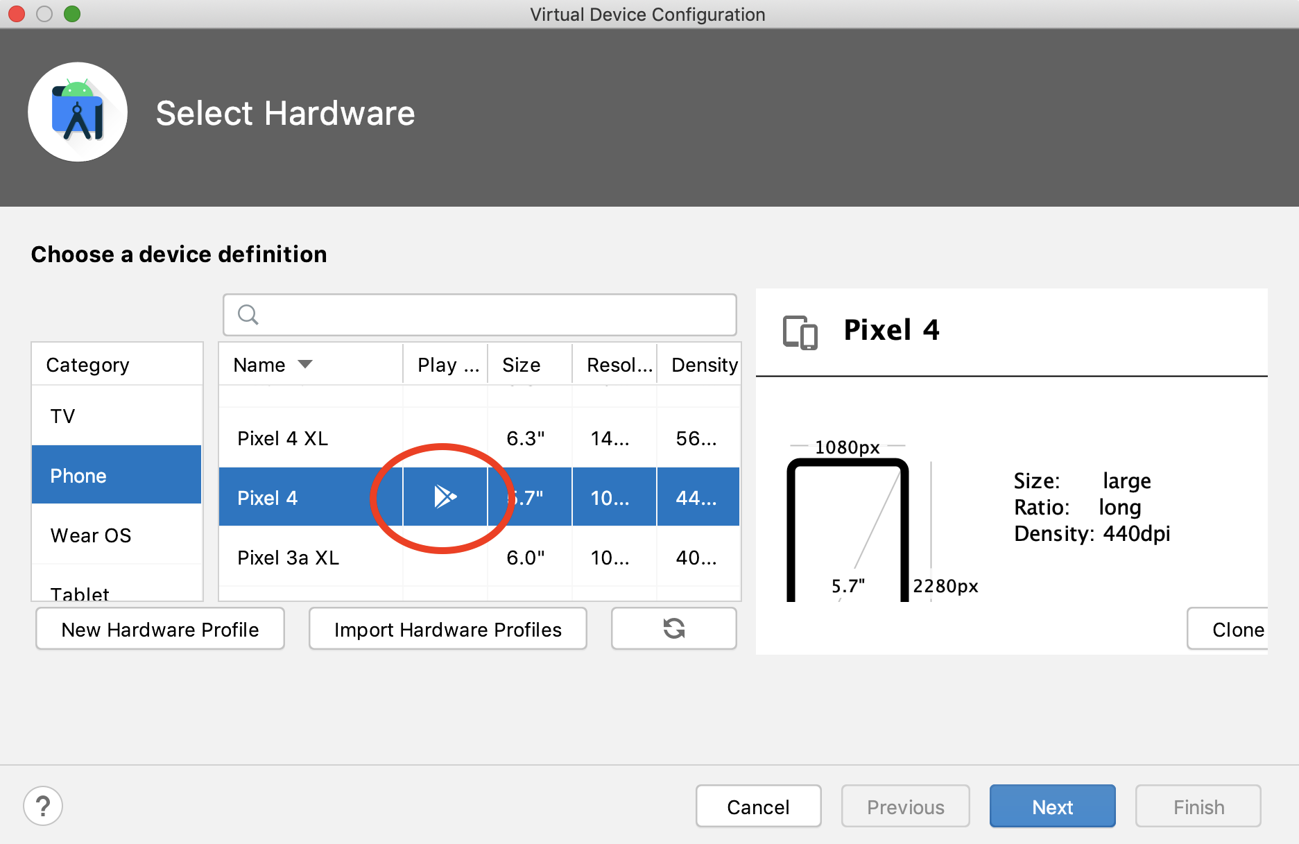
From there, follow the wizard to finish creating the device. Using the defaults for the remaining steps is fine.
Once created, boot your new emulator and move on to the next step.
Downloading Accessibility Services (Optional)
If you’re working with an emulator, you’ll probably need to download accessibility services. Open the Play Store app and sign in with your Google account. Then, search for Android Accessibility Suite from Google.
Install the app, and you’re ready to move on.
Enabling Accessibility Services
You can enable most accessibility services through your device settings. Go to Settings ‣ Accessibility and notice the options available.
Depending on your device, some options you might see are display size and color correction. You’re encouraged to try out each of these services with your app. For this tutorial, you’re looking for TalkBack.
Tap TalkBack to open the TalkBack settings. Before enabling it, you need to know a few things, as you won’t be able to navigate your phone as you normally would.
Navigating With TalkBack
TalkBack is most often used by people with vision impairments. You navigate using gestures, and TalkBack reads the content out loud.
You swipe right to get to the next element, swipe left to move to the previous element and double-tap to select the current item. To select something, you can single-tap anywhere on the screen.
- Alt + Arrow Right to navigate to the next item.
- Alt + Arrow Left to navigate to the previous item.
- Alt + ENTER to select.
Use the toggle to turn on TalkBack and walk through the tutorial.
You can turn TalkBack on and off in two other ways: using a hardware shortcut and using adb. By default, you can press and hold both volume keys to toggle.
Alternatively, use the following adb commands to enable and disable it:
# Enable TalkBack
adb shell settings put secure enabled_accessibility_services com.google.android.marvin.talkback/com.google.android.marvin.talkback.TalkBackService
# Disable TalkBack
adb shell settings put secure enabled_accessibility_services com.android.talkback/com.google.android.marvin.talkback.TalkBackService
Once you’re feeling somewhat comfortable navigating, you’re ready to move on.
Understanding Semantics
There are two trees created from your composables. There’s the Composition that describes the UI, as well as the Semantics that describes the semantic meaning of your UI.
Both accessibility and testing services use the semantics tree. The accessibility services use the tree to provide information to the people using the services, and the testing framework uses it to make assertions.
Because both tests and accessibility services use the same tree, you can write tests for your accessibility and prevent regressions.
Before digging into fixing the accessibility of the app, first write a test to prove the correctness — yay, Test-Driven Development!
Writing an Accessibility Test
Try using TalkBack in the Bon Appetit menu app, and you might notice that you don’t audibly receive any meaningful information about the images. For the attributes, it just says “Attribute”. Without that information, it might come as a surprise to you that the Droid O’s are spicy!
You need to inform the accessibility services what these images are. You do that through content descriptions. You’ll learn more about these in the next section. For now, add a test for it.
Open MenuItemTest.kt and add the following test at the end of the class:
@Test
fun hasAttributeContentDescription() {
  // 1
  val contentDescription = "Gluten Free"
  composeTestRule.setContent {
    // 2
    MenuItem(
      dish = testDish,
      onDishSelected = {},
    )
  }

  // 3
  composeTestRule
    .onNodeWithContentDescription(contentDescription)
    .assertIsDisplayed()
}
Here, you:
- Begin the test by describing the content description you’ll assert.
- Set the composable content to a
MenuItemusing thetestDish. Look at thetestDish, and notice that it’s gluten-free. - Assert that the gluten-free content description exists.
Run the test and see that it fails.
No surprise there! You’ve yet to add the content description.
Adding the Content Description
Content descriptions inform the semantic tree of what an element is so it can describe it to the user. It’s most often used for icons and images. While the accessibility services can use the text of a textual element for information, it doesn’t automatically have information about a graphic.
A content description should describe the meaning of an icon rather than what the icon is. For example, you should use “Back” for a left arrow and “Edit” for a pencil.
In Bon Appetit, you’ll want to use “Spicy” instead of “thermometer” and “Gluten-free” instead of “circle slash croissant”.
Lucky for you, these content descriptions are already included in the resources and data class for you.
Open DishAttributes.kt and find the Image composable. Notice that the content description currently says "Attribute". This explains the unhelpful message you received before when using TalkBack.
Replace "Attribute" with stringResource(it.descriptionRes). The resulting Image composable should look like this:
Image(
  painter = painterResource(it.iconRes),
  contentDescription = stringResource(it.descriptionRes),
  modifier = Modifier.height(16.dp)
)
And that’s all! Adding content descriptions only takes one line.
Now, run the automated test you already wrote to make sure it passes.

Also, build and run the app to make sure you receive the menu item attribute information when using TalkBack.
Omitting Content Descriptions
There are more images than just the attributes to consider. For example, there’s the leading image of the dish.
Sometimes the content in an app can be perfectly understood without the image. Maybe the image is there for additional decoration, or the information from the image can be found elsewhere. In this case, it makes sense for the accessibility services to ignore the image.
Because each dish has a description, you’ll treat the dish image as a simple decoration for this tutorial.
Open MenuItem.kt and find DishImage(). It contains an Image with a content description of "Image". Not very helpful!
To have the accessibility services ignore this image since the description is elsewhere, set the content description to null. The resulting Image should look like this:
Image(
  painter = painterResource(dish.imageRes),
  contentDescription = null,
  modifier = Modifier.size(42.dp)
)
Now, TalkBack and other accessibility services will ignore this element. Build and run the app, and you’ll notice that you’re unable to focus on the image.
Before moving on, another place also has an unhelpful content description. In AddOrRemoveIcon(), set the two content descriptions to null. You’ll describe this state a different way in State Descriptions.
Understanding Jetpack Compose and Accessibility
You may have noticed that Jetpack Compose can be accessibility forward at times. Both accessibility and testing use the semantics tree, so having testable components encourages accessible components and vice versa. Components such as Image require a content description, forcing you to make a decision about it.
You’ll keep seeing this encouragement as you work with Compose, but stay vigilant. You still have work to do!
Grouping
When navigating through the app using TalkBack, you may have found it cumbersome to walk through each element of a dish before moving to the next: the title, the description, the attributes…
Wouldn’t it be nice to be able to consume all this information at once? You can!
Open MenuItem.kt and find the semanticsModifier. This modifier is applied to the Row that describes each dish. Change this modifier to look like this:
val semanticsModifier =
  Modifier.semantics(mergeDescendants = true) { }
This semantics modifier, using mergeDescendants = true, will merge the descendent semantics tree so it’s treated as a single node. This has the effect of grouping the elements so they can all be read at once.
Build and run the app, navigating it using TalkBack. Isn’t it much nicer to navigate now?
Heading Navigation
You can do even more to improve the navigation of the menu. Accessibility services such as TalkBack provide navigation shortcuts. One of those is jumping between headers to skip to the content the user is interested in. Maybe someone just wants a drink and isn’t interested in ordering any food.
You can inform accessibility services that something is a header using the same semantics modifier you used previously.
Open MenuList.kt and find the Heading composable. Within it, there’s a Text composable that already has a chain of modifiers. Add .semantics { heading() } so the chain looks like:
modifier = Modifier
  .fillMaxWidth(0.75f)
  .padding(horizontal = 16.dp, vertical = 8.dp)
  .background(
    colorPrimary,
    shape = CutCornerShape(topEnd = 12.dp)
  )
  .padding(16.dp)
  .semantics { heading() }
Build and run the app. Now, while using TalkBack, you can navigate through the headings.
.assert(isHeading()) assertion. You can test numerous attributes using this pattern.
How this navigation works depends on your device. Learn how to navigate through headings using the TalkBack tutorial.
Two of the possible options include:
- Swipe right with three fingers until you hear “headings”. Then, swipe up or down with one finger to navigate between headings.
- Open the local context menu using the swipe up then to the right gesture or Alt-Shift-Space with the keyboard. Once selected, you can navigate forward like you usually would by swiping right, but now you move through the headers.
Handling Actions
All that is great, but what good is an app if you can’t perform any actions in it? This app might as well be a PDF at this point. Time to add some actions.
When tapping a dish, it should toggle whether you want to order that menu item. Displaying an icon representing the state is already set up, but there’s no click handler. Nothing happens on tap.
Open MenuItem.kt and find clickableModifier. This is already applied to the Row, so you only have to update the modifier here.
Update clickableModifier like so:
val clickableModifier = Modifier.clickable() {
  onDishSelected(dish)
}
Now, when you tap an item, the onDishSelected callback is called, and this updates the state for whether you’re ordering the dish.
clickable modifier automatically applies mergeDescendants = true for you. You can remove that declaration now, or leave it and keep it specific. Either way, you’d have the same behavior.
Build and run the app. Using TalkBack, you’ll notice some new behavior. When you reach a menu item, it reads “Double-tap to activate”.
When double-tapping, it appropriately toggles the state.
Adding State Descriptions
It’s great that you can now toggle that state, but you can’t perceive that state using TalkBack. You could accomplish this using a content description, but there’s another way.
In MenuItem.kt, find that semanticsModifier again. Just like you used it to set heading semantics, you can use this modifier to describe state.
To start, you need some strings that describe the state. Add these lines before the modifier:
val selectedDescription =
  stringResource(R.string.description_selected)
val unselectedDescription =
  stringResource(R.string.description_unselected)
This sets up descriptions for both the selected and unselected states.
Next, set stateDescription and selected in the lambda that’s passed to semantics(). Your code will look like this:
val semanticsModifier =
  Modifier.semantics(mergeDescendants = true) {
    stateDescription = if (dish.selected) {
      selectedDescription
    } else {
      unselectedDescription
    }
  }
Now, this node knows:
- That it’s selectable.
- If it’s currently selected.
- What it means to be selected or unselected.
Build and run the app to find out how the selected and unselected states change the behavior. Use TalkBack to select an item. It now describes the state and announces when it changes.
Testing Selectable
It’s worth jumping back to testing for a moment. Along with headings and content descriptions, it’s possible to test if something is selectable and if it’s currently selected.
You’ll write some tests now and use them later when you refactor to make sure you don’t have any regressions.
Open MenuItemTest.kt and add the following test:
@Test
fun isSelectable() {
  composeTestRule.setContent {
    MenuItem(
      dish = testDish,
      onDishSelected = {},
      modifier = Modifier.testTag(testTag)
    )
  }

  composeTestRule.onNodeWithTag(testTag).assertIsSelectable()
}
Modifier, use import from the androidx.compose.ui package.
This test is similar to what you wrote before, except for the assertion: assertIsSelectable. Build and run the test, and it should prove that your MenuItem is selectable. It would fail if you didn’t set those semantics.
Similarly, add some tests to check if the item is currently selected:
@Test
fun isSelected() {
  composeTestRule.setContent {
    MenuItem(
      dish = testDish.copy(selected = true),
      onDishSelected = {},
      modifier = Modifier.testTag(testTag)
    )
  }

  composeTestRule.onNodeWithTag(testTag).assertIsSelected()
}

@Test
fun isNotSelected() {
  composeTestRule.setContent {
    MenuItem(
      dish = testDish.copy(selected = false),
      onDishSelected = {},
      modifier = Modifier.testTag(testTag)
    )
  }

  composeTestRule.onNodeWithTag(testTag).assertIsNotSelected()
}
Selected and unselected each have one test. You use a dish with the given state and use assertIsSelected and assertIsNotSelected to verify.
Run these tests to see them pass.
Adding Action Labels
You can still provide more information. One thing you can do is let the consumer know what will happen when they perform an action.
The clickable modifier has a handy parameter to share this information. To start, add the following descriptions before clickableModifier:
val selectActionDescription =
  stringResource(R.string.description_action_order)
val unselectActionDescription =
  stringResource(R.string.description_action_remove_order)
Now, you can use these descriptions. Add the onClickLabel parameter to the clickable modifier you added before:
onClickLabel = if (dish.selected) {
  unselectActionDescription
} else {
  selectActionDescription
}
When the dish is selected, the action will unselect it, and vice versa.
Build and run the app to see this in practice. TalkBack will now read “Double-tap to Order”.
Using Foundational Modifiers
This app is a million times better than when you started. Good work! However, it kinda took a lot of little steps, especially when handling specific actions. There’s an easier way to do this.
Google encourages you to use foundational modifiers when building custom views. Why’s that? They do a lot of the work you just did for you, so you don’t have to try to remember it all.
Some of these modifiers include triStateToggleable and selectable. The selectable one is perfect for this app.
In MenuItem.kt, delete clickable and add selectable:
val clickableModifier = Modifier.selectable(
  selected = dish.selected,
  onClick = { onDishSelected(dish) }
)
This keeps track of the selected state for you, so you don’t need to do it yourself in the semantics modifier. It also sets it as selectable.
Run your selectable tests, and make sure they still pass.
Build and run the app to observe similar selectable behavior.
When building a component, it’s helpful to look at the range of modifiers to help you find shortcuts like this one. You can also peek at how Material and foundational components are built. This makes it less likely for you to forget something while also making your app more accessible!
Understanding Touch Targets
While this app currently has no infractions, a discussion on accessible action handling would be incomplete without discussing touch targets.
It’s recommended that any intractable item should be at least 48×48 dp. This ensures it’s big enough to tap for someone who’s visually impaired, has shaky hands or is on a bumpy bus ride. Because Compose is accessibility forward, with Material components and some modifiers, this is often enforced, but not always. It’s worth watching out for on your own.
You can test this in automated tests using assertTouchHeightIsEqualTo and assertTouchWidthIsEqualTo. You can also test manually using the Accessibility Scanner.
To solve a too-small item, you can:
- Make the element bigger.
- Add some padding.
- Use the
touchBoundsInRootmodifier to update the touch area.
Testing Comprehensively
While this tutorial showed two ways to test your app for accessibility — automated tests and TalkBack — it only scratches the surface when it comes to testing. People use other accessibility tools, and automated testing doesn’t catch everything.
Try changing your display size or updating the color correction. Test your app in a variety of scenarios.
When you feel you have the basics down, there’s no replacement for user testing. Watch people who use accessibility services every day use your app. It’s a promise you’ll get insights you never would otherwise.
Where to Go From Here
Great job! You’ve learned a lot here, today. You can check out the final project using the Download Materials button at the top or bottom of this tutorial.
If you want to dig deeper into accessibility on Android, check out Android Accessibility by Tutorials.
If you want more information about accessibility in Jetpack Compose, you can look at the official documentation:
Please join the comments below with any questions or thoughts!
raywenderlich.com Weekly
The raywenderlich.com newsletter is the easiest way to stay up-to-date on everything you need to know as a mobile developer.
Get a weekly digest of our tutorials and courses, and receive a free in-depth email course as a bonus!
Recommend
About Joyk
Aggregate valuable and interesting links.
Joyk means Joy of geeK