

Complete guide to Rich Text in Jetpack Compose ✍️
source link: https://dmytroshuba.com/blog/complete-guide-to-rich-text-in-jetpack-compose/
Go to the source link to view the article. You can view the picture content, updated content and better typesetting reading experience. If the link is broken, please click the button below to view the snapshot at that time.

Complete guide to Rich Text in Jetpack Compose ✍️
23 Feb 2022 ⋅ Android, Jetpack Compose, UI/UX
This article teaches how to customize text content in Jetpack Compose. It covers basics first and then goes deeper into advanced ways of customizing text appearance.
Users don’t read anymore. They scan the content for anything that seems to be what they need.
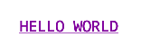
If you are not familiar with what rich text is then see the comparison to plain text below:
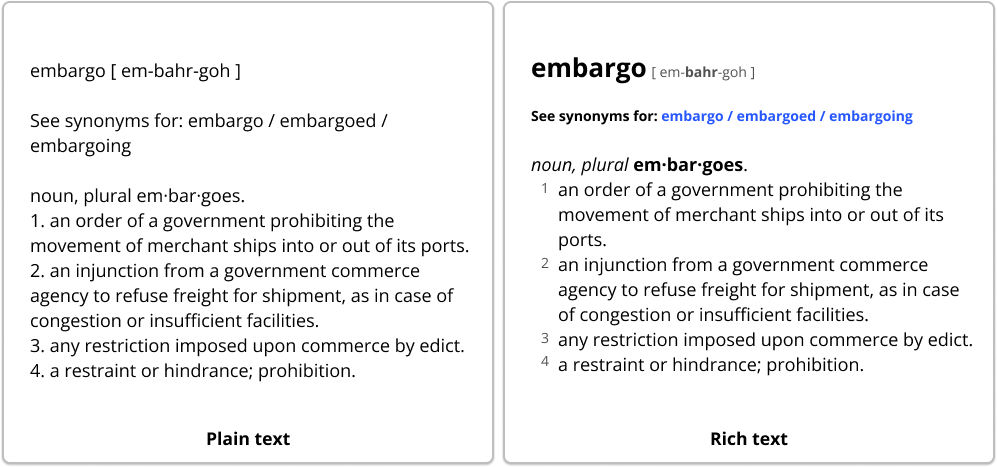
From the picture we can see that rich text:
- Displays content using multiple different styles;
- Emphasizes some segments to stress the importance of some particular text.
It’s important to say that text styling is about UI and UX. Just like huge text in a book tells you it’s a header for a new chapter, this blue text makes you think it’s a link (it’s not).
So rich text is not only about formatting and styling, but also about the delivery of the content and its meaning.
# Now how to apply styles to Text?
We’re going to cover 3 ways how one can tweak text appearance. Each following approach is more advanced and flexible:
- Filling
Textcomposable properties - Using (and reusing)
TextStyle - With
AnnotatedString
# Style Text composable with its properties
In this section we will go through Text parameters. We will learn what these parameters do, how we can specify them and then see what content looks like when we apply them.
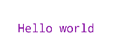
Let’s start with a basic text field in Jetpack Compose:
    Text(
        text = "Hello world"
    )
Here’s our text!
Now let’s have some fun and style it.
# Text size
A Text composable actually supports 2 units for size:
sp- scaled pixels. Just as in Views, use this one.em- relative font size.
We will simply set an sp value to fontSize to make it slightly bigger.
⏭️ tldr: fontSize = 24.sp
# Text color
Jetpack Compose has its own Color class which is:
- not compatible with Android View Color
However, you can simply turn Compose Color into View Color using thetoArgb()function. - created in a different way:
When setting a custom hex color we specify it asInt. Be aware of its transparency as we have to set it explicitly.
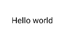
Let’s make the text purple. The value would be 0xFF81009E where
81009Eis the hex of the color (#81009E)0xFFis the alpha that adjusts transparency (hex transparency table)
Now0xFF81009Eis anIntvalue.
⏭️ tldr:color = Color(0xFF81009E)
# Font family
Using fontFamily we can select a custom typeface or choose one of the font families that come by default:
To apply a platform default font use FontFamily.Default
Others go by:
FontFamily.MonospaceFontFamily.SansSerifFontFamily.CursiveFontFamily.Serif
Here’s how different these font styles are visually:
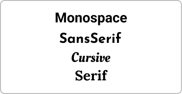
To use a custom font put it into the Font class like this: FontFamily(Font(R.font.open_sans))
⏭️ tldr:fontFamily = FontFamily.Monospace
# Text alignment
The TextAlign value is used to align text content.
There are 6 types of alignment:
TextAlign.Center- centers text content(based onTextwidth)TextAlign.Justify- fills the width of the Text composable by stretching its content all over the available space.TextAlign.StartandTextAlign.Left- the default. Align the text on the leading/left edge.TextAlign.EndandTextAlign.Right- Align the text on the leading/right edge.
The difference between start and left, end and right is not big, but never mix them.
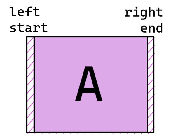
❗ Keep in mind that start ≠ left and end ≠ right when you have to support RTL languages (such as Arabic).end is the same as right if the direction is left-to-right and left if the direction is right-to-left.
Align to right and the content is aligned to the right edge of the composable.
⏭️ tldr:textAlign = TextAlign.Center
# Set max lines limit
The maxLines property sets how many lines your text can be on.
Now what happens if maxLines equals 1, but the text requires 2 lines? It’s called text overflow and there are a few strategies on how to handle it.
⏭️ tldr:maxLines = 1
# Text overflow
There are 3 ways how you can handle text overflow by default:
TextOverflow.Clip- clips the overflowing text to the bounds of the composable;TextOverflow.Ellipsis- replace overflowing text with an ellipsis (…);TextOverflow.Visible- shows all text even if there is not enough space (will render even outside of the composable)
⏭️ tldr:overflow = TextOverflow.Ellipsis - end with 3 dots if too many characters
# Make text clickable
- To Make the entire text clickable use modifier:
modifier = Modifier.clickable { } - To make some parts of text clickable:
UseClickableTextandAnnotatedString(more details below)
⏭️ tldr: modifier = Modifier.clickable { /* execution */ }
# Text all caps
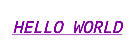
Just make the input text uppercase:text = "Hello world".uppercase()
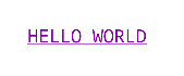
# Add underline
TextDecoration draws a line for your text.
TextDecoration.Udnerline- draws it right below;TextDecoration.LineThrough- draws a line right through the content;TextDecoration.None- as the name suggests - does nothing.
⏭️ tldr: textDecoration = TextDecoration.Udnerline
# Make text bold
Text now has weight! It gives a whole range of values from Thin & ExtraLight to Bold & ExtraBold!
You can set how bold the text is in glyphs(“unit” for font weight) or by simply using aliases like:
FontWeight.ThinFontWeight.ExtraLightFontWeight.LightFontWeight.NormalFontWeight.MediumFontWeight.SemiBoldFontWeight.BoldFontWeight.ExtraBoldFontWeight.Black
⏭️ tldr: fontWeight = FontWeight.ExtraBold
Don’t be confused with the fontStyle parameter though!
# Make text italic
Now fontStyle is very simple. It has only 2 options:
FontStyle.Italic- applies italic to the text.FontStyle.Normal- keeps the original text.
⏭️ tldr: fontStyle = FontStyle.Italic
# Now briefly about some other properties:
letterSpacing - specifies the amount of space between each character.lineHeight - specifies line height for the text paragraph.softWrap - specifies if the text breaks at soft line breaks.onTextLayout - a callback to trigger when text layout is calculated (more details).
# Recap
- Text composable has common basic properties for styling
- Use
fontWeightto make text Bold andfontStyleto make it Italic
# Update text appearance with TextStyle
Text properties provide common styling attributes. However, this approach has 2 major drawbacks:
- It’s tedious to fill properties manually every time.
- It has a limited number of attributes and is missing other properties like text background color or shadows.
- Not very convenient to reuse.
# Applying 1 style to many texts in a single line
💡 TextStyle is a styling configuration. It can be reused easily and its properties are all attributes that a text can have by default.
When creating a TextStyle you can either fill out its properties directly or initialize it with SpanStyle and ParagraphStyle whose parameters TextStyle takes anyways.
SpanStyleparameters affect text itself.ParagraphStyleadjusts the paragraph or “the lines” text is on.
Just like we could use styles from Android resource for our Text Views we now can reuse one TextStyle in many composables. So this XML style resource:
    <style name="TextAppearance.MyApp.Medium" parent="TextAppearance.AppCompat.Medium">
        <item name="android:textSize">32sp</item>
        <item name="android:color">@color/black</item>
        <item name="background">@color/gray</item>
    </style>
Becomes this:
    val medium = SpanStyle(
        fontSize = 32.sp,
        color = Color.Black,
        background = Color.Gray
    )
If we go further, we can organize it in a way that we can reuse it later as a part of our app theme! So in this case we could collect other text styles under TextAppearance object:
object TextAppearance {

val Medium = SpanStyle(
        fontSize = 32.sp,
        color = Color.Black,
        background = Color.Gray
    )
}
Check out my article on how to create custom themes in Jetpack Compose to see more on theming!
# Recap
- TextStyle extends the number of properties you can style your text by;
- It is possible to reuse the same TextStyle for multiple
Textcomposable; - You can generate TextStyle with different combinations of
SpanStyleandParagraphStyle. The first tweaks text content appearance, the second changes paragraph settings.
# Full customization with AnnotatedString
What makes AnnotatedString different from TextStyle and Text properties is that their parameters affect the entire text. AnnotatedString allows to tweak the apperance of its certain parts and can even add metadata to it.
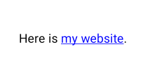
# Hyperlink example
Let’s say we want to make a hyperlink and open a website when we click on it. Theoretically, we could set the blue color to text and add Modifier.clickable to open a static link in a browser.
Our entire content is plain text. It’s just a few links here and there that should be highlighted and clickable.
AnnotatedString is the perfect tool to make a hyperlink in Jetpack compose in this case! Let’s implement this use case to see it.
# Implementing a hyperlink
First, let’s create some constants and add a ClickableText composable. It requires us to specify the text and onClick parameters by default.
private const val TAG_URL = "ANNOTATION_TAG_URL"

@Composable
fun MainText() {
    val uriHandler = UriHandlerAmbient.current // utility to open links in a browser
    val text = "Here is my website." // "my website" contains a link

val link = "https://dmytroshuba.com/"
    val annotatedText = attachLink(
        source = text,
        segment = "my website",
        link = link
    )
    ClickableText(
        text = annotatedText,
        onClick = { /* implementation */}
    )
}
onClick when triggered provides the index of the character that a user clicked on. It’s important as that’s the way we can verify that there’s a link.
Not let’s have a closer look at the attachLink function:
fun attachLink(
    source: String,
    segment: String,
    link: String
): AnnotatedString {
    val builder = AnnotatedString.Builder() // builder to attach metadata(link)
    builder.append(source) // load current text into the builder

val start = source.indexOf(segment) // get the start of the span "my website"
    val end = start + segment.length // get the end of the span
    val hyperlinkStyle = SpanStyle(
        color = Color.Blue,
        textDecoration = TextDecoration.Underline
    ) // create a hyperlink text style

builder.addStyle(hyperlinkStyle, start, end) // style "my website" to make it look like a link
    builder.addStringAnnotation(TAG_URL, link, start, end) // attach the link to the span. We can then access it via the TAG_URL

return builder.toAnnotatedString()
}
AnnotatedString contains the text. We styled “my website” substring in it and added a url “behind its characters”.
Now let’s get back to the ClikableText.
    ClickableText(
        text = annotatedString,
        onClick = {
            annotatedString
                .getStringAnnotations(TAG_URL, it, it)
                .firstOrNull()
                ?.let { url -> uriHandler.openUri(url.item) }
        }
When clicking on the text we call onClick callback and get the index of the character that was clicked.
Then what we do is we try to extract the url with TAG_URL from the character behind the index. If the character is the one that is behind the span with “my website” text then we receive the link and open it in a browser using uriHandler.
# Extra: dynamic parsing example
Using AnnotatedString we can pretty much automate the styling and annotation of our content.
One of my recent releases is DailyTags library. It can parse markdown, some HTML and even custom markups! Using AnnotatedString it could both style individual segments of text and add metadata (such as url) on the fly as it splits the entire content into small chunks called nodes.
In fact, it worked pretty much the same way as in the hyperlink example.
# Recap
- Using AnnotatedString we can style individual parts of text independently.
- AnnotatedString allows us to add metadata to text. It can be a url, an ID, etc.
- AnnotatedString is a great
# Q&A
# SpannableString vs AnnotatedString
SpannableString is used for decorating text in Android View while AnnotatedString is a native way to do so in Jetpack Compose.
In a nutshell, they’re pretty much the same, but made for different UI systems.
# The entire text row is clickable. How do I make only text Clickable?
The problem is that your Text composable takes more width/height than it needs for its content.
Wrap it into a Box and center the content inside it. Now Box should cover extra space while Text boundaries are right next to its content.
# How to make 3 dots in the end of a string if it’s too long in Jetpack Compose?
Add ellipsis overflow mode in the text properties:
Text(
    text = "...",
    overflow = TextOverflow.Ellipsis
)
# How to parse HTML text in Jetpack Compose?
HTML is a markup and the real question is what’s the tool to parse it. One way to do so is with AndroidView.
Another way to do so is using DailyTags library as it supports HTML text tags.
# Resources
Jetpack Compose Text
How to create a custom theme
Text Style documentation
Jetpack Compose styling text by Alex Zhukovich
Recommend
About Joyk
Aggregate valuable and interesting links.
Joyk means Joy of geeK