

快过年了~我用CSS画了个灯笼,赶紧来白嫖!!
source link: https://zhuanlan.zhihu.com/p/457220088
Go to the source link to view the article. You can view the picture content, updated content and better typesetting reading experience. If the link is broken, please click the button below to view the snapshot at that time.

快过年了~我用CSS画了个灯笼,赶紧来白嫖!!
大家好,我是一碗周,一个不想被喝(内卷)的前端。如果写的文章有幸可以得到你的青睐,万分有幸~
写在前面
过年了~ 过年了~ 过年了~
辞旧迎新过年啦 张灯结彩春节啦~
金鸡起舞送福啦 新的一年福来啦~
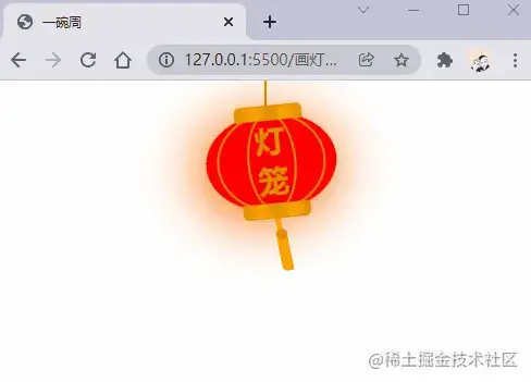
文章开头几句歌词,顿时显得喜庆了不,我们的灯笼是下面这个样子的。
animation属性
画灯笼我们肯定不能画一个静态的灯笼,我们先来复习一下CSS中的animation属性,该是是一个简写属性,由animation-name,animation-duration, animation-timing-function,animation-delay,animation-iteration-count,animation-direction,animation-fill-mode 和 animation-play-state 属性组成。这里我们就不展开讲解了,具体可以跳转到MDN学习。
我们先来看一下下面这个示例:
animation: swing 3s infinite ease-in-out;在上面的例子中使用了一个名为swing的动画序列,动画序列通过@keyframes创建,执行时间3s,动画循环执行,最后ease-in-out表示动画执行的节奏。
实现思路
- 为一个矩形添加
border-radius使其,形成一个灯笼的外形。 - 为矩形添加
::before和::after来形成灯笼的顶部和头部 - 画一个灯笼线。
- 在 矩形内部添加两个比较细的矩形,通过添加 border-radius 来形成灯笼的线条。
- 设置灯笼的动画效果
- 添加灯穗的样式
接下来我们就分步骤实现。
绘制灯笼外形
首先我们定义HTML结构,代码如下:
<!-- 灯笼容器 -->
<div class="lantern-con">
  <!-- 提着灯笼的线 -->
  <div class="lantern-line"></div>
  <!-- 灯笼主要区域 -->
  <div class="lantern-light">
  </div>
</div>然后我们画一个椭圆,然后通过::before和::after,绘制上下的两个灯笼盖,CSS如下:
/* 灯笼容器 */
.lantern-con {
  position: fixed;
  left: 160px;
}

/* 灯笼中间红色区域 */
.lantern-light {
  position: relative;
  width: 120px;
  height: 90px;
  background-color: red;
  margin: 30px;
  border-radius: 50%;
  box-shadow: -5px 5px 50px 4px #fa6c00;
  /* 设置旋转点 */
  transform-origin: top center;
  animation: swing 3s infinite ease-in-out;
}

/* 灯笼顶部和底部的样式 */
.lantern-light::before,
.lantern-light::after {
  content: '';
  position: absolute;
  border: 1px solid #dc8f03;
  width: 60px;
  height: 12px;
  /* 背景渐变 */
  background: linear-gradient(
    to right,
    #dc8f03,
    #ffa500,
    #dc8f03,
    #ffa500,
    #dc8f03
  );
  left: 30px;
}

/* 顶部位置 */
.lantern-light::before {
  top: -7px;
  border-top-left-radius: 5px;
  border-top-right-radius: 5px;
}

/* 底部位置 */
.lantern-light::after {
  bottom: -7px;
  border-bottom-left-radius: 5px;
  border-bottom-right-radius: 5px;
}

/* 提着灯笼的线的样式 */
.lantern-line {
  width: 2px;
  height: 50px;
  background-color: #dc8f03;
  position: absolute;
  left: 88px;
}
/* 灯笼的动画效果 */
@keyframes swing {
  0% {
    transform: rotate(-6deg);
  }

  50% {
    transform: rotate(6deg);
  }

  100% {
    transform: rotate(-6deg);
  }
}
现在就实现了一个比较基础灯笼外形,效果如下:
灯笼内部线条
灯笼的内部线条是通过两个矩形实现了,通过border-radius属性将其设置为椭圆,然后绘制边,呈现灯笼线条。
<div class="lantern-light">
  <!-- 灯笼中间的线条 -->
  <div class="lantern-circle">
    <div class="lantern-rect">
      <!-- 灯笼中间的文字内容 -->
      <div class="lantern-text">灯笼</div>
    </div>
  </div>
</div>
对应的CSS如下:
- 中间的线条 */
/* 灯笼中间的线条 */
.lantern-circle,
.lantern-rect {
  height: 90px;
  border-radius: 50%;
  border: 2px solid #dc8f03;
  background-color: rgba(216, 0, 15, 0.1);
}

/* 外层 */
.lantern-circle {
  width: 100px;
  margin: 12px 8px 8px 10px;
}

/* 内层 */
.lantern-rect {
  margin: -2px 8px 8px 26px;
  width: 45px;
}

/* 文字样式 */
.lantern-text {
  font-size: 28px;
  font-weight: bold;
  text-align: center;
  color: #dc8f03;
  margin-top: 4px;
}
灯笼穗
现在我们来绘制一下灯笼穗,这个东西比较简单,最主要的是添加一个动画效果,其HTML结构如下:
<!-- 灯笼主要区域 -->
<div class="lantern-light">
  <!-- more code -->
  <!-- 灯笼穗 -->
  <div class="lantern-tassel-top">
    <div class="lantern-tassel-middle"></div>
    <div class="lantern-tassel-bottom"></div>
  </div>
</div>
主要区域 -->
CSS如下:
/* 灯穗 */
.lantern-tassel-top {
  width: 5px;
  height: 20px;
  background-color: #ffa500;
  border-radius: 0 0 5px 5px;
  position: relative;
  margin: -5px 0 0 59px;
  /* 让灯穗也有一个动画效果 */
  animation: swing 3s infinite ease-in-out;
}

.lantern-tassel-middle,
.lantern-tassel-bottom {
  position: absolute;
  width: 10px;
  left: -2px;
}

.lantern-tassel-middle {
  border-radius: 50%;
  top: 14px;
  height: 10px;
  background-color: #dc8f03;
  z-index: 2;
}

.lantern-tassel-bottom {
  background-color: #ffa500;
  border-bottom-left-radius: 5px;
  height: 35px;
  top: 18px;
  z-index: 1;
}
到这我们就把这个灯笼画完了。
写在最后
本篇文章到这就结束了,都看完了就点个赞支持一下,谢谢了~
原作者姓名: 一碗周
原出处:掘金
原文链接:https://juejin.cn/post/7051370971932033038
Recommend
About Joyk
Aggregate valuable and interesting links.
Joyk means Joy of geeK