

Using the Psutil Module for System Monitoring - DZone Performance
source link: https://dzone.com/articles/using-the-psutil-module-for-system-monitoring-bonu
Go to the source link to view the article. You can view the picture content, updated content and better typesetting reading experience. If the link is broken, please click the button below to view the snapshot at that time.

Using Psutil Module for System Monitoring [+Bonus]
In this post, we'll learn to use the Python Psutil module for system monitoring and how can we visualize reports with the Python data visualization tool called Plotly.
Join the DZone community and get the full member experience.
Join For FreeLet’s face it: the mighty Task Manager isn’t a magic wand for all operations. Thus, managing system processes and profiling is better off without it. Unless you’re into the dread of manual and repetitive checks. That is why we need an effective alternative to assess the impact of our test.
With this in mind, you might need to create a script that goes through the system processes and provides a report when the script runs.
This is where the Psutil module comes into the limelight. It provides valuable functions that help deal with system processes and ease the strain.
A Few Lines About Psutil
If you’re reading this post, you must know the ins and outs of this module. But just in case, let me brush up on your knowledge while we’re here. Psutil is the Python module that is suitable for system monitoring, profiling as well as limiting the resources of the processes and managing the running processes.
Put simply, Psutil is a third-party module that obtains information about information. The Psutil module can be used on different platforms and supports Linux / UNIX / OSX / Windows etc. You can install it by simply typing pip install Psutil in the cmd command line
How To Use Psutil: A Short Guide
Here’s how we can leverage this Python library.
First, let’s import libraries:

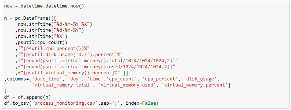
Then, we’ll create an empty dataframe:

The function psutil.cpu_percent() provides the current system-wide CPU utilization in the form of a percentage. It requires a time interval as a parameter (e.g. seconds). Make sure you include a time interval because CPU use is calculated over a period of time.

The next function is psutil.disk usage (path). It returns a tuple of disk usage statistics for a given path. The total, used, and free space, as well as the % consumption, are all stated in bytes.
Going over to the next function, psutil.virtual_memory () provides insight into the system memory usage. It returns the value of total RAM capacity in bytes. This value remains constant, but we’ll need it later for graph plotting.

Let's convert to gigabytes:

and round up to two digits:

Then, we’ll return the amount of used RAM at the moment of a startup, in bytes. Let's convert it to gigabytes and round up to two digits:

You can add any metrics to the report in case it is your matter of concern and monitoring. Feel free to check out more about metrics in Psutil's documentation.
Let's add another percentage of used RAM.

Then, we’ll set a variable to the current date and add all values to the dataframe relevant for the current time.
After that, we’ll write the new value into a CSV file.
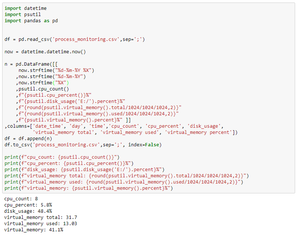
Your final script will look like this:
However, you wouldn’t like activating it manually every five minutes. So I suggest you set up a scheduler that takes care of your script automatically.
By running it every 2/3/5 or 10 minutes, we will gather statistics about our system load. Reports like these are useful to get a fuller image of the system under load, and whether you can reduce downtime and add some extra load. In large organizations, such reports will help the executives get a look into the capacity in use and budget planning for resource expansion.
On that note, let’s see how we can visualize reports in this context. Here’s our bonus section.
Creating Charts and Graphs With Python Plotly
Plotly is one of the richest Python data visualization tools for Data Science.
Although the Pandas, Matplotlib, and Seaborn libraries are excellent libraries for plotting data, they are fit for statistical graphs. In most cases, statistical plots are enough to channel the message.
However, in some cases, you may want to spruce up your reports by making them more interactive. Besides, Plotly allows you to create a whole lot of visualizations, including line plots, area and bar charts, box plots, heatmaps, and others.
So here’s how we can use Plotly for visualizing your data.
First, let’s import the Plotly graphic libraries that we’ll need for plotting. Then we’ll write a file path (the one that collects information about system processes).

Let's start plotting the graph.
First set the bar on which we are going to plot.
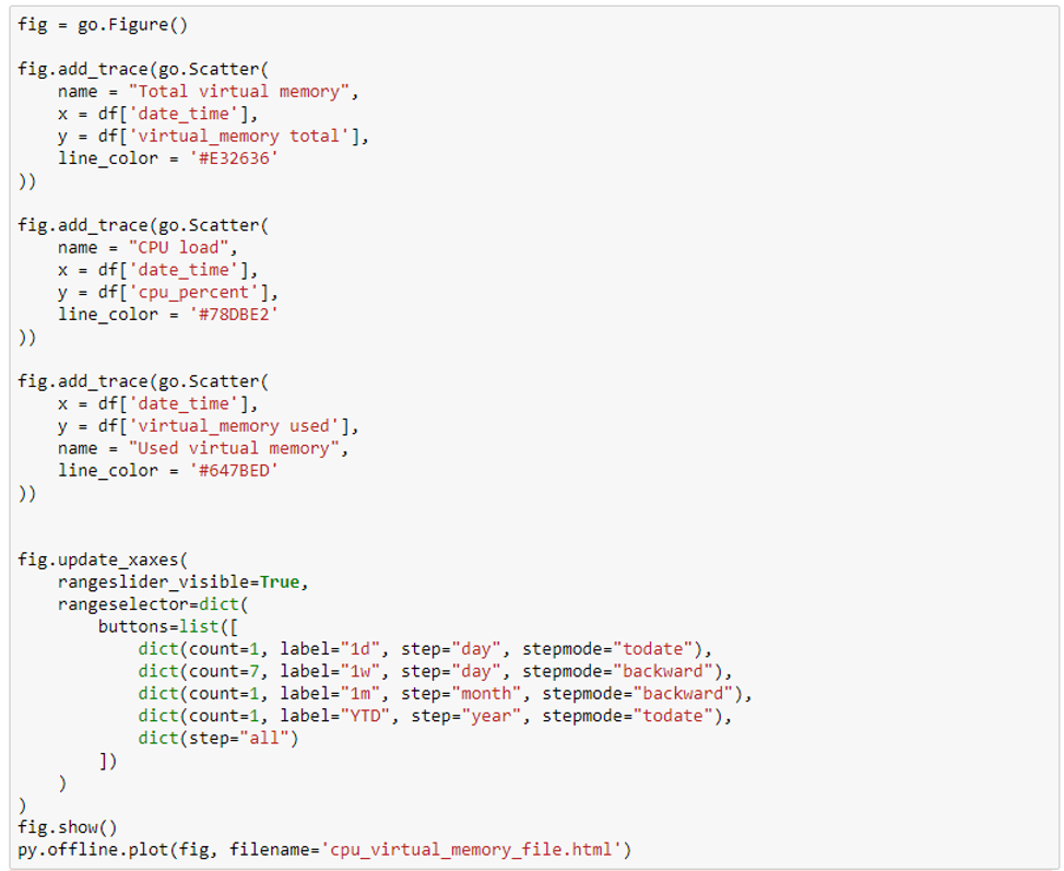
Add a new trace using add_trace() method
Then we’ll write the chart title in the name.
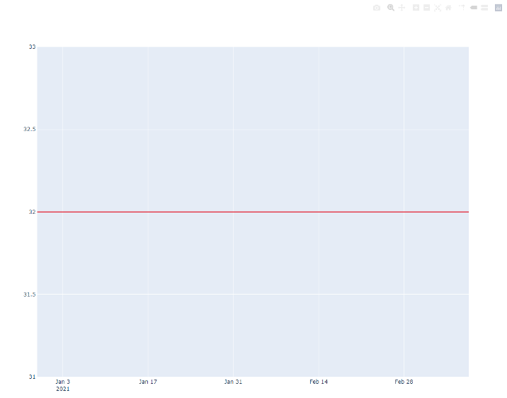
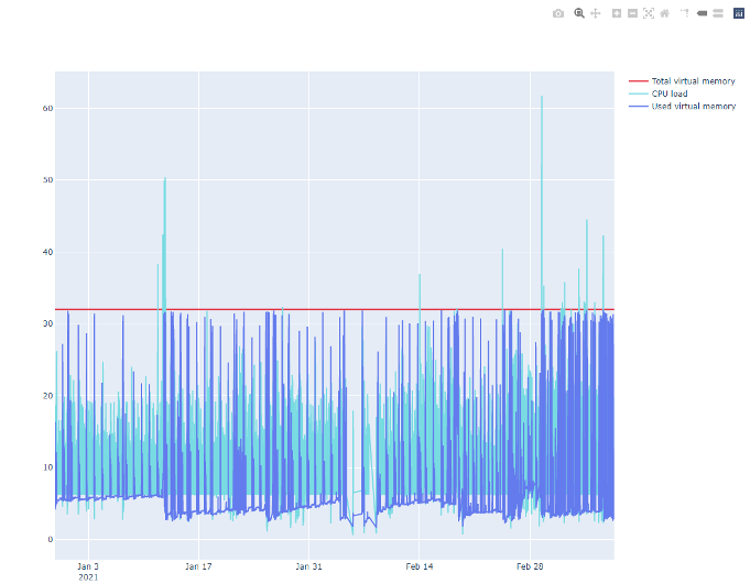
On the X-axis, let’s plot the time and along the Y-axis, start with a value that will be used as a total virtual memory value. We know that this is a constant and we want to see a straight line on the graph. To highlight our resource limits, we’ll make it red in the line_color parameter.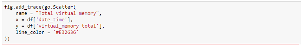
Let's draw our graph, but since it's big, let’s take it to the HTML page.
Don’t worry: the interactive functionality will be fine.

The first graph is down. Let's add two more indicators - CPU load and memory usage.
Since CPU load is expressed in percentage and uses a different measurement system than RAM, let’s make it pale blue. This way, it won’t divert our focus, yet we’ll be able to observe the correlation of index fluctuations with the running processes.

Note that the interactivity of plotly allows you to show or hide traces by clicking or double-clicking on the legend.
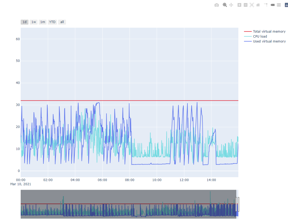
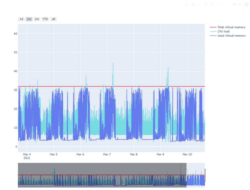
You can also use time scale zoom to see the day/hour and zoom back to see the year.
Let's add buttons to the chart for a more convenient data view. We’ll do it:
- per day
- per week
- per month
- per year
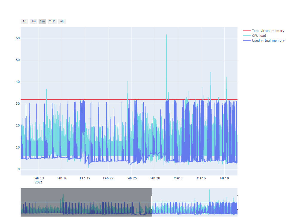
Et voila! Just like that, you have created your chart with Plotly.
Recommend
About Joyk
Aggregate valuable and interesting links.
Joyk means Joy of geeK