

Clearing Rows with CSS Grid
source link: https://dev.to/bennypowers/clearing-rows-with-css-grid-49c1
Go to the source link to view the article. You can view the picture content, updated content and better typesetting reading experience. If the link is broken, please click the button below to view the snapshot at that time.

Clearing Rows with CSS Grid
Today I completed a fun little challenge using CSS Grid.
The goal was to update a layout that relied on container elements and flexbox.
<div class="cards">
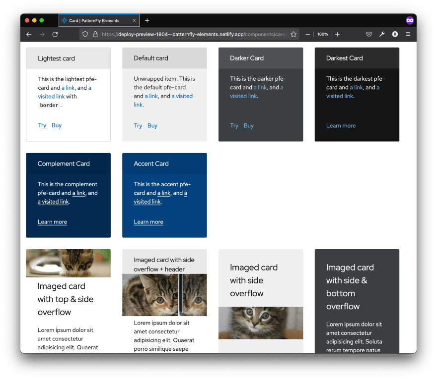
<pfe-card id="a-1">...</pfe-card>
<pfe-card id="a-2">...</pfe-card>
<pfe-card id="a-3">...</pfe-card>
<pfe-card id="a-4">...</pfe-card>
</div>
<div class="cards">
<pfe-card id="b-1">...</pfe-card>
<pfe-card id="b-2">...</pfe-card>
<pfe-card id="b-3">...</pfe-card>
<pfe-card id="b-4">...</pfe-card>
</div>
Enter fullscreen mode
Exit fullscreen mode
.cards {
  display: flex;
  flex-flow: row wrap;
}

.cards > * {
  margin-bottom: 15px;
  margin-right: 15px;
  min-width: 200px;
  width: calc(25% - 32px);
}
Enter fullscreen mode
Exit fullscreen mode
My first step was to remove the container elements and 'lift up' the flex properties into the grid container
<pfe-card id="a-1">...</pfe-card>
<pfe-card id="a-2">...</pfe-card>
<pfe-card id="a-3">...</pfe-card>
<pfe-card id="a-4">...</pfe-card>
<pfe-card id="b-1">...</pfe-card>
<pfe-card id="b-2">...</pfe-card>
<pfe-card id="b-3">...</pfe-card>
<pfe-card id="b-4">...</pfe-card>
Enter fullscreen mode
Exit fullscreen mode
:host {
  display: grid;
  grid-template-columns: repeat(
    auto-fill,
    minmax(
      200px,
      calc(25% - 32px)));
  grid-auto-rows: max-content;
  gap: 15px;
}
Enter fullscreen mode
Exit fullscreen mode
This did most of the job on its own, but there was one issue: in the original layout, card b-1 appeared in a new 'row' below the first set of cards. How could I emulate this 'row-clearing' behaviour? Using grid-column, I specified the position of the first card in the second set:
#b-1 {
  grid-column: 1/2;
}
Enter fullscreen mode
Exit fullscreen mode
Now, that one specific card 'resets' it's whole row, replicating the original behaviour, but with fewer non-semantic elements, and less CSS.
nice
Recommend
About Joyk
Aggregate valuable and interesting links.
Joyk means Joy of geeK