

CSS isn't magic. All nuances about the display property
source link: https://dev.to/melnik909/css-isnt-magic-all-nuances-about-the-display-property-3fok
Go to the source link to view the article. You can view the picture content, updated content and better typesetting reading experience. If the link is broken, please click the button below to view the snapshot at that time.

In my experience, the display property raises a lot of questions for novice developers. Yes, to be honest, I often met confusion from experienced developers too.
I created a live cheat sheet for fixing this situation. Also I talk about most of the nuances of the property in this article.
display: block
The width of block-level elements fills up all available space by the text direction.
The height of block-level elements is calculated automatically depending on the content height.
Block-level elements always start on a new line.
The width and height properties can be applied to block-level elements.
The padding and border properties can be applied too.
When we set margins we get some surprises. The margin before the first block-level element and the margin after the last block-level element end up outside the parent.

If we set the border and padding properties for the parent element margins cease collapsing.

The margins from adjacent block-level elements collapse too. The browsers choose the biggest between the two. And you can't change it.

display: inline
The width and height of inline elements are calculated automatically depending on the content.

If the content of the inline element doesn't fit on one line then a browser will move it on a new line. The width will be calculated depending on the maximum line length.

Inline elements will be on the same line if there is space. If there isn't space, a browser will move an element on a new line.

The width and height properties aren't applied to inline elements.

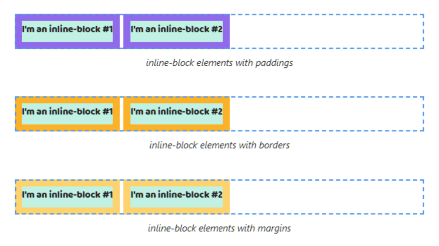
You can set paddings, borders and margins, but vertical paddings, borders and margins will end up outside the parent.

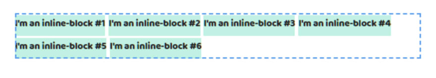
display: inline-block
The width and height of inline-block elements are calculated automatically depending on the content.

If the content of the inline-block element doesn't fit on one line then a browser will move it on a new line. The width will be equal of the parent width.

Inline-block elements will be on the same line if there is space. Also the whitespace in the HTML code will create some gap between elements.

If there isn't space, a browser will move an element on a new line.
The width and height properties are applied to inline-block elements.

You can set paddings, borders and margins without ending up outside the parent.
display: flex
The width of the flex container fills up all available space by the text direction.

The height of a flex container is calculated automatically depending on the content height.

Flex containers always starts on a new line.

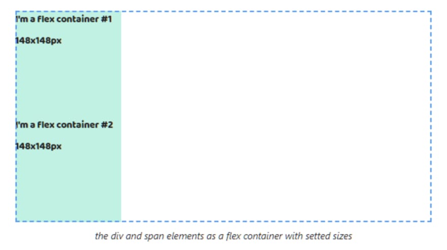
The width and height properties can be applied to a flex container.
The padding and border properties can be applied too.

When we set margins we get some surprises. The margin before the first child element and the margin after the last child element end up outside the parent.

If we set the border and padding properties for the parent element margins cease collapsing.

The margins from adjacent flex containers collapse. The browsers choose the biggest between the two. And you can't change it.

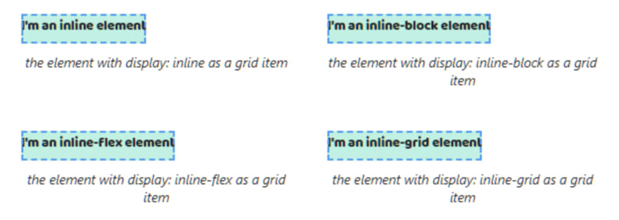
Flex items always are blockified. All flex items that are set the display property with the inline, inline-block, inline-flex, inline-grid, or inline-table values will be changed. The inline and inline-block will changed to block, inline-flex -> flex, inline-grid -> grid and inline-table -> table.

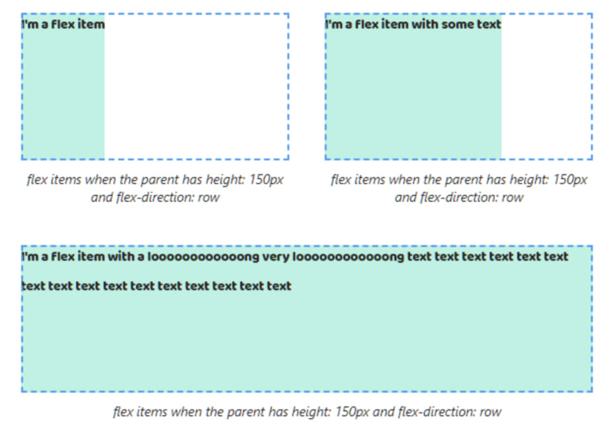
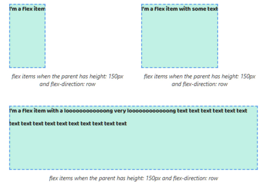
The width of flex items depending on the flex-direction property. If flex-direction: row (default value) the width is calculated automatically depending on the content and the height of flex items is equal to the flex container height.
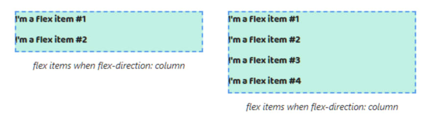
When flex-direction: column the width of flex items fills up all available space by the text direction and the height is calculated automatically depending on the content.

Flex items position depending on the flex-direction property. When flex-direction: row (default value) flex items will be on the same line. If there isn't space, a browser will squeeze an element depending on its content.

When flex-direction: column flex items will be alignment in a column.
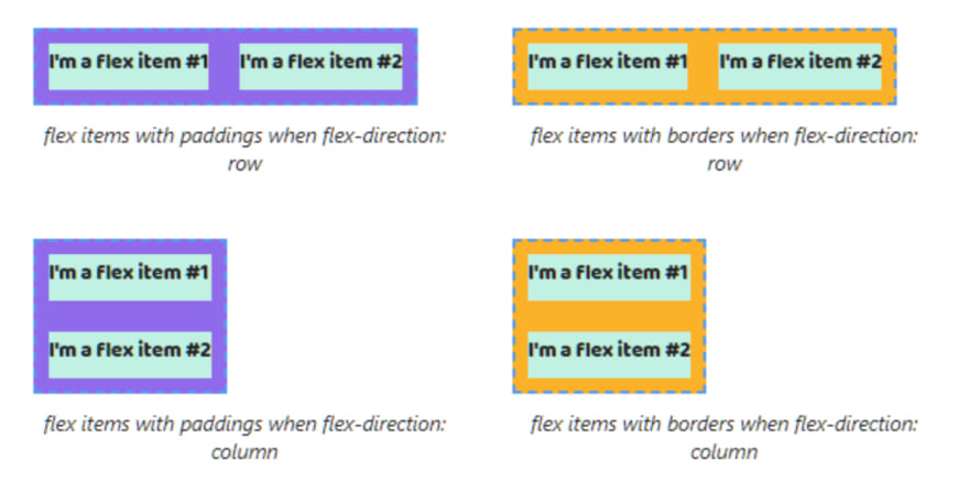
The width and height properties can be applied to flex items.

The padding and border properties can be applied too.

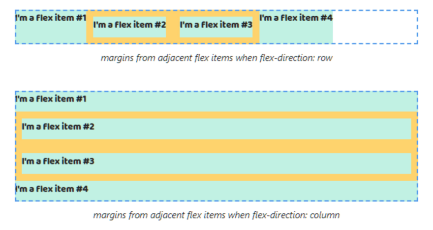
Pay attention margins don't end up outside the parent.

The margins from adjacent flex items don't collapse too.
display: inline-flex
The width and height of inline flex container is calculated automatically depending on the content.

If the content of the inline flex container doesn't fit on one line then a browser will move it on a new line. The width will be equal of the parent width.

Inline flex containers will be on the same line if there is space. Also the whitespace in the HTML code will create some gap between elements.

The width and height properties can be applied to an inline flex container.

You can set paddings, borders and margins without ending up outside the parent.

Flex items always are blockified. All flex items that are set the display property with the inline, inline-block, inline-flex, inline-grid, or inline-table values will be changed. The inline and inline-block will changed to block, inline-flex -> flex, inline-grid -> grid and inline-table -> table.

The width of flex items depending on the flex-direction property. If flex-direction: row (default value) the width is calculated automatically depending on the content and the height of flex items is equal to the flex container height.
When flex-direction: column the width of flex items fills up all available space by the text direction and the height is calculated automatically depending on the content.

Flex items position depending on the flex-direction property. When flex-direction: row (default value) flex items will be on the same line. If there isn't space, a browser will squeeze an element depending on its content.

When flex-direction: column flex items will be alignment in a column.

The width and height properties can be applied to flex items.

The padding and border properties can be applied too.
Pay attention margins don't end up outside the parent.

The margins from adjacent flex items don't collapse too.

display: grid
The width of the grid container fills up all available space by the text direction.
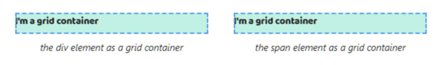
The height of a grid container is calculated automatically depending on the content height.

A grid container always starts on a new line.

The width and height properties can be applied to a grid container.

The padding and border properties can be applied too.
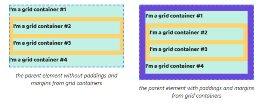
When we set margins we get some surprises. The margin before the first child element and the margin after the last child element end up outside the parent.

If we set the border and padding properties for the parent element margins cease collapsing.

The margins from adjacent grid containers collapse. The browsers choose the biggest between the two. And you can't change it.
Grid items always are blockified. All grid items that are set the display property with the inline, inline-block, inline-flex, inline-grid, or inline-table values will be changed. The inline and inline-block will changed to block, inline-flex -> flex, inline-grid -> grid and inline-table -> table.

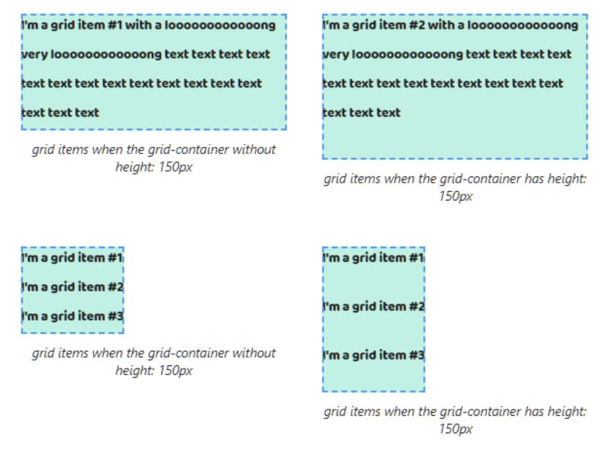
The width of grid items fills up all available space by the text direction.

The height of grid items depending on the height of content and the number of items in the grid container.
If the grid container has fixed height grid items' height shares evenly between them taking into account the content height.

If the total height of grid items is more than the grid container the last grid item ends up outside the grid container.

Grid items start on a new line.

The width and height properties can be applied to grid items.

The padding and border properties can be applied too.

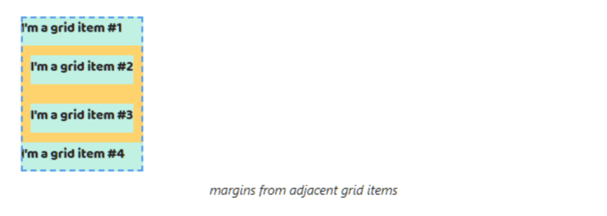
Pay attention margins don't end up outside the parent

The margins from adjacent grid items don't collapse too.

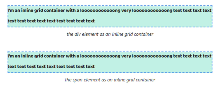
display: inline-grid
The width and height of inline grid container is calculated automatically depending on the content.
If the content of the inline grid container doesn't fit on one line then a browser will move it on a new line. The width will be equal of the parent width.
Inline grid containers will be on the same line if there is space. Also the whitespace in the HTML code will create some gap between elements.

The width and height properties can be applied to an inline grid container.

You can set paddings, borders and margins without ending up outside the parent.

Grid items always are blockified. All grid items that are set the display property with the inline, inline-block, inline-flex, inline-grid, or inline-table values will be changed. The inline and inline-block will changed to block, inline-flex -> flex, inline-grid -> grid and inline-table -> table.
The width of grid items fills up all available space by the text direction.

The height of grid items depending on the height of content and the number of items in the inline grid container.
If the inline grid container has fixed height grid items' height shares evenly between them taking into account the content height.

If the total height of grid items is more than the inline grid container the last grid item ends up outside the inline grid container.

Grid items start on a new line.

The width and height properties can be applied to grid items.
The padding and border properties can be applied too.

Pay attention margins don't end up outside the parent

The margins from adjacent grid items don't collapse too.
P.S.
Folks, please, help me to extend my live cheat sheet on the web. Share it on Twitter or other social media. Thank you ❤❤❤
👉 Live cheat sheet about the display property
💪 Get more free tips directly to your inbox
👀 Also I tell stories from my career on Substack. Join my free newsletter, if you're interested in my background
Recommend
About Joyk
Aggregate valuable and interesting links.
Joyk means Joy of geeK