

How to Get Started With Matplotlib - DZone Big Data
source link: https://dzone.com/articles/getting-started-with-matplotlib
Go to the source link to view the article. You can view the picture content, updated content and better typesetting reading experience. If the link is broken, please click the button below to view the snapshot at that time.

Visualization as a tool takes part of the analysis coming from the data scientist in order to extract conclusions from a dataset. In today’s article, we are going to go through the Matplotlib library. Matplotlib is a third-party library for data visualization. It works well in combination with NumPy, SciPy, and Pandas.
Basic Plot, Function Visualization, and Data Visualization
The 2009 data set "Wine Quality Dataset," elaborated by Cortez et al. available at UCI Machine Learning, is a well-known dataset that contains wine quality information. It includes data about red and white wine physicochemical properties and a quality score. Before we start, we are going to visualize the head a little example dataset:
Basic Plot
Matplotlib is a library that has an infinite power to represent data in almost any possible way. To understand how it works, we are going to start with the most basic instructions, and little by little we are going to increase the difficulty.
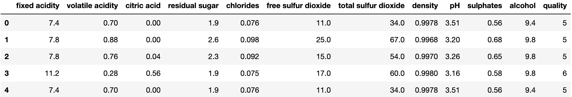
The most useful way to check the data distribution is to represent it, so we are going to start by painting a series of points. For this, we can both use plt.plot and plt.scatter to visualize them.
List of Points Plot Distribution
Import matplotlib as plt
plt.plot([1, 2, 3, 4], [1, 4, 9, 16], 'ro')
plt.axis([0, 6, 0, 21])
Representing a List of Points Using 'Plot' Function:
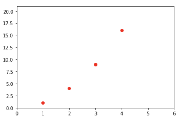
Fig 1. Plotting List of points using plt.plot and plt.scatter plot.
The difference between the two comes with the control over the color, shape, and size of points. In plt.scatter, you have more control over each point's appearance.
Import matplotlib as plt
plt.scatter([1, 2, 3, 4], [1, 4, 9, 16])
plt.axis([0, 6, 0, 21])
Representing a List of Points Using the 'Scatter' Function:
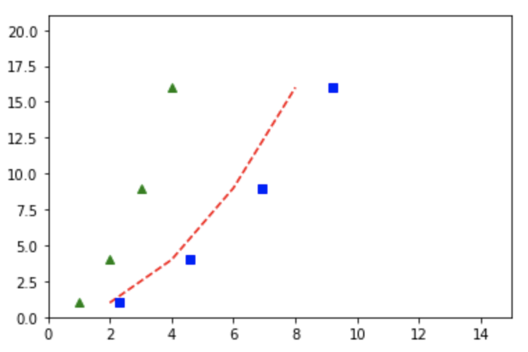
Fig 2. Plot of three different lists of points.
points = [[1,2,3,4], [1,4,9,16]]
plt.plot(points[0], points[1], 'g^')
plt.plot([x * 2 for x in points[0]], points[1], 'r--')
plt.plot([x * 2.3 for x in points[0]], points[1], 'bs')
plt.axis([0, 15, 0, 21])
The Scatter plot function allows you to customize the shape of the different points.
Function Visualization
Sometimes we want to paint a series of points based on a certain function's behavior. To illustrate this example we are going to use the sine(2πx) function. As you will see, we are going to previously define the function so we could use any function that we create, it does not have to be predetermined.
Representing a Function:
Fig 3. Representation of a function with points and lines using scatter plot and plot functions from matplotlib library
Import matplotlib as plt
Import numpy as np

def sin(t):
    return np.sin(2*np.pi*t)

t1 = np.arange(0.0, 5.0, 0.1)

plt.scatter(t1, sin(t1))
Now we will make the same representation but using a line that runs through all these points.
Import matplotlib as plt
Import numpy as np
def sin(t):
    return np.sin(2*np.pi*t)

t1 = np.arange(0.0, 5.0, 0.1)

plt.plot(t1, sin(t1), 'b')
Data Visualization
We are going to start with some basic but very useful visualizations when we begin to study our data. For this, we are going to use the Quality wine dataset discussed above and we are going to learn how to represent a histogram of data and a comparison between two columns.
Representation of a Histogram of a Column in Our Dataset:
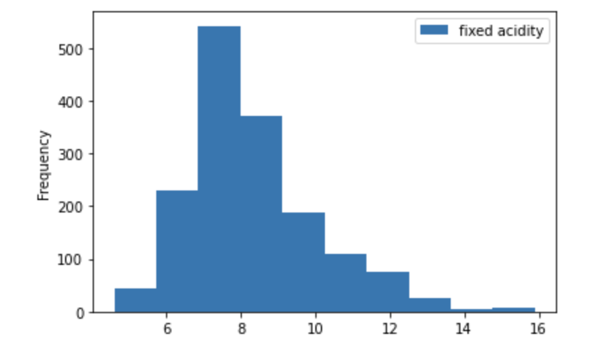
df_wine['fixed acidity'].hist(legend=True)Comparison of Two Columns of the Dataset:
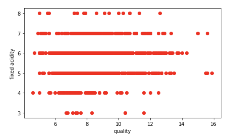
plt.figure(figsize=(7, 4))
plt.plot(df_wine['fixed acidity'], df_wine['quality'], 'ro')
plt.xlabel('quality')
plt.ylabel('fixed acidity')
Representation of a Histogram of a Column in Our Dataset:
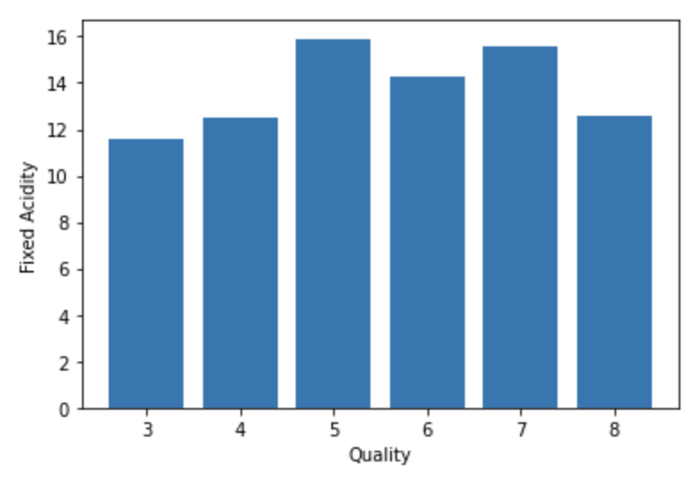
plt.bar(df_wine['quality'], df_wine['fixed acidity'])
plt.xlabel('Quality')
plt.ylabel('Fixed Acidity')
Now we are going to raise the difficulty a bit and we are going to enter what Matplotlib calls Figures.
Matplotlib graphs your data on Figures (i.e., windows, Jupyter widgets, etc.), each of which can contain one or more Axes (i.e., an area where points can be specified in terms of x-y coordinates, or theta-r in a polar plot, or x-y-z in a 3D plot, etc.).
The simplest way of creating a figure with an axis is using pyplot.subplots. We can then use Axes.plot to draw some data on the axes.
We are going to start by creating an empty figure and we are going to add a title to it.
Empty Figure With Title ‘This Is an Empty Figure’:
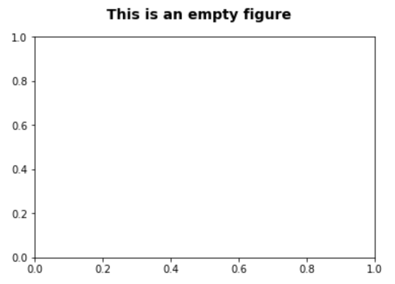
fig = plt.figure()
fig.suptitle('This is an empty figure', fontsize=14, fontweight='bold')
ax = fig.add_subplot(111)
plt.show()
As you can see `fig.add_subplot(111)` are subplot grid parameters encoded as a single integer.
For example, “111” means “1×1 grid, first subplot” and “234” means “2×3 grid, 4th subplot”.
Alternative form for add_subplot(111) is add_subplot(1, 1, 1)
Next, we will write the name of what each axis represents and add a small text box.
Plot Text Inside a Box:
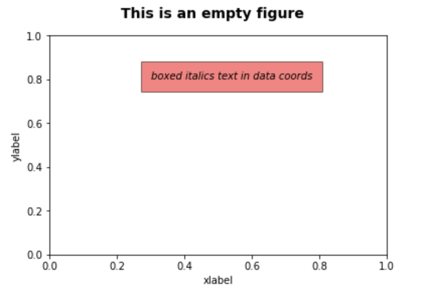
fig = plt.figure()
fig.suptitle('This is an empty figure', fontsize=14, fontweight='bold')
ax = fig.add_subplot(111)

ax.set_xlabel('xlabel')
ax.set_ylabel('ylabel')

ax.text(0.3, 0.8, 'boxed italics text in data coords', style='italic',
        bbox={'facecolor':'red', 'alpha':0.5, 'pad':10})
plt.show()
Now we are going to try writing an annotation followed by an arrow.
Plot an Annotate:
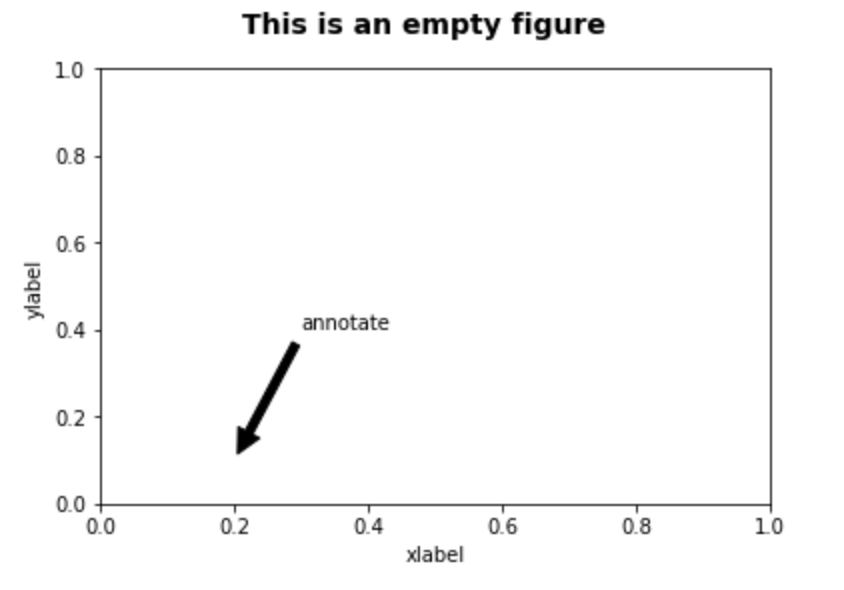
fig = plt.figure()
fig.suptitle('This is an empty figure', fontsize=14, fontweight='bold')
ax = fig.add_subplot(111)

ax.set_xlabel('xlabel')
ax.set_ylabel('ylabel')

ax.annotate('annotate', xy=(0.2, 0.1), xytext=(0.3, 0.4),
            arrowprops=dict(facecolor='black', shrink=0.05))
plt.show()
Finally, something very useful that we usually need is to set the range of the axes for our representation. For this, we are going to use the axis attribute and pass it the values that we want to configure.
Change Axis Ranges to x -> [0, 10] y -> [0, 10]:
fig = plt.figure()
fig.suptitle('This is an empty figure', fontsize=14, fontweight='bold')
ax = fig.add_subplot(111)

ax.set_xlabel('xlabel')
ax.set_ylabel('ylabel')

ax.axis([0, 10, 0, 10])Recommend
About Joyk
Aggregate valuable and interesting links.
Joyk means Joy of geeK