

Large screens & foldables | Android Developers
source link: https://developer.android.com/large-screens
Go to the source link to view the article. You can view the picture content, updated content and better typesetting reading experience. If the link is broken, please click the button below to view the snapshot at that time.

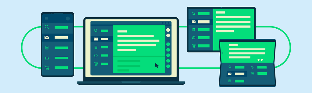
Responsive layouts for large screen development
People use your apps on all kinds of devices. Unlock the full potential of your apps by using responsive layouts that adapt to fit phones, tablets, foldables, and Chrome OS devices.
Reach the fastest growing segment of Android users
More than 250 million large screen Android devices are currently in use, including tablets, foldables, and Chrome OS.
Build for current and future Android devices
Deploy your application across a wide variety of Android devices — all from the same codebase using responsive layouts.
Increase user engagement
Large screens are ideal for content consumption. Many apps have higher user engagement and time in app metrics on foldable devices and tablets.
Get started building responsive layouts
Learn how to target large screen devices effortlessly with layouts that dynamically grow to fill available space and take advantage of new device features.
Getting started
Supporting different screen sizes
Learn about APIs that can help you manage resizing and responding to configuration changes.
Getting started
Supporting multi-window
Learn to configure how your app handles multi-window display.
Getting started
Building apps for foldables
Read our best practices on making sure your app adapts well to folded and unfolded states.
Getting started
Jetpack WindowManager library
The WindowManager library makes it easy to implement new hardware features, like hinges and folds.
Material Design resources for large screens
5 Exercises to prepare your app for large screens
What to prioritize when building a responsive experience.
Understanding layout
Material Design layouts use uniform elements and spacing to encourage consistency across platforms, environments, and screen sizes.
Many apps already use responsive layouts
Optimizing your app for large screens improves the experience for your users and delivers positive business results. We’ve seen an increase in the number of apps across all categories taking advantage of the opportunities with large screens. View the experiences developers built, learn about what they implemented, and why this is important to their businesses.
Latest news
Medium
Trackr comes to the Big Screen
Trackr is a sample task management app. While mainly used to explore common UI patterns from the perspective of supporting accessibility, Trackr is also one of the samples where we showcase modern Android development best practices. We recently
September 7, 2021
Medium
Unbundling the WindowManager
Optimize application for foldables and large screen devices Screen sizes in Android are rapidly changing, and with the rising popularity of tablets and foldable devices, understanding the window size and state of your app is critical to developing a
August 19, 2021

Medium
Large-screen UI in the Google I/O App
On May 18–20, Google hosted our yearly I/O developer conference completely online, with 112 sessions, 151 codelabs, 79 meetups, 29 workshops, and a ton of exciting announcements. While this year’s event did not include a new release of the Google I/O
August 6, 2021
Recommend
About Joyk
Aggregate valuable and interesting links.
Joyk means Joy of geeK