

Compose for Desktop: Get Your Weather!
source link: https://www.raywenderlich.com/26791460-compose-for-desktop-get-your-weather
Go to the source link to view the article. You can view the picture content, updated content and better typesetting reading experience. If the link is broken, please click the button below to view the snapshot at that time.

Compose for Desktop: Get Your Weather!
Build a desktop weather app with Compose for Desktop! You’ll get user input, fetch network data and display it all with the Compose UI toolkit.
Version
Compose for Desktop is a UI framework that simplifies developing user interfaces for desktop apps. Google introduced it in 2021. This modern toolkit uses Kotlin for creating fast reactive UIs with no XMLs or templating language. Also, by using it, you’re able to share UI code between desktop and Android apps.
JetBrain’s developers created Compose for Desktop based on Jetpack Compose for Android, but there are some things that differ. For example, you won’t work with the Android lifecycle, Android ViewModels or even Android Studio.
For the project, you’ll use Kotlin and IntelliJ IDEA to create an app that lets you query weather data for a specific city in the world.
In this tutorial, you’ll learn how to:
- Model your desktop app
- Use the Loading, Content, Error (LCE) model
- Publish your app
Getting Started
Download the starter project by clicking Download Materials at the top or bottom of the tutorial.
Import the starter project into IntelliJ IDEA and run MainKt.

Then, you’ll see a simple Compose introduction screen with one test Button.

In this specific project, you already have a data source — a repository that fetches free meteorological data for a specific city from WeatherAPI.com.
First, you need to register an account for WeatherAPI and generate a key. Once you have the key, add it inside Main.kt as the value of API_KEY:
private const val API_KEY = "your_api_key_goes_here"
Next, open Repository.kt, and you’ll see the class is using Ktor to make a network request to the endpoint, transform the data and return the results — all in a convenient suspending function. The results are saved in a class, which you’ll need to populate the UI.
It’s time to finally dive into UI modeling.
Getting User Input
As the first step, you need to get input from the user. You’ll need a TextField to receive the input, and a Button to submit it and perform the network call.
Create a new file in the SunnyDesk.main package and set its name to WeatherScreen.kt. In that file, add the following code:
@Composable
fun WeatherScreen(repository: Repository) {

}
Here, you’re creating a Composable function and passing in repository. You’ll be querying WeatherAPI for the results, so it makes sense to have your data source handy.
Import the runtime package, which holds Composable, by adding this line above the class declaration:
import androidx.compose.runtime.*
The next step is setting up the text input. Add the following line inside WeatherScreen():
var queriedCity by remember { mutableStateOf("") }
With this code, you create a variable that holds the TextField‘s state. For this line to work, you need to have the import for the runtime package mentioned above.
Now, you can declare TextField itself with the state you just created:
TextField(
    value = queriedCity,
    onValueChange = { queriedCity = it },
    modifier = Modifier.padding(end = 16.dp),
    placeholder = { Text("Any city, really...") },
    label = { Text(text = "Search for a city") },
    leadingIcon = { Icon(Icons.Filled.LocationOn, "Location") },
)
In the code above, you create an input field that holds its value in queriedCity. Also, you display a floating label, a placeholder and even an icon on the side!
Then, add all necessary imports at the top of the file:
import androidx.compose.foundation.layout.*
import androidx.compose.material.*
import androidx.compose.material.icons.Icons
import androidx.compose.material.icons.filled.LocationOn
import androidx.compose.ui.*
import androidx.compose.ui.unit.dp
Now, you want to create a Button that sits next to TextField. To do that, you need to wrap the input field in a Row, which lets you have more Composables on the same horizontal line. Add this code to the class, and move the TextField declaration as follows:
Row(
  modifier = Modifier
    .fillMaxWidth()
    .padding(horizontal = 16.dp, vertical = 16.dp),
  verticalAlignment = Alignment.CenterVertically,
  horizontalArrangement = Arrangement.Center
) {
  TextField(...)
  // Button will go here
}
Right now, you have a Row that will take up the whole screen, and it’ll center its children both vertically and horizontally.
However, you still need the input text to expand and take all the space available. Add a weight value to the already declared modifier in TextField. The modifier value will look like this:
modifier = Modifier.padding(end = 16.dp).weight(1f)
This way, the input field will take all the available space on the line. How cool is that?!
Now, you need to create a Button with a meaningful search icon inside the Row, right below the TextField:
Button(onClick = { /* We'll deal with this later */}) {
    Icon(Icons.Outlined.Search, "Search")
}
As before, add the next import at the top of the file:
import androidx.compose.material.icons.outlined.Search
Finally, you added Button! You now need to show this screen inside main(). Open Main.kt and replace main() with the following code:
fun main() = Window(
  title = "Sunny Desk",
  size = IntSize(800, 700),
) {
  val repository = Repository(API_KEY)

  MaterialTheme {
    WeatherScreen(repository)
  }
}
You just gave a new title to your window and set a new size for it that will accommodate the UI you’ll build later.
Build and run to preview the change.
Next, you’ll learn a bit of theory about the LCE model.
Loading, Content, Error
Loading, Content, Error, also known as LCE, is a paradigm that will help you achieve a unidirectional flow of data in a simple way. Every word in its name represents a state your UI can be in. You start with Loading, which is always the first state that your logic emits. Then, you run your operation and you either move to a Content state or an Error state, based on the result of the operation.
Feel like refreshing the data? Restart the cycle by going back to Loading and then either Content or Error again. The image below illustrates this flow.

To implement this in Kotlin, represent the available states with a sealed class. Create a new Lce.kt file in the SunnyDesk.main package and add the following code to it:
sealed class Lce<out T> {
  object Loading : Lce<Nothing>() // 1
  data class Content<T>(val data: T) : Lce<T>() // 2
  data class Error(val error: Throwable) : Lce<Nothing>() // 3
}
Here’s a breakdown of this code:
1. Loading: Marks the start of the loading cycle. This case is handled with an object, as it doesn’t need to hold any additional information.
2. Content: Contains a piece of data with a generic type T that you can display on the UI.
3. Error: Contains the exception that happened so that you can decide how to recover from it.
With this new paradigm, it’ll be super easy to implement a delightful UI for your users!
Transforming the Network Data
Before you can dive into the UI, you need to get some data. You’re already familiar with the Repository that fetches weather updates from the backend, but these models aren’t suitable for your UI just yet. You need to transform them into something that more closely matches what your UI will represent.
As a first step, as you already did before, create a WeatherUIModels.kt file and add the following code in it:
data class WeatherCard(
  val condition: String,
  val iconUrl: String,
  val temperature: Double,
  val feelsLike: Double,
  val chanceOfRain: Double? = null,
)

data class WeatherResults(
  val currentWeather: WeatherCard,
  val forecast: List<WeatherCard>,
)
WeatherCard represents a single forecast: You have the expected weather condition with its icon for a visual representation, the temperature and what the weather actually feels like to people, and finally, the chance of rain.
WeatherResults contains all the various weather reports for your UI: You’ll have a large card with the current weather, and a carousel of smaller cards that represent the forecast for the upcoming days.
Next, you’ll transform the models you get from the network into these new models that are easier to display on your UI. Create a new Kotlin class and name it WeatherTransformer.
Then, write code to extract the current weather condition from the response. Add this function inside WeatherTransformer:
private fun extractCurrentWeatherFrom(response: WeatherResponse): WeatherCard {
  return WeatherCard(
    condition = response.current.condition.text,
    iconUrl = "https:" + response.current.condition.icon.replace("64x64", "128x128"),
    temperature = response.current.tempC,
    feelsLike = response.current.feelslikeC,
  )
}
With these lines, you’re mapping the fields in different objects of the response to a simple object that will have the data exactly how your UI expects it. Instead of reading nested values, you’ll have simple properties!
Unfortunately, the icon URL returned by the weather API isn’t an actual URL. One of these values looks something like this:
//cdn.weatherapi.com/weather/64x64/day/116.png
To fix this, you prepend the HTTPS protocol and increase the size of the icon, from 64×64 to 128×128. After all, you’ll display the current weather on a larger card!
Now, you need to extract the forecast data from the response, which will take a bit more work. Below extractCurrentWeatherFrom(), add the following functions:
// 1
private fun extractForecastWeatherFrom(response: WeatherResponse): List<WeatherCard> {
  return response.forecast.forecastday.map { forecastDay ->
    WeatherCard(
      condition = forecastDay.day.condition.text,
      iconUrl = "https:" + forecastDay.day.condition.icon,
      temperature = forecastDay.day.avgtempC,
      feelsLike = avgFeelsLike(forecastDay),
      chanceOfRain = avgChanceOfRain(forecastDay),
    )
  }
}

// 2
private fun avgFeelsLike(forecastDay: Forecastday): Double =
  forecastDay.hour.map(Hour::feelslikeC).average()
private fun avgChanceOfRain(forecastDay: Forecastday): Double =
  forecastDay.hour.map(Hour::chanceOfRain).average()
Here’s a step-by-step breakdown of this code:
- The first thing you need to do is loop through each of the nested forecast objects, so that you can map them each to a
WeatherCard, similar to what you did for the current weather model. This time, the response represents both the feeling of the weather and the chance of rain as arrays, containing the hourly forecasts for these values. - For each hour, take the data you need (either the felt temperature or the chance of rain) and calculate the average across the whole day. This gives you an approximation you can show on the UI.
With these functions prepared, you can now create a function that returns the proper model expected by your UI. At the end of WeatherTransformer, add this function:
fun transform(response: WeatherResponse): WeatherResults {
  val current = extractCurrentWeatherFrom(response)
  val forecast = extractForecastWeatherFrom(response)

  return WeatherResults(
    currentWeather = current,
    forecast = forecast,
  )
}
Your data transformation code is ready! Time to put it into action.
Updating the Repository
Open Repository.kt and change the visibility of getWeatherForCity() to private:
private suspend fun getWeatherForCity(city: String) : WeatherResponse = ...
Instead of calling this method directly, you’re going to wrap it in a new one so that it returns your new models.
Inside Repository, create a property that contains a WeatherTransformer:
private val transformer = WeatherTransformer()
Now, add this new function below the property:
suspend fun weatherForCity(city: String): Lce<WeatherResults> {
  return try {
    val result = getWeatherForCity(city)
    val content = transformer.transform(result)
    Lce.Content(content)
  } catch (e: Exception) {
    e.printStackTrace()
    Lce.Error(e)
  }
}
In this method, you get the weather, and you use the transformer to convert it into a WeatherResult and wrap it inside Lce.Content. In case something goes terribly wrong during the network call, you wrap the exception into Lce.Error.
If you want an overview of how you could test a repository like this one, written with Ktor, look at RepositoryTest.kt in the final project. It uses Ktor’s MockEngine to drive an offline test.
Showing the Loading State
Now you know everything about the LCE pattern, and you’re ready to apply these concepts in a real-world application, aren’t you? Good!
Open WeatherScreen.kt, and below WeatherScreen(), add this function:
@Composable
fun LoadingUI() {
  Box(modifier = Modifier.fillMaxSize()) {
    CircularProgressIndicator(
      modifier = Modifier
        .align(alignment = Alignment.Center)
        .defaultMinSize(minWidth = 96.dp, minHeight = 96.dp)
    )
  }
}
What happens here is the representation of the loading UI — nothing more, nothing less.
Now, you want to display this loading UI below the input components. In WeatherScreen(), wrap the existing Row into a vertical Column and call LoadingUI() below it in the following way:
Column(horizontalAlignment = Alignment.CenterHorizontally) {
  Row(...) { ... } // Your existing input code
  LoadingUI()
}
Build and run, and you’ll see a spinner.

You’ve got the loading UI up and running, but you also need to show the results, which you’ll do next.
Displaying the Results
The first thing you need to do is declare a UI for the content as a function inside WeatherScreen:
@Composable
fun ContentUI(data: WeatherResults) {
}
You’ll handle the real UI later, but for the moment, you need a placeholder. :]
Next, at the top of WeatherScreen(), you need to declare a couple of values below the existing queriedCity:
// 1
var weatherState by remember { mutableStateOf<Lce<WeatherResults>?>(null) }
// 2
val scope = rememberCoroutineScope()
In the code above:
-
weatherStatewill hold the current state to display. Every time the LCE changes, Compose will recompose your UI so that you can react to this change. - You need the
scopeto launch a coroutine from aComposable.
Now, you need to implement the button’s onClick() (the one marked with the /* We'll deal with this later */ comment), like so:
onClick = {
    weatherState = Lce.Loading
    scope.launch {
      weatherState = repository.weatherForCity(queriedCity)
    }
  }
Every time you click, weatherState changes to Loading, causing a recomposition. At the same time, you’ll launch a request to get the updated weather. When the result arrives, this will change weatherState again, causing another recomposition.
Then, add the necessary import:
import kotlinx.coroutines.launch
At this point, you need to handle the recomposition, and you need to draw something different for each state. Go to where you invoked LoadingUI at the end of WeatherScreen(), and replace that invocation with the following code:
when (val state = weatherState) {
 is Lce.Loading -> LoadingUI()
 is Lce.Error -> Unit
 is Lce.Content -> ContentUI(state.data)
}
With this code, every time a recomposition occurs, you’ll be able to draw a different UI based on the state.
Your next step is downloading the image for the weather conditions. Unfortunately, there isn’t an API in Compose for Desktop for doing that just yet. However, you can implement your own solution! Create a new file and name it ImageDownloader.kt. Inside, add this code:
import androidx.compose.ui.graphics.ImageBitmap
import androidx.compose.ui.graphics.asImageBitmap
import io.ktor.client.*
import io.ktor.client.engine.cio.*
import io.ktor.client.request.*
import org.jetbrains.skija.Image

object ImageDownloader {
  private val imageClient = HttpClient(CIO) // 1

  suspend fun downloadImage(url: String): ImageBitmap { // 2
    val image = imageClient.get<ByteArray>(url)
    return Image.makeFromEncoded(image).asImageBitmap()
  }
}
Here’s an overview of what this class does:
- The first thing you might notice is that you’re creating a new
HttpClient: This is because you don’t need all the JSON-related configuration from the repository, and you really only need one client for all the images. -
downloadImage()downloads a resource from a URL and saves it as anarrayofbytes. Then, it uses a couple of helper functions to convert thearrayinto abitmap, which is ready to use in your Compose UI.
Now, go back to WeatherScreen.kt, find ContentUI() and add this code to it:
var imageState by remember { mutableStateOf<ImageBitmap?>(null) }

LaunchedEffect(data.currentWeather.iconUrl) {
  imageState = ImageDownloader.downloadImage(data.currentWeather.iconUrl)
}
These lines will save the image you downloaded into a state so that it survives recompositions. LaunchedEffect() will run the download of the image only when the first recomposition occurs. If you didn’t use this, every time something else changes, your image download would run again, downloading unneeded data and causing glitches in the UI.
Then, add the necessary import:
import androidx.compose.ui.graphics.ImageBitmap
At the end of ContentUI(), add a title for the current weather:
Text(
  text = "Current weather",
  modifier = Modifier.padding(all = 16.dp),
  style = MaterialTheme.typography.h6,
)
Next, you’ll create a Card that will host the data about the current weather. Add this below the previously added Text:
Card(
  modifier = Modifier
    .fillMaxWidth()
    .padding(horizontal = 72.dp)
) {
  Column(
    modifier = Modifier.fillMaxWidth().padding(16.dp),
    horizontalAlignment = Alignment.CenterHorizontally,
  ) {
    Text(
      text = data.currentWeather.condition,
      style = MaterialTheme.typography.h6,
    )

    imageState?.let { bitmap ->
      Image(
        bitmap = bitmap,
        contentDescription = null,
        modifier = Modifier
          .defaultMinSize(minWidth = 128.dp, minHeight = 128.dp)
          .padding(top = 8.dp)
      )
    }

    Text(
      text = "Temperature in °C: ${data.currentWeather.temperature}",
      modifier = Modifier.padding(all = 8.dp),
    )
    Text(
      text = "Feels like: ${data.currentWeather.feelsLike}",
      style = MaterialTheme.typography.caption,
    )
  }
}
Here, you use a couple of Text components to show the different values, and an Image to show the icon, if that’s already available.
To use the code above, you need to import androidx.compose.foundation.Image.
Next, add this code below Card:
Divider(
  color = MaterialTheme.colors.primary,
  modifier = Modifier.padding(all = 16.dp),
)
This adds a simple divider between the current weather and the forecast you’ll implement in the next step.
The last piece of content you want to display is the forecast weather. Here, you’ll use yet another title and a LazyRow to display the carousel of items, as you don’t know how many of them will come back from the network request, and you want it to be scrollable.
Add this code below the Divider:
Text(
  text = "Forecast",
  modifier = Modifier.padding(all = 16.dp),
  style = MaterialTheme.typography.h6,
)
LazyRow {
  items(data.forecast) { weatherCard ->
    ForecastUI(weatherCard)
  }
}
Add the missing imports as well:
import androidx.compose.foundation.lazy.LazyRow
import androidx.compose.foundation.lazy.items
At this point, you’ll notice the IDE complaining, but that’s expected, as you didn’t create ForecastUI() yet. Go ahead add this below ContentUI():
@Composable
fun ForecastUI(weatherCard: WeatherCard) {
}
Here, you declare the missing function. Inside, you can use the same image loading pattern you used for the current weather’s icon:
var imageState by remember { mutableStateOf<ImageBitmap?>(null) }

LaunchedEffect(weatherCard.iconUrl) {
  imageState = ImageDownloader.downloadImage(weatherCard.iconUrl)
}
Once again, you’re downloading an image, and it’s now time to show the UI for the rest of the data inside your models. At the bottom of ForecaseUI(), add the following:
Card(modifier = Modifier.padding(all = 4.dp)) {
  Column(
    modifier = Modifier.padding(8.dp),
    horizontalAlignment = Alignment.CenterHorizontally,
  ) {
    Text(
      text = weatherCard.condition,
      style = MaterialTheme.typography.h6
    )

    imageState?.let { bitmap ->
      Image(
        bitmap = bitmap,
        contentDescription = null,
        modifier = Modifier
          .defaultMinSize(minWidth = 64.dp, minHeight = 64.dp)
          .padding(top = 8.dp)
      )
    }

    val chanceOfRainText = String.format(
      "Chance of rain: %.2f%%", weatherCard.chanceOfRain
    )

    Text(
      text = chanceOfRainText,
      style = MaterialTheme.typography.caption,
    )
  }
}
This is again similar to displaying the current weather, but this time, you’ll also display the chance of rain.
Build and run. If you search for a valid city name, you’ll receive a result like in the following image.

So far, so good!
Showing the Error State
The last component you need to implement is the UI for when everything goes south. You’ll display an error message in this case. The app performs the search when a user presses the search button, so you don’t really need a retry option.
Add this import at the top of WeatherScreen.kt:
<code>androidx.compose.ui.text.style.TextAlign</code>
Now, add function at the end of WeatherScreen.kt:
@Composable
fun ErrorUI() {
  Box(modifier = Modifier.fillMaxSize()) {
    Text(
      text = "Something went wrong, try again in a few minutes. ¯\\_(ツ)_/¯",
      modifier = Modifier
        .fillMaxSize()
        .padding(horizontal = 72.dp, vertical = 72.dp),
      textAlign = TextAlign.Center,
      style = MaterialTheme.typography.h6,
      color = MaterialTheme.colors.error,
    )
  }
}
This code is adding a Text that displays an error message when an error occurs.
Now, you need to link this function to the choice in WeatherScreen. Scroll up to WeatherScreen() and find the when statement that handles the different states. Update Error to show your newly added UI:
is Lce.Error -> ErrorUI()
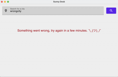
You’re done! Build and run. Then, search for a non-existent city. You’ll see your error message popping up.
Lastly, you’ll learn how to publish your app.
Publishing Your App
Creating an app that leverages Compose for Desktop means you also get out-of-the-box Gradle tasks to create packages of the app, based on the operating system. You can run packageDmg to create a macOS installer, or run packageMsi to create an installer that runs on Windows. You can even create a .deb package with packageDeb.
This process, though, has a little caveat attached. Since the packaging process uses jpackage, you need to be running a minimum JDK version of 15. Otherwise, the tasks will fail.
Where to Go From Here?
Download the completed project files by tapping Download Materials at the top or bottom of the tutorial.
Now you know how to get started on Compose for Desktop, and you got a glimpse of some of the core parts of building an app, like making network calls. In this tutorial, you used Ktor, which you can learn how to use on Android in the Ktor: REST API for Mobile tutorial.
Make sure to also check out the Android Networking: Fundamentals video course for information on how to get started with Android networking, or follow along with Android Networking With Kotlin Tutorial: Getting Started, which targets Kotlin specifically.
To learn more about coroutines, you can grab the Kotlin Coroutines by Tutorials book, or read Kotlin Coroutines Tutorial for Android: Getting Started.
Hopefully, you enjoyed this tutorial. If you have any questions or comments, please join the forum discussion below!
raywenderlich.com Weekly
The raywenderlich.com newsletter is the easiest way to stay up-to-date on everything you need to know as a mobile developer.
Get a weekly digest of our tutorials and courses, and receive a free in-depth email course as a bonus!
Recommend
About Joyk
Aggregate valuable and interesting links.
Joyk means Joy of geeK