

Ignite UI for Angular
source link: https://www.infragistics.com/community/blogs/b/infragistics/posts/ignite-ui-for-angular-13-0-0-release
Go to the source link to view the article. You can view the picture content, updated content and better typesetting reading experience. If the link is broken, please click the button below to view the snapshot at that time.

Ignite UI for Angular 13 rounds out a year of Angular goodies released in 12.1 and 12.2!
We are all excited about the long-awaited "100 per cent Ivy" Angular 13! As you may recall, Angular Ivy is the next-generation compilation and rendering pipeline from Google, which reduces the bundle size, loads faster in slower networks and is simple to use, Sass modules and more. At Infragistics, we strive to provide you with the best possible user experience and keep you up-to-date with the latest versions of frameworks, platforms, and technology. That is why we are excited to share what we have included in the Ignite UI for Angular 13.0.0 release, with full support for Angular 13!
With Ignite UI for Angular 13.0.0, we are supporting Ivy along with two new awesome Angular components: Angular Stepper and Angular Single Select Combo.
Keep in mind that Angular 13 builds on a slew of new components and features we added throughout 2021 in Ignite UI Angular 12.1 and 12.2, including the Paginator and Accordion components, and features such as:
We’ve also updated the navigation structure of our Ignite UI for Angular documentation pages, making it fast and easy for you to navigate.
It’s one part of our commitment to keep you up to date with the latest versions of frameworks, platforms, and technology.
Get Ignite UI for Angular 13.0.0 now by running ng update [email protected] in your project. We also have an update guide to help you on update your projects.
Cloud-based WYSIWYG IDE + Angular
If you are eager to start building your Angular applications with these new components and with the only cloud-based, drag-and-drop WYSIWYG IDE, App Builder, you can check the App Builder roadmap and see when they will be available in its toolbox.
 Important note. With Angular 13 comes the end of IE11 support and so Ignite UI for Angular 13.0.0 also ends IE11 support. Developers who still need to support IE11 users for existing projects can continue to use Ignite UI for Angular version 12.
New with Ignite UI for Angular 13
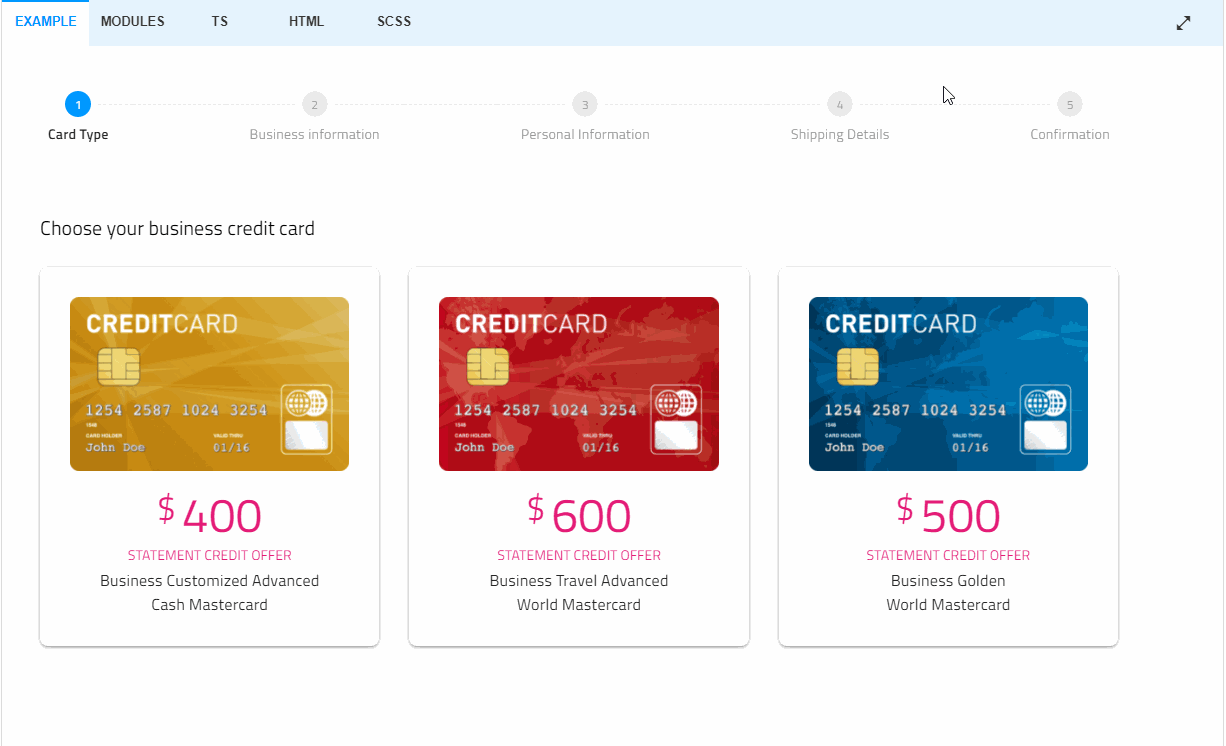
 Angular Stepper Component
Angular Stepper is a highly customizable component that visualizes content as a process and shows its progress by dividing the content into successive steps. It appears as a vertical or horizontal line. Provided by the Ignite UI for Angular library, the Stepper component delivers a wizard-like workflow and multiple features like step validation, styling, orientation and keyboard navigation.
Angular Single Selection Combo Component
The Angular Single Selection Combo component is a modification of the ComboBox component, requested by our clients in Ignite UI for Angular GitHub, that allows for single selections. Single Selection Combo is an editable input that allows users to choose an option from a predefined list of items. The new component also provides filtering capabilities, selections of items, grouping and adding custom values to a dropdown list. It can be used as an alternative to the HTML select tag and has several out-of-the-box features such as data binding (local and remote), filtering, grouping, custom templates, custom values, and more.
Here is the complete Ignite UI for Angular Change Log for 13.0.0
New Features
-
Added
IgxSteppercomponent- Highly customizable component that visualizes content as a process and shows its progress by dividing the content into chronological
igx-steps. - Exposed API to control features like step validation, styling, orientation, and easy-to-use keyboard navigation.
- Code example below:
<igx-stepper> <igx-step *ngFor="let step of stepsData" > ... </igx-step> </igx-stepper> - Highly customizable component that visualizes content as a process and shows its progress by dividing the content into chronological
-
Added
IgxFocusTrapdirective, which traps the Tab key focus within an element.<div #wrapper [igxFocusTrap]="true" tabindex="0"> <input type="text" placeholder="Enter Username" name="uname"> <input type="password" placeholder="Enter Password" name="psw"> <button>SIGN IN</button> </div> -
Added
IgxSimpleComboComponent- The
igx-simple-combowhich is a modification of theigx-combocomponent that allows single selection and has the appropriate UI and behavior for that. It inherits most of theigx-combo's API. - Allows the selection of single items in a filterable list.
- Supports custom values, keyboard navigation, validation, customized positioning of the item list via overlay settings.
- Example:
<igx-simple-combo [(ngModel)]="item" [allowCustomValues]="true" [placeholder]="'Search'" [data]="items"> <label igxLabel>Items</label> <igx-hint>Please select an item from the dropdown list.</igx-hint> </igx-simple-combo> - The
-
IgxCsvExporterService,IgxExcelExporterService- Exporter services are no longer required to be provided in the application since they are now injected on a root level.
-
IgxGridToolbarPinningComponent,IgxGridToolbarHidingComponent- Exposed new input
buttonTextwhich sets the text that is displayed inside the dropdown button in the toolbar.
- Exposed new input
-
IgxCombo- Added
groupSortingDirectioninput, which allows you to set groups sorting order.
- Added
-
IgxGrid,IgxTreeGrid,IgxHierarchicalGrid- Added new directives for re-templating header sorting indicators -
IgxSortHeaderIconDirective,IgxSortAscendingHeaderIconDirectiveandIgxSortDescendingHeaderIconDirective.
- Added new directives for re-templating header sorting indicators -
-
IgxGrid- Exposed a
groupStrategyinput that functions similarly tosortStrategy, allowing customization of the grouping behavior of the grid. Please, refer to the Group By topic for more information.
- Exposed a
-
IgxDialog- Added
focusTrapinput to set whether the Tab key focus is trapped within the dialog when opened. Defaults totrue.
- Added
General
-
IE discontinued supportBreaking Change detailsweb-animations-jsis removed as Peer Dependency.- Removed IE from
.browserslistrc - Removed IE related
polyfills, like Importing ES7 polyfill for Object ('core-js/es7/object') for IE is no longer used.
-
IgxDialog- Breaking Change - The default positionSettings open/close animation has been changed to
fadeIn/fadeOut. The open/close animation can be set through the position settings, e.g. change the animation to the previously default open/close animation:
import { slideInBottom, slideOutTop } from 'igniteui-angular'; @ViewChild('alert', { static: true }) public alert: IgxDialogComponent; public newPositionSettings: PositionSettings = { openAnimation: useAnimation(slideInBottom, { params: { fromPosition: 'translateY(100%)' } }), closeAnimation: useAnimation(slideOutTop, { params: { toPosition: 'translateY(-100%)'} }) }; this.alert.positionSettings = this.newPositionSettings; - Breaking Change - The default positionSettings open/close animation has been changed to
-
igxGrid,igxHierarchicalGrid,igxTreeGrid- Breaking Change - The following deprecated inputs have been removed
- Inputs
showToolbar,toolbarTitle,columnHiding,columnHidingTitle,hiddenColumnsText,columnPinning,columnPinningTitle,pinnedColumnsText. UseIgxGridToolbarComponent,IgxGridToolbarHidingComponent,IgxGridToolbarPinningComponentinstead.
- Inputs
- Breaking Change - The
rowSelectedevent is renamed torowSelectionChangingto better reflect its function. - Breaking Change - The
columnSelectedevent is renamed tocolumnSelectionChangingto better reflect its function. - Breaking Change -
columnsCollectionis removed. Usecolumnsinstead. If at certain ocasionscolumnsreturn empty array, query the columns usingViewChildrenand access those inngAfterViewInit:
@ViewChildren(IgxColumnComponent, { read: IgxColumnComponent }) public columns: QueryList<IgxColumnComponent>;RowType,IgxRowDirective- Breaking Change -
rowDataandrowIDdeprecated properties are now removed. Usedataandkeyinstead. Useng updatefor automatic migration.
- Breaking Change -
igxRowSelectorrowIDin the context object of theigxRowSelectoris now deprecated and will be removed in future version. Usekeyproperty instead:
<igx-grid [data]="data", [rowSelection]="'multiple'" primaryKey="ID"> <igx-column field="Name"></igx-column> <igx-column field="Age"></igx-column> <ng-template igxRowSelector let-rowContext> <span>{{ rowContext.key }}</span> </ng-template> </igx-grid>IgxColumnActionsComponent- Breaking Change - Input
columnshas been removed. UseigxGridcolumnsinput instead.
- Breaking Change - Input
- Breaking Change - The following deprecated inputs have been removed
-
IgxCarousel- Breaking Changes - The carousel animation type
CarouselAnimationTypeis renamed toHorizontalAnimationType.
- Breaking Changes - The carousel animation type
-
Theming- Breaking Change - Changed CSS palette variables from HEX values to a list of H, S, L comma-separated values, which requires the use of the CSS
hslfunction when accessing these values directly..bozo { background: hsl(var(--igx-surface-500)); }
- Breaking Change - Changed CSS palette variables from HEX values to a list of H, S, L comma-separated values, which requires the use of the CSS
Wrap-Up
We continue to incrementally ship new features, performance, and stability improvements as we are committed to provide you the best Angular UI toolkit and develop the best app builder platform - Indigo.Design. As we mentioned, some of our enhancements come from users like yourself through our GitHub repository. With this in mind, we are always open to suggestions and feedback – it’s what makes us grow and serve you better. Last but not least we know that predictability and visibility on our next goals is critical for the good business partners so we have our roadmap always up to date!
Follow us on Medium and stay up-to-date with the latest Angular-related projects that we are working on. Give us a star on GitHub and help us to continue to improve our product by addressing any concerns, questions or feature requests in the issues section. We will continue to do our best to constantly improve our product experience to meet all your needs and build apps with ease.
Recommend
About Joyk
Aggregate valuable and interesting links.
Joyk means Joy of geeK